
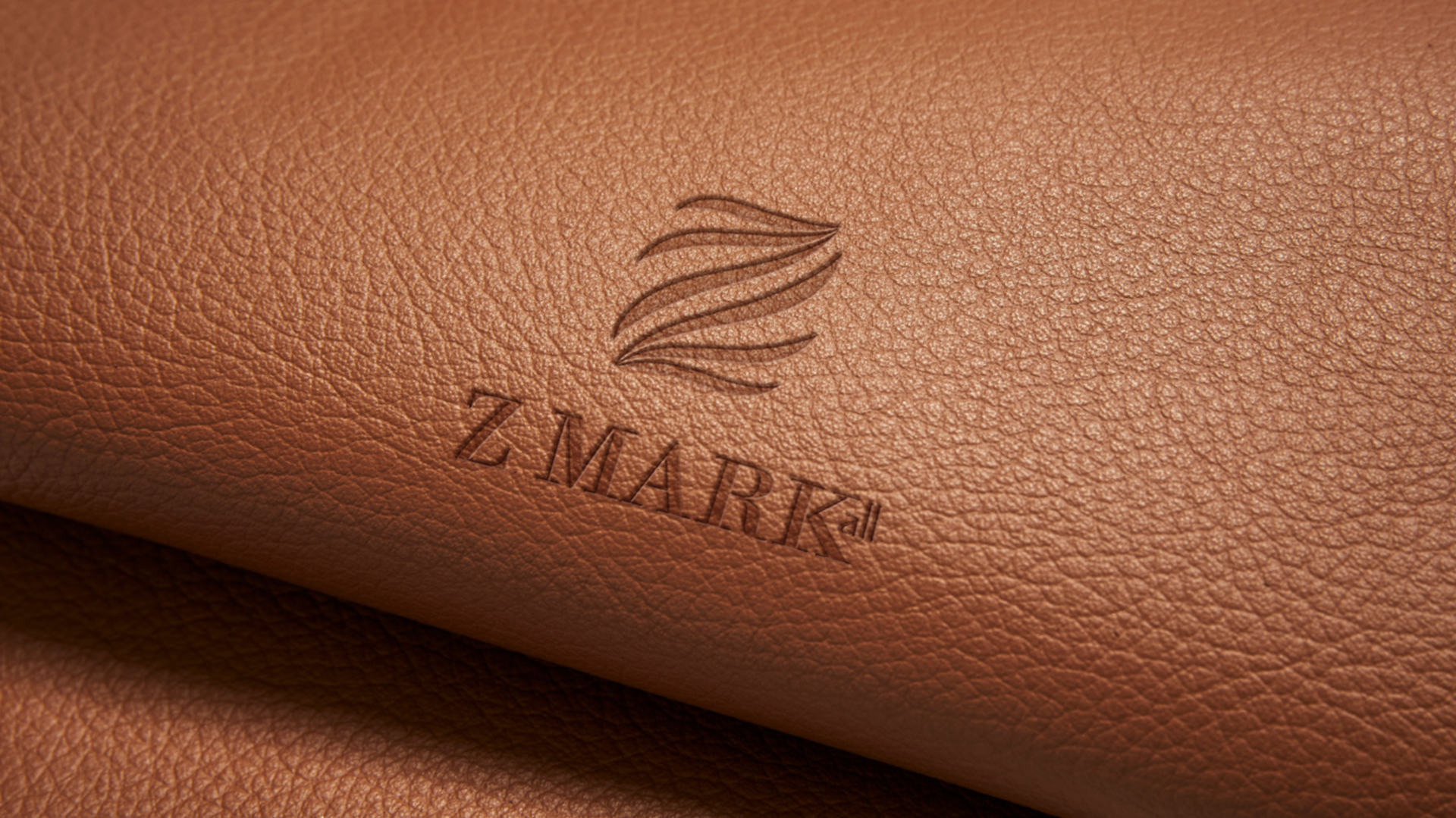

The Logo
The central element, the letter “Z,” was chosen as a symbol of the brand’s name and its position as a modern, forward-thinking entity.
The Z Mark logo is a visually striking and modern design. The use of a gradient purple color palette and the intricate interplay of lines within the “Z” create a sophisticated and memorable symbol.
The Significance of the Strokes
The divergent strokes within the ‘Z’ were a deliberate design choice, intended to symbolize the brand’s versatility and adaptability. This element resonated with the diverse range of products offered by Z Mark, from classic leather shoes to contemporary watches and stylish accessories. The strokes also hinted at the brand’s ability to cater to different tastes and preferences, ensuring there was something for everyone.
The Color Pallette
The gradient of purple chosen for the design was carefully selected to evoke feelings of luxury, sophistication, and creativity. Purple is often associated with royalty and wealth, aligning with the brand’s aspiration to offer premium products. The gradient effect added depth and dimension to the logo, making it visually appealing and memorable.

The logo is a successful representation of the brand’s modern aesthetic, high-end products, and diverse offerings. It is visually appealing, memorable, and effectively conveys the brand’s identity.