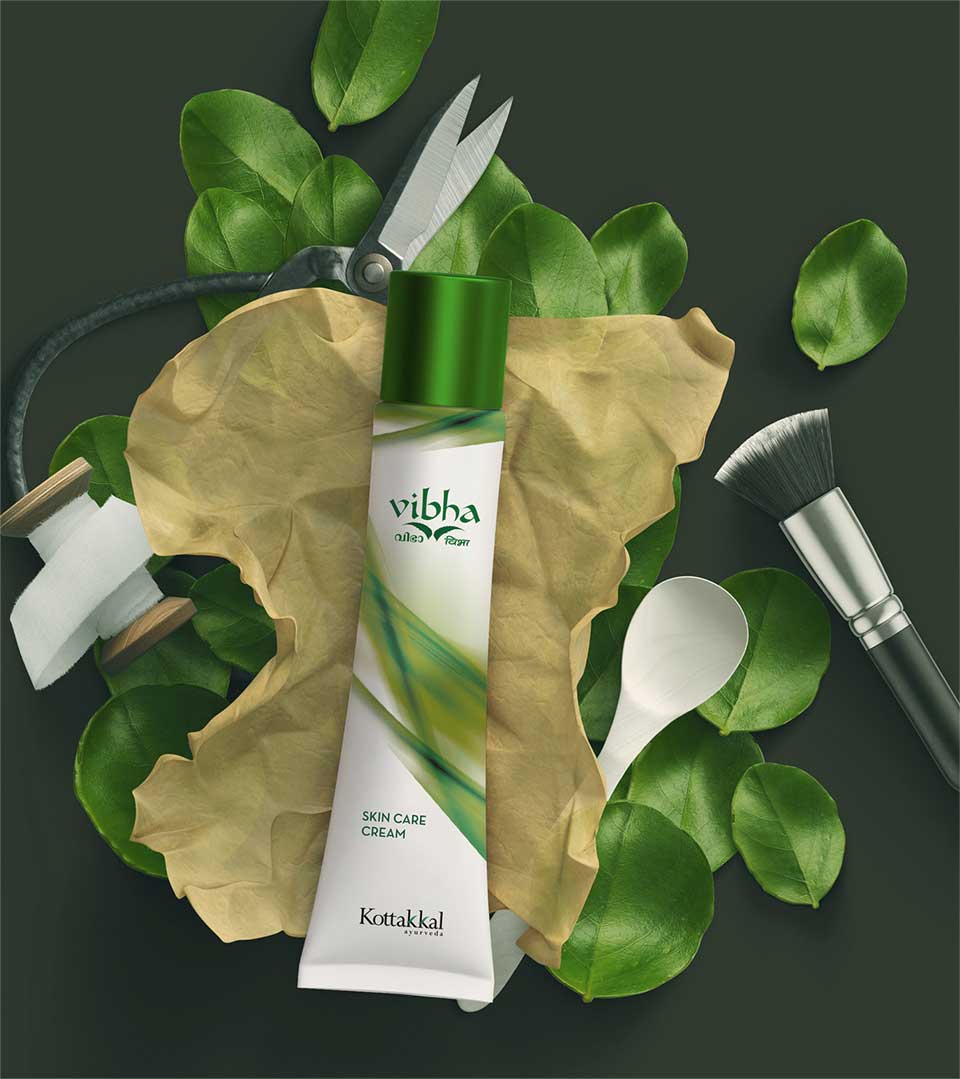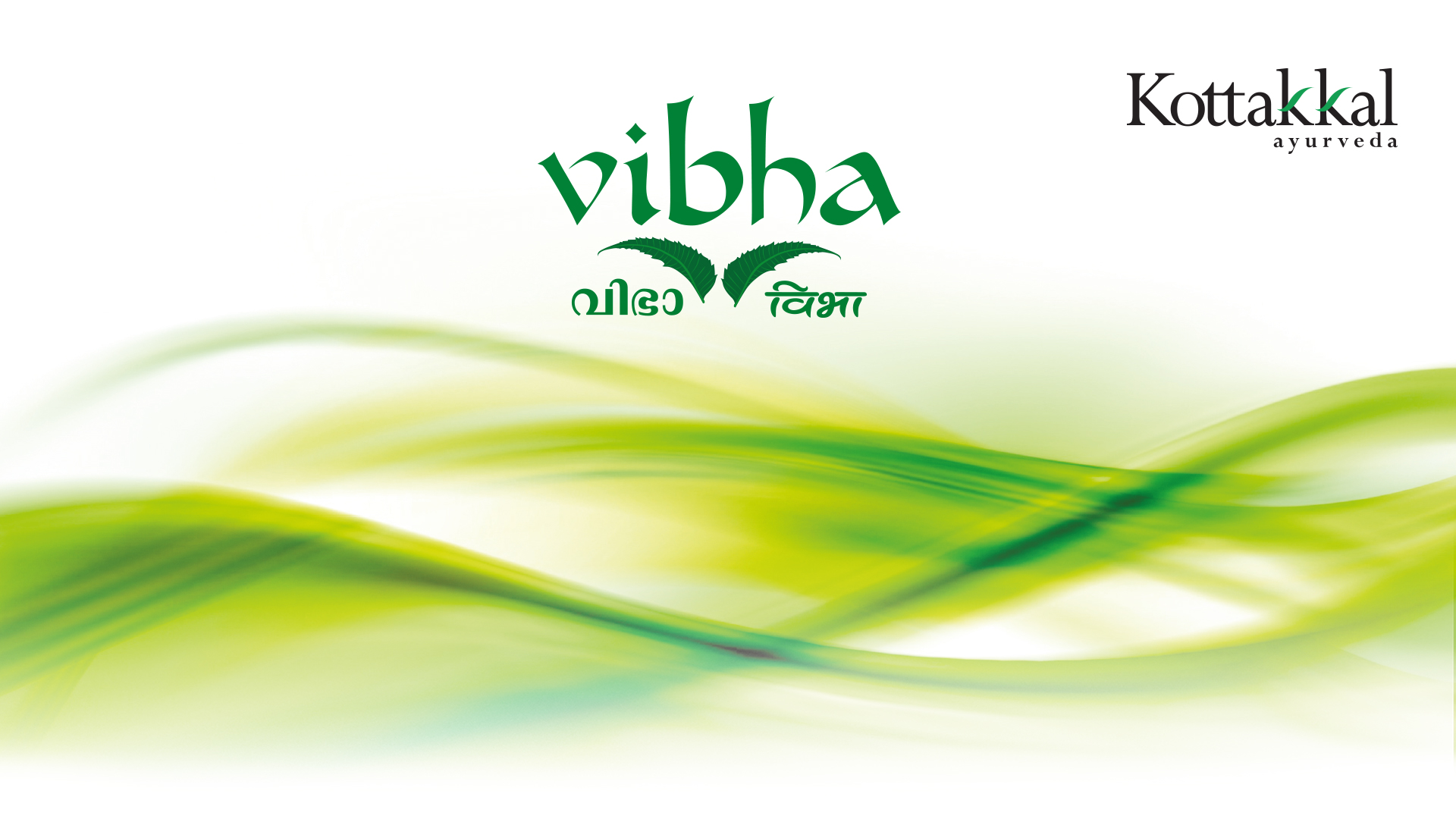
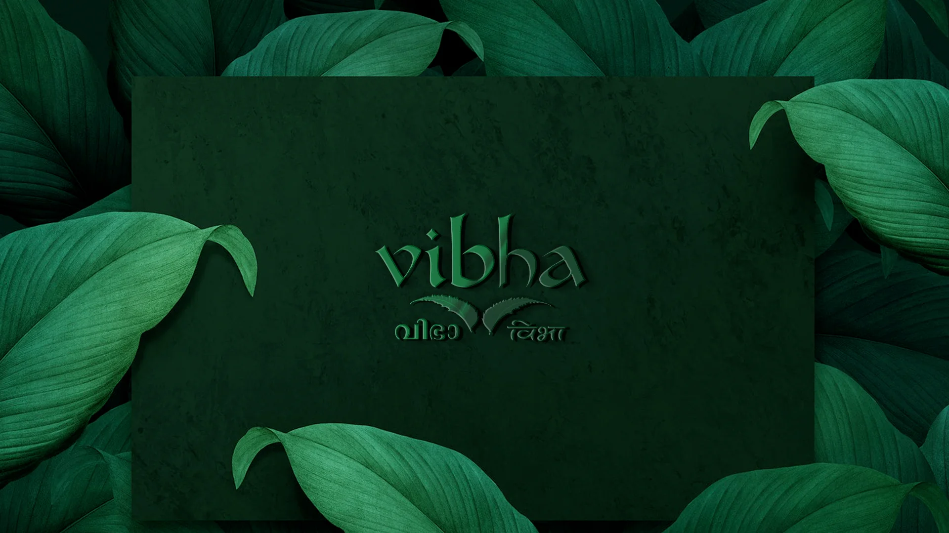
Vibha: A Logo Steeped in Nature’s Goodness
Developing a logo for Kottakkal Arya Vaidya Sala’s Vibha required capturing the essence of its natural ingredients and rich Ayurvedic heritage.Kottakkal Ayurveda Products always stands out for its commitment to natural ingredients and Ayurvedic principles. The logo design and branding services must reflect these core values and resonate with the target audience seeking authentic Ayurvedic wellness.
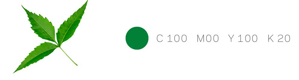
Why Neem Leaves?
Neem, a cornerstone of Ayurveda, was a natural choice for visual representation.
Here’s why:
- Powerful Ingredient: Renowned for its purifying and medicinal properties. The logo directly connects with the core benefits of Vibha.
- Symbolism: Neem leaves symbolize health, wellness, and holistic healing – perfectly aligning with the philosophy of Ayurveda.
- Visually Appealing: Two neem leaves create a balanced and harmonious form, adding an aesthetically pleasing element to the logo.
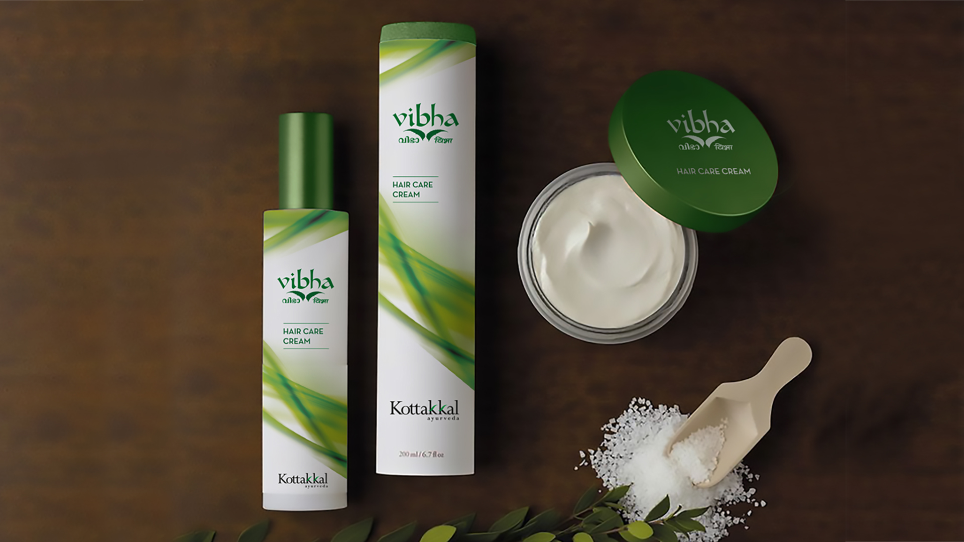
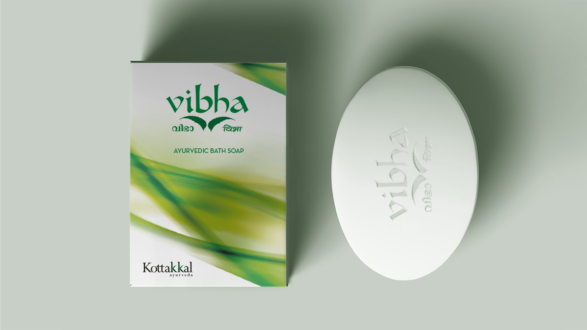
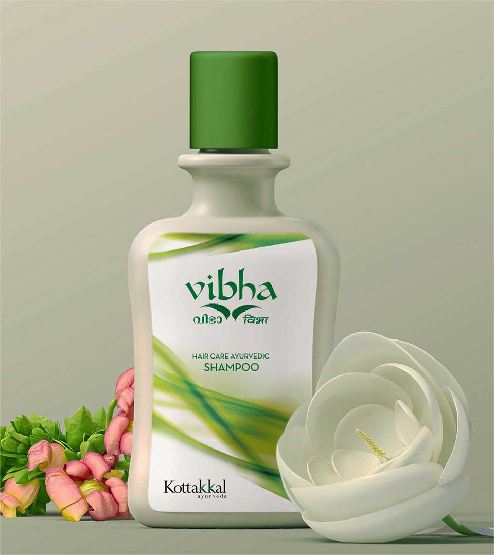
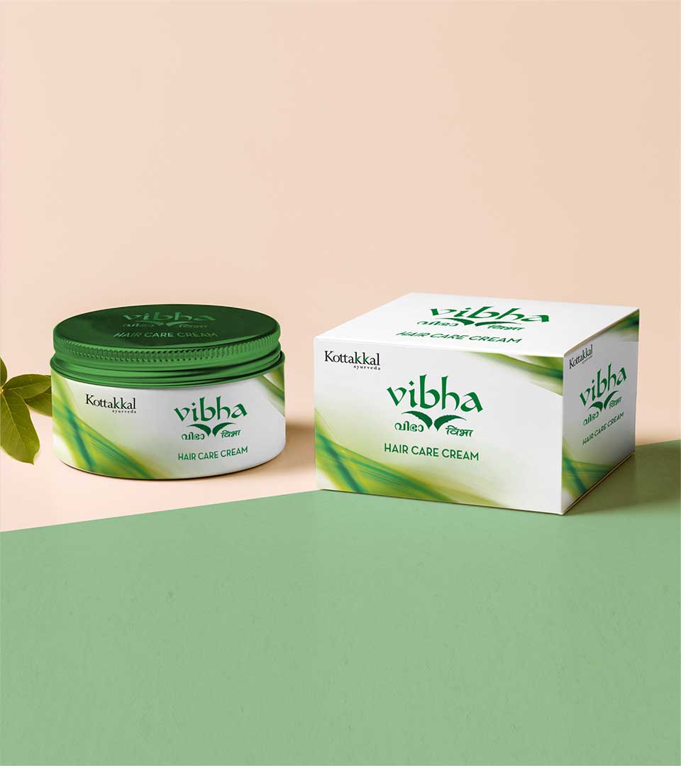
The Power of Green
The green color abstract we used in the packages reinforces the brand’s connection to nature:
Natural Connection: Green universally evokes freshness, purity, and association with plants and growth. This aligns with Kottakkal Ayurveda Beauty Care Products’ use of natural ingredients. This also helped to seal the identity of the brand among the public, as a familiar product from popular Kottakkal Arya Vaidya Sala.
Brand Cohesiveness: Green complements the established brand identity of Vibha, known for its commitment to traditional Ayurvedic practices.
The Design Journey
Research & Exploration: We began by researching symbols associated with Ayurveda and Vibha’s brand identity.
Ingredient Focus: Recognizing neem’s importance, we explored ways to visually represent it.
Refined Design: Through iterative sketches and refinements, the two overlapping neem leaves emerged as a simple yet impactful logo.
Color Selection: Green was a natural choice to reinforce the natural and Ayurvedic aspects of Ayurvedic beauty care products.