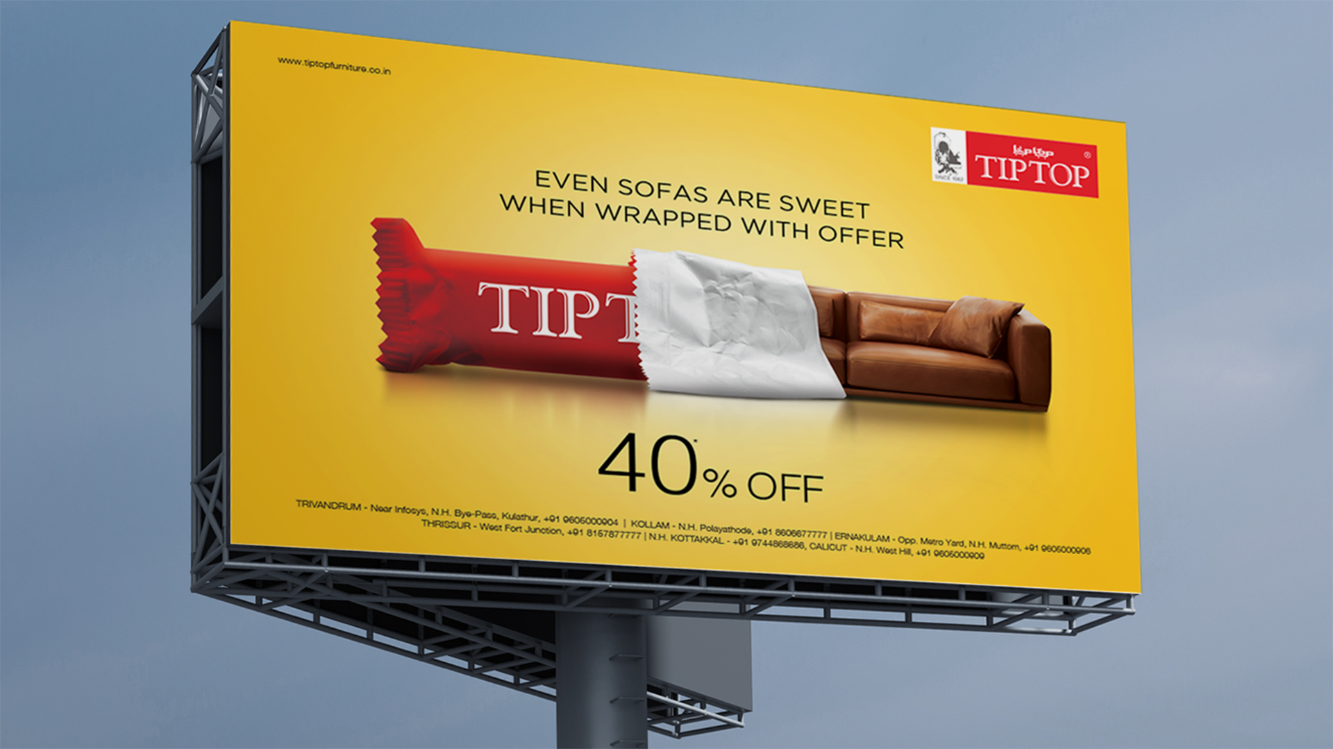
The Concept
The core concept behind the campaign was to bridge the gap between the perceived luxury of the brand and the affordability of its products. The campaign aimed to convey the message that Tip Top offers high-quality furniture at competitive prices.
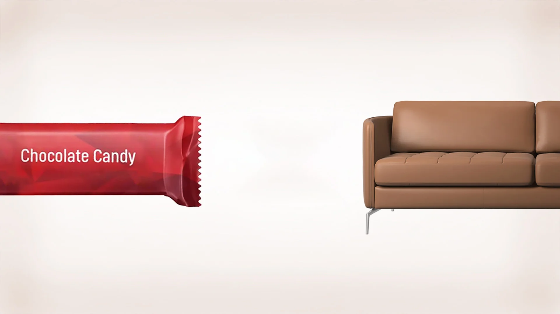
To achieve this, CR8’s creative team devised a visual metaphor: the Indian rupee as furniture. The rupee, a symbol of everyday life and economy, was transformed into chairs. This imagery immediately communicated the idea that Tip Top Furnitures is a brand that caters to the everyday needs of people, not just the affluent.
The Creative Execution
The execution of the campaign centered around the visual metaphor of the rupee as furniture. This visually striking imagery was accompanied by a clear message: “Flat 20% off on all furniture.”
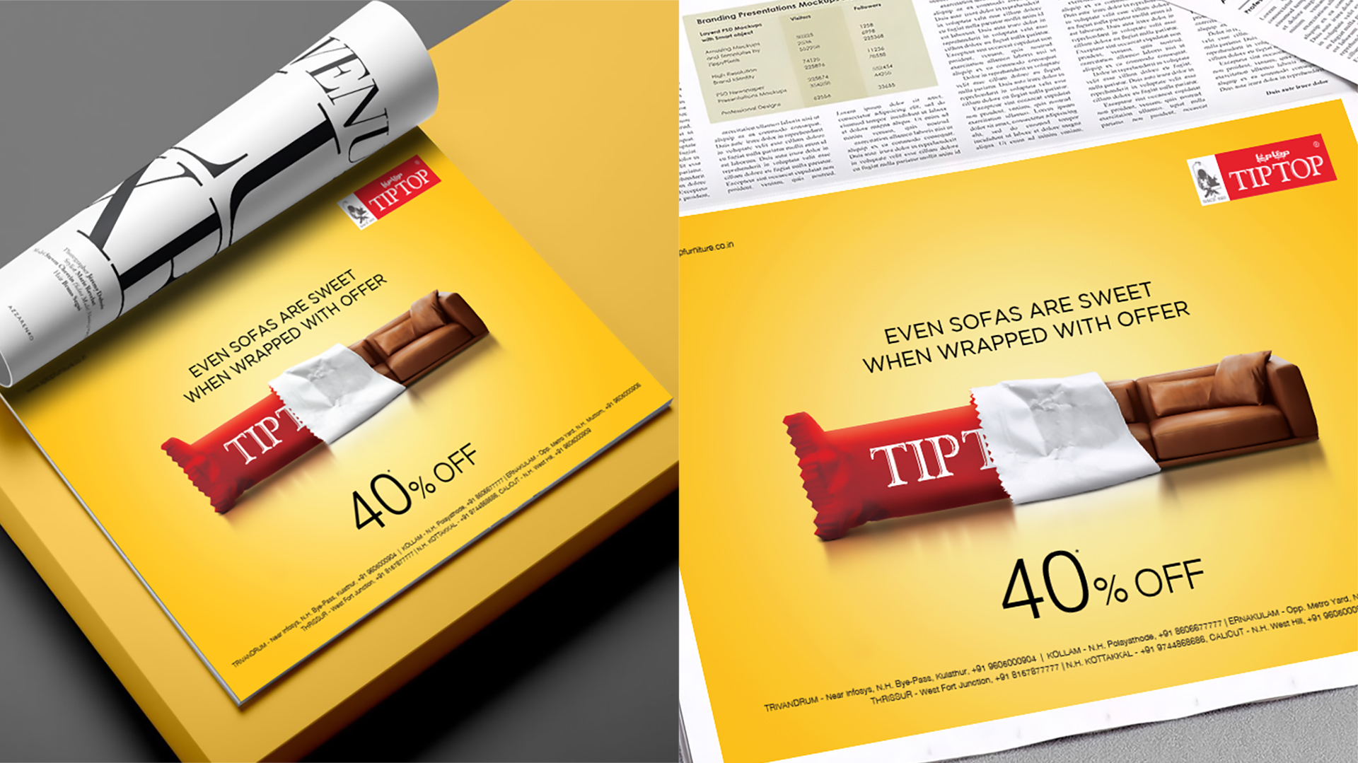
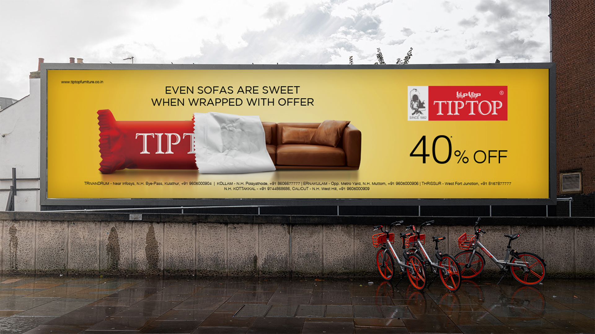
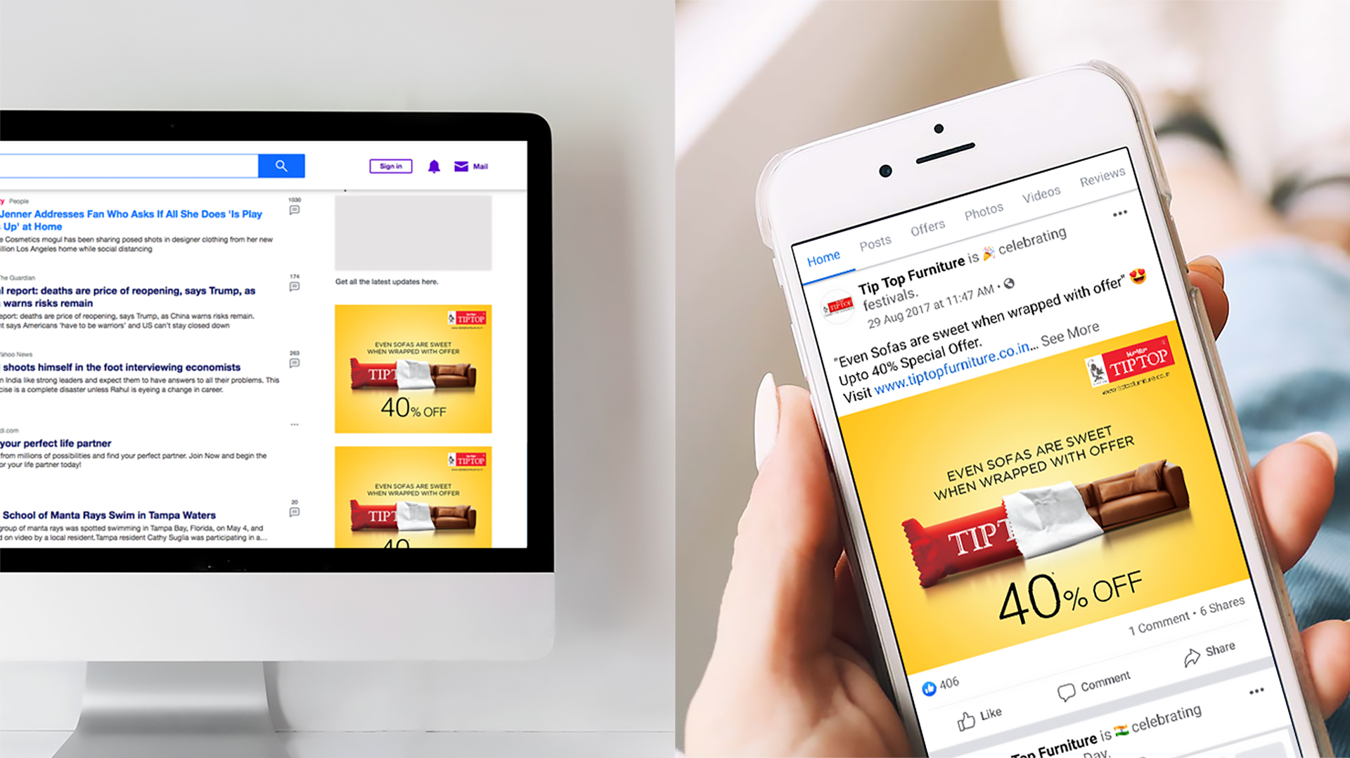
The campaign was strategically placed in various media channels to reach the target audience, including print and digital platforms. The use of multiple channels ensured maximum visibility and impact.
The Result
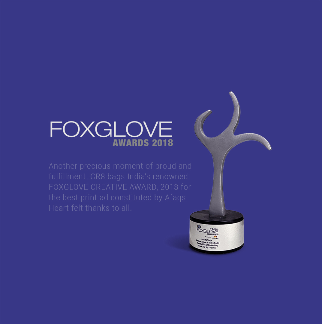
The campaign was a resounding success. Tip Top Furnitures successfully shifted its brand image from a luxury brand to a more accessible one. The middle-class market, which had previously been hesitant to consider Tip Top Furnitures, began to see the brand as a viable option.
As a result of the successful campaign, Tip Top Furnitures experienced a significant increase in sales and customer base. The campaign’s effectiveness can be attributed to the strong concept, creative execution, and strategic media placement.