A Strong Brand Identity for Suraksha Sevana Medineeds
Sevana approached CR8 with the challenge of redefining Suraksha’s visual identity. Their existing logo, while simple, lacked the emotional depth and impact required to represent the brand’s essence. The brief was clear: a new logo focused on typography.
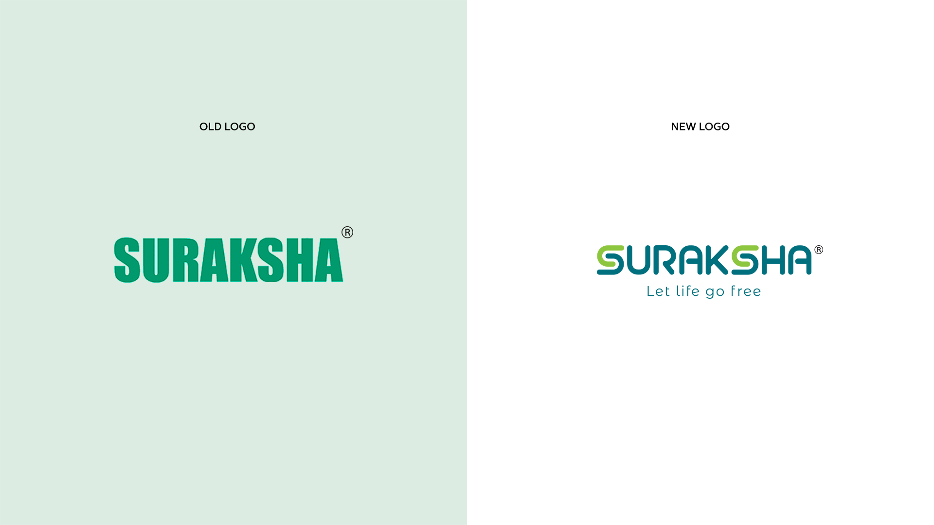
The Old Logo
As one of the best logo design and branding services in Kerala, we identified the initial logo rendered in straightforward teal typography, lacked the depth and emotional resonance necessary to create a strong brand identity.
The reliance on a single color, while bold, contributed to a generic appearance, as teal is a commonly used color across the healthcare industry. Moreover, the absence of distinctive brand elements limited the logo’s ability to stand out in a crowded marketplace.
The New Logo
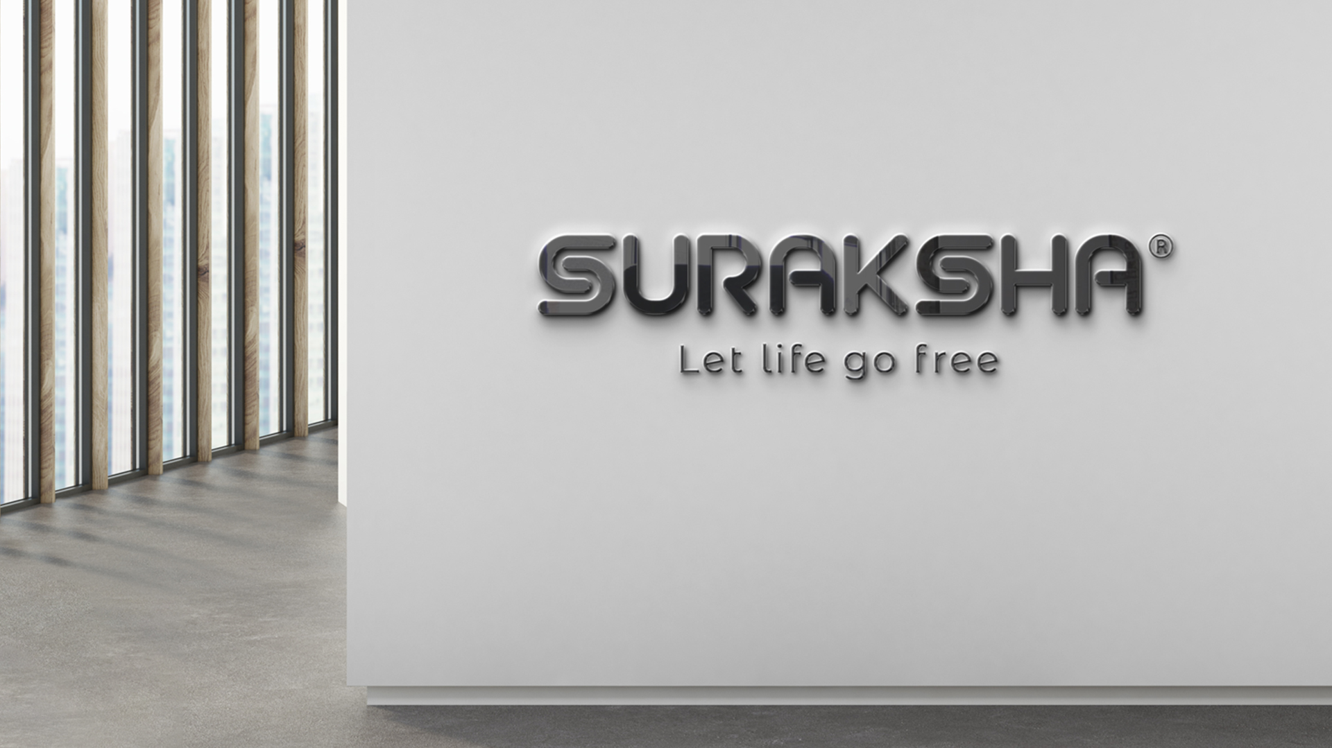
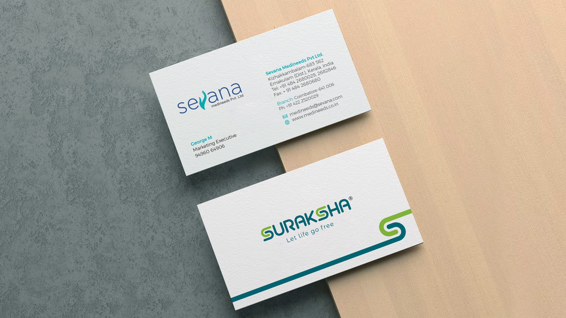
The redesigned Suraksha logo represents a significant evolution in the brand’s visual identity. The letter ‘S’ in “Suraksha” is cleverly crafted to resemble a pair of interlocking hands. This powerful imagery conveys a sense of unity, support, and security, immediately resonating with the Suraksha by Sevana Medineeds’ commitment to safeguarding lives.
The incorporation of the tagline, “Let life go free,” further strengthens the logo’s impact, emphasizing the freedom and peace of mind that comes with a secure environment.
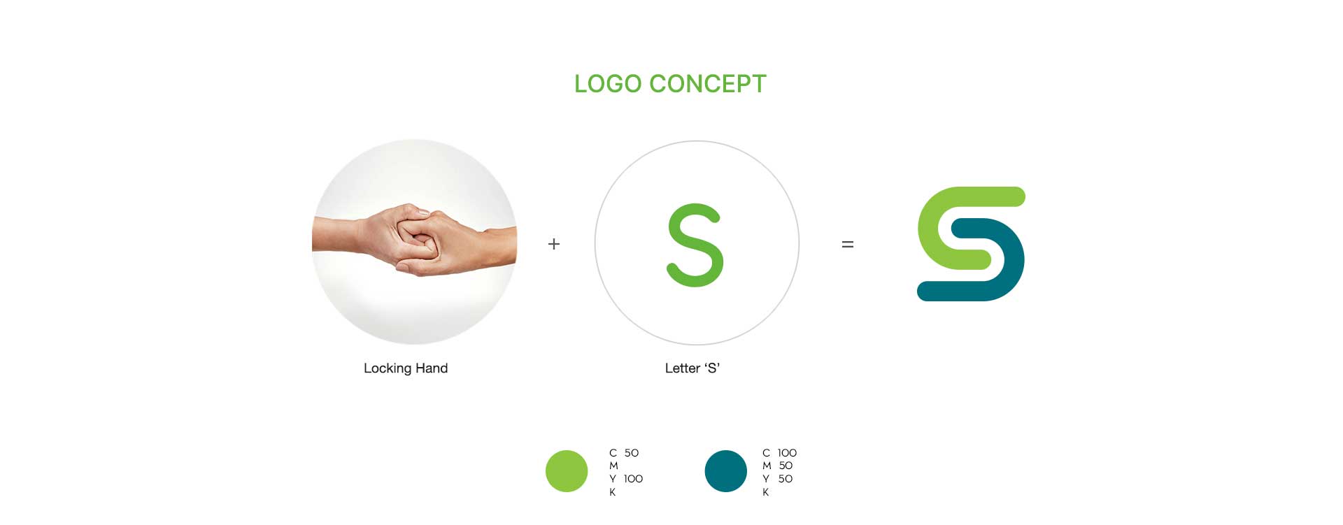
A pair of interlocking hands + The letter S
A masterful blend of form and function, summarizing the brand’s essence in a visually compelling manner. Inspired by the core value of safety, the design ingeniously intertwines the word “Suraksha” with a symbolic representation of protection.
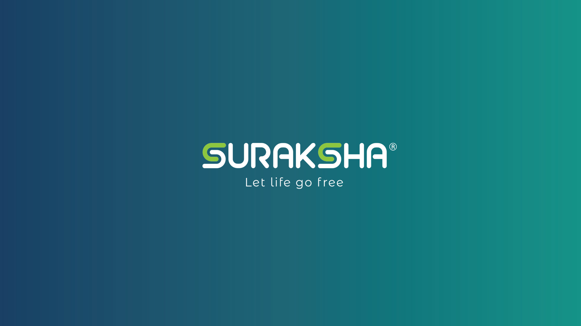
Color Palette
The dual themes of trust and vitality. Blue symbolizes professionalism, trust, and reliability—qualities that are foundational to Sevana Medineeds. Green represents health, growth, and vitality, echoing the brand’s commitment to life and safety. Together, these colors evoke a sense of assurance and well-being, perfectly aligned with Suraksha’s brand identity.
Tagline
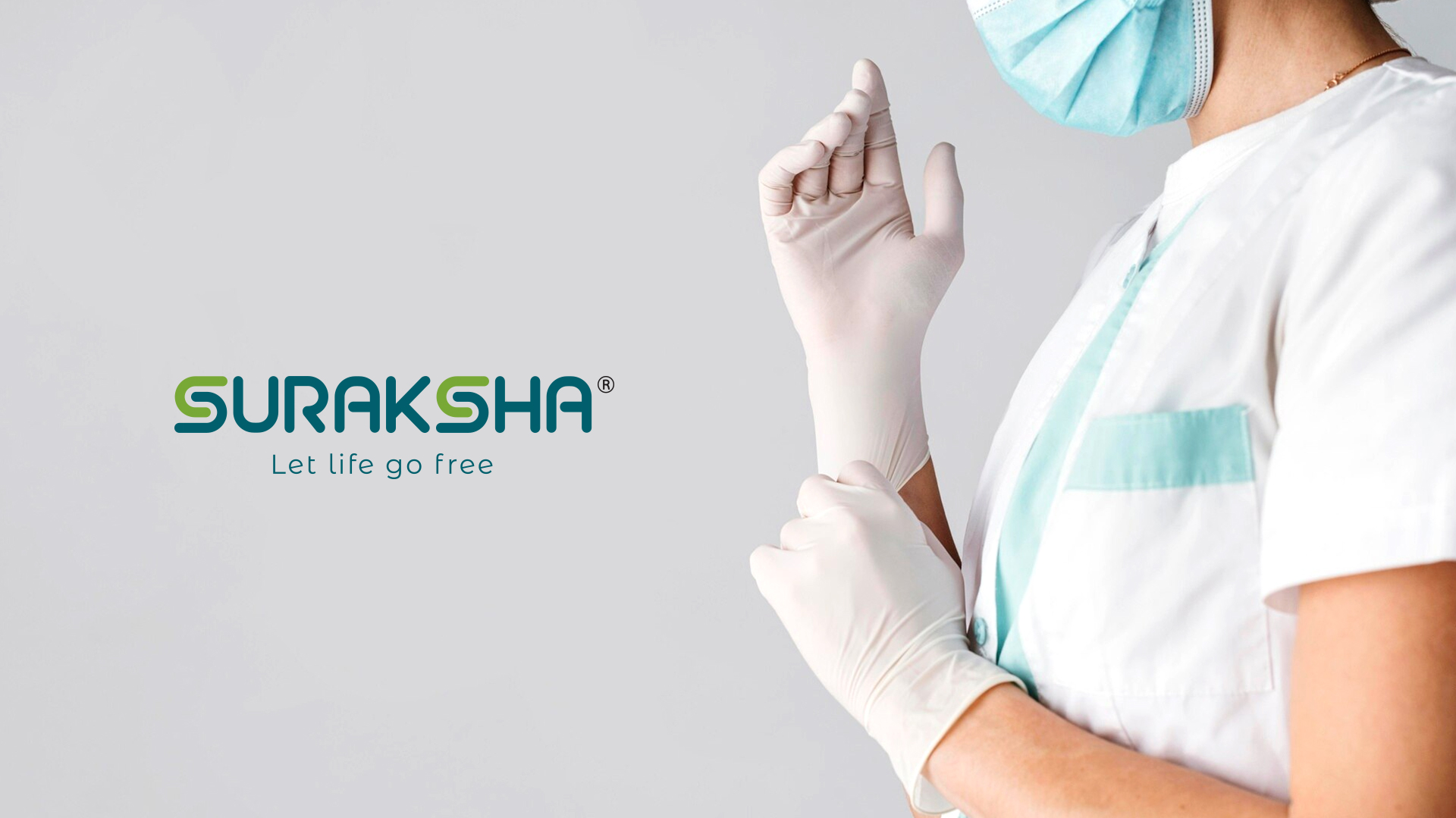
The tagline, “Let life go free,” complements the logo by highlighting the freedom and peace of mind that comes with a secure environment. It invites consumers to embrace life without worry, knowing that Suraksha is there to provide essential protection.
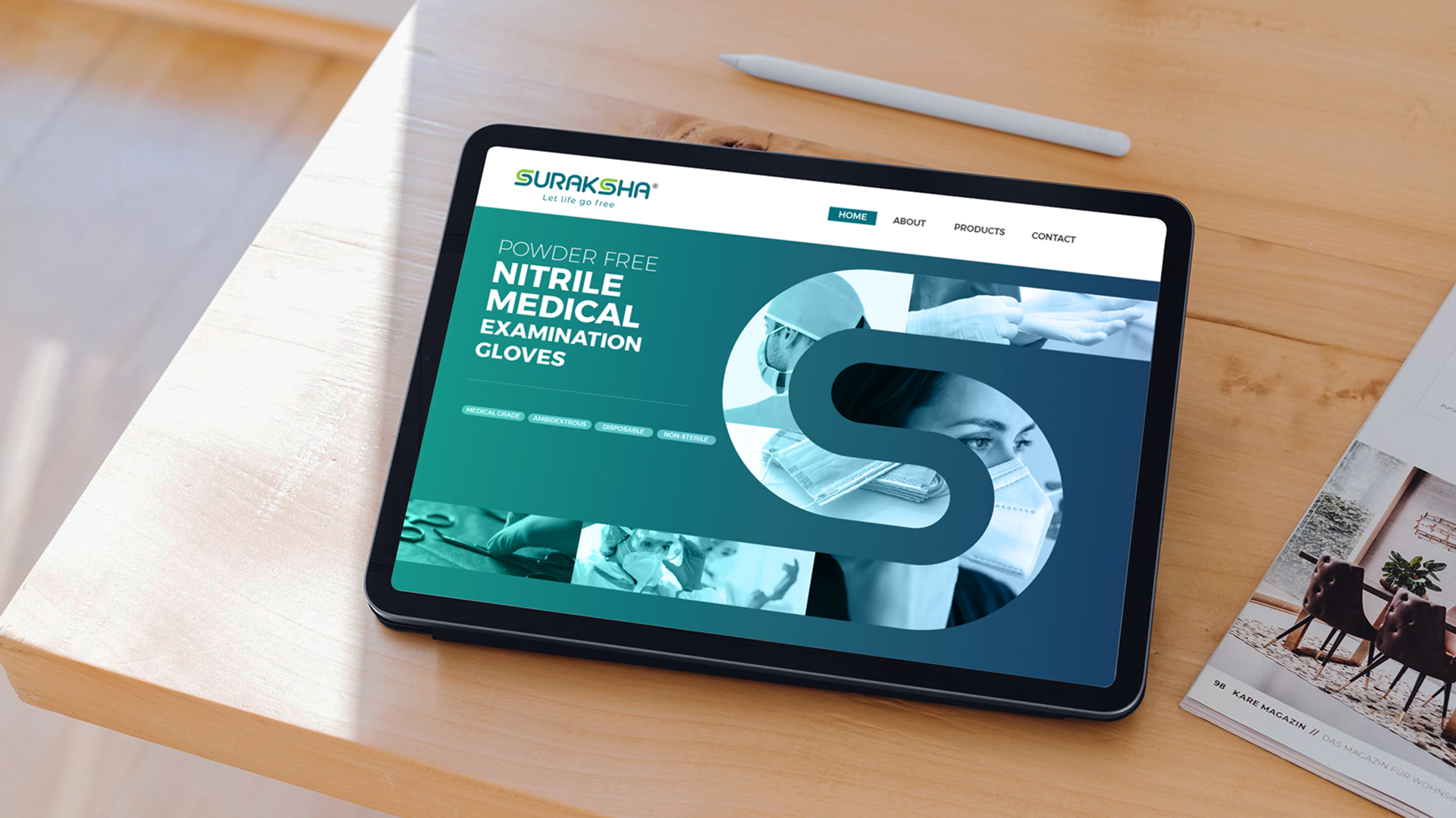
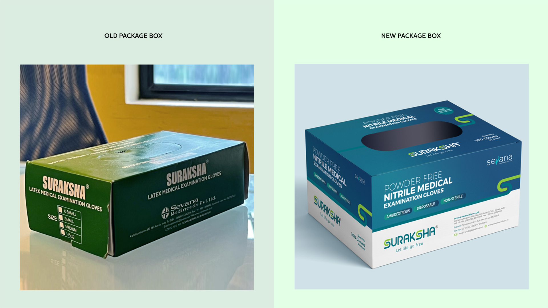
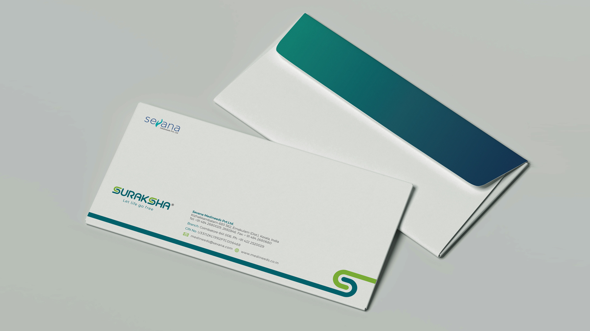
Creating a Visual Identity
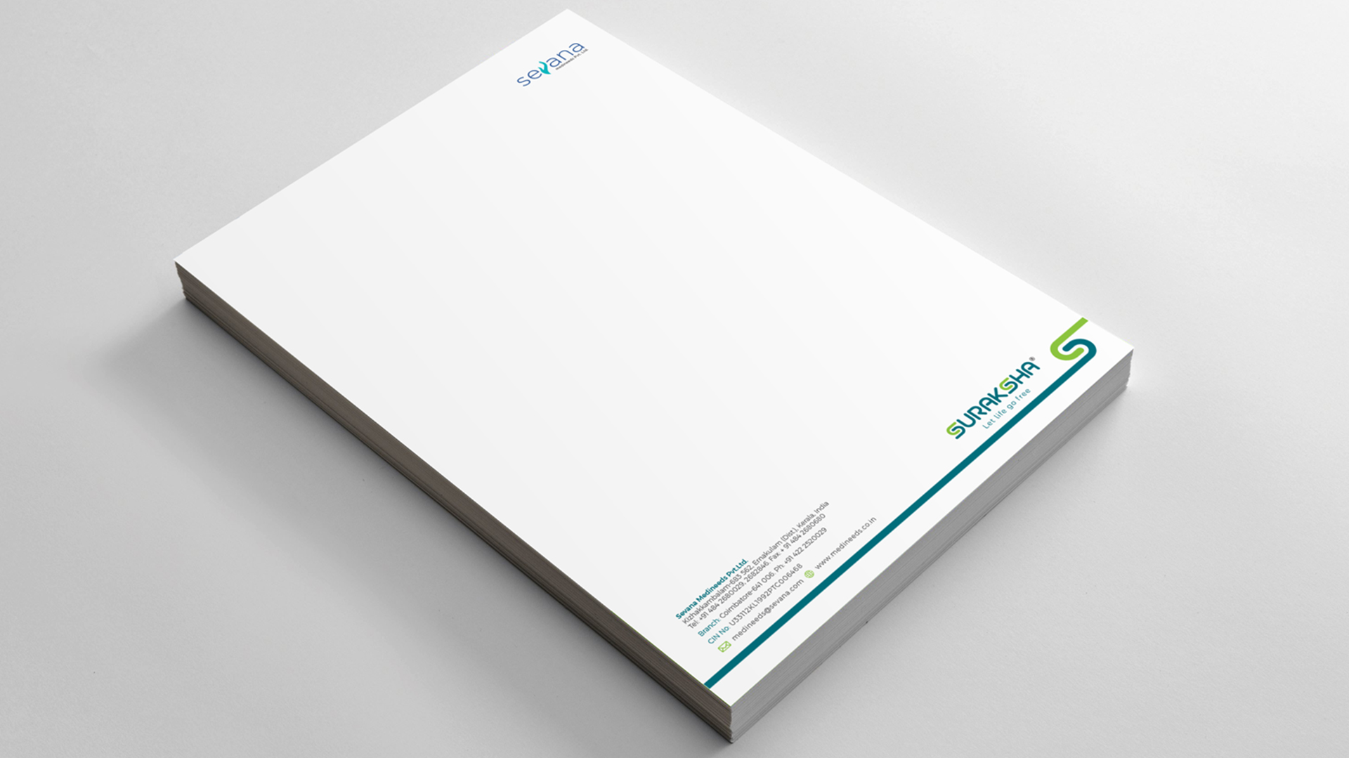
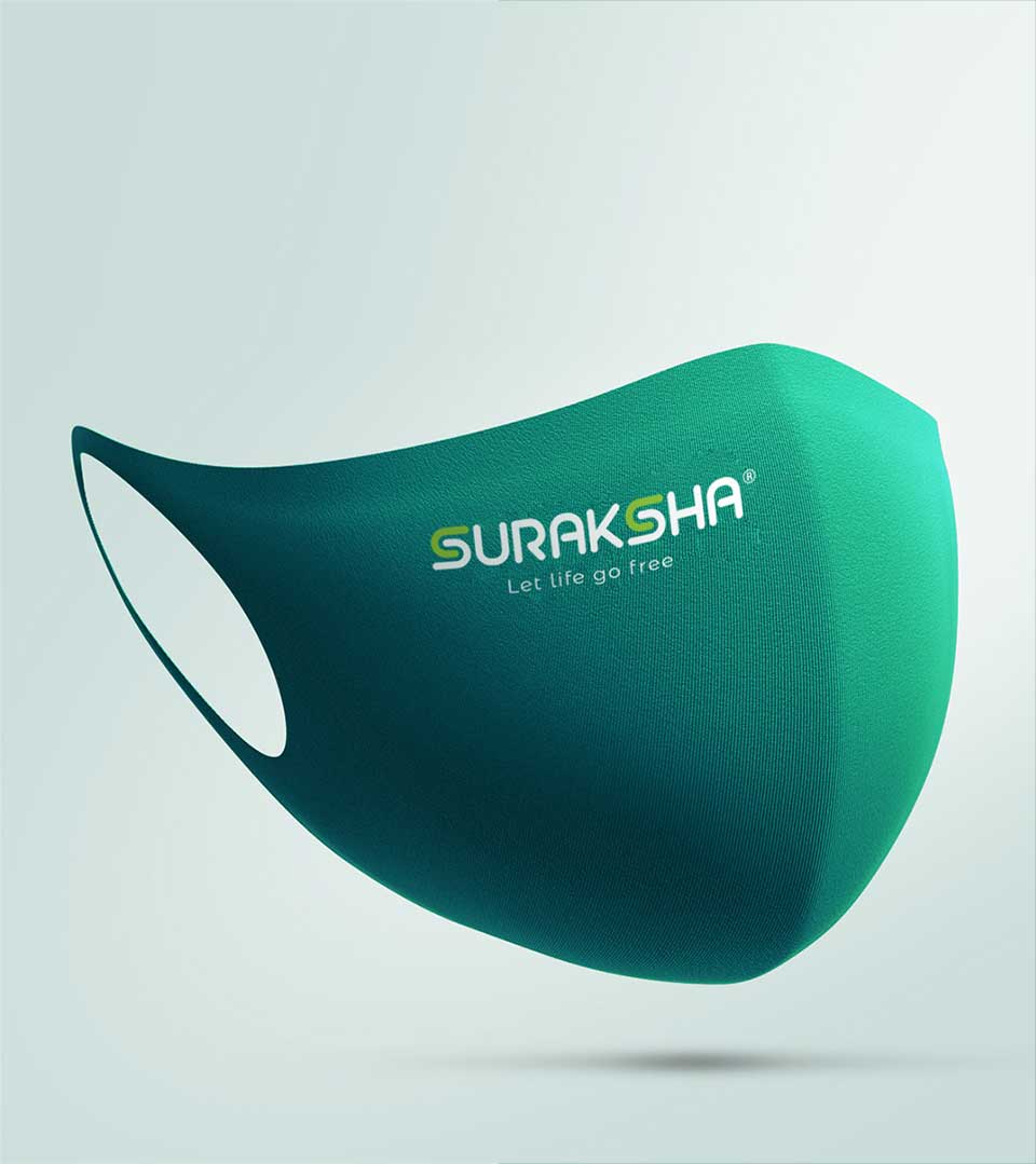
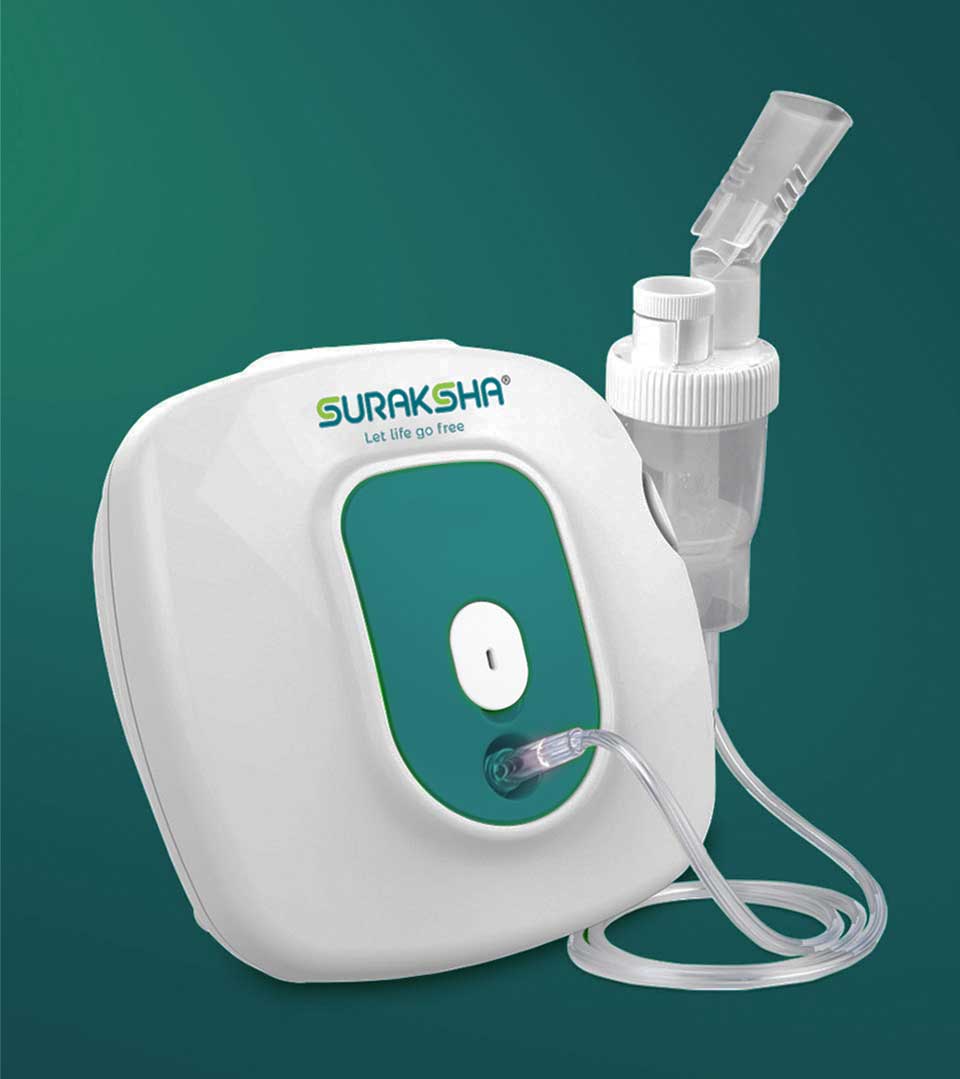
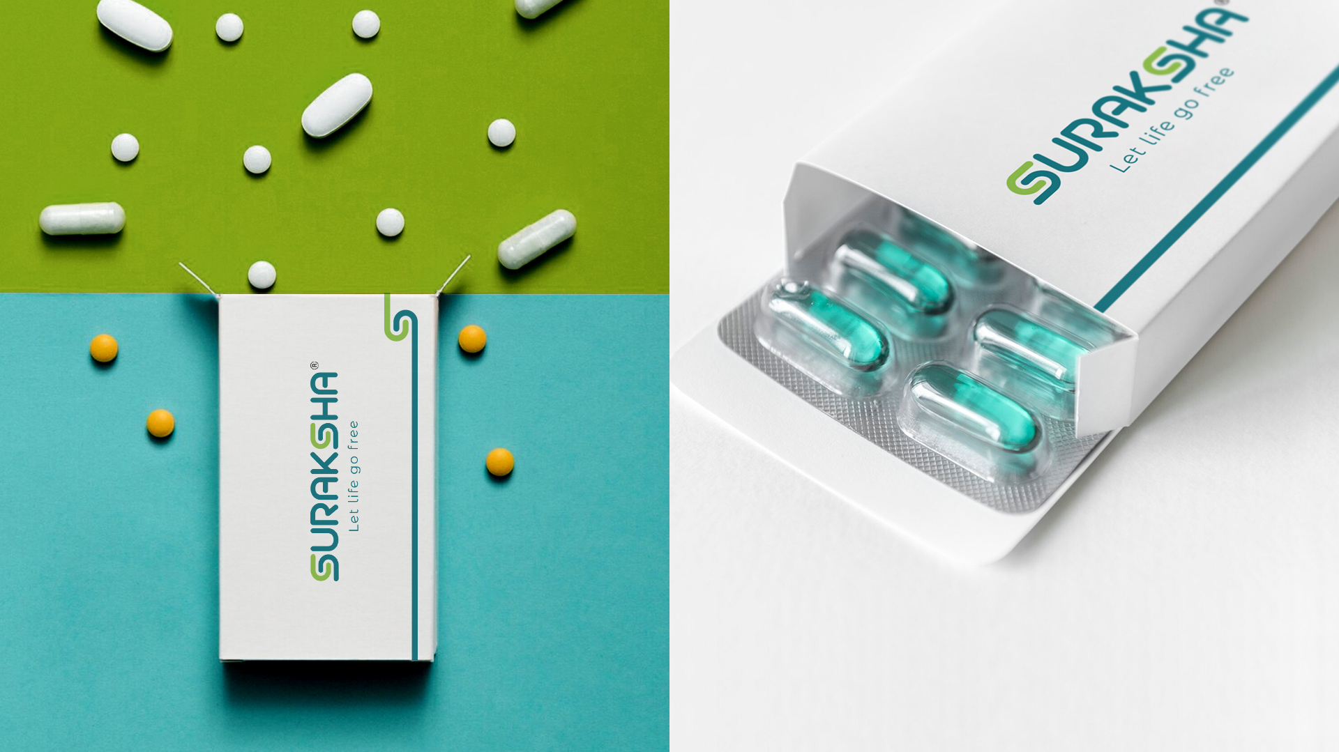
This refreshed identity extends beyond the logo. We’ve infused the brand essence into packaging designs, creating a unified look and feel. CR8 developed a pattern by picking the brand element from the identity that we created, that seamlessly integrates into corporate stationery, business cards, and other collaterals, reinforcing the brand’s identity at every touchpoint.
CR8 has demonstrated expertise in logo design and branding services by crafting a compelling identity for Suraksha by Sevana Medineeds. The ability to understand the client’s vision and translate it into a visually impactful service is commendable. This project showcases our skills as a logo design and rebranding agency.