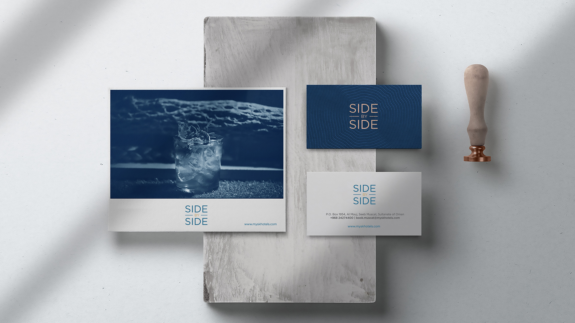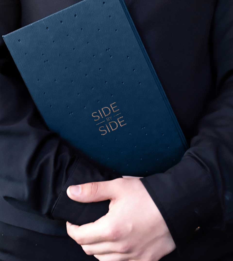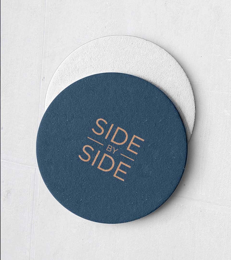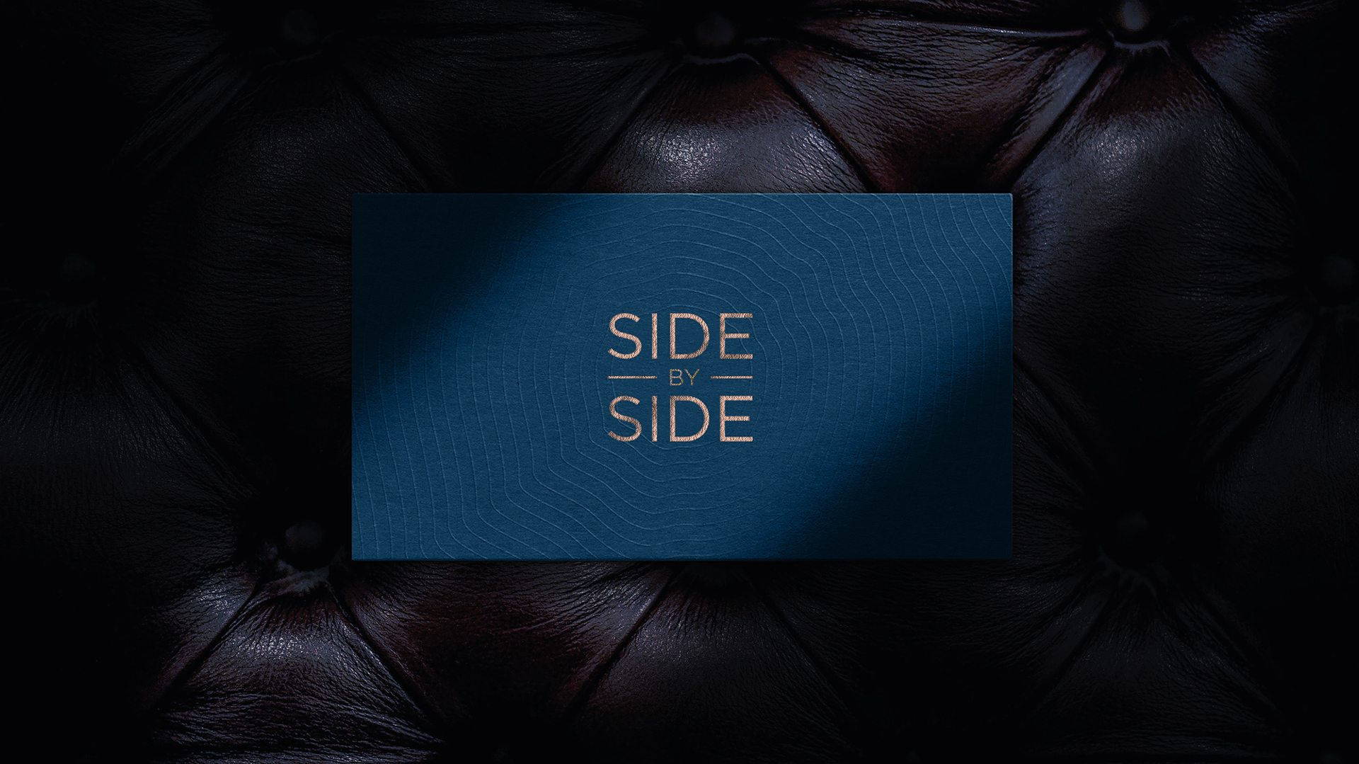
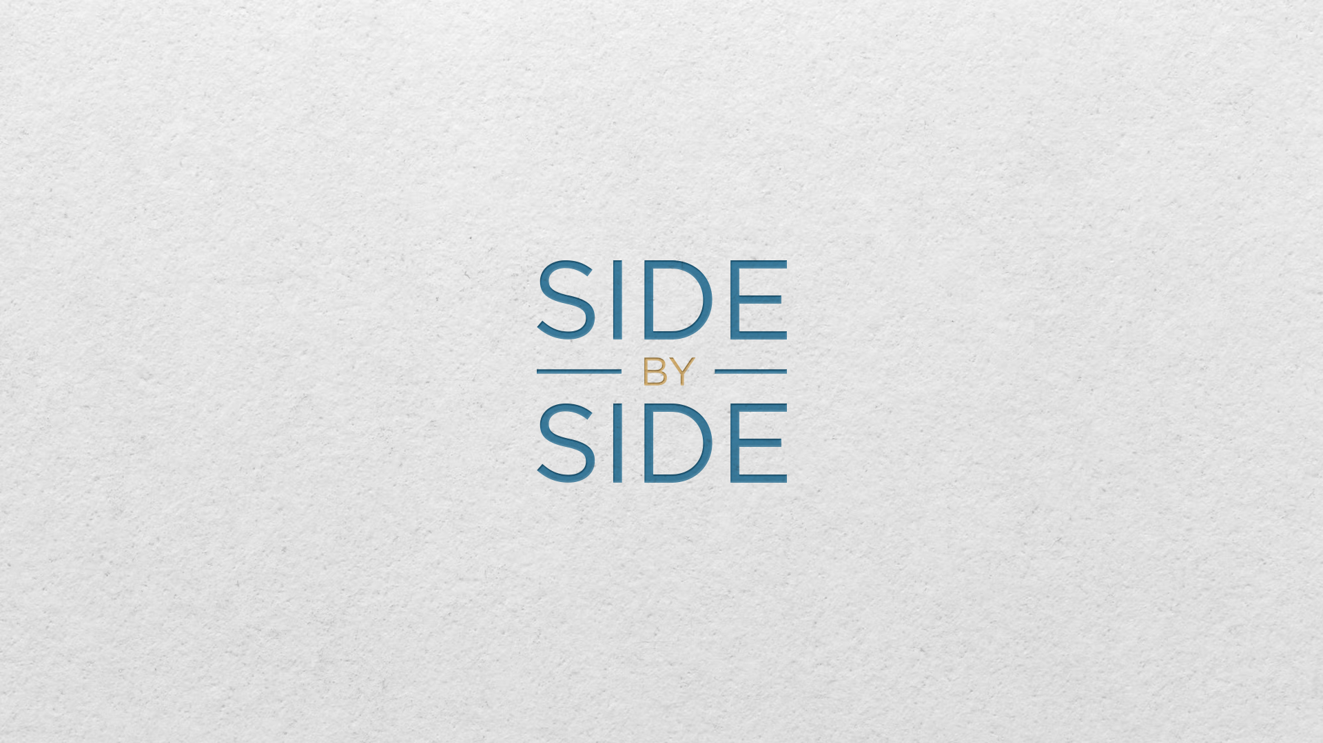
Side By Side: The Logo
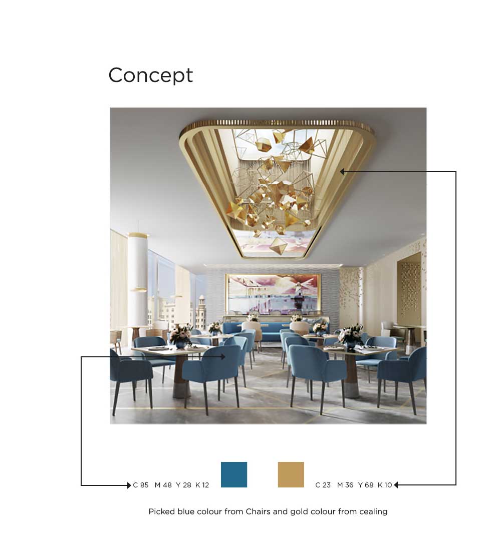
The design inspiration is drawn from the interior aesthetics of the restaurant, specifically the blue chairs and gold ceiling. The core challenge was to create a logo that encapsulates the essence of the restaurant’s name while aligning with the overall luxury and contemporary feel of the space.
The Concept
The logo is a masterful exercise in typography. The deliberate placement of the words, with “side” positioned above and below, and “by” centered, is more than just a visual arrangement. It’s a symbolic representation of the core concept: togetherness and companionship.
The very essence of the restaurant’s name is embodied in the logo. It suggests a space where people come together, sharing experiences and creating memories. Also, the chosen typography exudes a sense of sophistication and modernity, perfectly complementing the restaurant’s contemporary design ethos. The clean lines and elegant forms of the typeface resonate with the luxury positioning of Mysk The Palm.
The Color Palette
The blue and gold color scheme is a direct homage to the restaurant’s interior. Blue is associated with trust, serenity, and intelligence, aligning with the premium dining experience. Gold, on the other hand, symbolizes luxury, success, and elegance, reinforcing the restaurant’s upscale positioning.
The logo is more than just a visual identity; it’s a strategic communication tool that encapsulates the restaurant’s brand essence. It successfully cooperates the interior design elements with the restaurant’s concept, creating a cohesive and memorable brand identity. The logo not only reflects the physical space but also evokes the emotional experience of dining at Side by Side.
This logo is a testament to the power of design to create a strong brand identity. It is a perfect reflection of Side by Side’s position as a contemporary, premium dining destination within the luxurious Mysk The Palm Hotel.