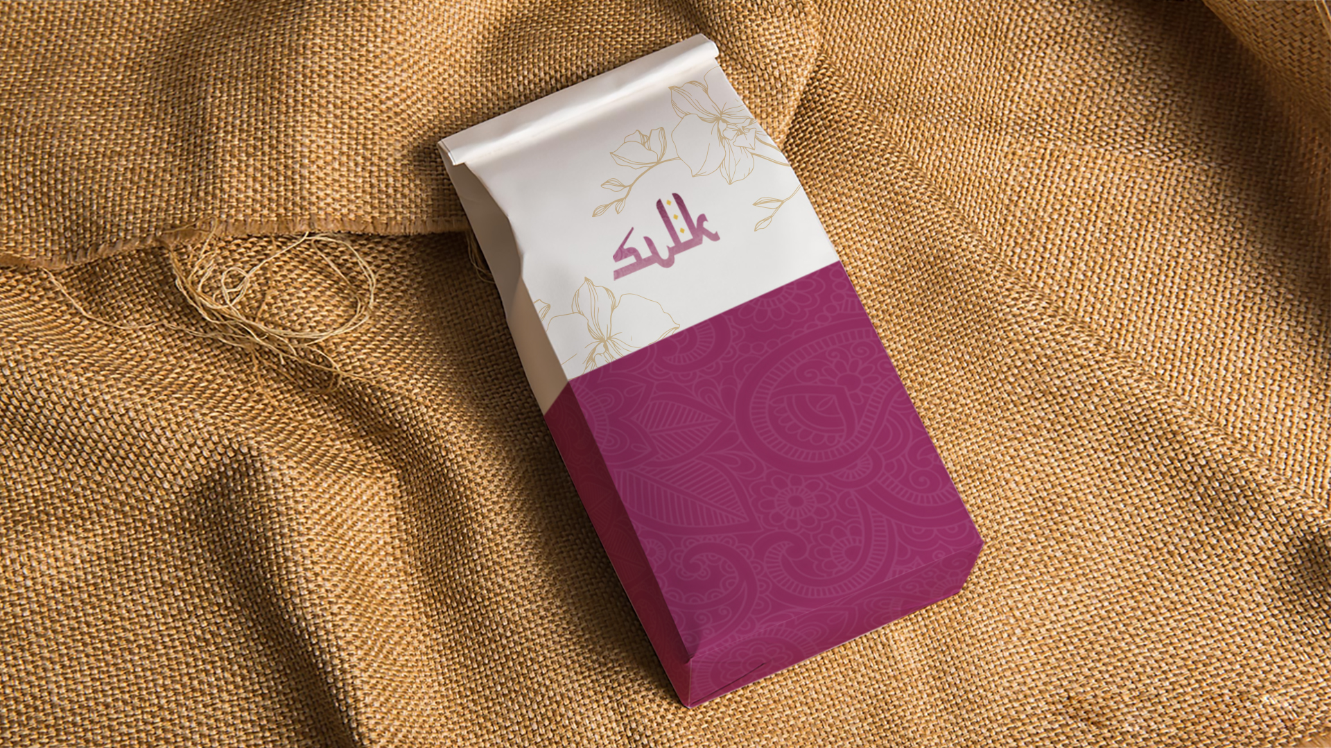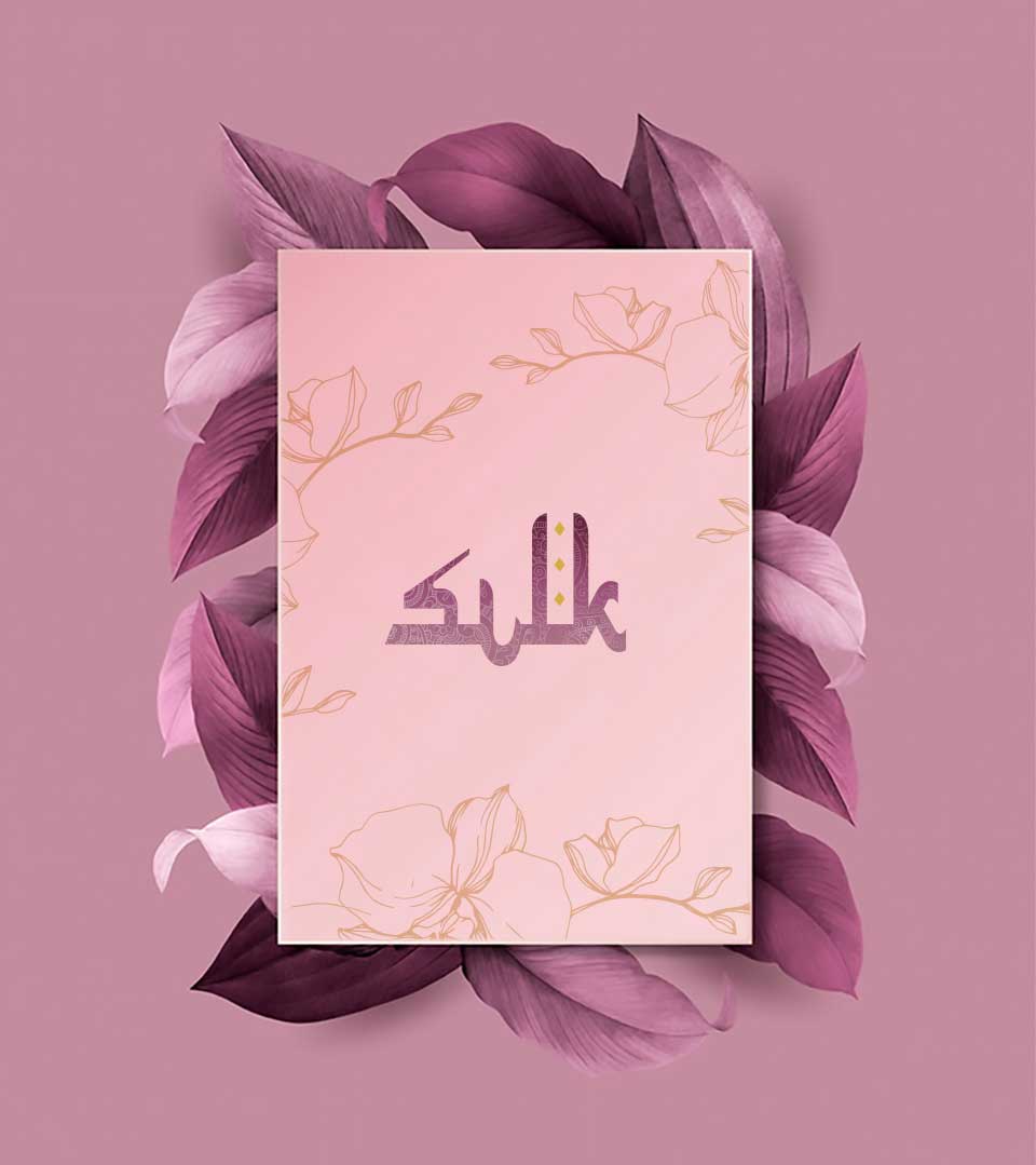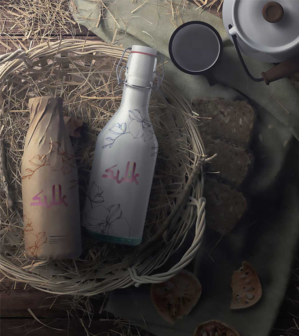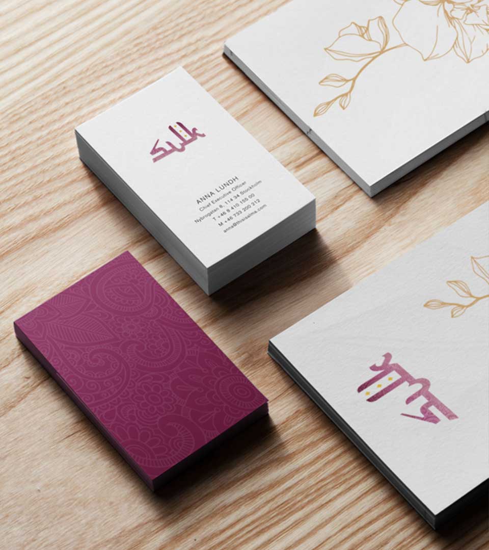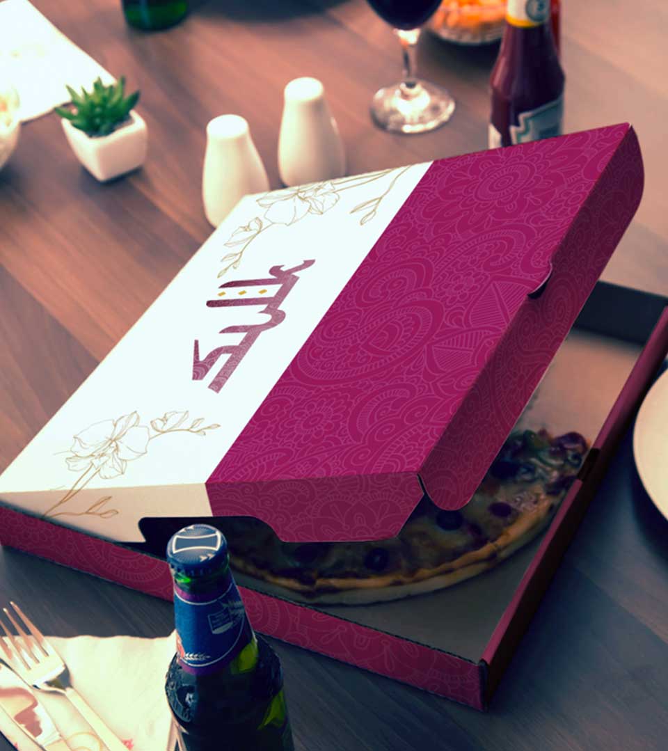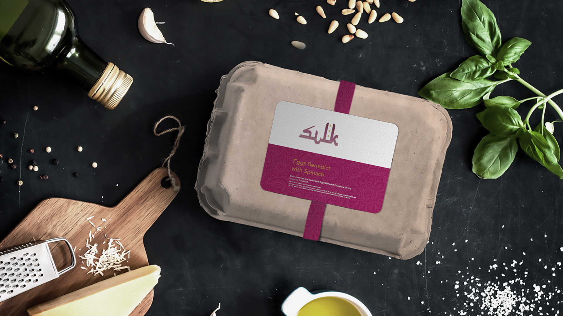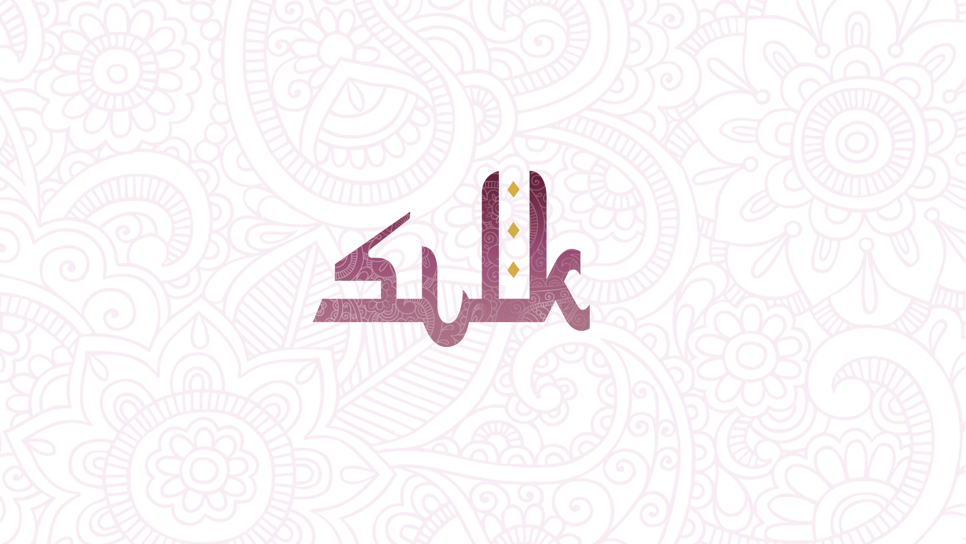
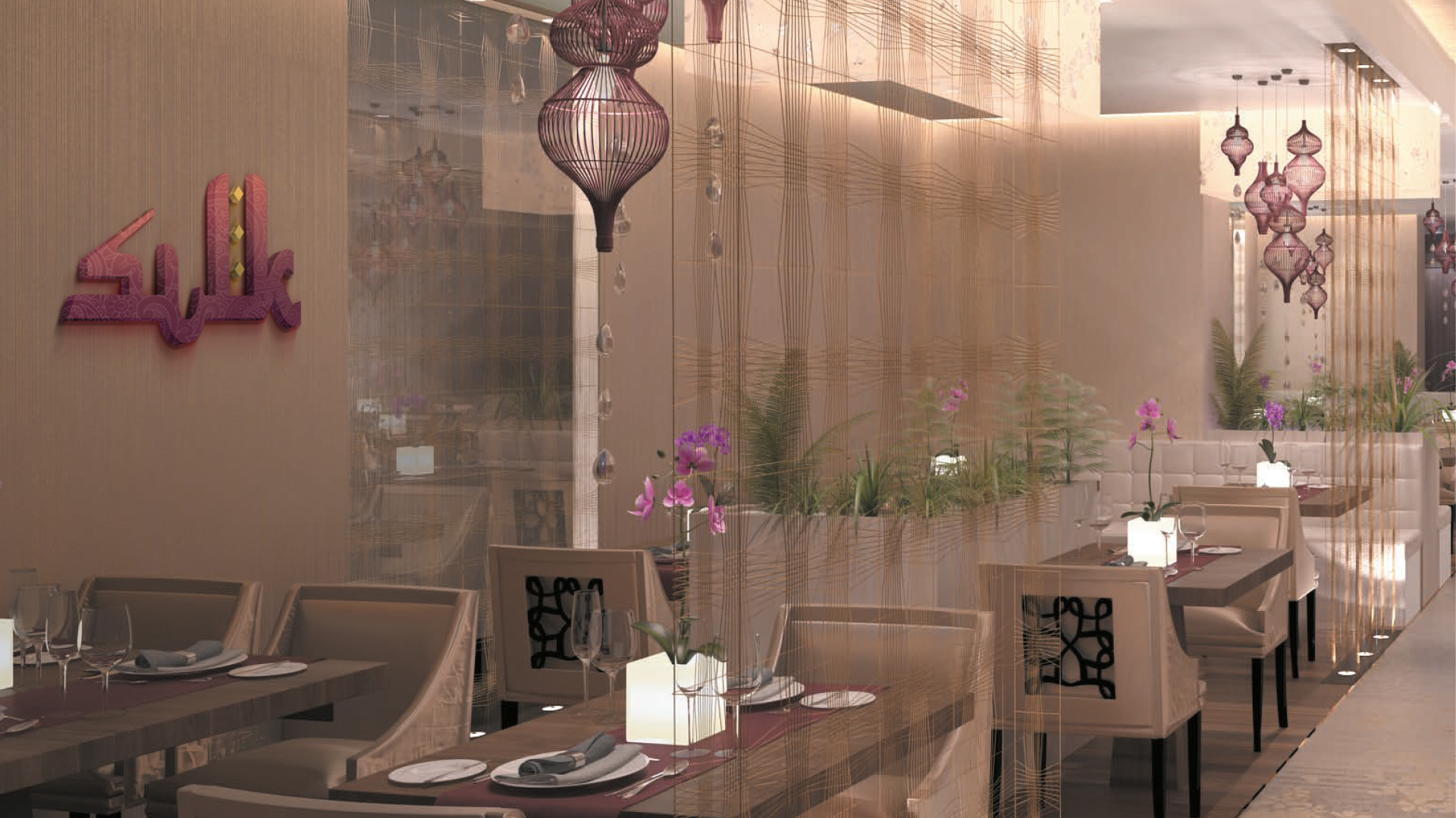
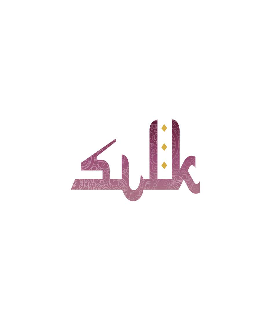
The Logo
The logo is a typographic one, beautifully conveys the essence of its culinary journey along the famed Silk Route. Inspired by the easternmost stretch of the route, the Far East, the restaurant celebrates the rich and diverse cuisines of Indonesia, Malaysia, and Singapore.
Decoding the Logo
The logo’s design is a harmonious blend of old and new, reflecting the restaurant’s commitment to preserving culinary traditions while embracing contemporary aesthetics. The Arabic-style typeface pays homage to the region’s cultural heritage, evoking a sense of tradition and authenticity.
The deep purple color scheme with antique tones used in the logo creates a timeless and sophisticated atmosphere, suggesting a connection to the past. Also, the intricate patterns and motifs woven into the logo symbolize the delicate artistry and craftsmanship associated with silk, a precious commodity traded along the Silk Route.