
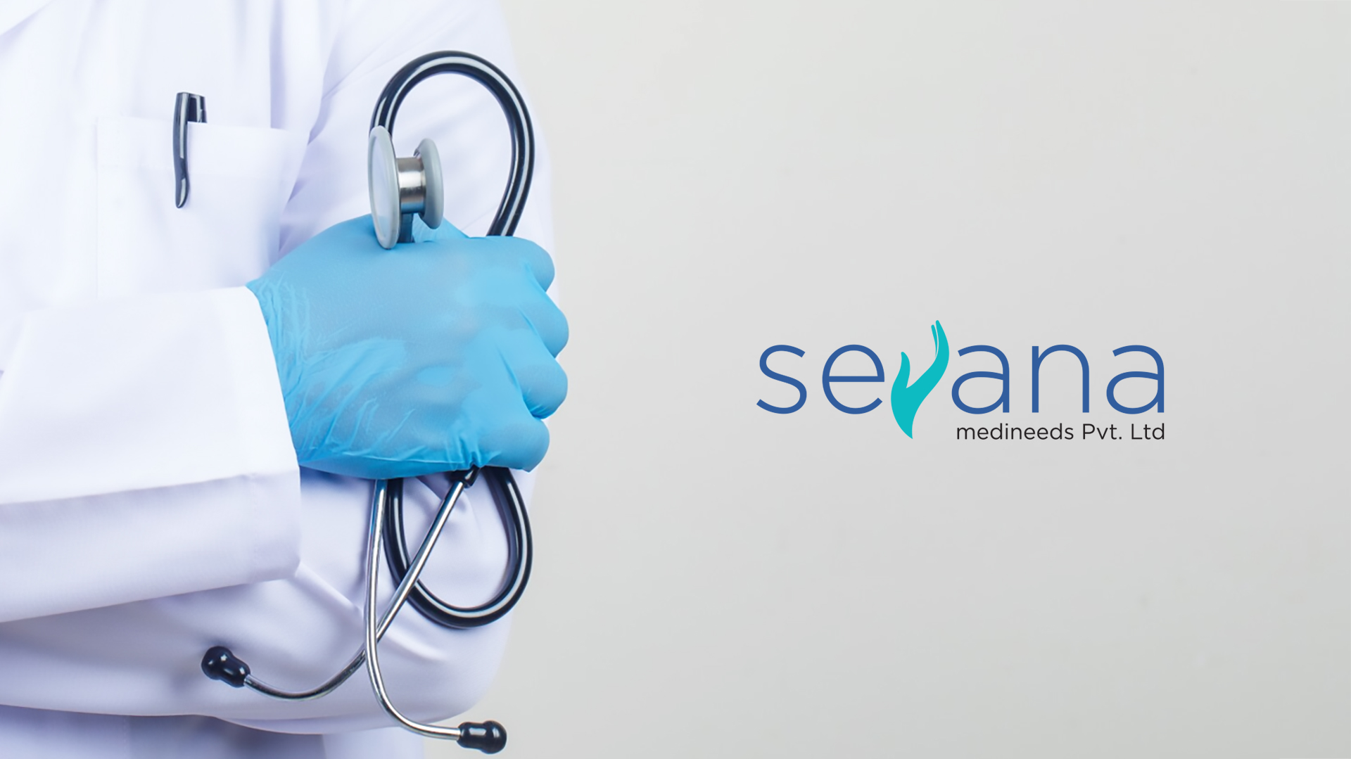
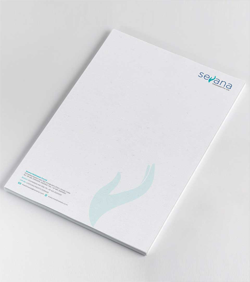
A Powerful Corporate Identity for Sevana Medineeds
A sophisticated and meaningful representation of the brand’s commitment to healthcare, the Sevana Medineeds logo is designed to be a cornerstone of its corporate identity. The central element serves as a powerful visual metaphor for the care, compassion, and support that Sevana Medineeds offers to its customers.
CONCEPT DEVELOPMENT
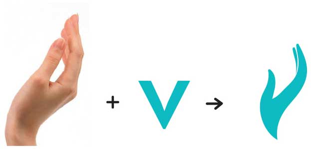
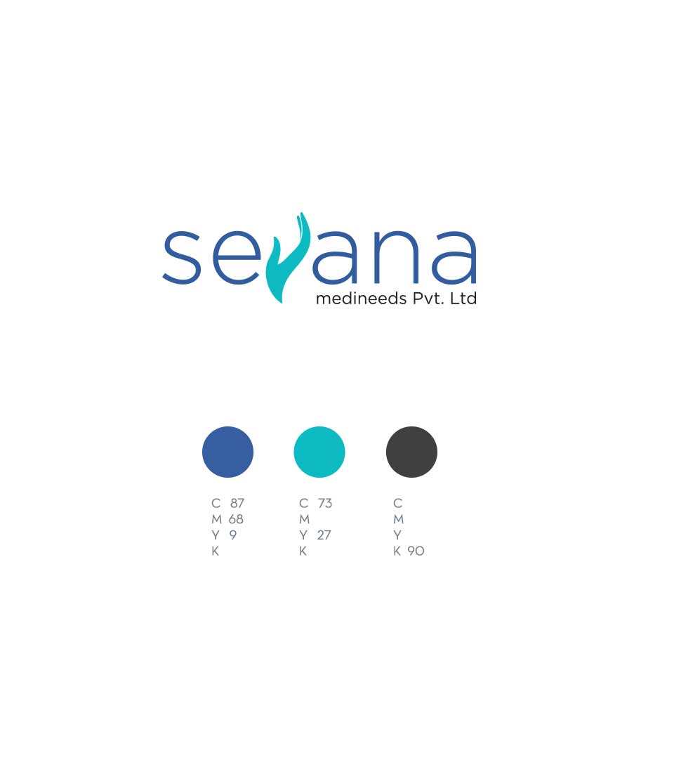
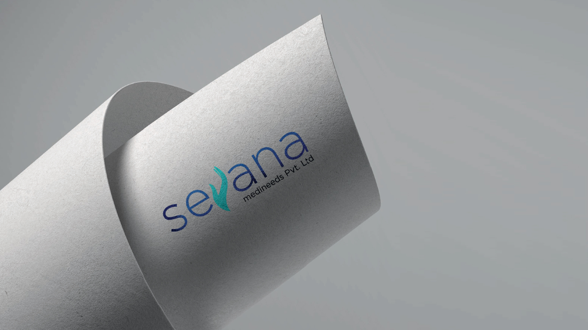
The logo features the letter ‘V’ in Sevana creatively transformed into a human hand, symbolizing care, compassion, and support. The use of blue in two different shades adds depth and reinforces the brand’s association with trust and reliability in the healthcare industry.
Colour Pallete
The choice of blue as the primary color palette reinforces the logo’s message. Blue is often associated with trust, reliability, and stability, qualities that are important in the healthcare industry. The two varying shades of blue create a sense of depth and dimension, adding visual interest to the logo while maintaining a professional and clean aesthetic.
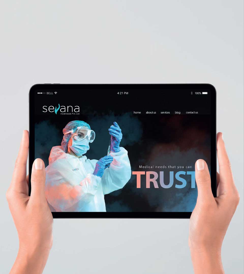
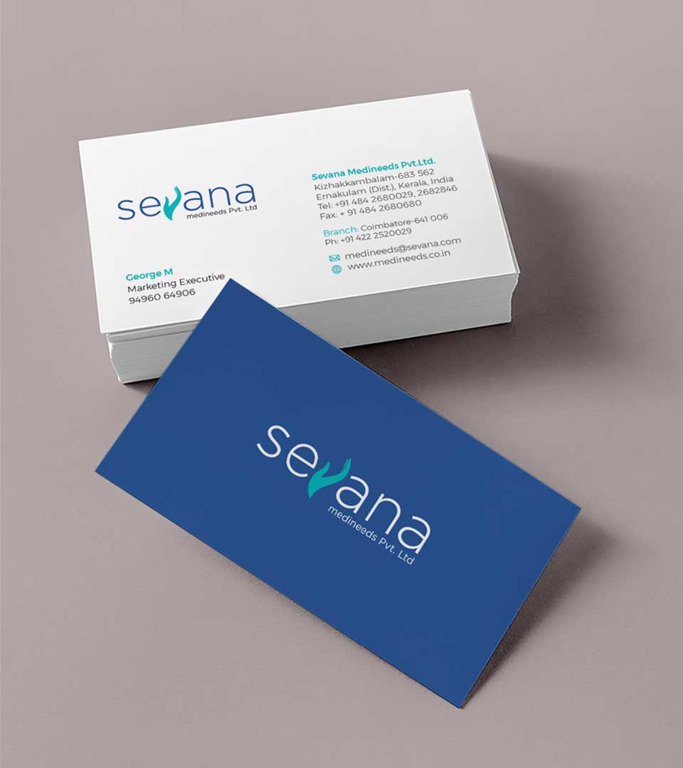
The logo we designed for Sevana Medineeds is more than just a visual identity; it is a tangible expression of the brand’s values. To establish an immediate connection with the audience, evoking feelings of empathy and care, is further enhanced by the use of blue, a color that is universally recognized as calming and reassuring.