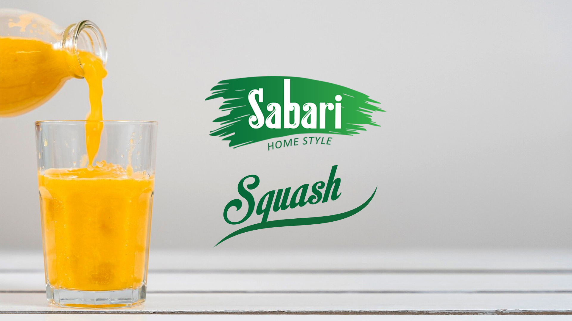
The Focus
We began by immersing ourselves in the brand’s history, understanding its values, and analyzing the preferences of its target audience. Consumers sought natural, high-quality beverages that were visually appealing. So, the packaging needed to complement the brand’s new identity, emphasizing its commitment to freshness and vitality.
The Design
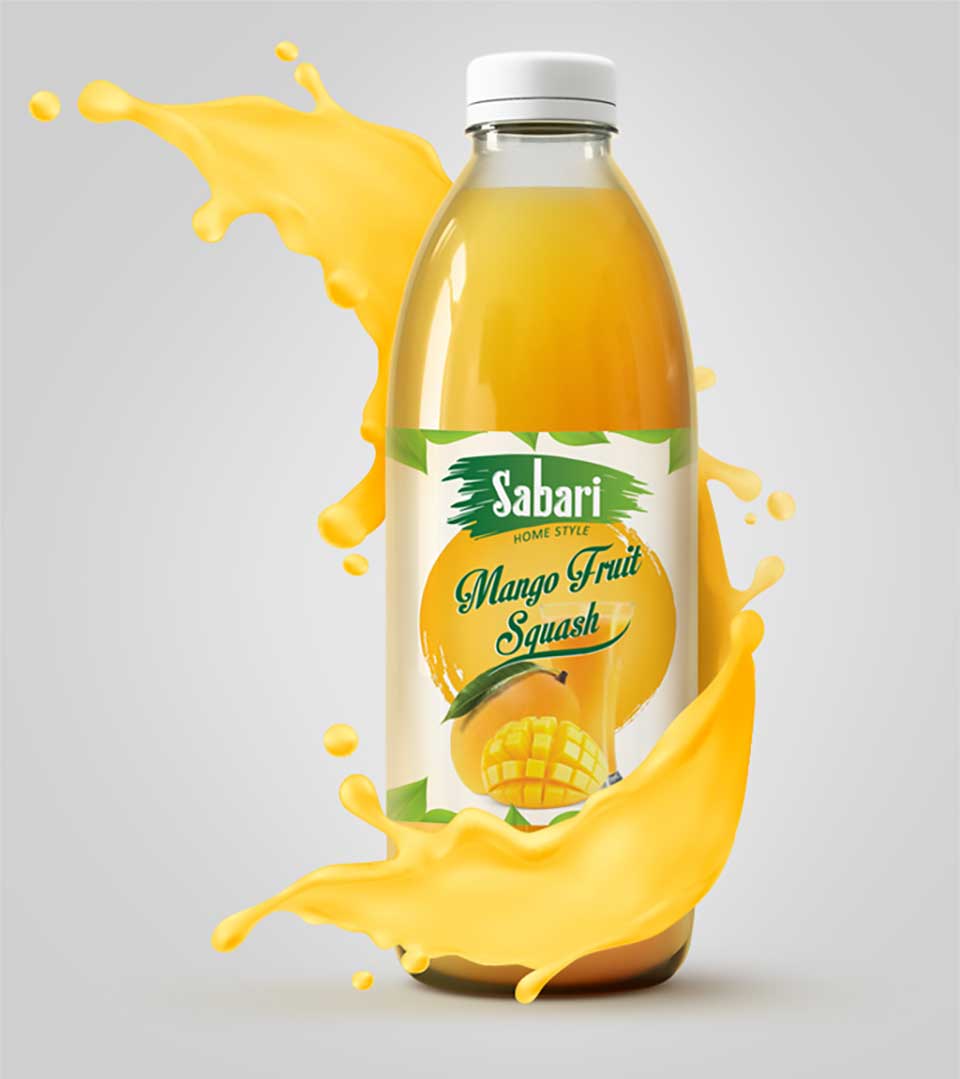
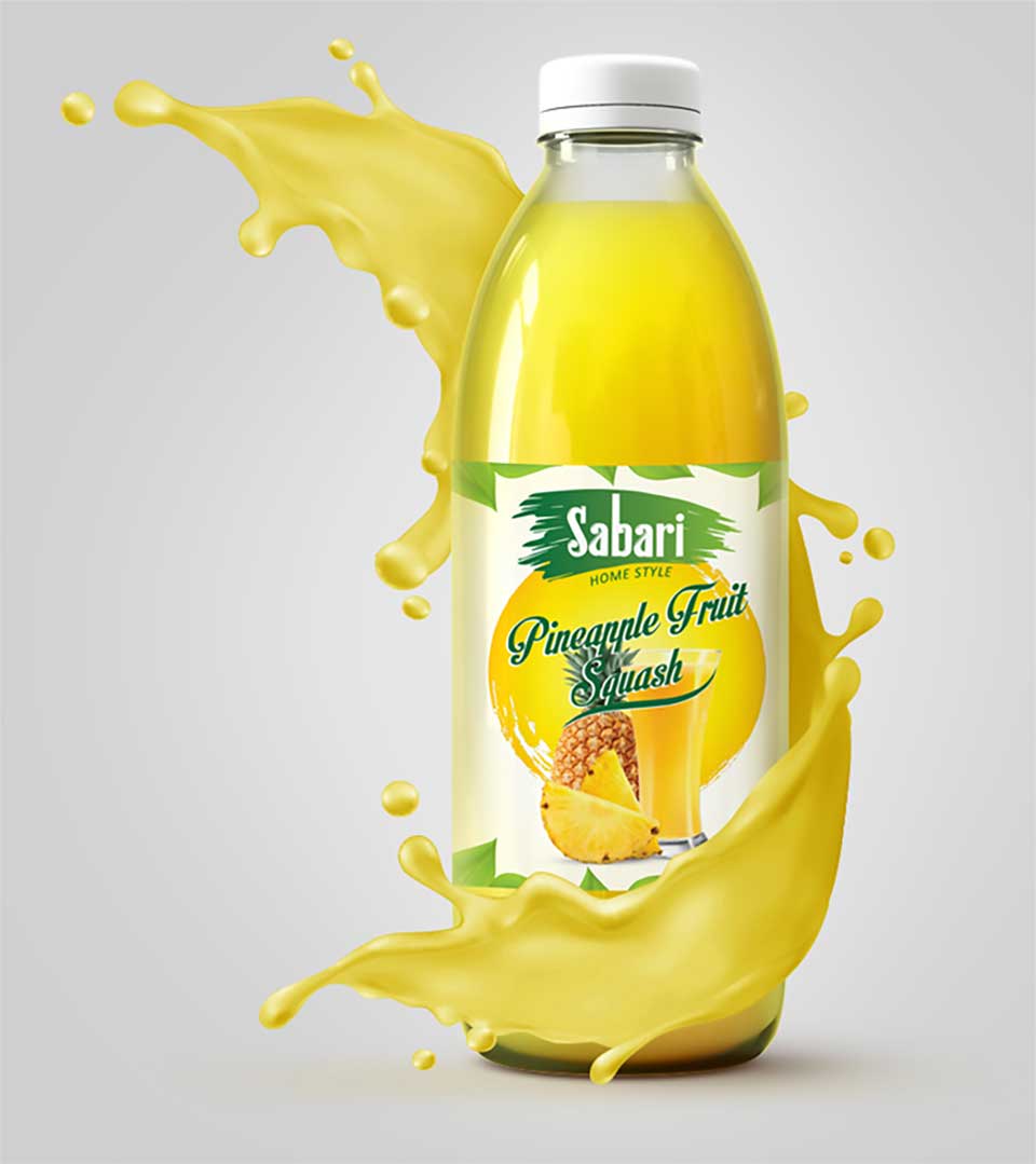
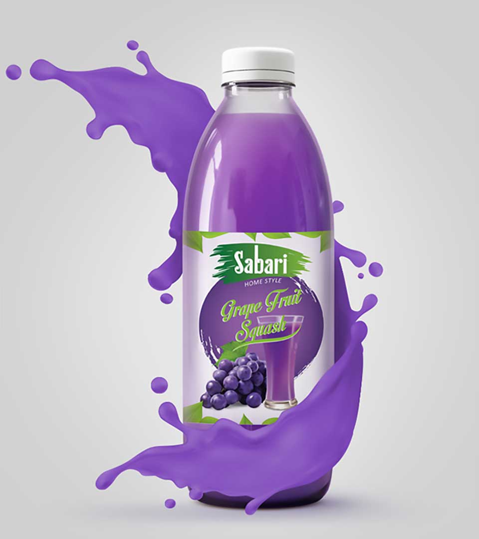
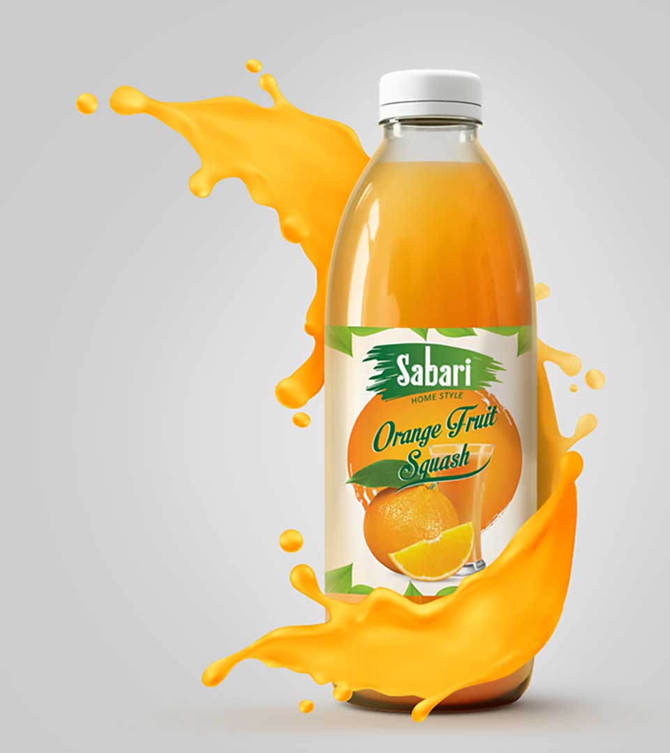
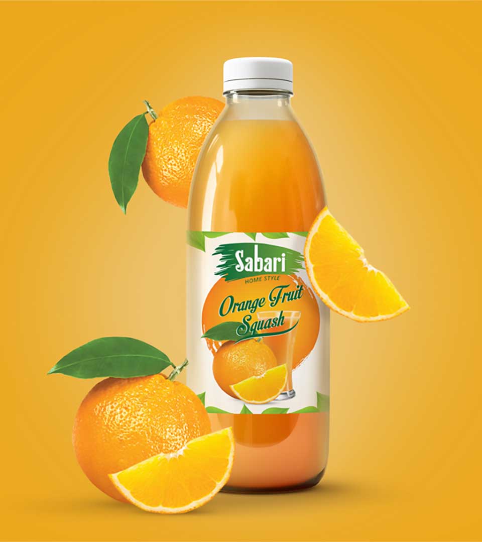
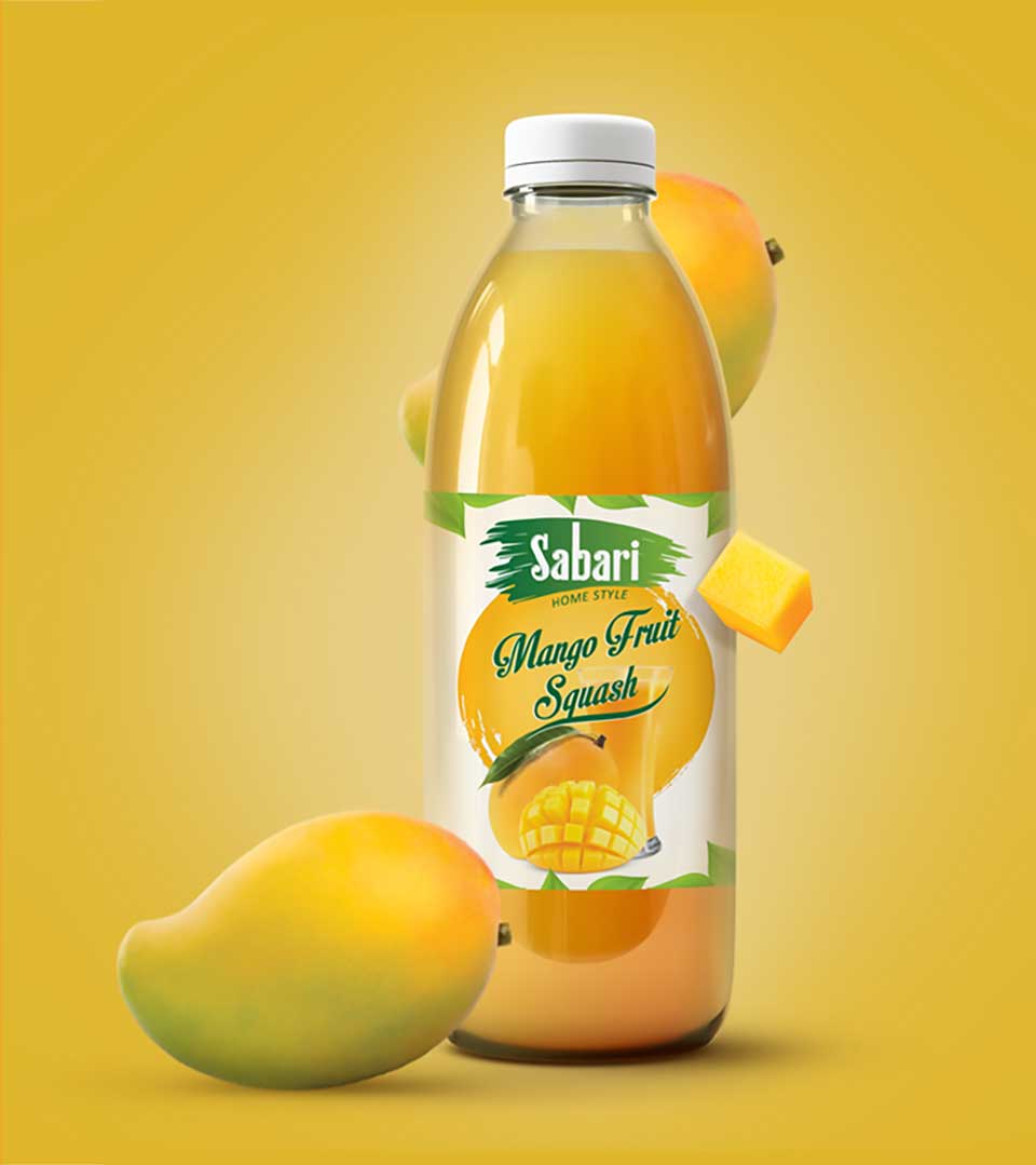
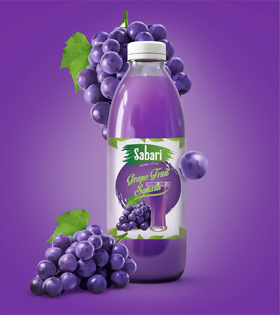
CR8 explored various design directions, focusing on elements that evoked freshness, nature, and the brand’s heritage. The concept of incorporating artistic leaves as a recurring motif emerged as a strong contender, symbolizing the natural ingredients and vitality of Sabari Squash.
To maintain the brand’s heritage, we refined the existing typography, ensuring it remained legible and complemented the overall design aesthetic. The packaging structure was designed to be functional, easy to use, and visually appealing.
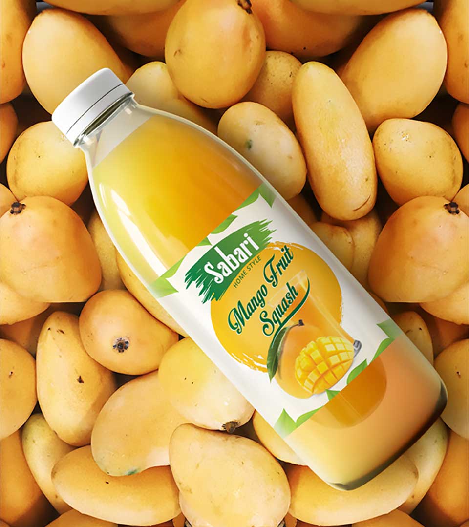
Key Design Elements
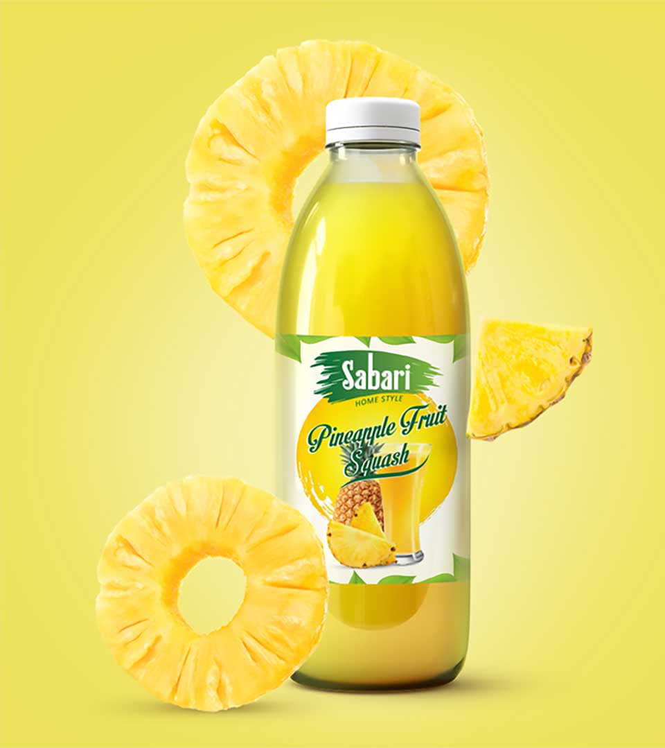
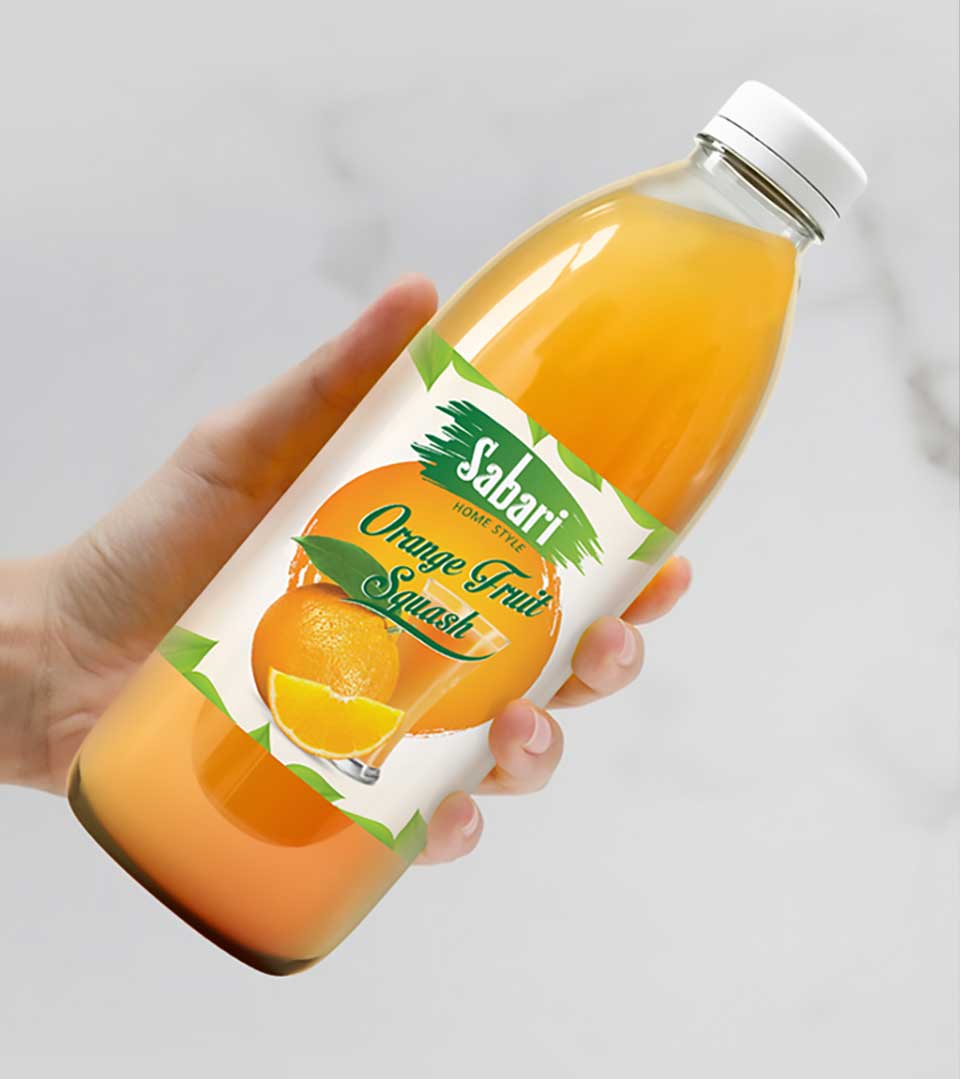
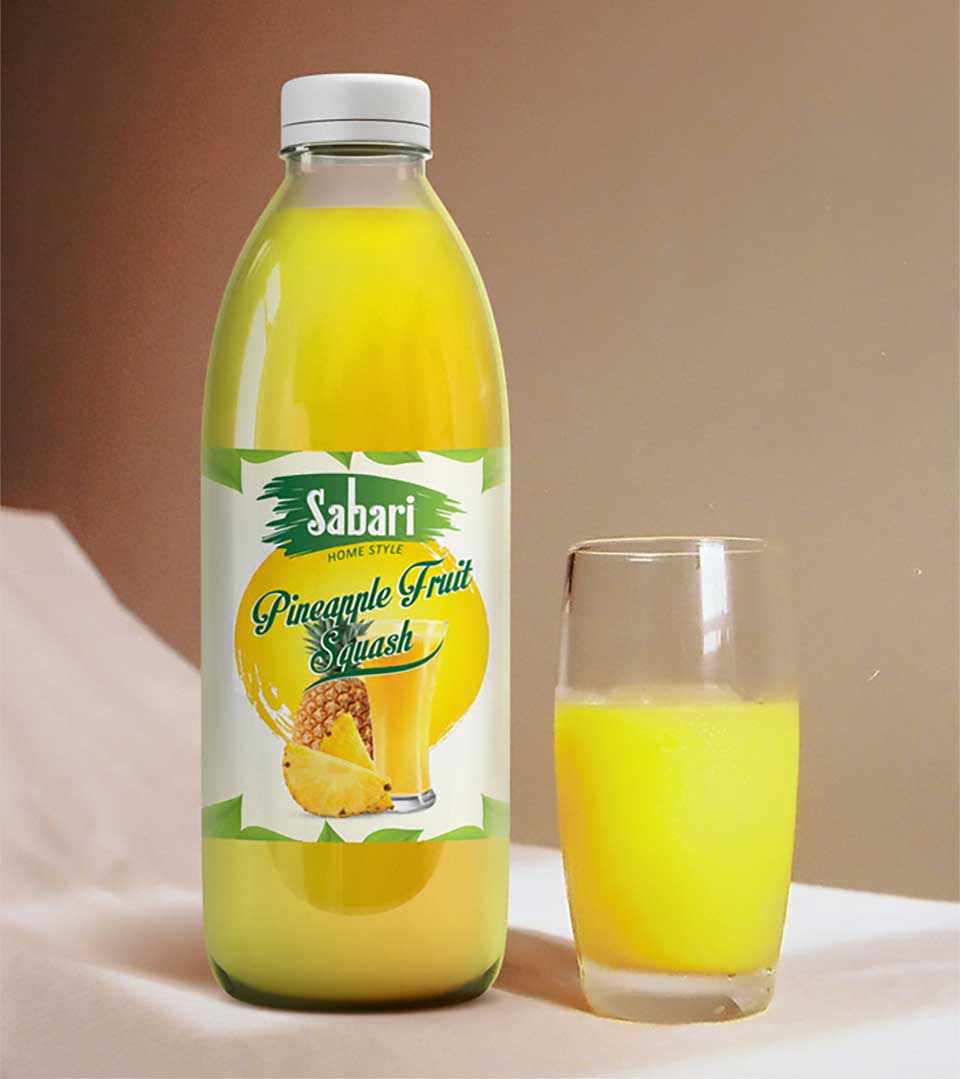
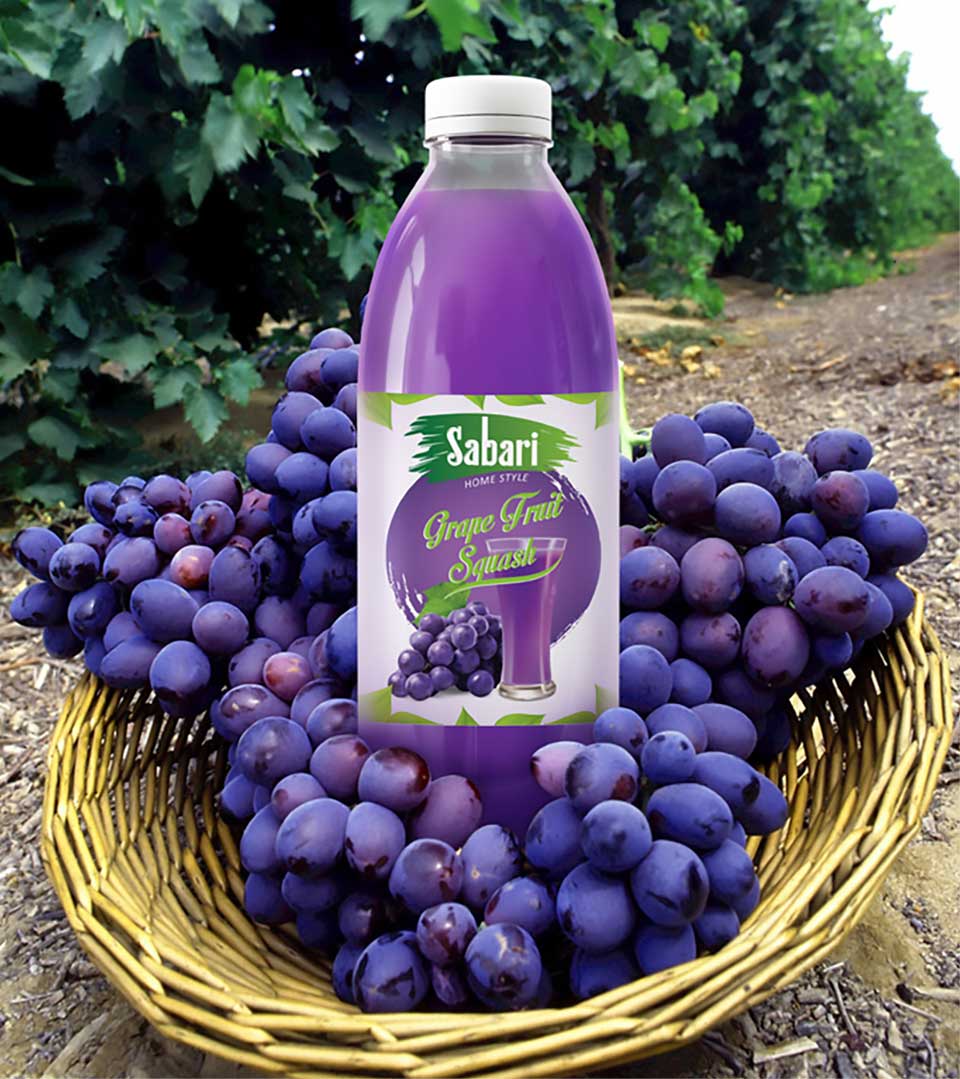
Ingredient-Inspired Imagery: Each squash flavor was represented by a unique visual element that directly correlated with the primary ingredient. This not only provided a clear indication of the product’s taste but also added a layer of visual interest.
Color Palette: The colors were carefully selected to harmonize with the brand’s overall aesthetic and ensure a cohesive look across the product line.
Typography Enhancement: While maintaining the brand’s iconic typography, we refined the font and spacing to create a more contemporary and sophisticated feel.
Leaf Motif: A recurring leaf motif was incorporated into the design to symbolize the natural elements that contribute to the product’s flavor and quality. The leaf motif served as a visual anchor and helped to reinforce the brand’s association with freshness and life.