The Focus
The challenge lay in encapsulating Sabari’s rich heritage while aligning with contemporary design aesthetics. The packaging needed to not only highlight the product’s unique flavors but also convey the brand’s commitment to quality and authenticity.
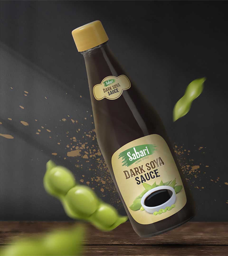
The primary focus was on creating a packaging design that was both visually striking and functional. The packaging should evoke the flavors and ingredients of each sauce variety. And also the packaging should stand out on store shelves and grab the attention of potential buyers.
The Design
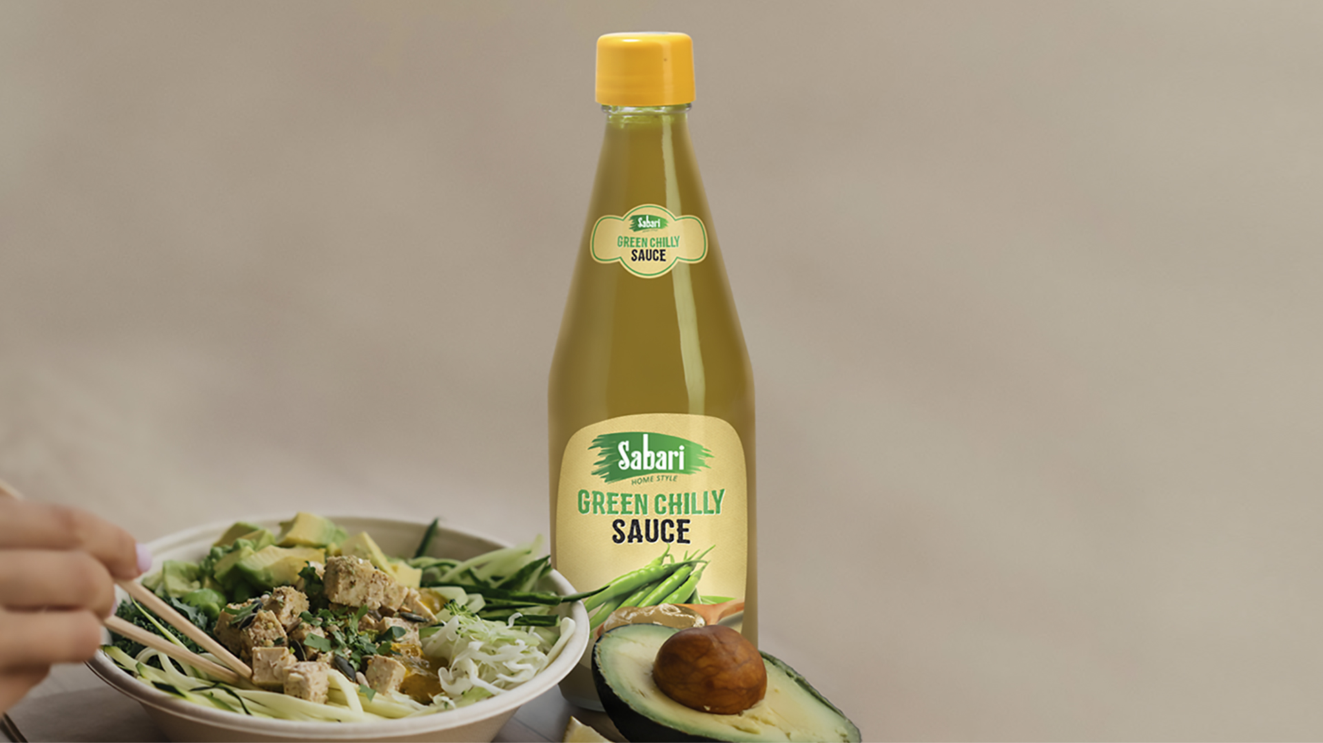
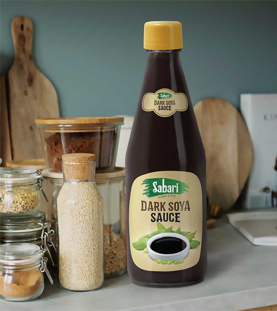
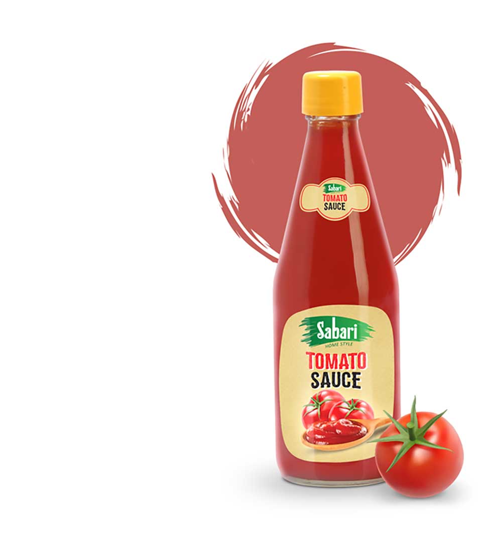
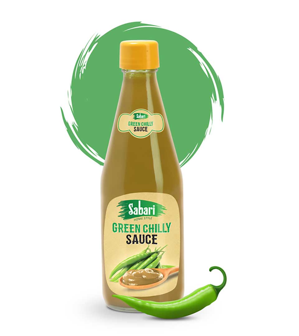
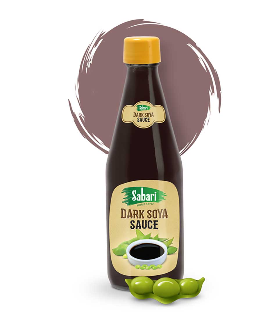
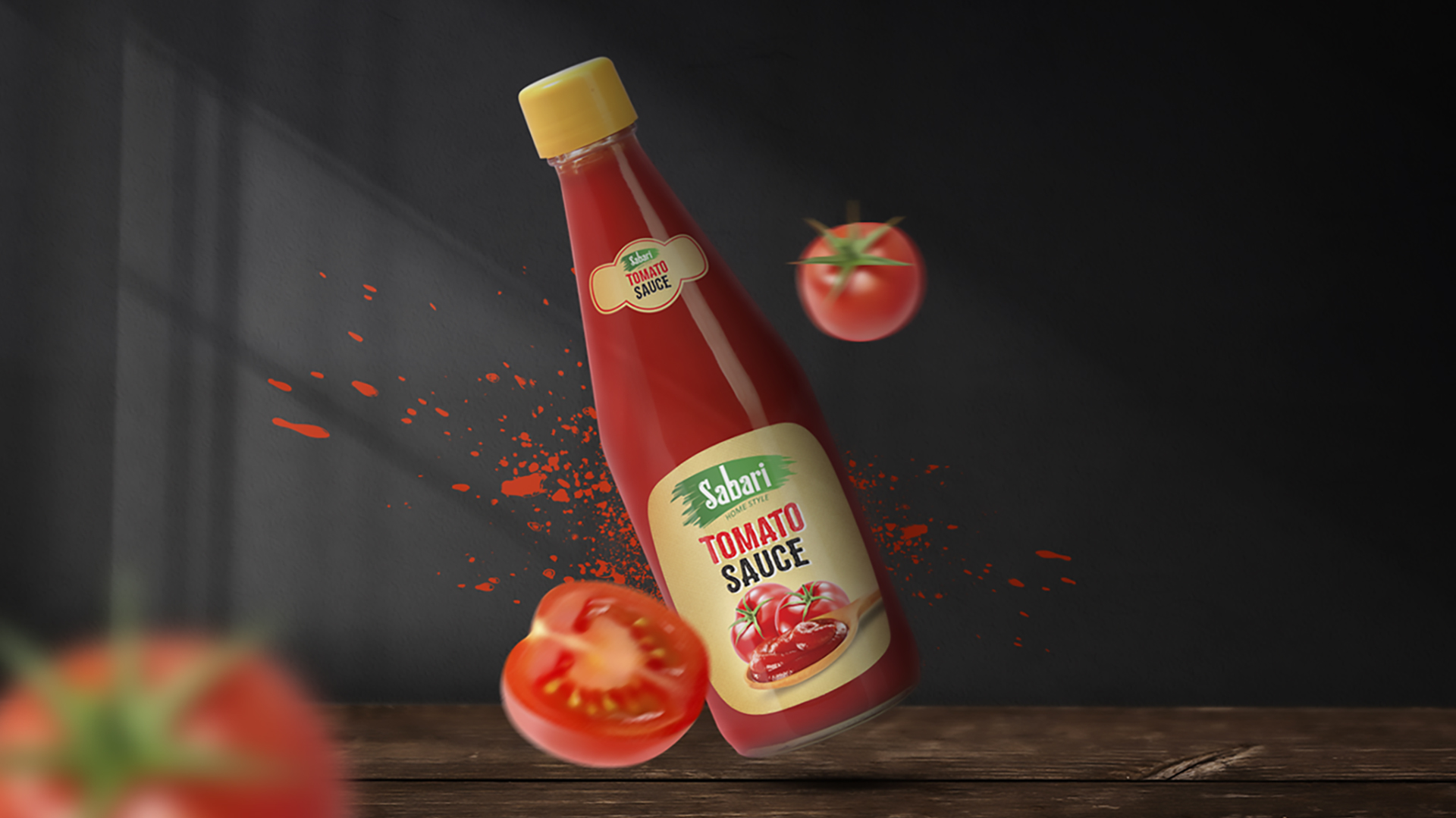
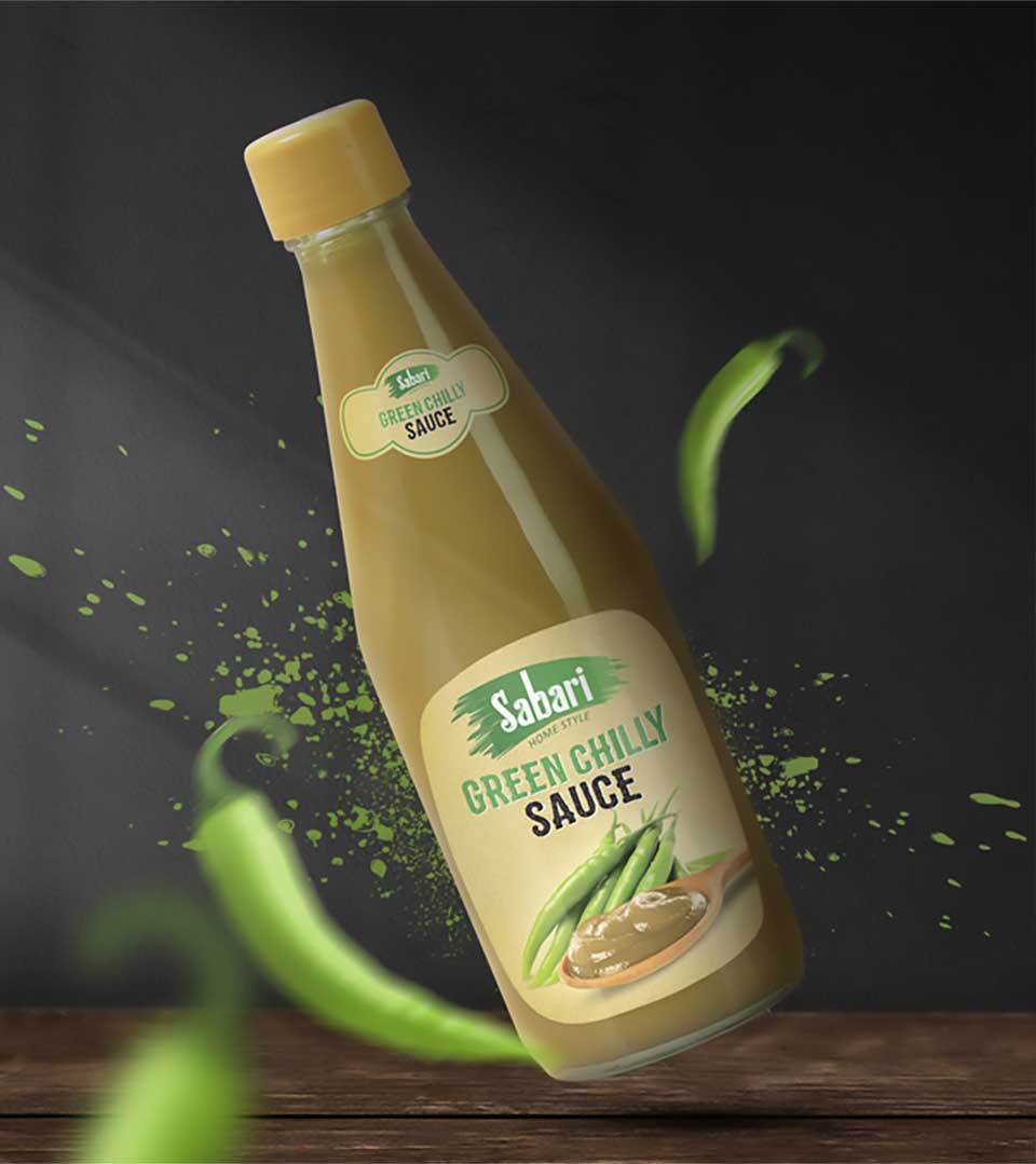
The packaging design incorporates a harmonious blend of earthy beige tones and vibrant hues according to the flavor to create a visually appealing and inviting aesthetic. Each sauce variety is represented by a distinct design element that reflects the key ingredients and flavor profiles. The packaging’s visual appeal and informative content play a crucial role in driving sales and building brand loyalty.
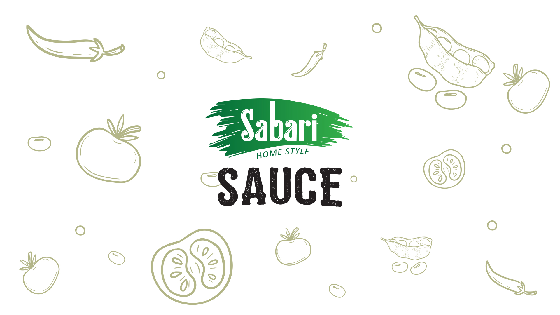
Key Design Elements
Color Palette: A carefully selected color palette that evokes the flavors and aromas of the sauces.
Typography: A clean and modern typeface that complements the overall design and conveys a sense of quality.
Imagery: Relevant illustrations and graphics that highlight the key ingredients and flavor profiles.
Packaging Structure: A functional and convenient packaging format that protects the product and enhances the user experience.