The Focus
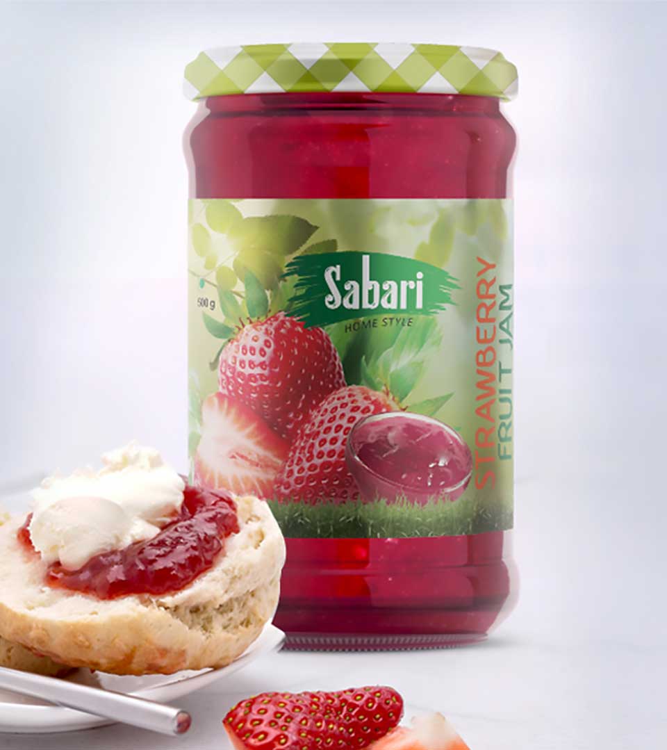
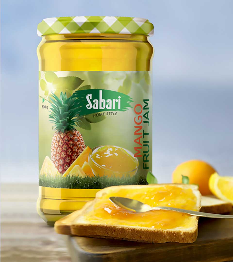
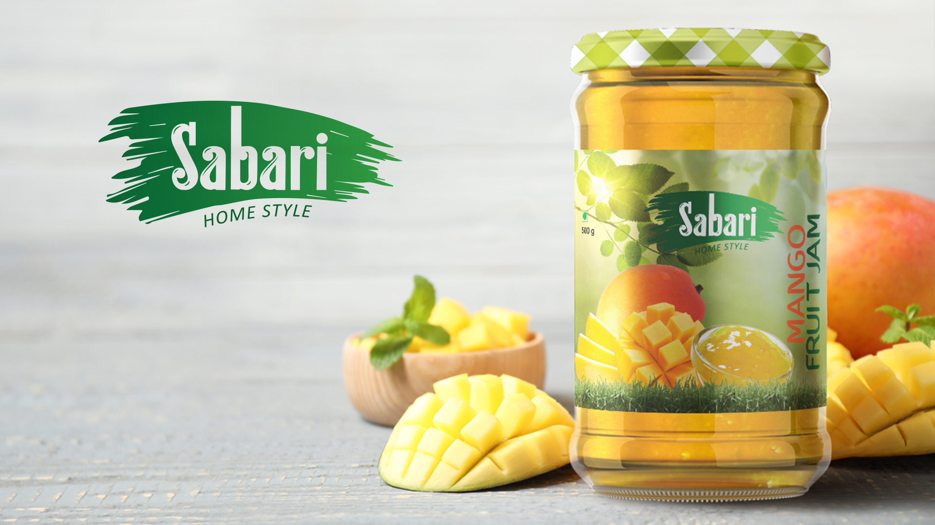
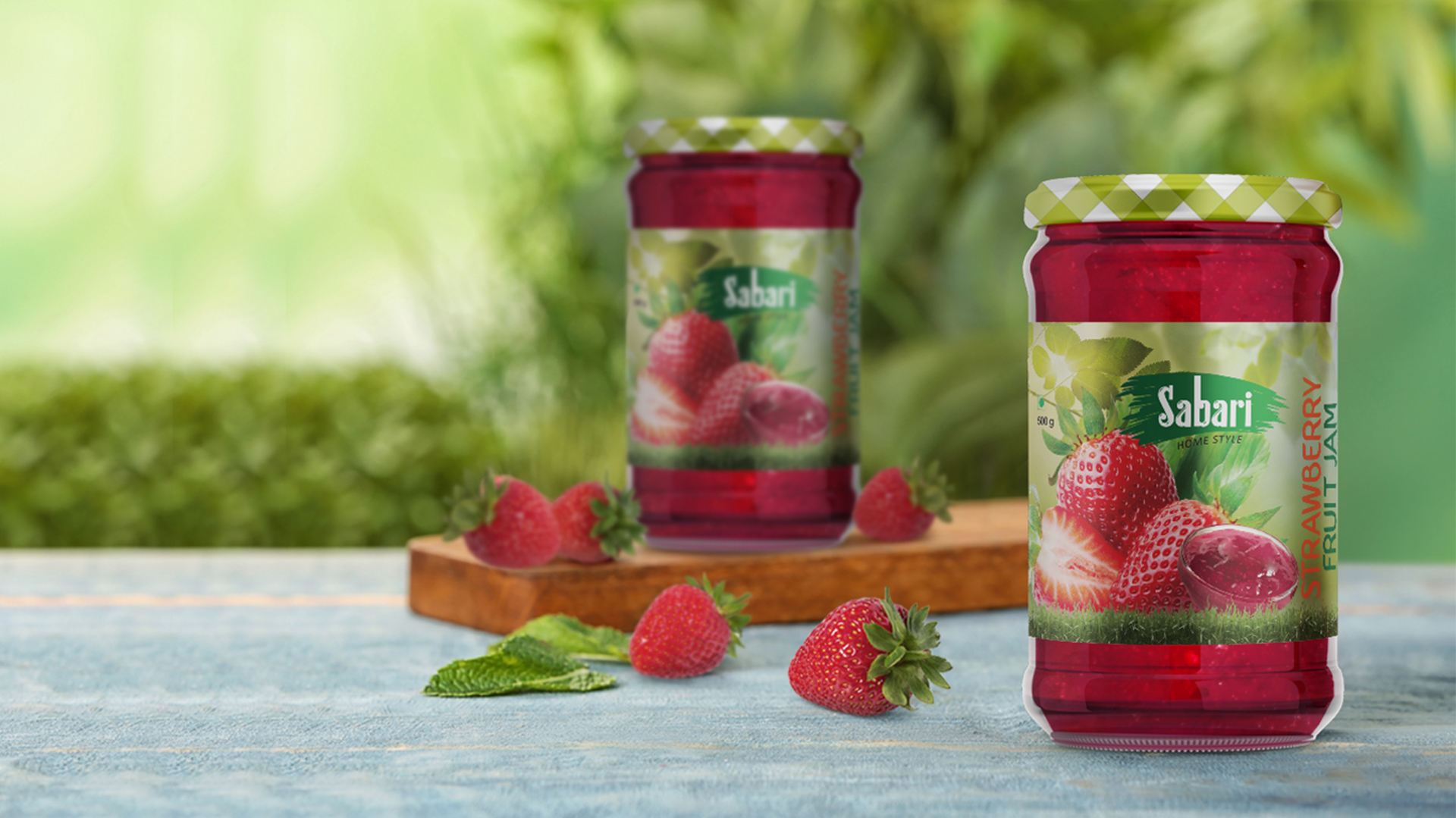
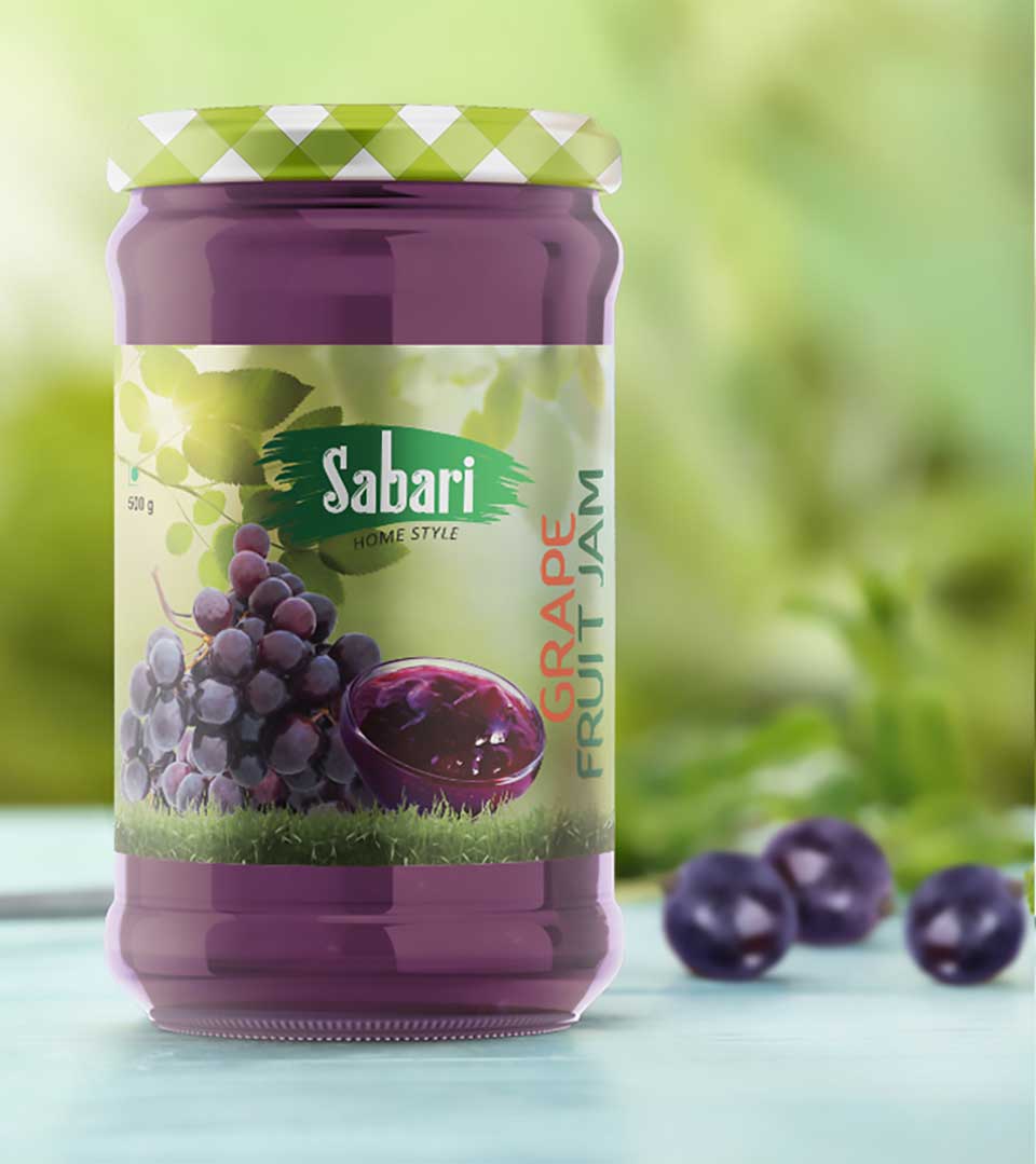
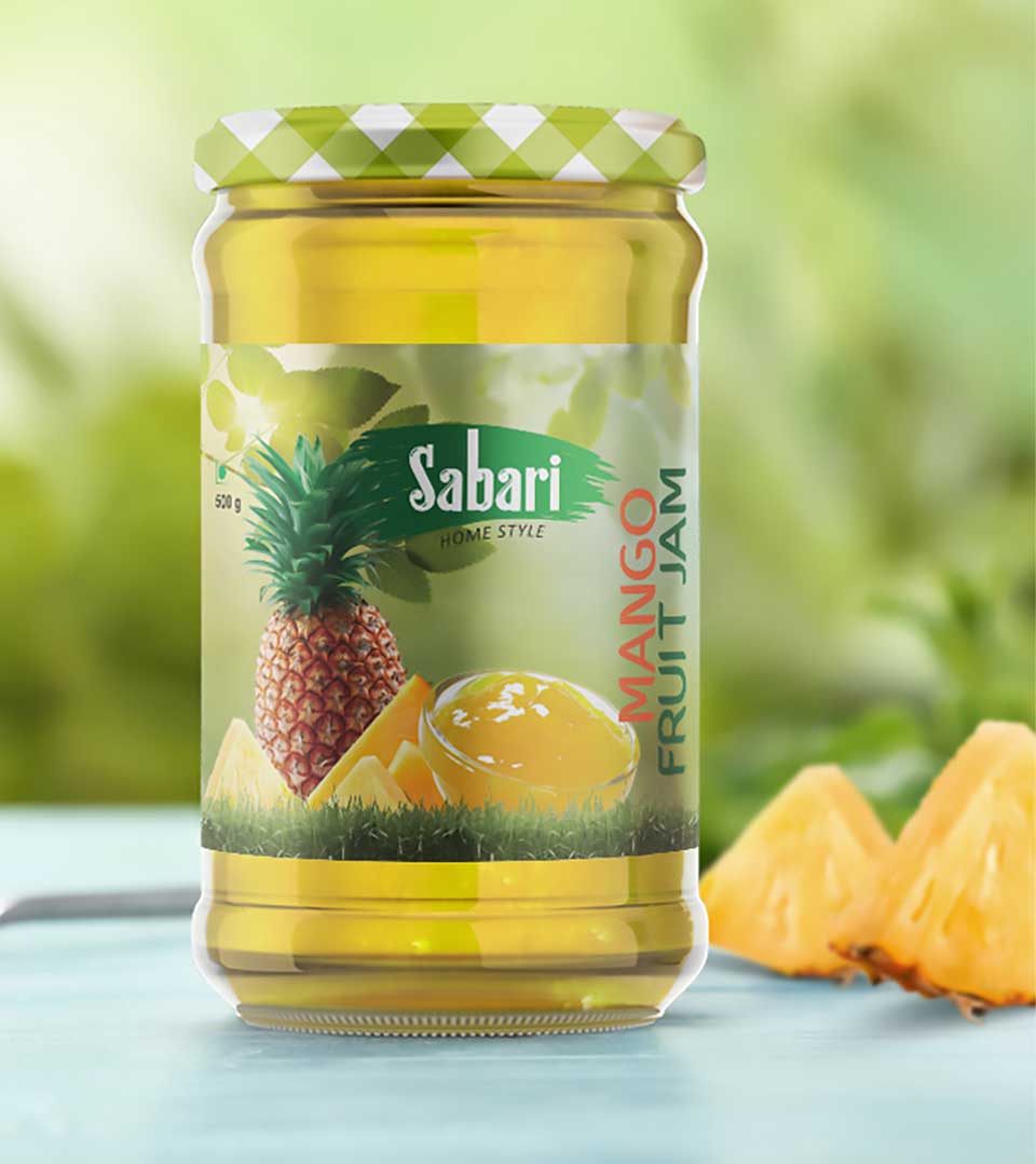
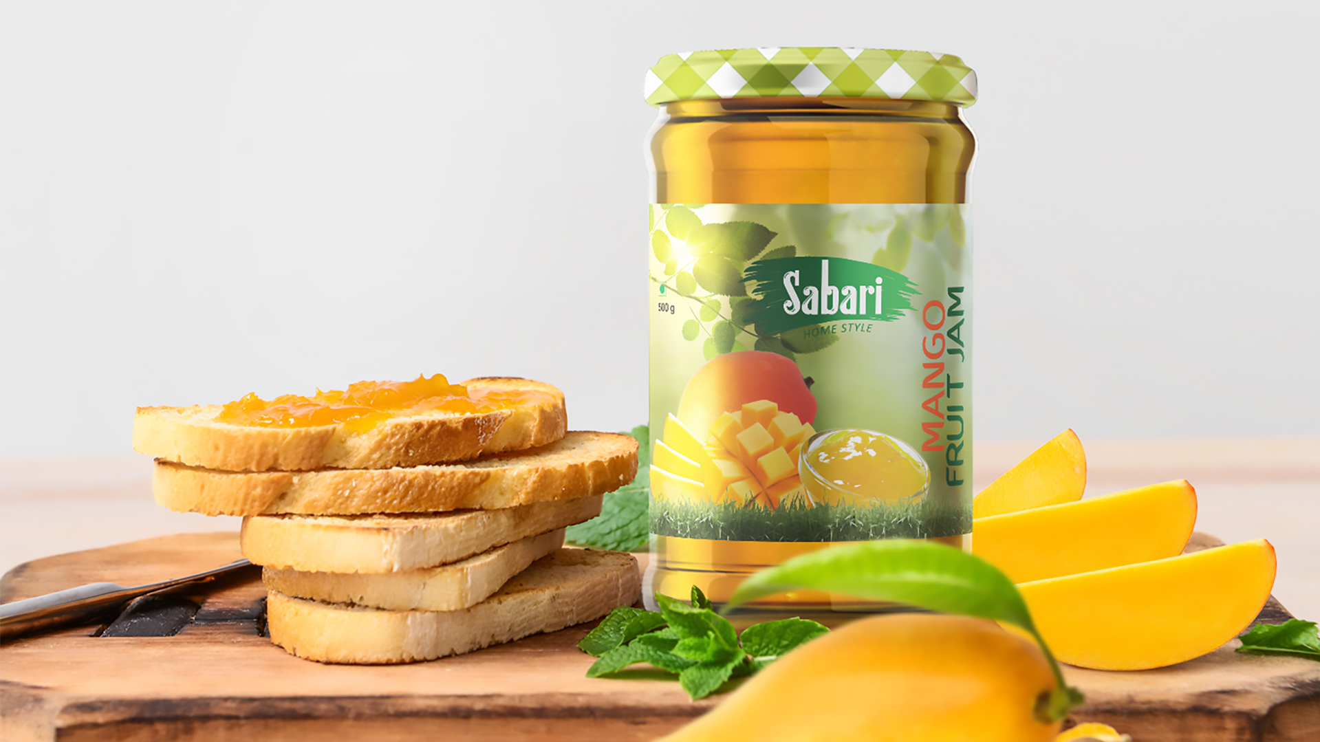
The primary focus of the Sabari fruit jam packaging design was to evoke a sense of warmth, familiarity, and natural goodness. We wanted to create a package that resonated with consumers on an emotional level, reminding them of homemade jams enjoyed in their kitchens. At the same time, the design needed to be visually appealing and modern, ensuring it stood out amidst the competition.
The Design
The packaging design successfully captures the homely essence of the product while also appealing to modern consumers. By combining a warm color palette, vibrant imagery, and a distinctive container shape, we have created a package that is both visually appealing and emotionally resonant. The design effectively communicates the brand’s values and helps Sabari stand out on the shelves, driving sales and building brand loyalty.
Key Design Elements
Vibrant Imagery: The packaging features lively illustrations of fruits and other natural elements, adding a playful and inviting touch. These images reinforce the product’s association with nature and freshness.
Green and White Lid Pattern: The geometric pattern on the lid, featuring green and white squares, adds a visual interest and complements the overall design aesthetic. It also reinforces the organic feel of the product.
Clear Labeling: Clear and concise labeling ensures that consumers can easily identify the flavor and understand the product’s ingredients.