The Rebranding Story of Sabari
The rebranding of Sabari was essential to connect the brand’s rich heritage with the evolving consumer landscape. The client wants to maintain the core typography and needed an enhancement through the rebranding. This is the real challenge here because the brand’s identity should remain as recognizable while ensuring a seamless transition on the logo for loyal customers.
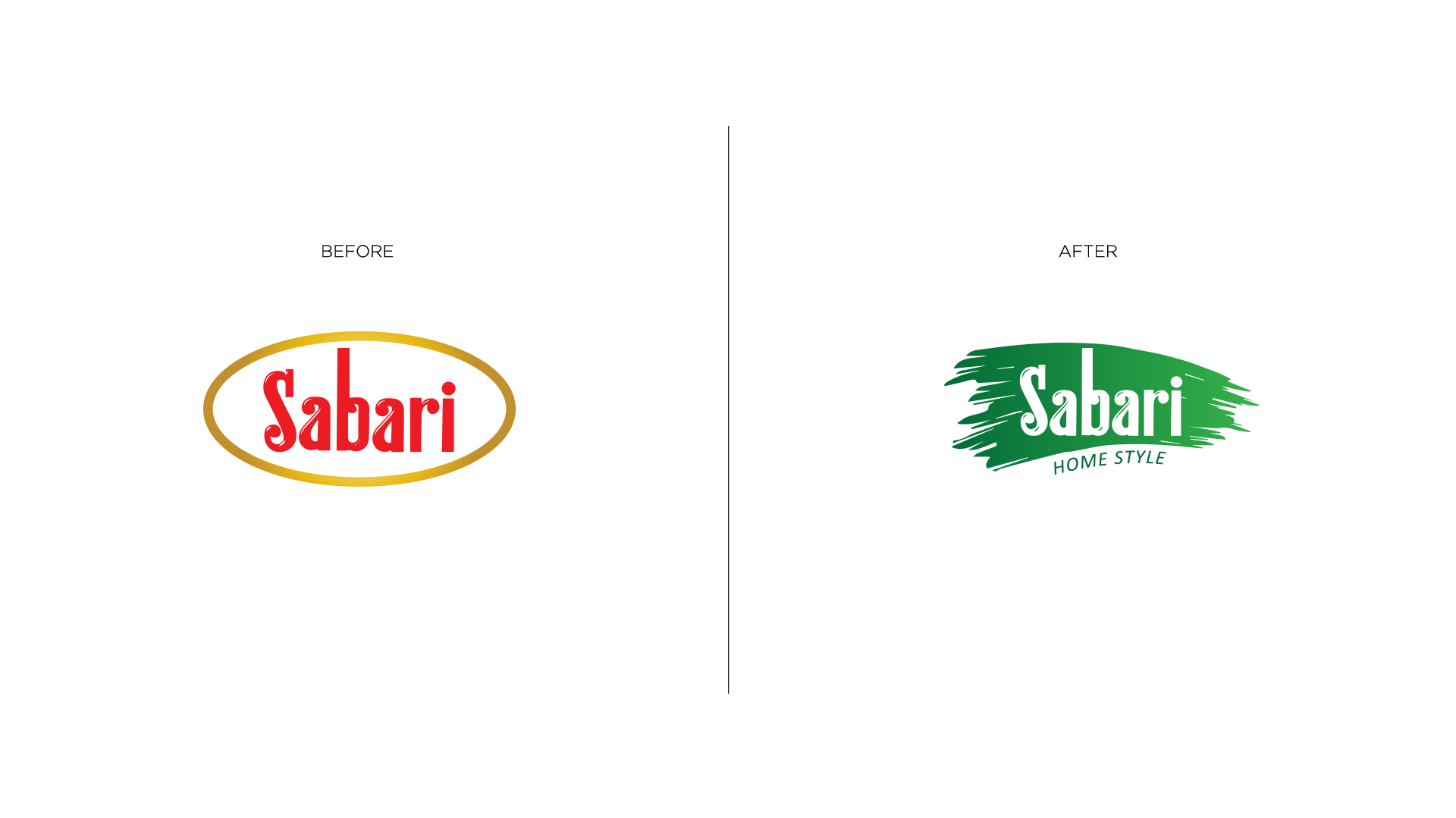
Old Logo
The old Sabari logo featured an old, circular design with the brand name in bold, red lettering within a golden oval. The design felt somewhat dated and lacked the dynamism required to resonate with a contemporary audience.
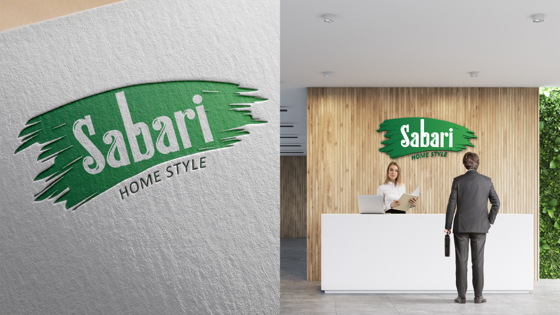
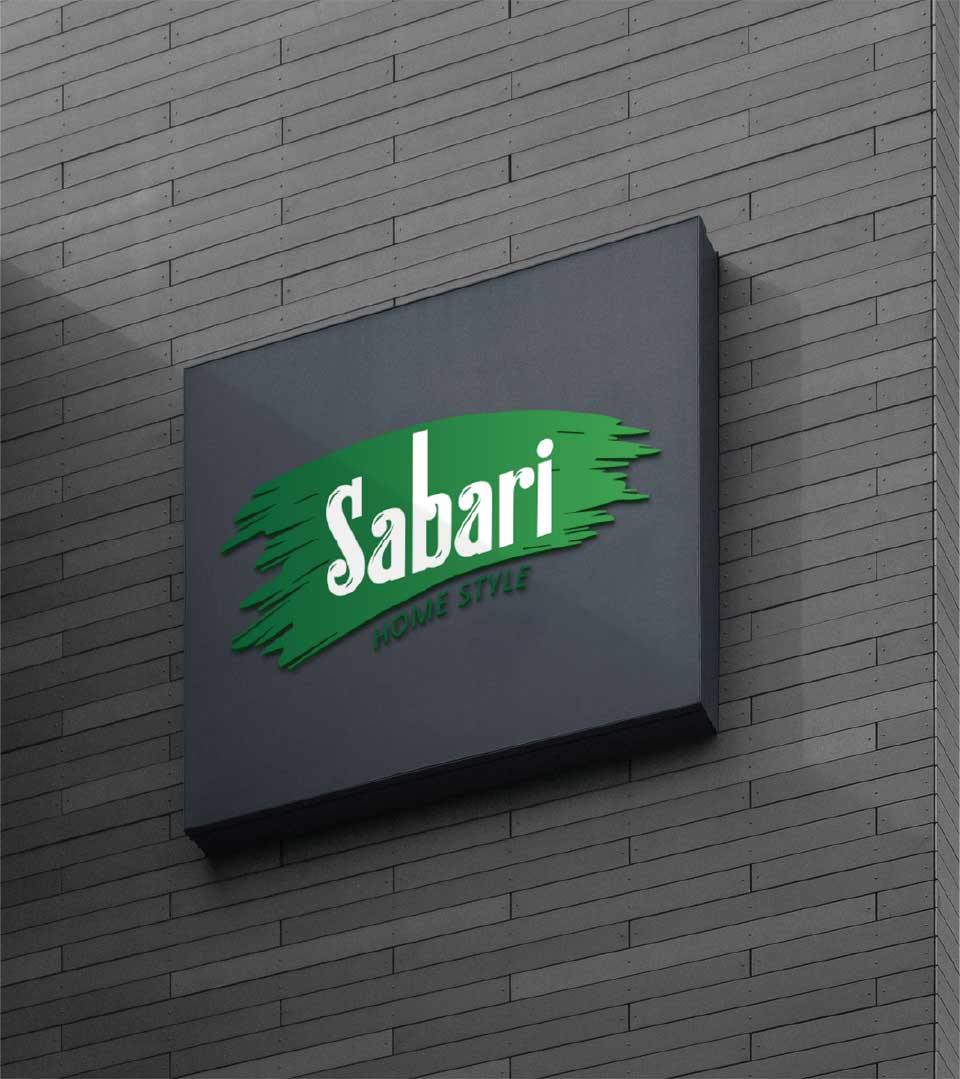
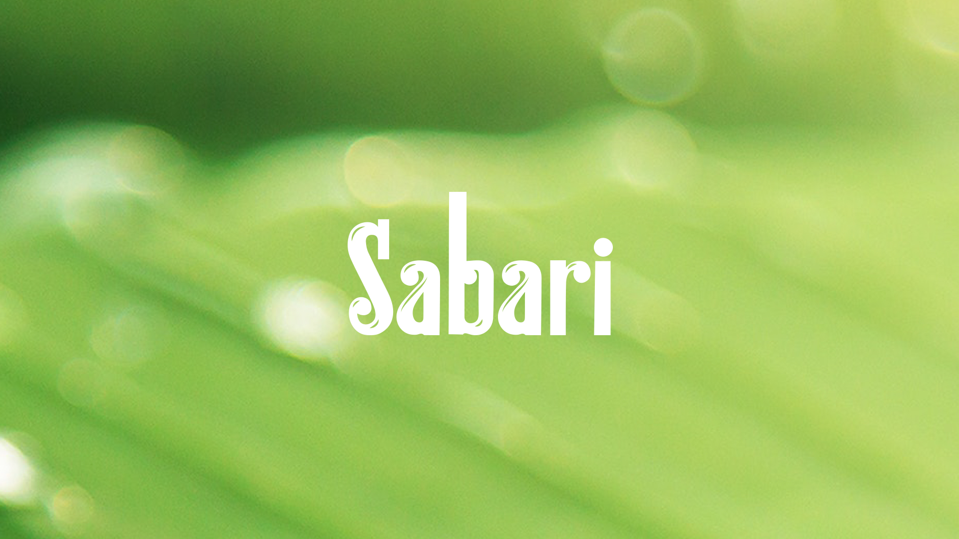
New Logo
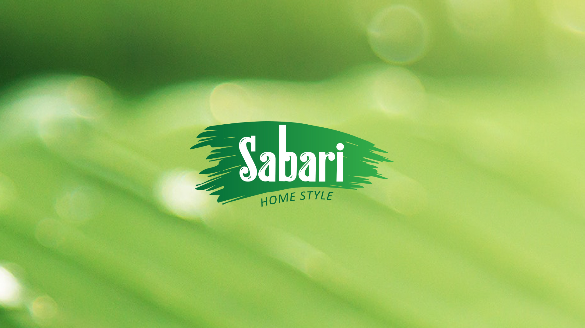
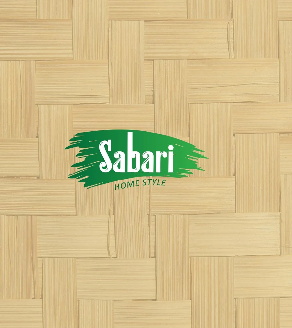
The revamped logo successfully preserves the brand’s legacy while infusing it with a fresh, modern appeal. The typography remains intact, but the surrounding elements have been reinvented.
The introduction of an artistic leaf element, rendered in a gradient of green, instantly evokes nature, freshness, and vitality. This visual cue perfectly aligns with the brand’s association with quality and life. The green backdrop with white typography creates a sense of tranquility and purity, further emphasizing the brand’s focus on natural ingredients.
The Concept
The concept development for the Sabari logo centered around the dual objectives of preserving the brand’s heritage and infusing it with contemporary appeal. By maintaining the iconic typography, we honored the brand’s history and ensured immediate recognition. The integration of the artistic leaf element was a pivotal decision, as it seamlessly blended the brand’s traditional roots with a modern, organic aesthetic. This symbol represents growth, freshness, and life, core attributes associated with Sabari’s product offerings. The careful selection of a green color palette further enhanced the natural and wholesome image, creating a visually compelling and emotionally connected logo.
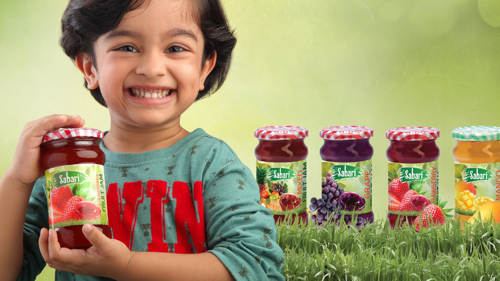
The incorporation of the artistic leaf element and the refreshing color palette revitalized the brand’s image, making it more appealing to a wider audience, particularly younger consumers who value natural and healthy products. The addition of the “Home Style” subtext reinforces the brand’s connection to authentic, home-cooked flavors, strengthening its emotional appeal.
The Color Palette
The dominant green hue, transitioning from a deeper shade to a lighter tone, symbolizes growth, freshness, and harmony. The choice of white for the typography ensures optimal readability and creates a sense of purity and clarity, contrasting beautifully against the green backdrop.
This color combination collectively imparts a modern, clean, and inviting aesthetic to the logo, reflecting Sabari’s evolution while staying true to its core values.
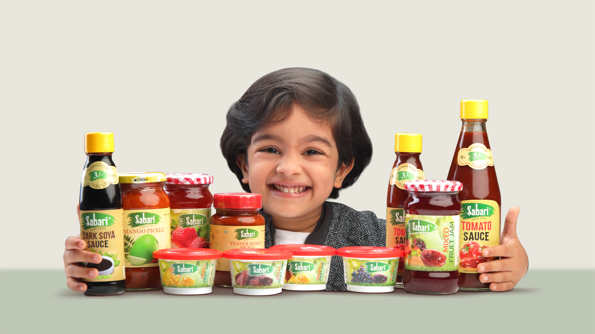
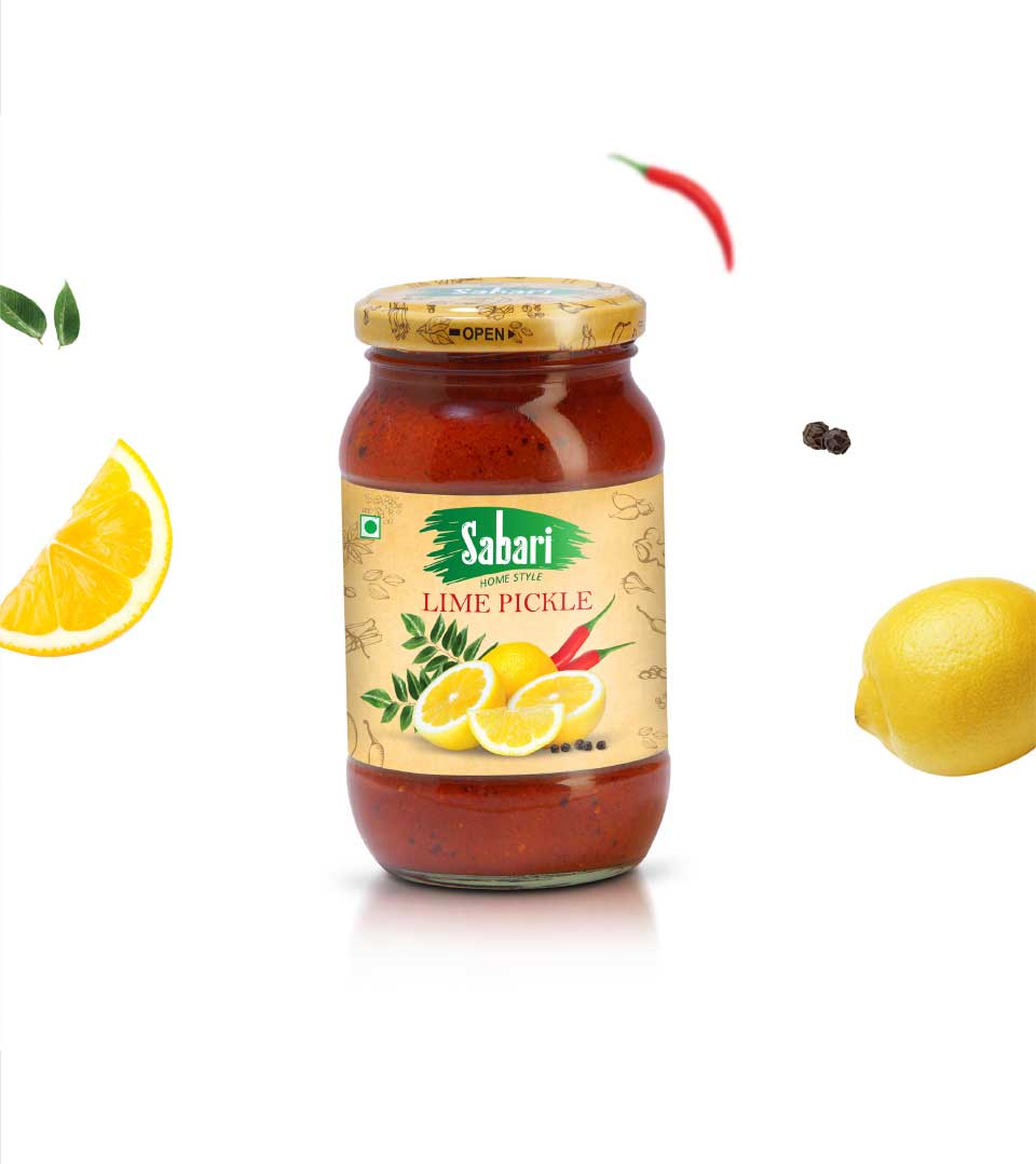
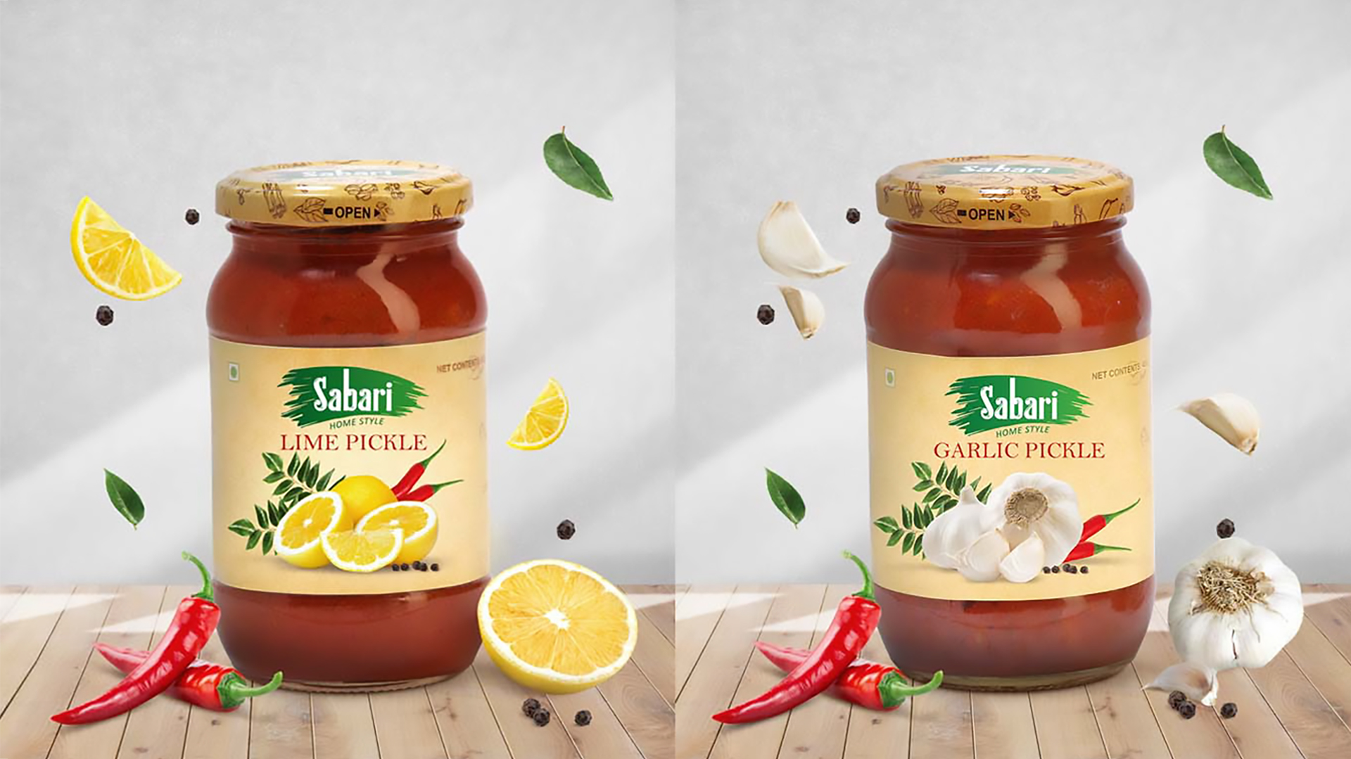
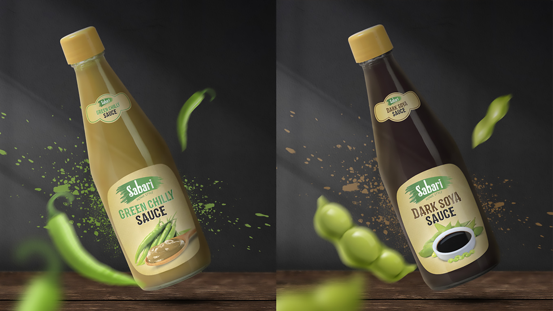
The Packaging Design
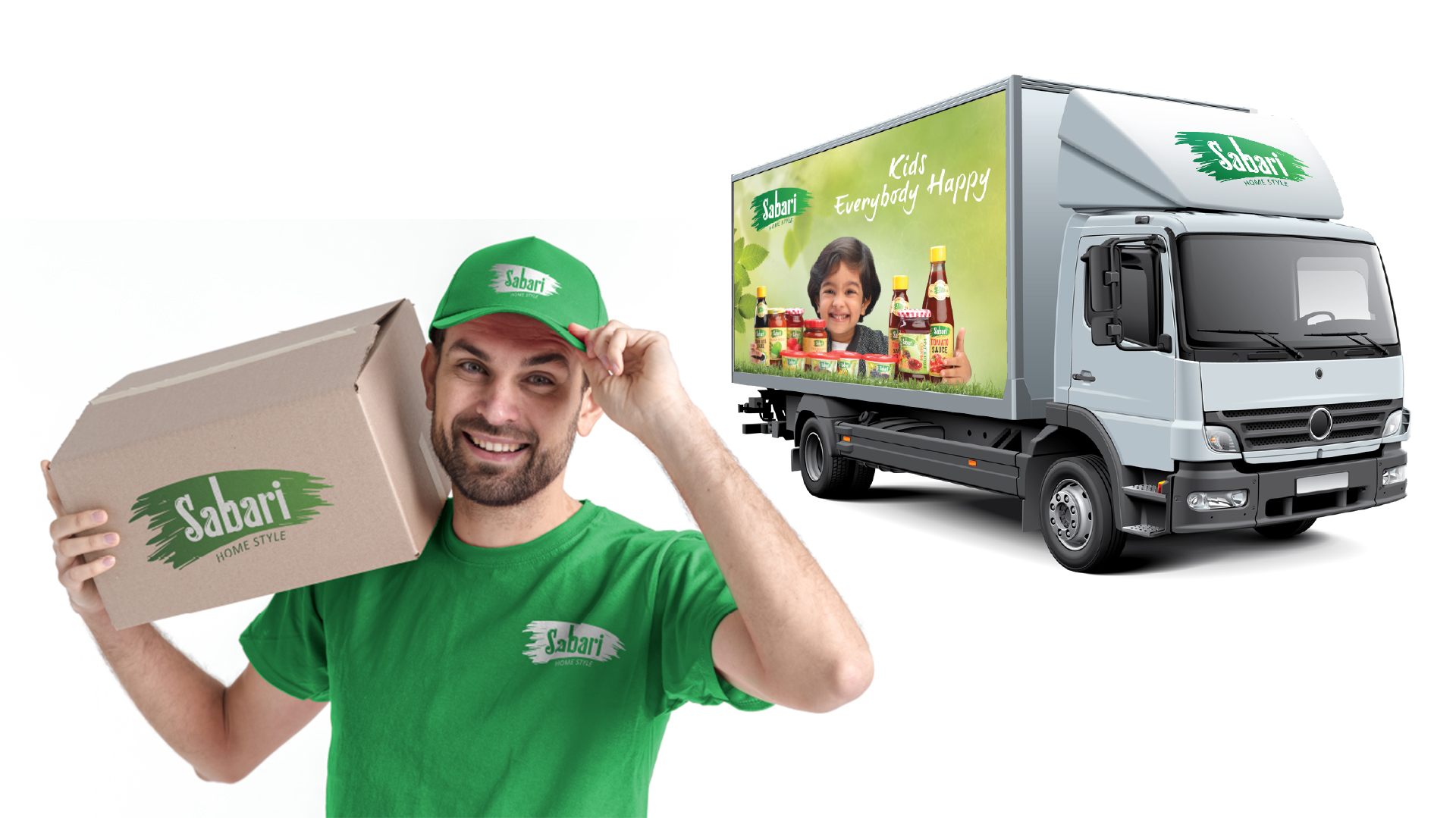
The rebranding of Sabari should be reflected consistently across all touchpoints, including packaging design. The new logo served as the foundation for the packaging aesthetic. By maintaining a consistent brand identity across all platforms, Sabari can effectively communicate its values and resonate with consumers on a deeper level.