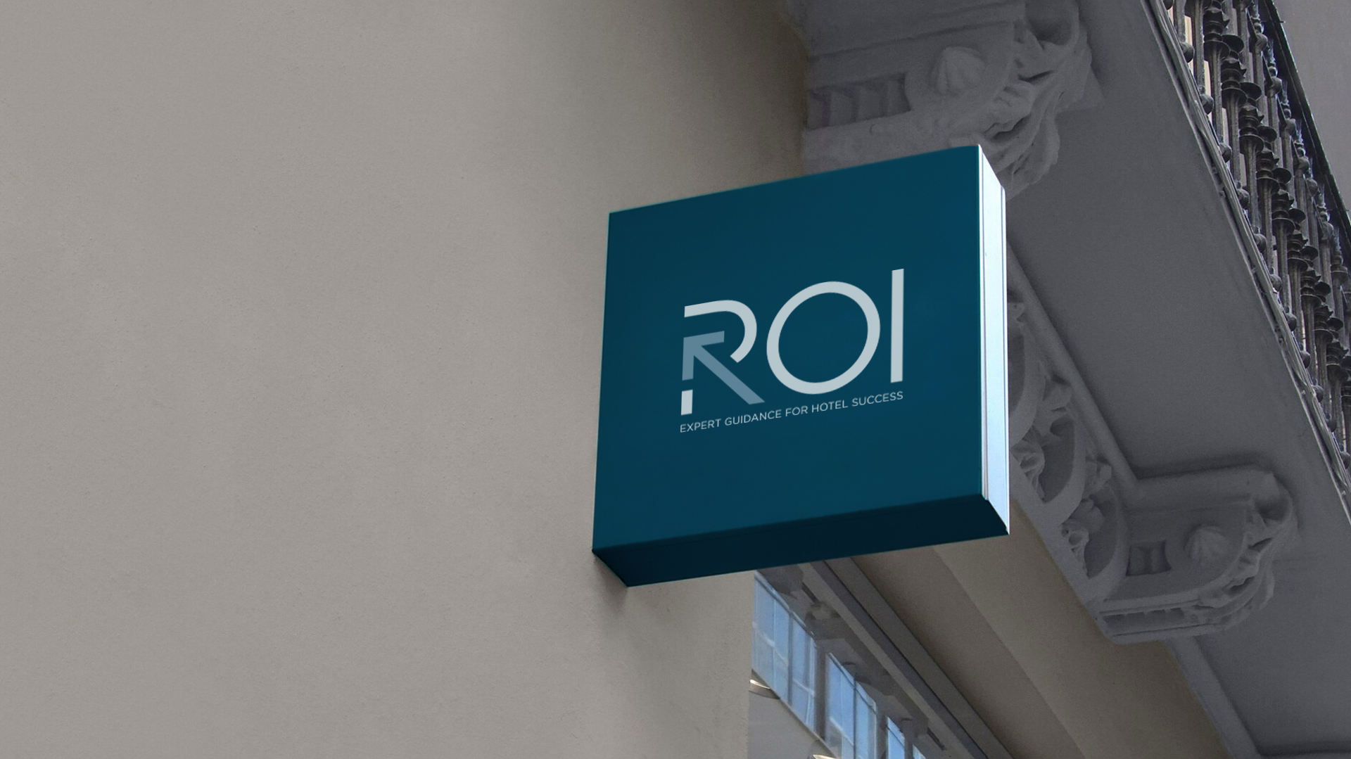
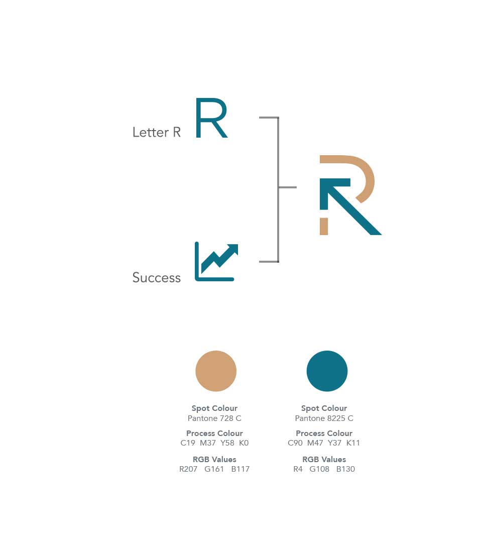
The Concept
The logo was designed to visually represent the firm’s commitment to providing expert guidance and driving success in the hotel industry. The central element, the stylized arrow, symbolizes upward growth and progress. This upward trajectory is a direct metaphor for the positive outcomes that ROI helps its clients achieve.
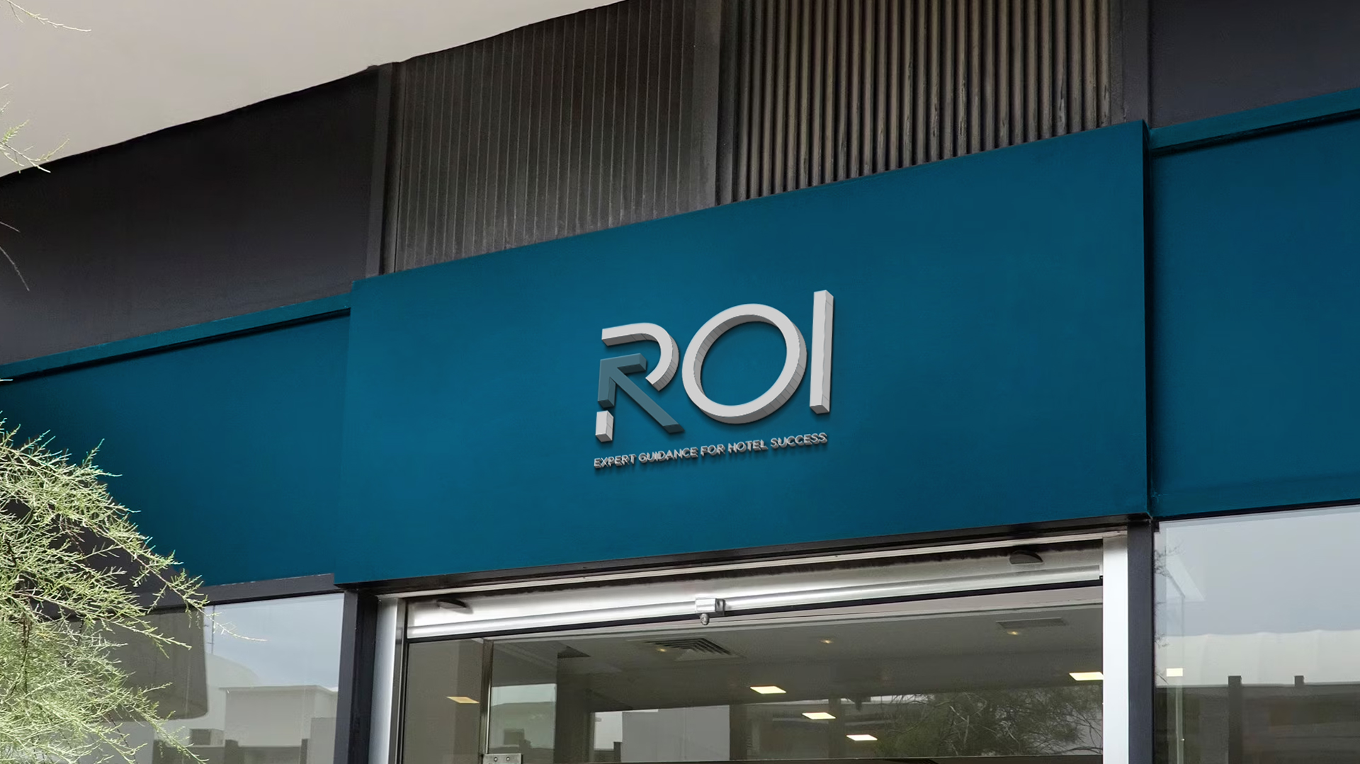
The Logo
The letter “R” is integrated into the arrow, forming a cohesive and memorable symbol. This fusion signifies the firm’s role as a guiding force, leading clients toward their desired goals. The teal blue and gold color palette further reinforces the concept of success and luxury. Teal blue, often associated with trust and power, reflects ROI’s expertise and reliability. Gold, a color synonymous with wealth and success, underscores the firm’s dedication to helping clients achieve financial prosperity.
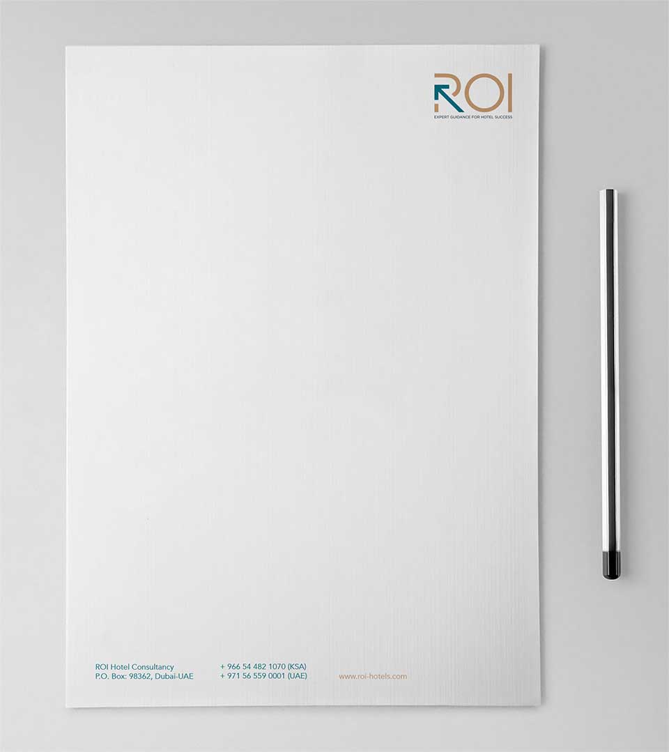
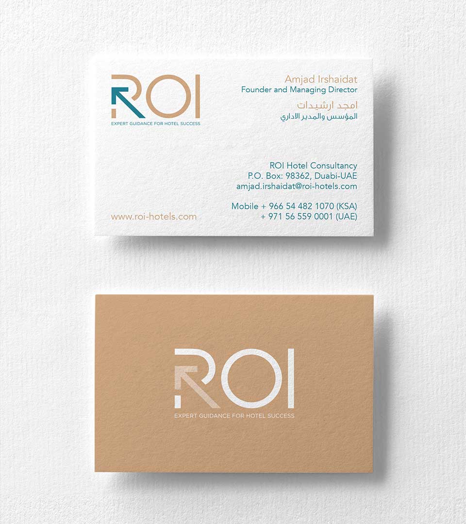
The Color Palette
A combination of teal blue and gold. Teal blue, a shade often associated with trust, power, and stability, reflects ROI’s expertise and reliability in the hotel industry. Gold, a color synonymous with wealth, success, and luxury, underscores the firm’s commitment to helping clients achieve financial prosperity. This color combination creates a visually striking and sophisticated aesthetic that aligns with ROI’s premium brand positioning.
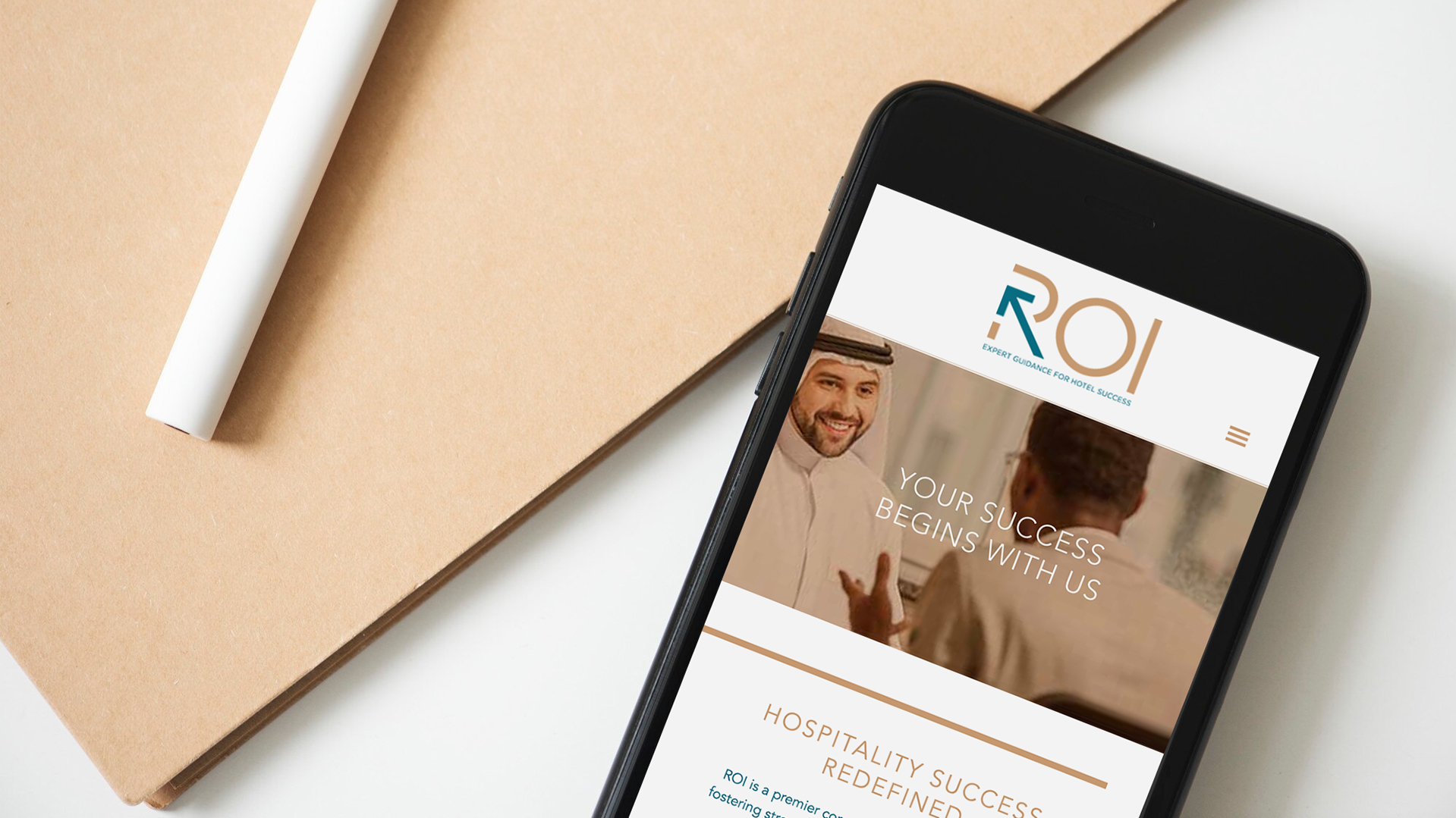
The Tagline
The tagline ‘Expert Guidance for Hotel Success’ conveys ROI’s core value proposition. It highlights the firm’s role as a trusted advisor, providing expert guidance to help clients achieve their goals in the hotel industry. The phrase ‘Hotel Success’ emphasizes the positive outcomes that ROI can deliver, reinforcing the firm’s commitment to driving growth and profitability.