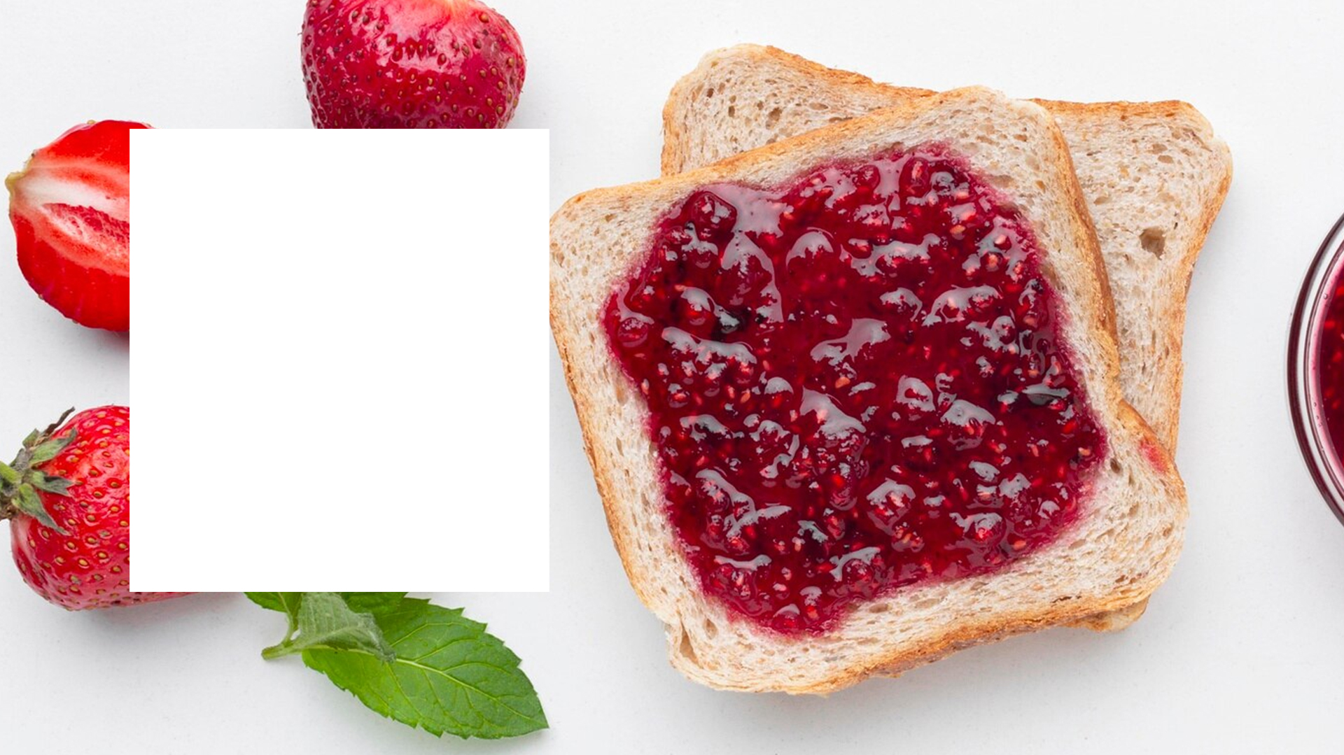
The Focus
The focus of the design was to evoke a sense of nostalgia, reminiscent of traditional Kerala households. The design needed to be visually appealing, while also highlighting the natural ingredients and the unique flavors of the jams. It was imperative that the packaging stand out on the shelves and resonate with both adults and children.
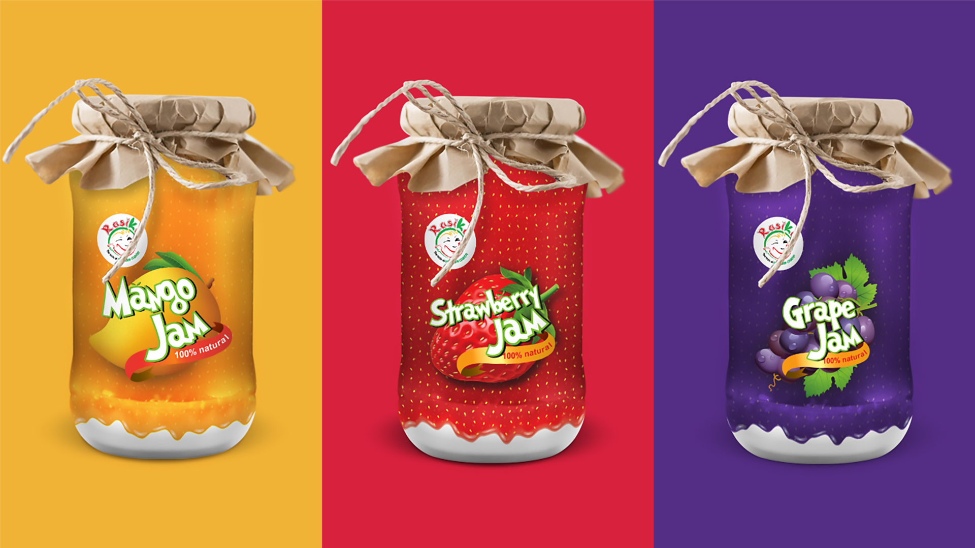
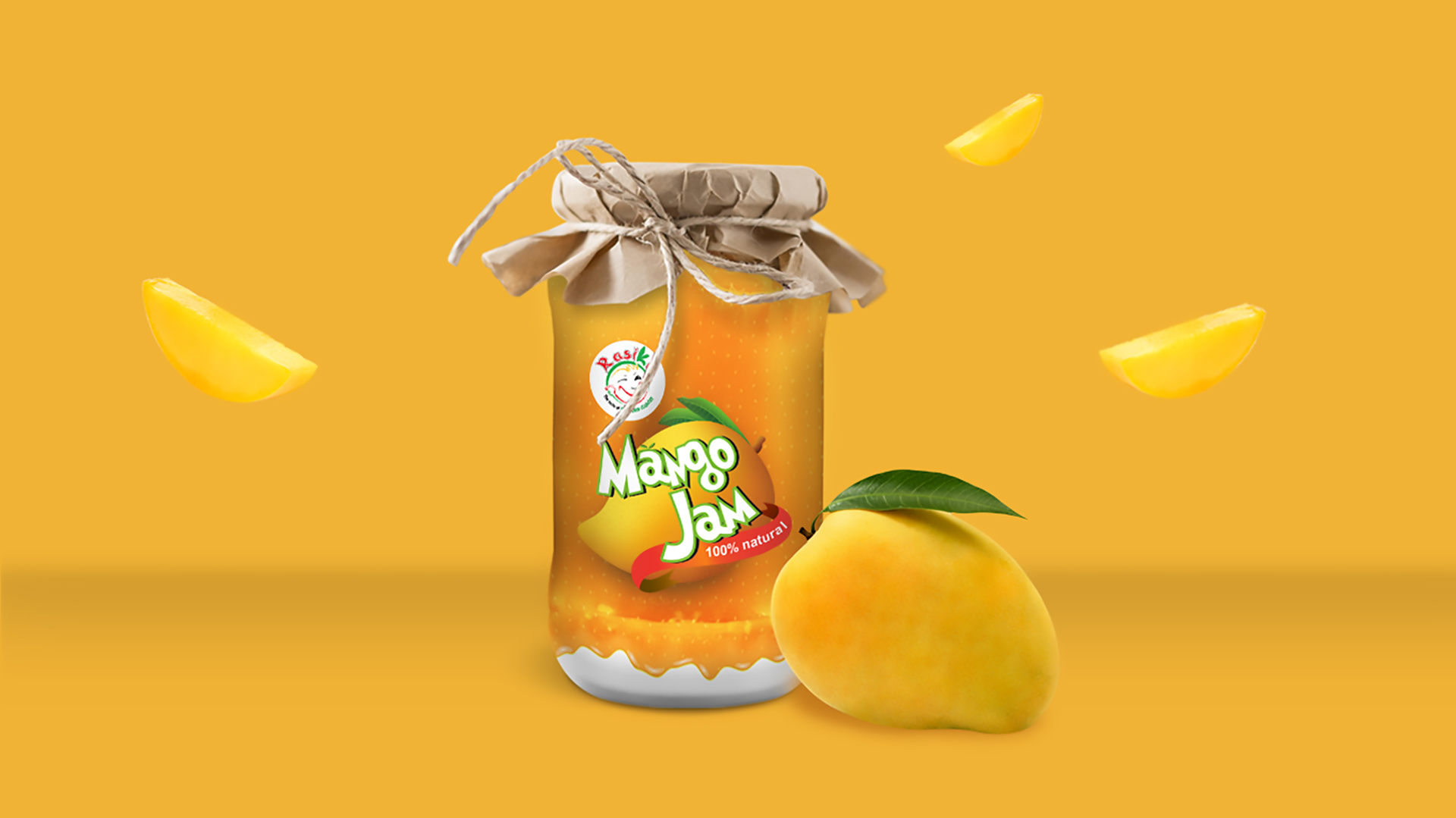
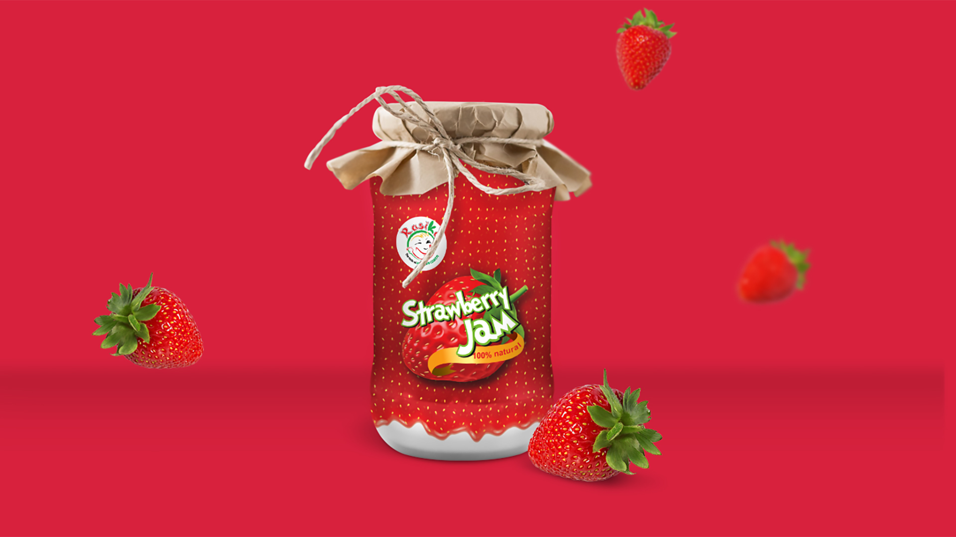
The Design
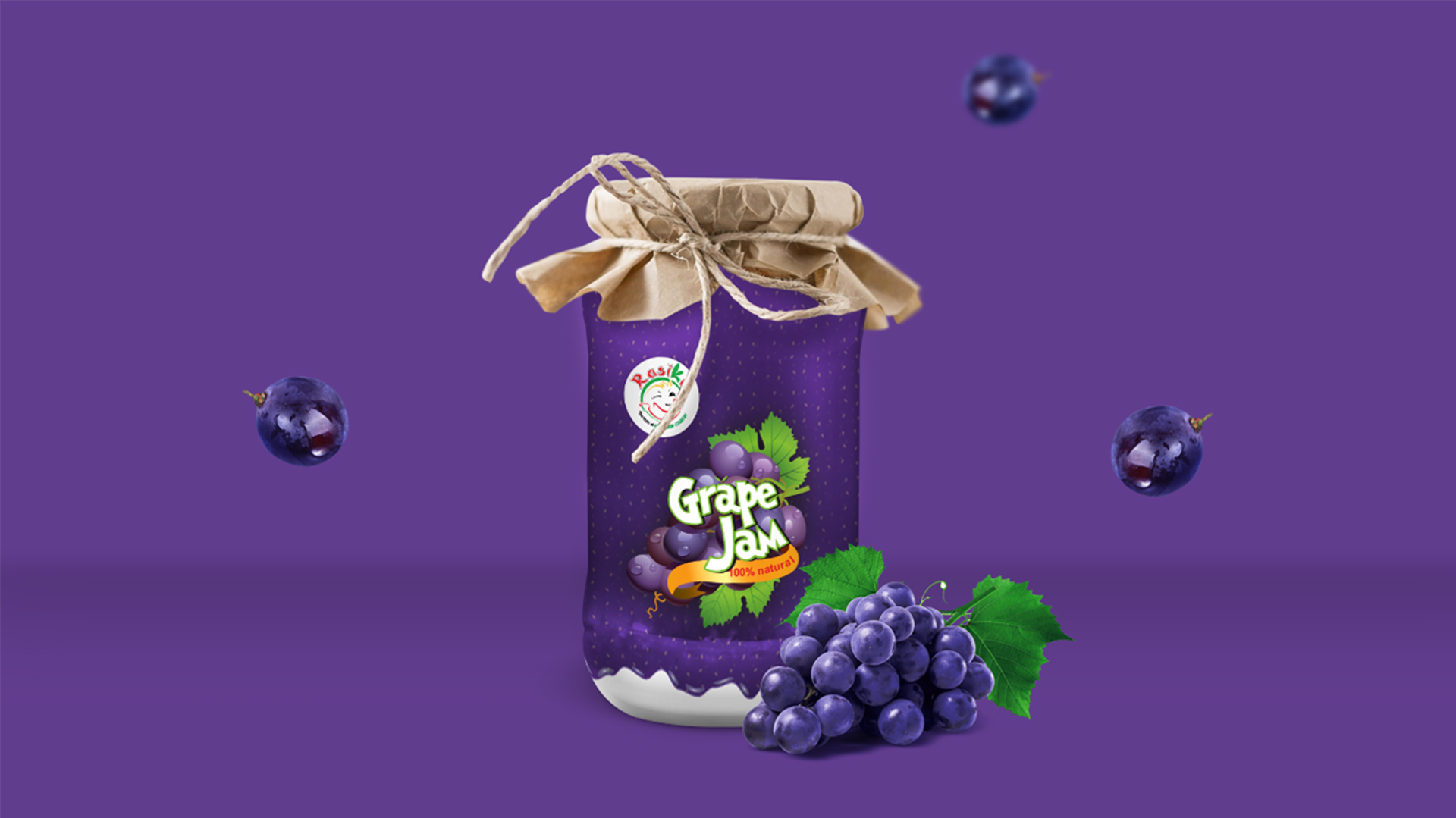
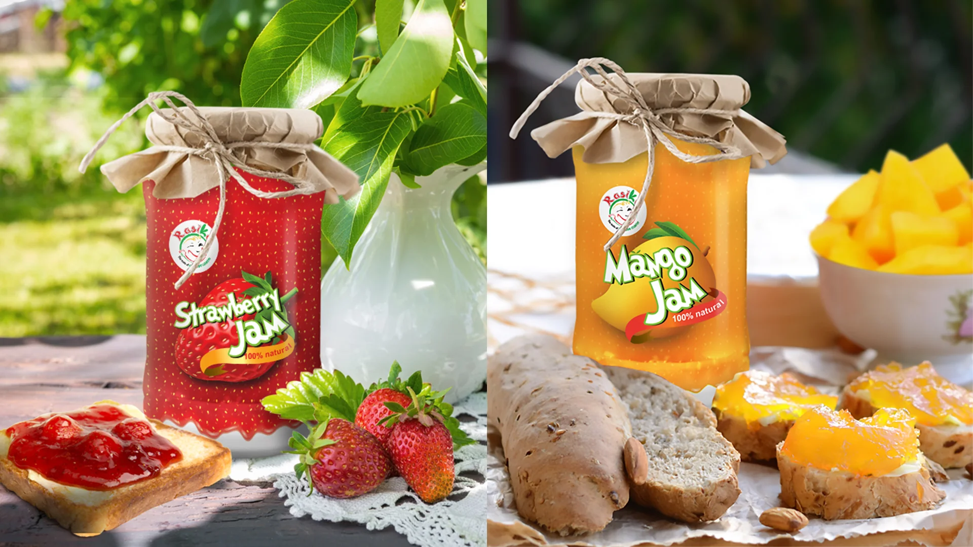
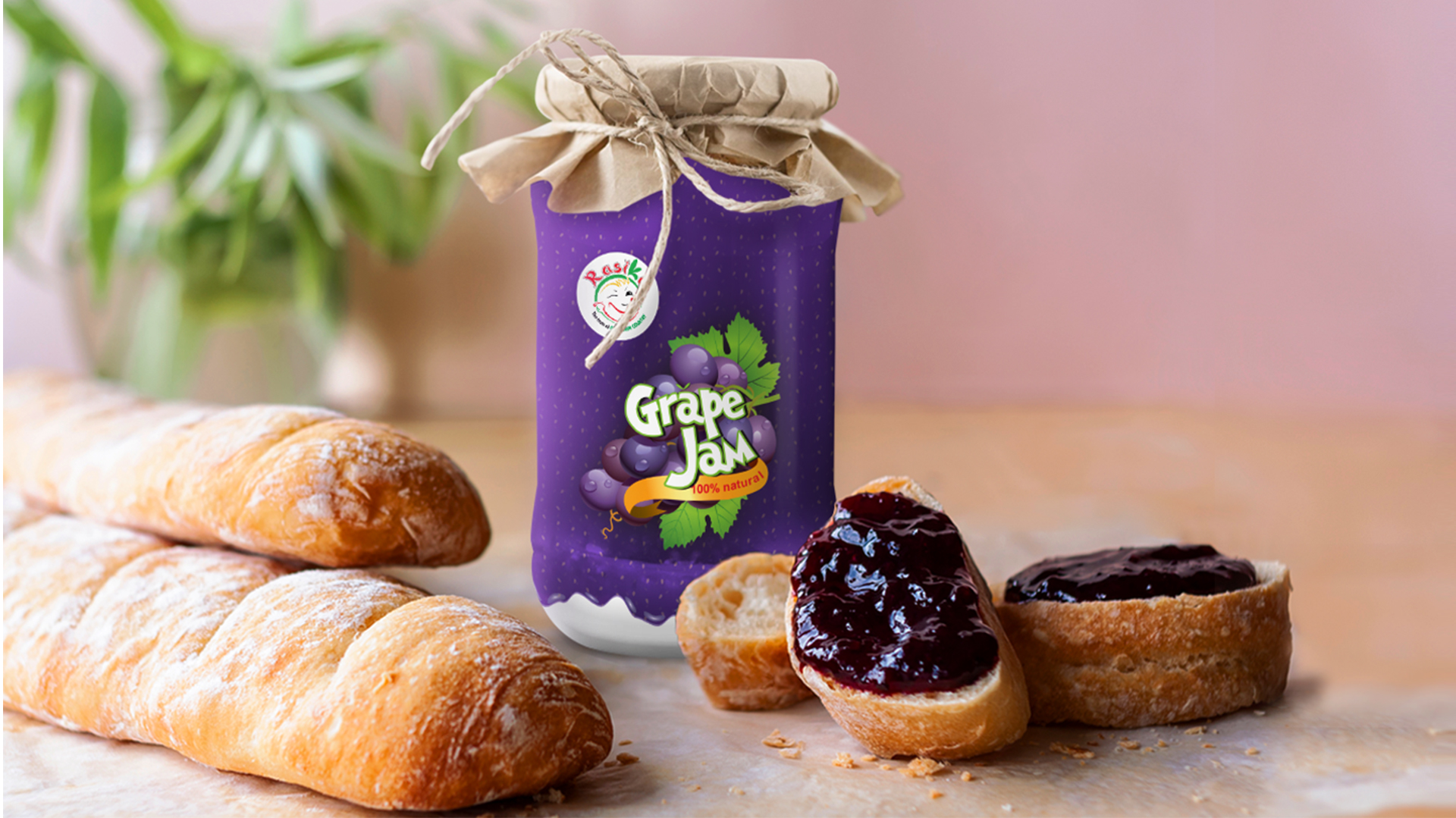
The packaging design features a wrap at the top, reminiscent of traditional Kerala parcels tied with strings made out of delicate coirs. This iconic element immediately sets the tone, inviting consumers to imagine the homemade goodness within. The wrap’s textured paper adds a tactile dimension, further enhancing the nostalgic appeal.
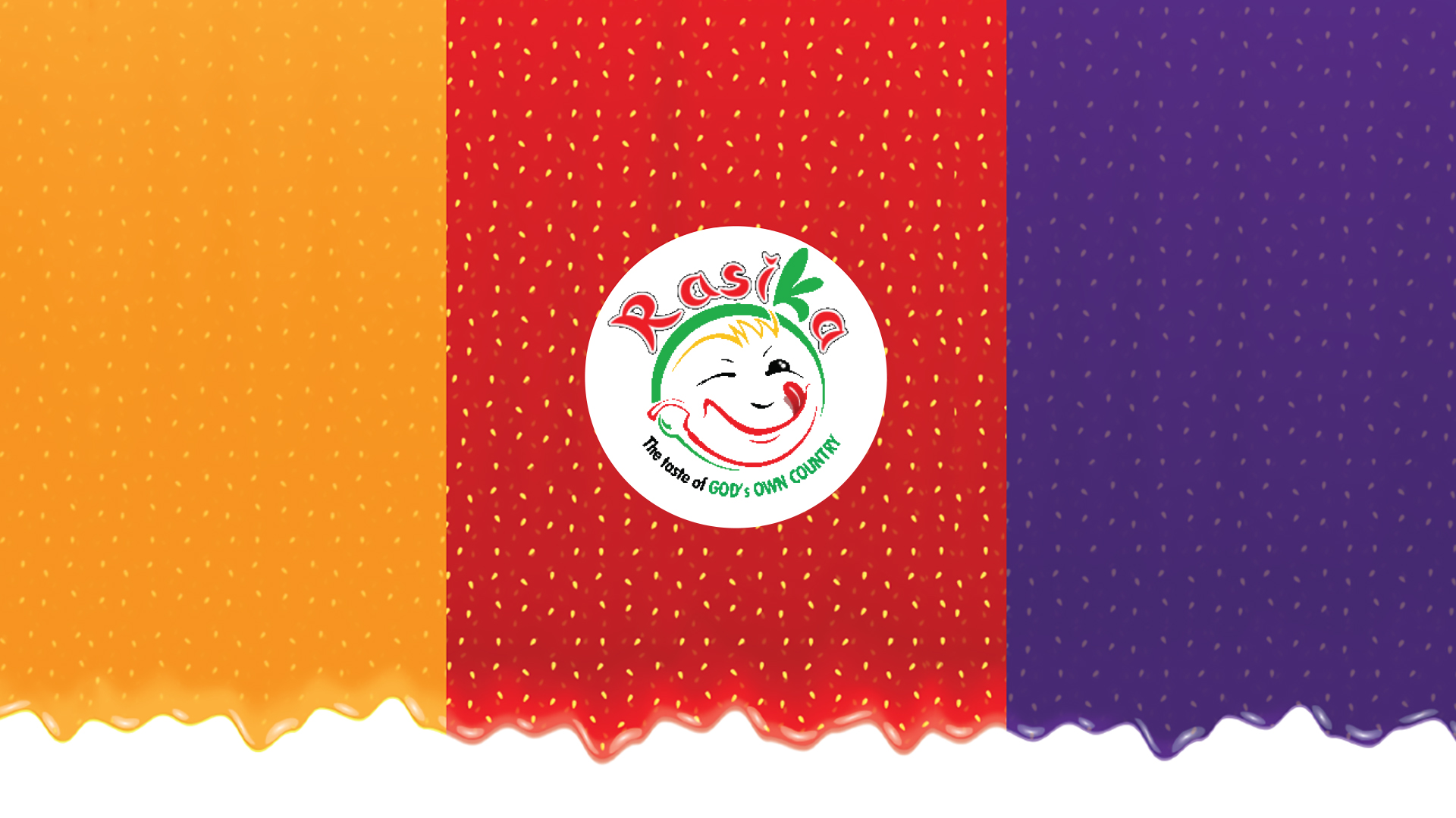
The overall aesthetic of the packaging is clean and minimalist, allowing the vibrant colors and imagery to take center stage. The colors used are carefully chosen to reflect the specific flavors of each jam, ensuring instant recognition. The playful and contemporary typeface adds a touch of modernity, making the product appealing to a wider audience.
Key Design Elements
Wrap at the top: A nostalgic nod to traditional Kerala packaging.
Textured paper: Adds a tactile element and enhances the nostalgic feel.
Vibrant colors: Reflect the specific flavors of each jam.
Playful typeface: Makes the product appealing to a wider audience.
Minimalist design: Allows the colors and imagery to take center stage.