Concept Development
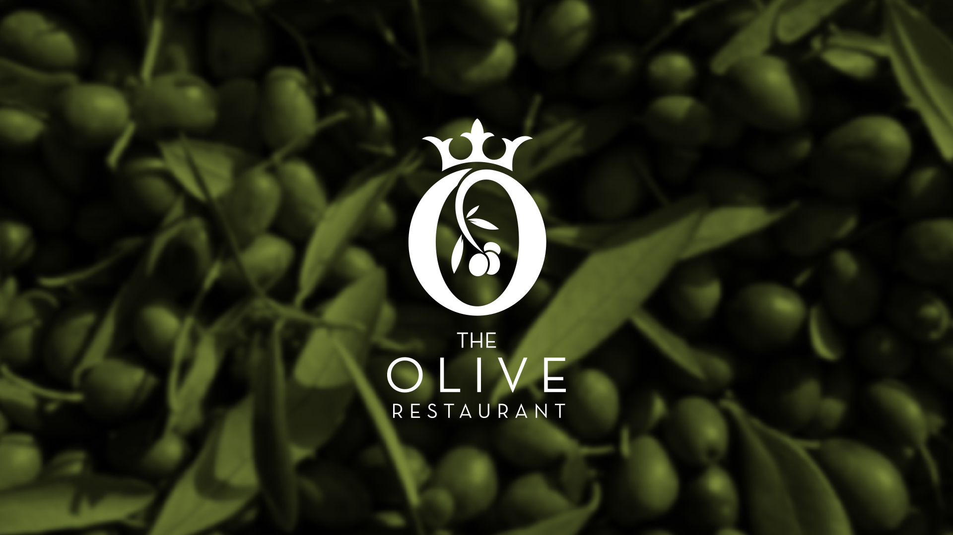
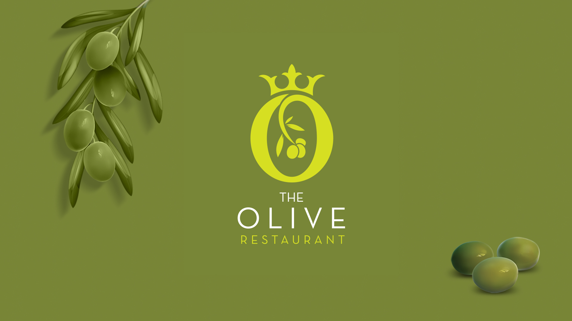
The olive, a symbol of peace, abundance, and prosperity, served as the inspiration for the logo. It’s considered to be a fruit from heaven. Its round shape, often associated with perfection and wholeness, aligned with the restaurant’s pursuit of excellence. We incorporated the letter “O” from the restaurant’s name into the olive design, creating a unique and memorable symbol.

The Logo
Crown + Olive + Letter ‘O’
Crown
The crown atop the olive signifies the restaurant’s premium status and commitment to providing a luxurious dining experience.
Olive
The central element, the olive, represents the freshness, quality, and abundance that Olive Restaurant strives to offer.
Letter O
The stylized “O” within the olive reinforces the restaurant’s name while adding a touch of elegance.
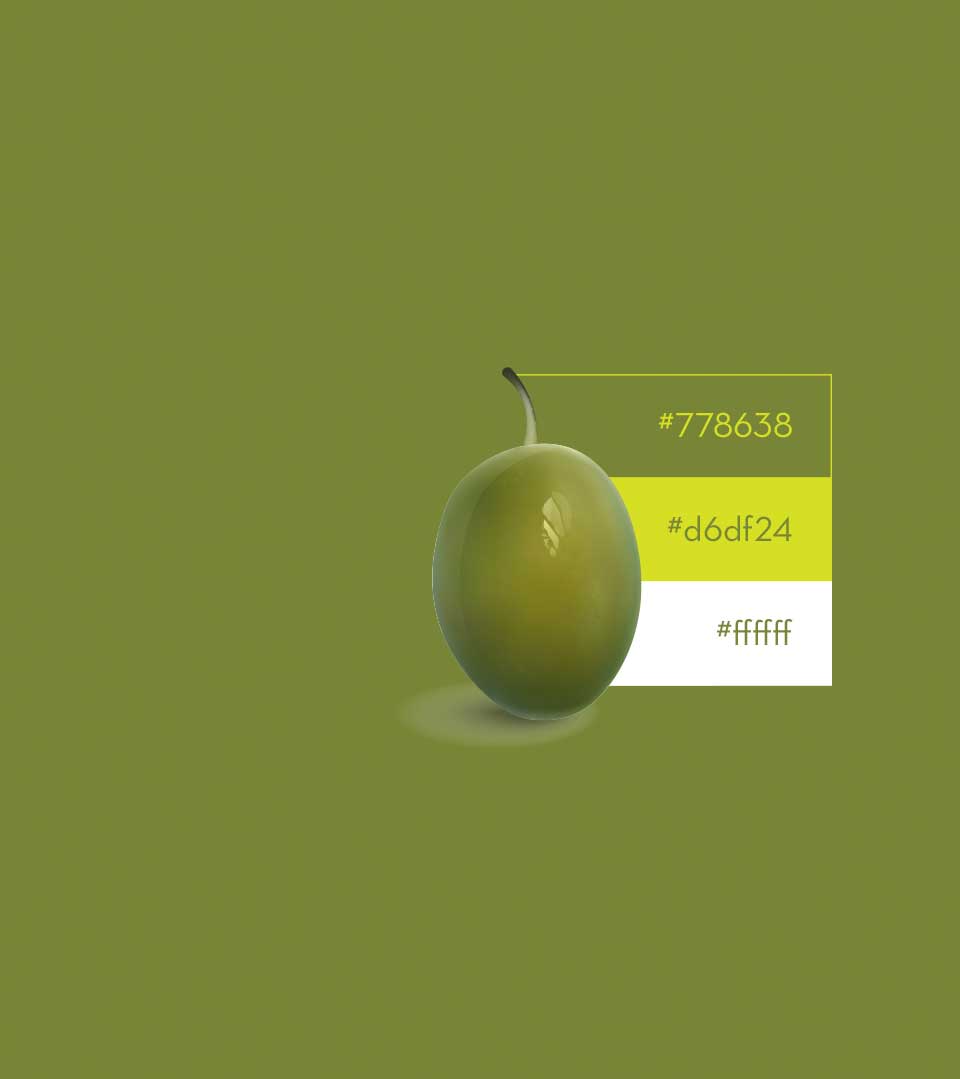
Color Palette and Typography
The choice of olive green as the primary color evokes a sense of nature, freshness, and sophistication. The simple, clean font used for the restaurant’s name complements the logo’s minimalist design and enhances its readability.
The logo effectively communicates the brand’s values and aspirations. Its elegant and timeless design, combined with the meaningful symbolism, creates a strong visual identity that resonates with discerning diners.