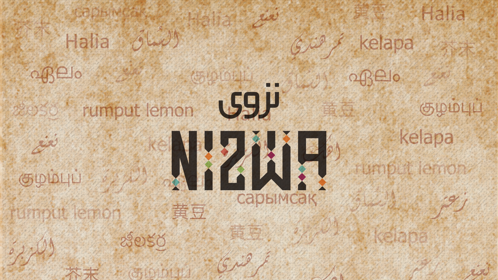
The Concept Behind the Design
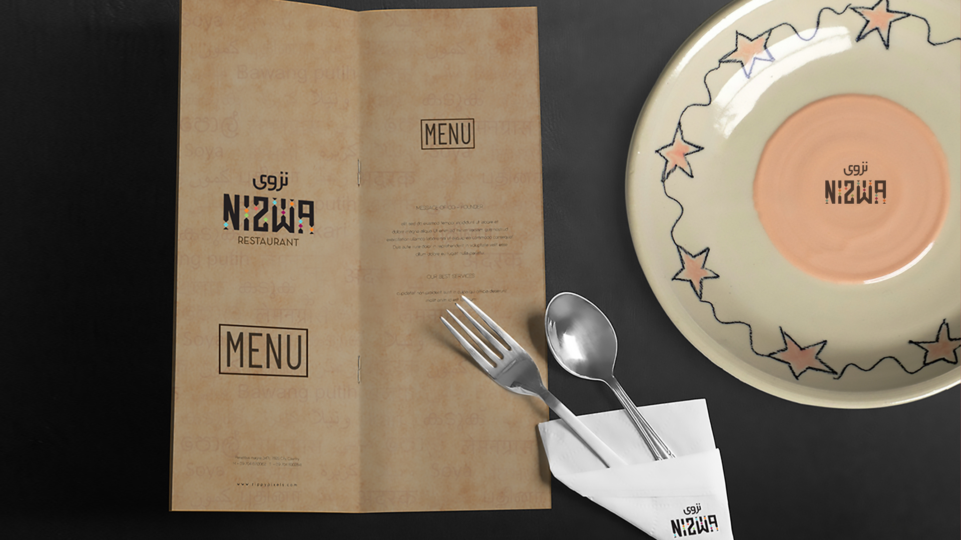
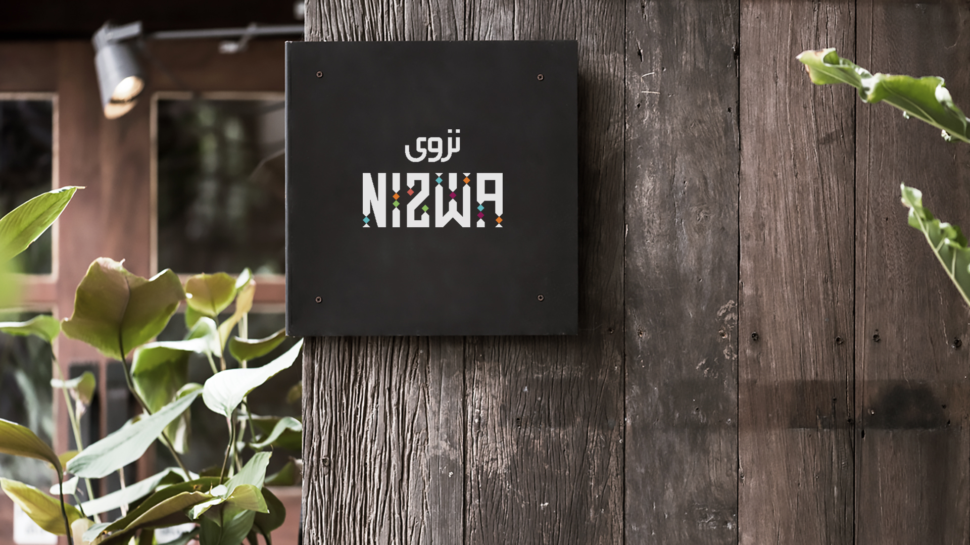
The logo’s concept is rooted in the idea of a culinary tapestry, where each thread represents a distinct Asian cuisine. The typography, forming the word “Nizwa,” acts as the loom, weaving together these diverse flavors into a harmonious whole.
Typographical elements form the word ‘Nizwa’ , while dots with different colors of the Asian region and proximity of intertwined culture across the region.

The Logo
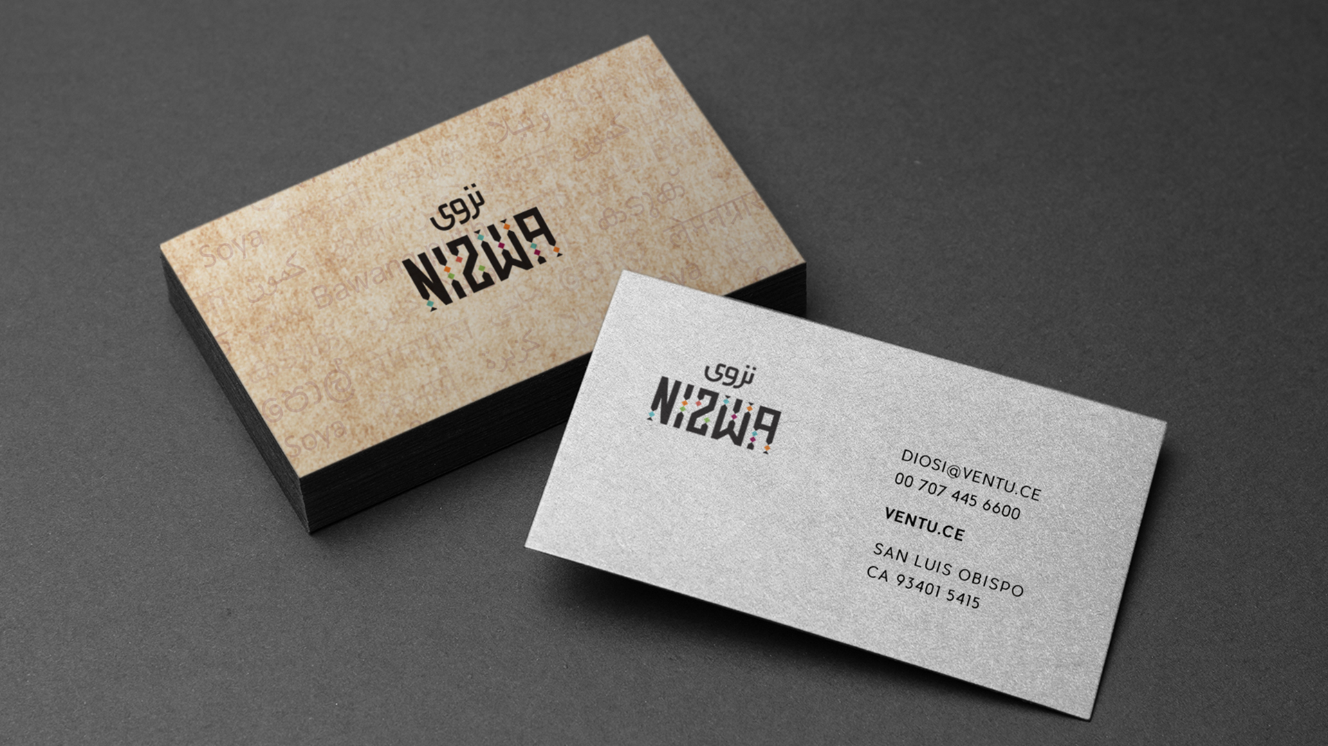
The logo, a typographic masterpiece, is the symbolic representation of the restaurant’s culinary journey across Asia. The intertwining of typography and colorful dots serves as a powerful metaphor for the interconnectedness of cultures and tastes in the region.
Each dot represents a specific cuisine, reflecting the restaurant’s commitment to offering a truly authentic Pan-Asian dining experience.
The intertwining of the letters further emphasizes the idea of interconnectedness, suggesting that the cuisines represented in Nizwa are not isolated but rather mutually influencing and enriching each other.
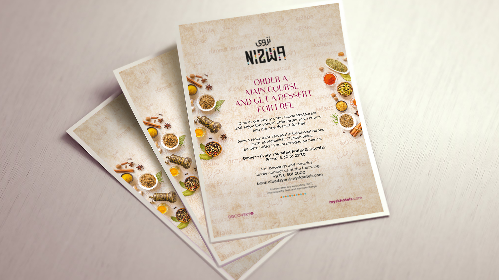
The logo’s connection to Sharjah and Mysk Hotels is subtly implied through the use of Arabic script and the overall aesthetic. This suggests that Nizwa is not merely a restaurant but a cultural experience, inviting guests to embark on a culinary journey through the heart of Asia.
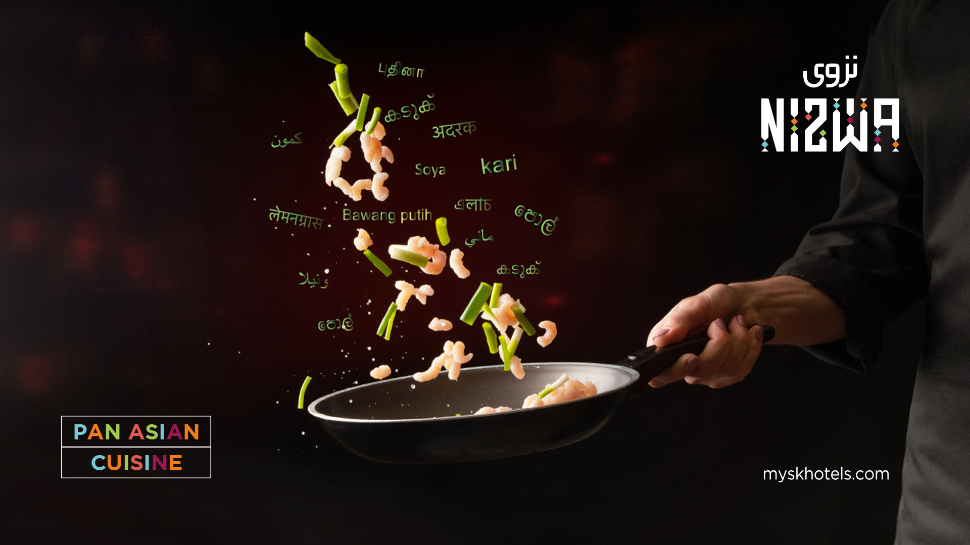
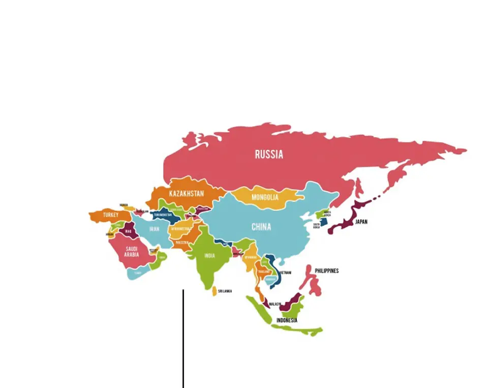
The Significance of Pan Asian Languages in Branding
The incorporation of Pan Asian languages in the branding further reinforces the concept of cultural exchange and culinary exploration. By using text from different Asian languages, the design communicates the restaurant’s commitment to representing a wide range of Asian cuisines.
A Global Perspective
The inclusion of languages from different Asian countries in the branding reinforces the restaurant’s global appeal. It suggests that Nizwa is a place where people can come together to enjoy a shared culinary experience.
The Nizwa logo is a brilliant example of how a well-designed visual identity can convey a complex concept in a simple and impactful way. By combining typography and symbolism, the logo effectively communicates the restaurant’s commitment to offering a diverse and authentic Pan-Asian dining experience.