The Logo
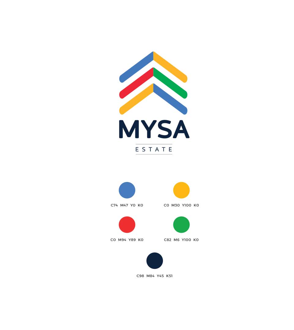
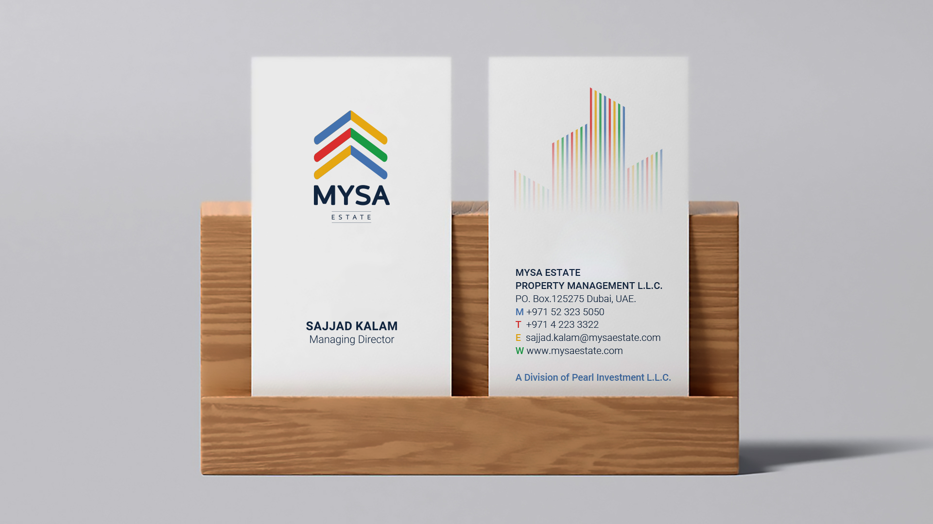
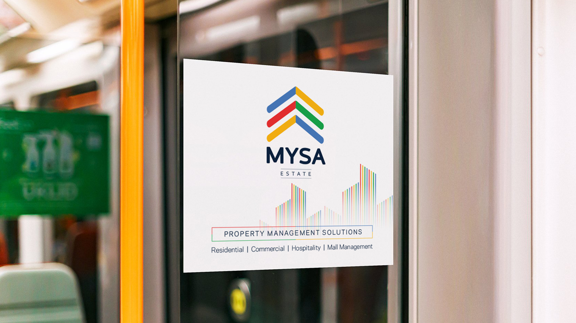
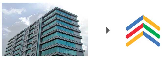
The logo is a visual representation of the company’s commitment to growth, innovation, and providing exceptional property management services. The upward-pointing arrows symbolize the upward trajectory of the company and its clients’ investments. The colorful design evokes a sense of energy, optimism, and diversity, reflecting the vibrant and multicultural nature of the real estate market.
The logo’s building-like structure suggests stability, security, and a solid foundation. The different colors within the arrows represent the diverse range of properties and services offered by Mysa. This conveys the company’s adaptability and ability to cater to various client preferences.
The Color Palette
The color palette chosen for the Mysa includes shades of blue, yellow, red, green, and dark blue. These colors are associated with qualities such as trust, optimism, energy, growth, and stability, respectively. Together, they create a visually appealing and memorable logo that resonates with the company’s brand values.
The Brand Identity
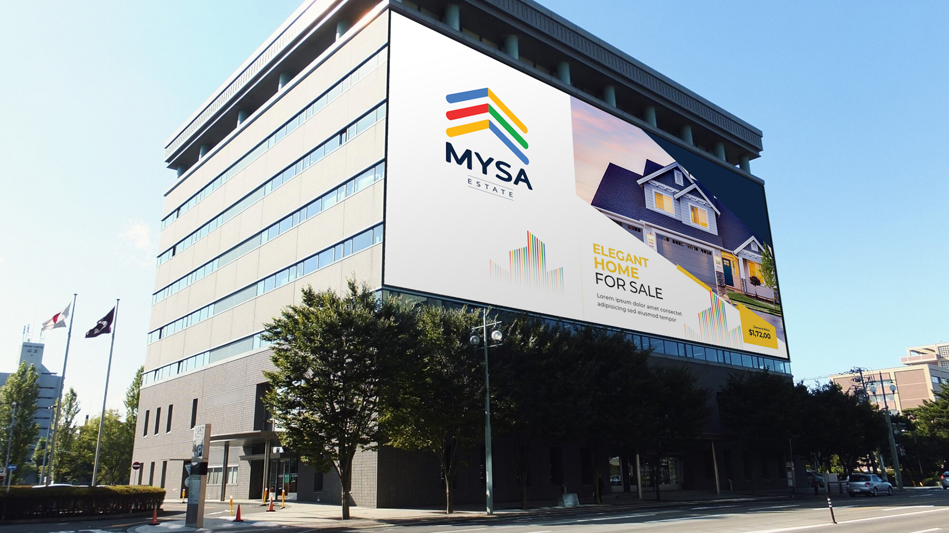
To reinforce the brand identity, cr8 developed a pattern based on the logo’s iconic elements. This pattern was then incorporated into various marketing materials, such as collaterals and stationery, ensuring a cohesive and visually consistent brand experience.
