The Logo
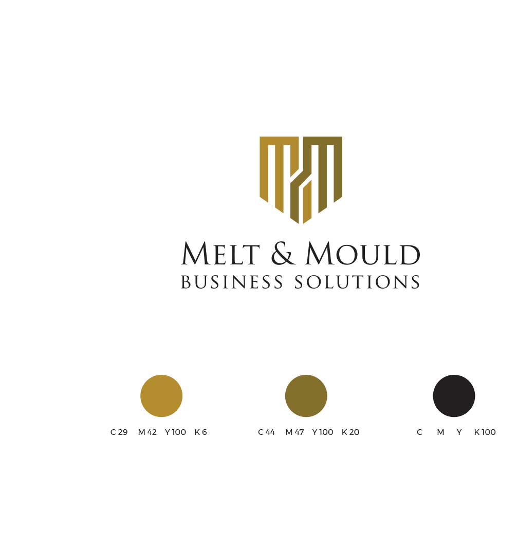
The logo is a visual embodiment of the company’s transformative power. The interlocking “M”s form a shield-like structure, symbolizing protection and support. This shield also represents the company’s role as a trusted partner, shielding businesses from challenges and guiding them toward success.
The interconnectivity of the “M”s signifies the collaborative and synergistic nature of Melt & Mould’s business consulting services. It suggests that by working closely with clients, the company can effectively mold and shape their businesses into thriving entities.
The Color Palette
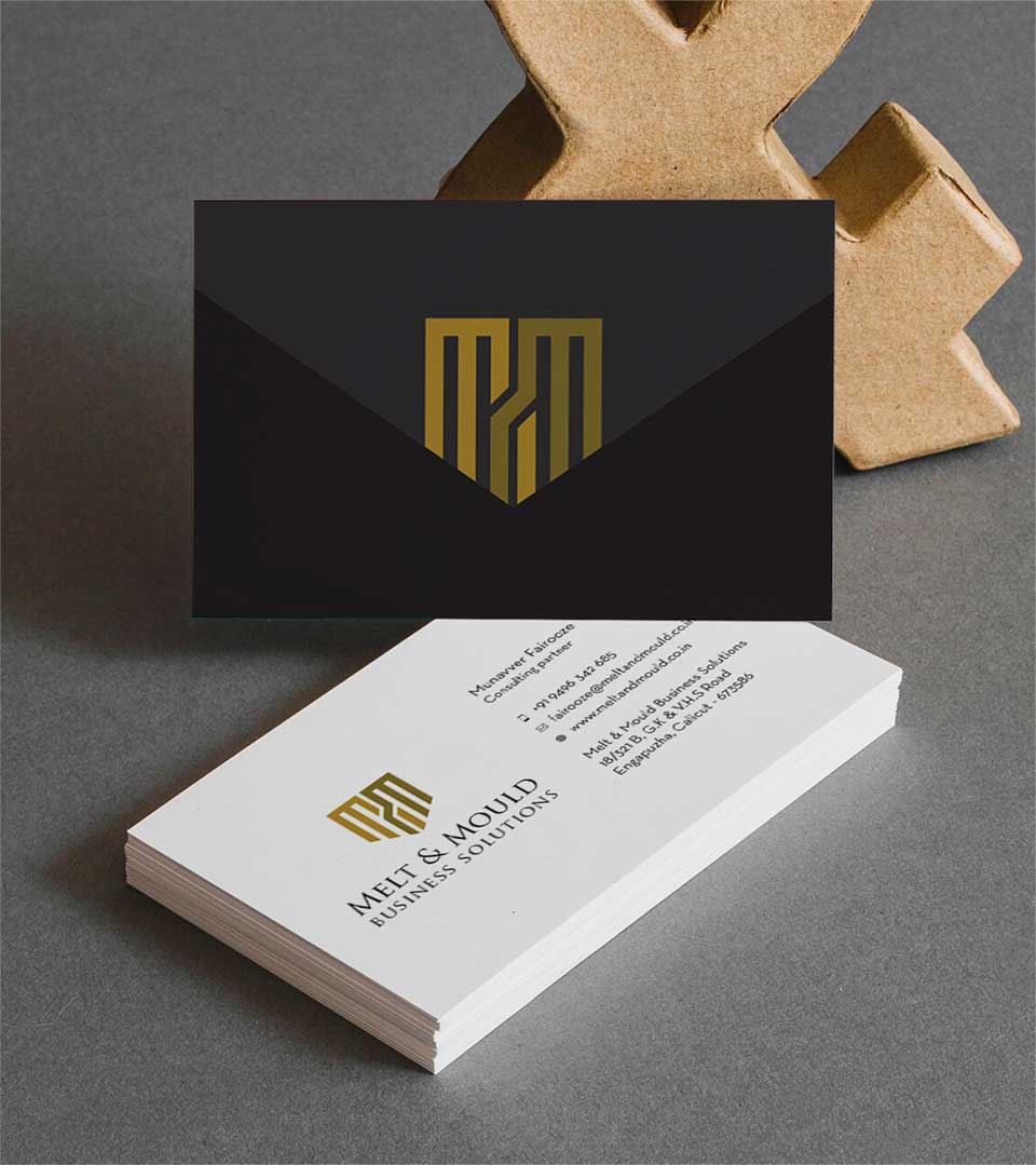
Featuring warm, earthy tones and a bold black, reflects the company’s grounded approach and unwavering commitment to delivering results. The mustard yellow and golden brown hues evoke a sense of warmth, reliability, and expertise, while the black provides a strong, solid foundation.
The Brand Identity
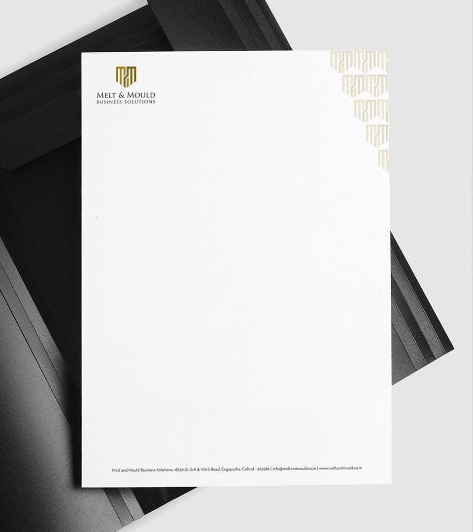
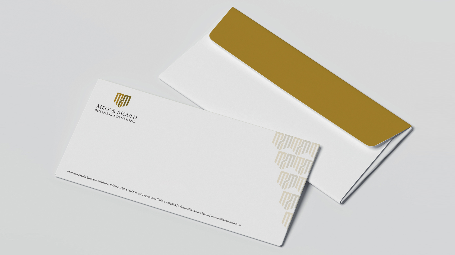
The pattern created using the brand element further reinforces the company’s identity and creates a cohesive visual language. This pattern can be applied across various marketing materials, ensuring consistency and brand recognition.
The Melt & Mould logo is a powerful representation of the company’s unique value proposition. It effectively conveys the idea of transformation, collaboration, and expertise, making it a memorable and impactful visual identity.
