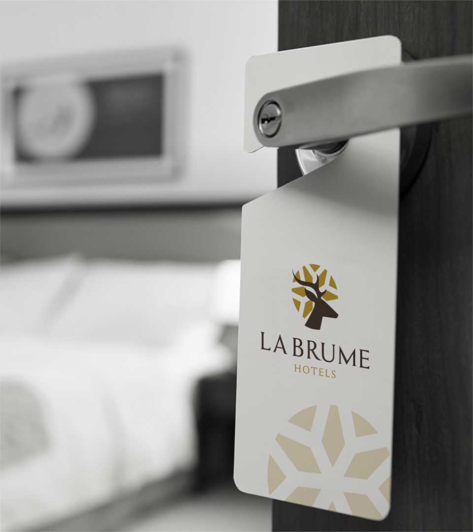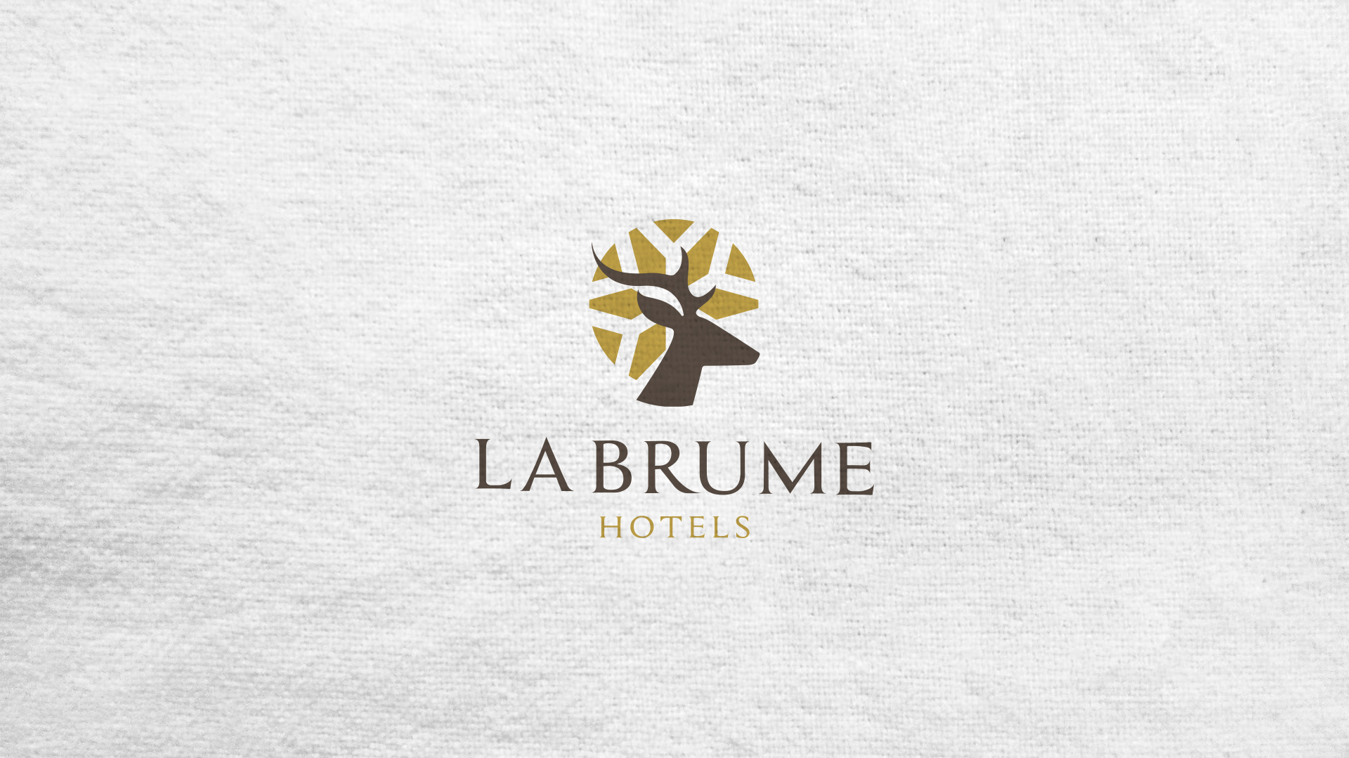
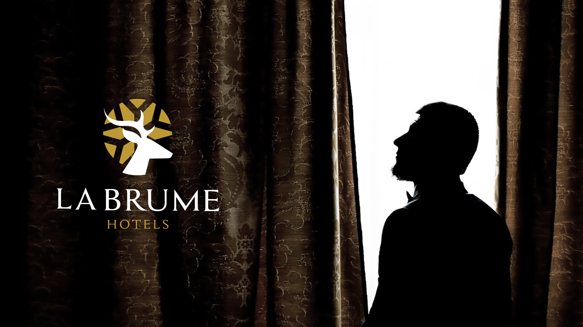

‘BRUME’ is a poetic term meaning «mist, fog, or vapor« it also represents winter. ‘La Brume Hotels’ is concealed between mountains and waters where its a charming place to retreat and sweep away your time in the luxury of ambience and rich tradition. The ethnic qualities of Wayanad has depicted in the logo. The soothing nature and the vibrant wild life being the exceptional markings of this north eastern lap of Kerala , the deer and the snowflakes (symbol of cold) fit there in aptly. There is an overall significance of the misty climate of Wayanad in the elegant Logo and it symbolises every aspects of specialties you intend to provide.
![]()
The Logo
The logo is a blend of symbolism, location, and color, reflecting the brand’s core values and aspirations. As a graceful and gentle creature, the deer symbolizes the harmony and tranquility of La Brume’s surroundings. It also hints at the rich wildlife that abounds in the region.
While Wayanad may not experience snowfall, the snowflakes represent the misty, cool atmosphere that characterizes the area. They also evoke a sense of winter and the cozy, inviting ambiance of the hotel.
The Inspiration
The logo’s design elements are inspired by the ethnic qualities of Wayanad, showcasing the region’s vibrant culture and natural beauty. The deer and snowflakes are particularly apt symbols for this northern Kerala destination.
The Color Palette
The warm and lively Mustard Yellow color represents the golden hues of the sun and the vibrant flora of Wayanad. It also evokes a sense of luxury and sophistication. And the muted brownish-grey color symbolizes the earthy tones of the mountains and the serene waters of the region. It also conveys a sense of stability and reliability.