
The Focus
The focus was on creating a package that was visually appealing, informative, and aligned with the product’s Ayurvedic essence. The design needed to evoke a sense of luxury, tradition, and natural beauty. The packaging should also highlight the key ingredients, particularly saffron, and communicate the product’s benefits clearly and concisely.
The Design
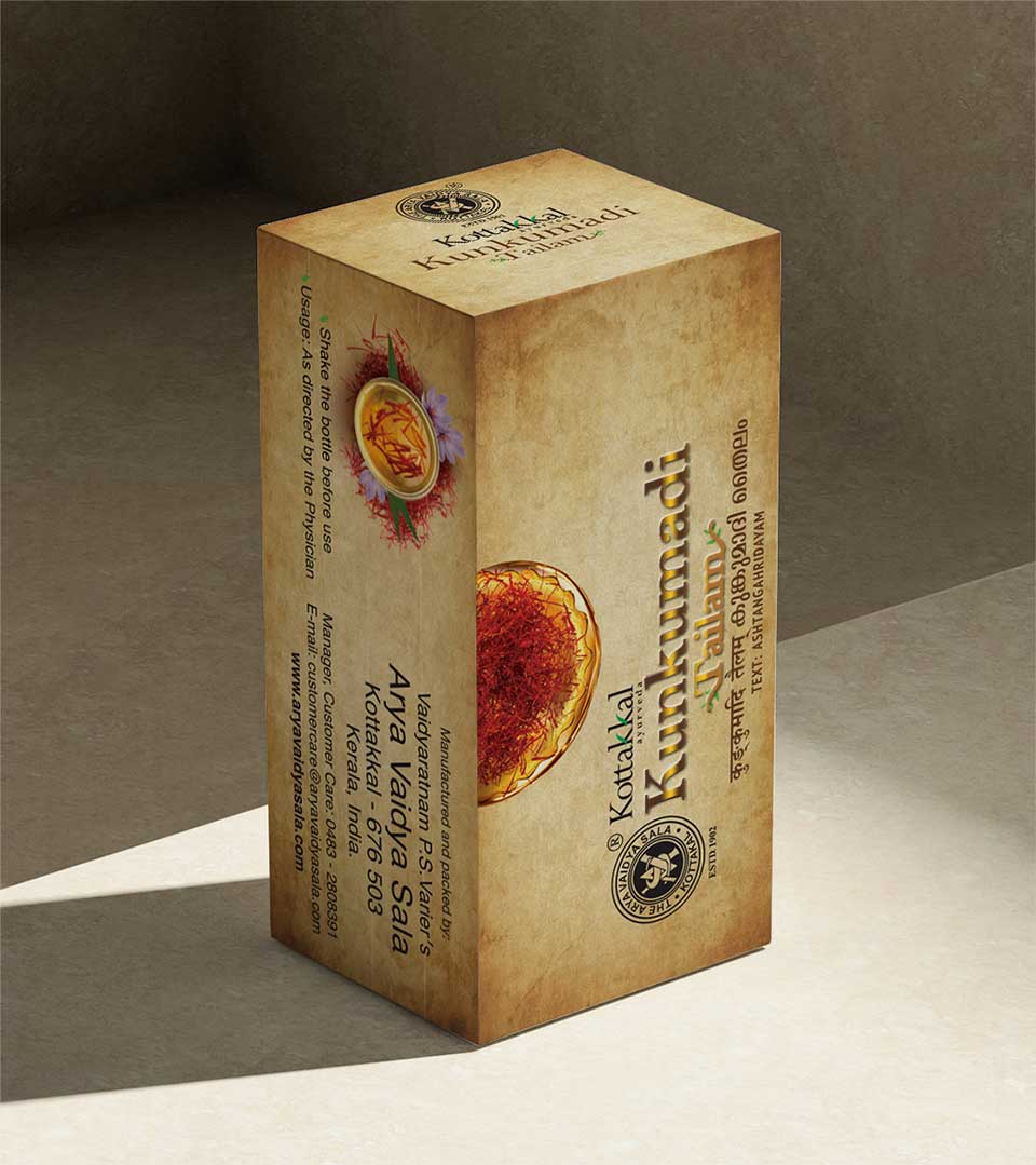
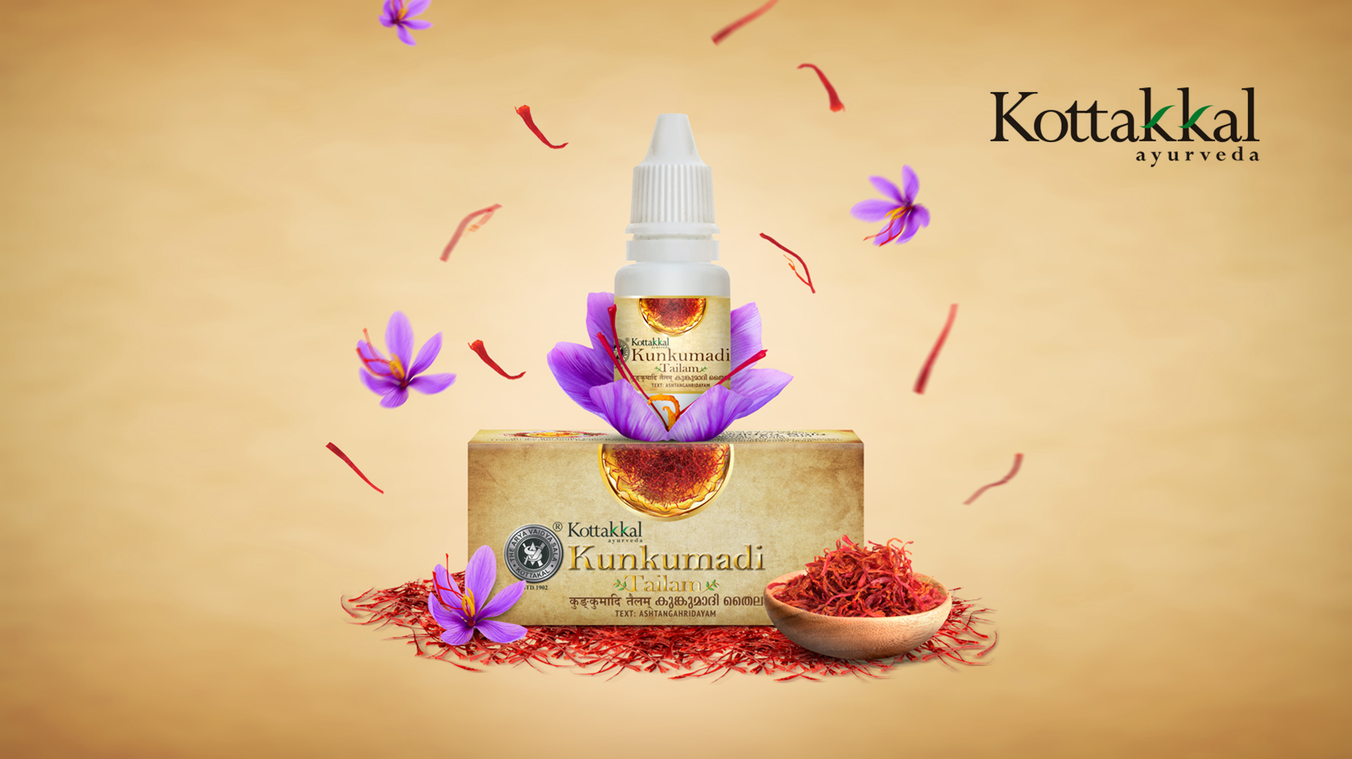
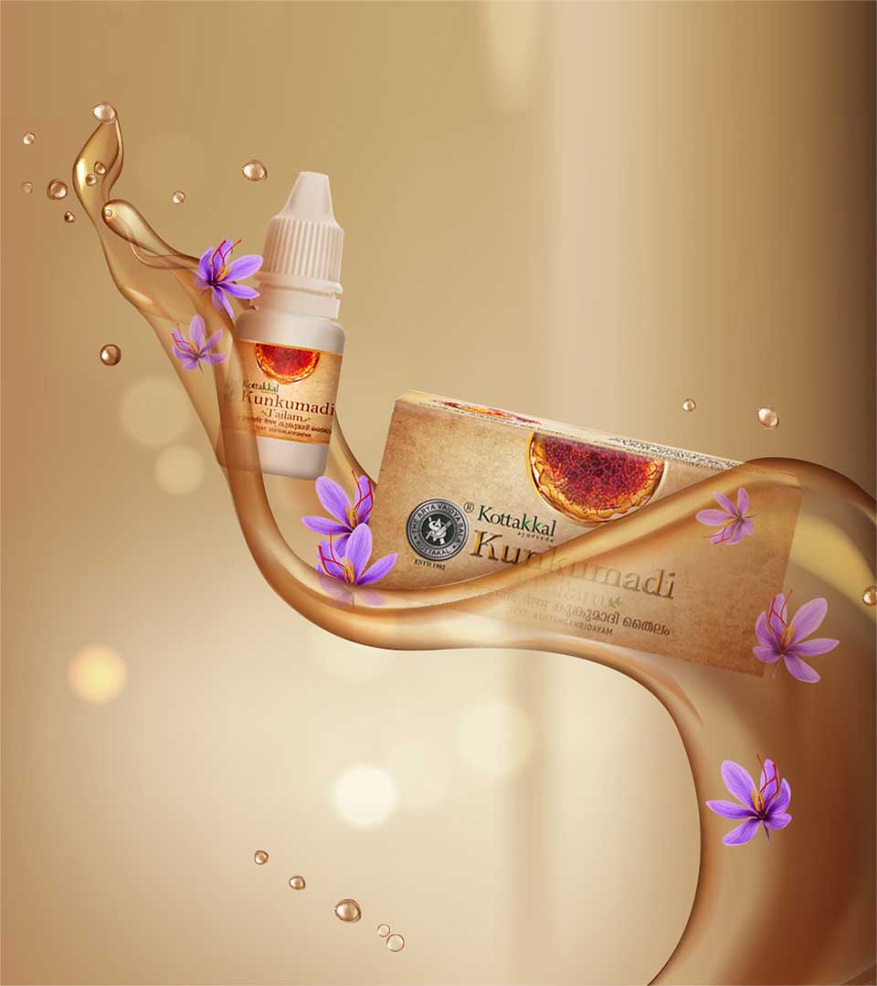
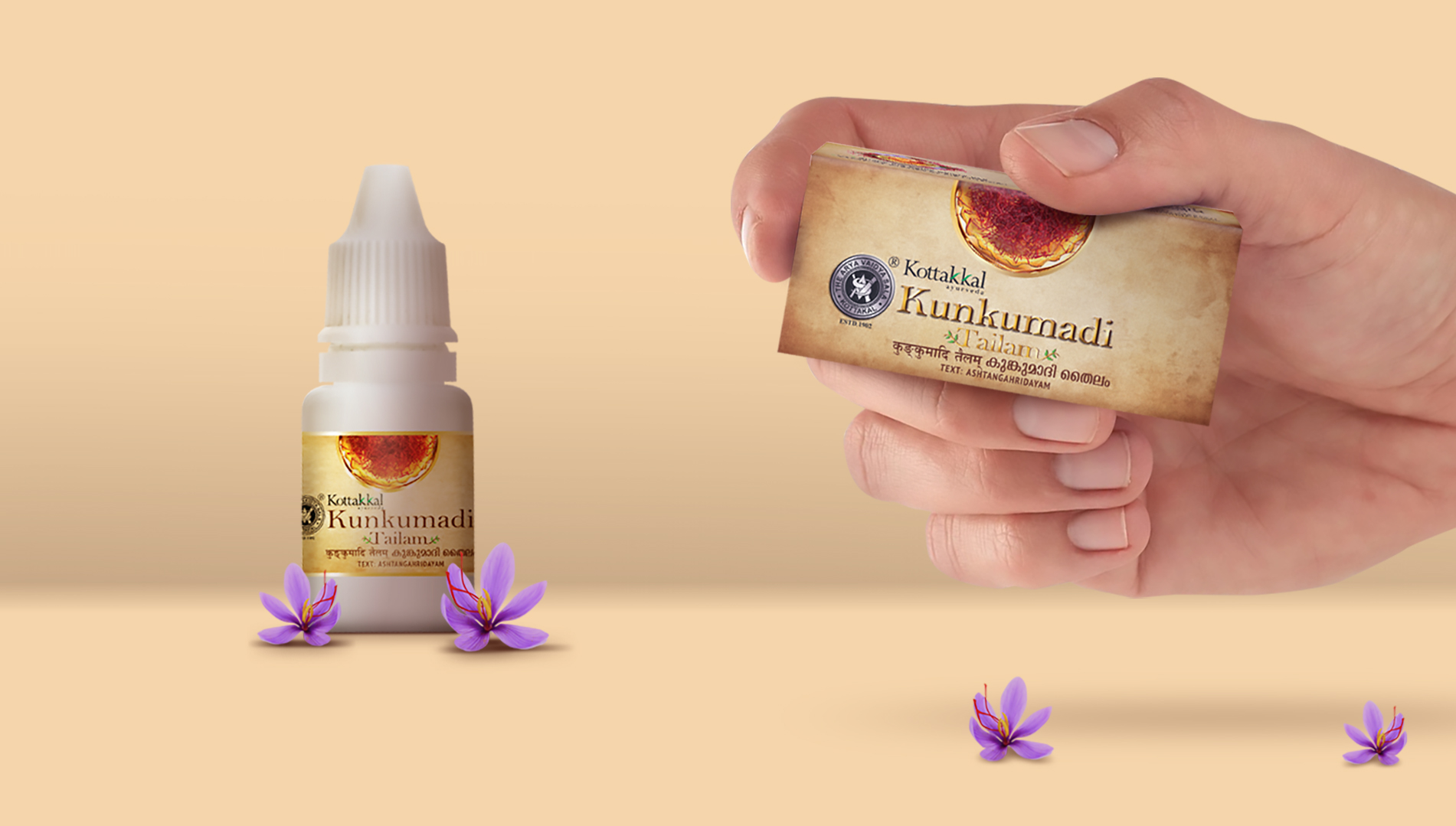
The packaging design for Kunkumadi Tailam incorporates a serene and earthy aesthetic that reflects the product’s Ayurvedic roots. The primary color, an earthy brown hue, symbolizes the natural elements and the product’s grounding properties. This color choice also complements the saffron motifs that adorn the packaging, creating a cohesive and visually appealing design.

Key Design Elements
Saffron Motif: The saffron motif, prominently featured on the packaging, represents the core ingredient of the product. Saffron is known for its skin-brightening and anti-inflammatory properties, and the motif reinforces the product’s efficacy.
Minimalist Typography: The typography is clean and minimalist, allowing the saffron motif to take center stage. The font choice is elegant and complements the overall aesthetic of the packaging.
Informative Labeling: The packaging includes clear and concise labeling, highlighting the product’s key benefits, ingredients, and usage instructions. This ensures that consumers can easily understand the product’s value proposition.
Premium Materials: The choice of materials for the packaging adds to the perceived premium quality of the product.
Gold Accents: These accents add a touch of luxury and sophistication, elevating the overall aesthetic.