

The Concept
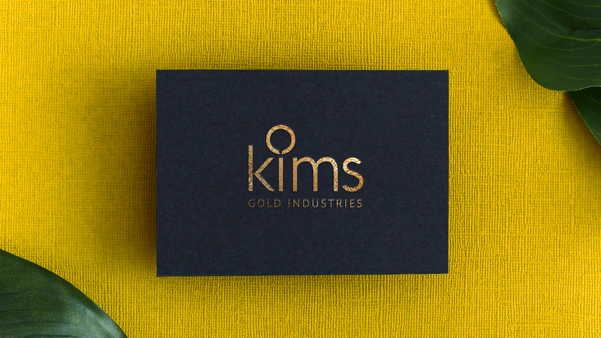
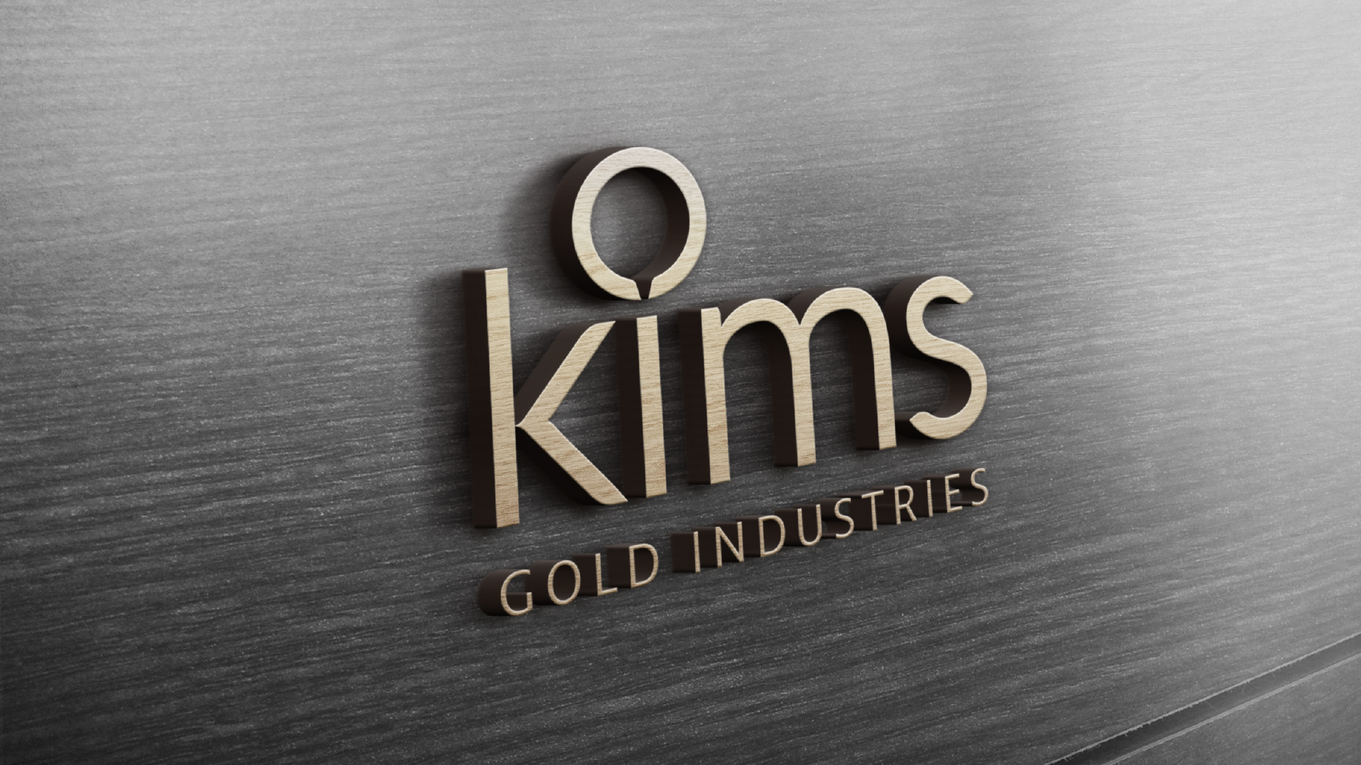
The circular motif at the core of the logo evokes the shape of a gold-melting furnace, a central element in the company’s manufacturing process.
The Logo
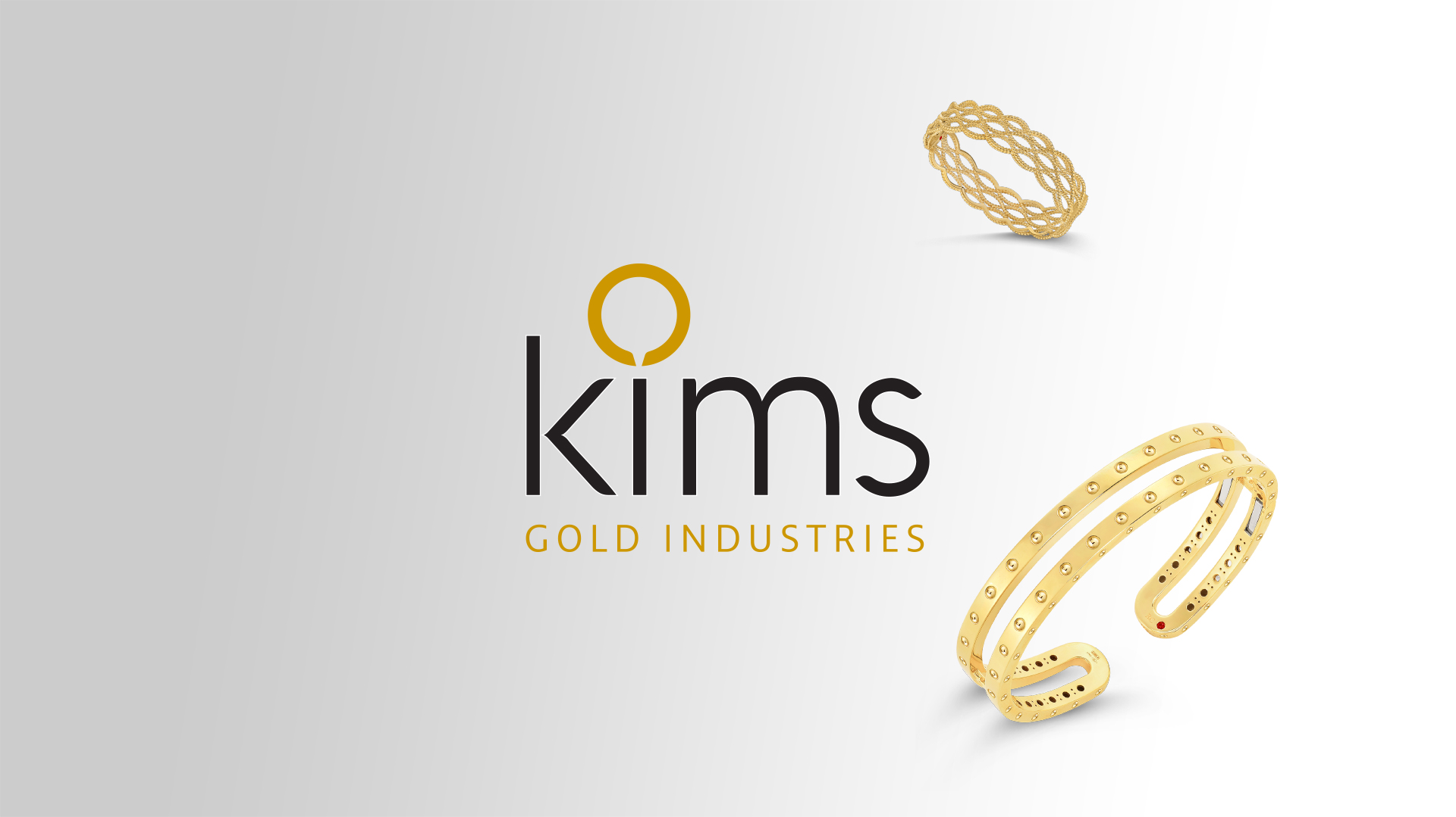
The circular shape in the logo suggests the molten gold as it pours from the furnace, a dynamic image that captures the transformative nature of the gold-making process. The typography is clean, modern, and easily legible. The font choice complements the circular element and contributes to the overall aesthetic. The combination of gold and dark gray adds a touch of sophistication and alludes to the traditional craftsmanship involved in gold-making.
Gold symbolizes wealth, luxury, and the precious nature of the product, while dark gray adds a grounding element.



The Brand Identity
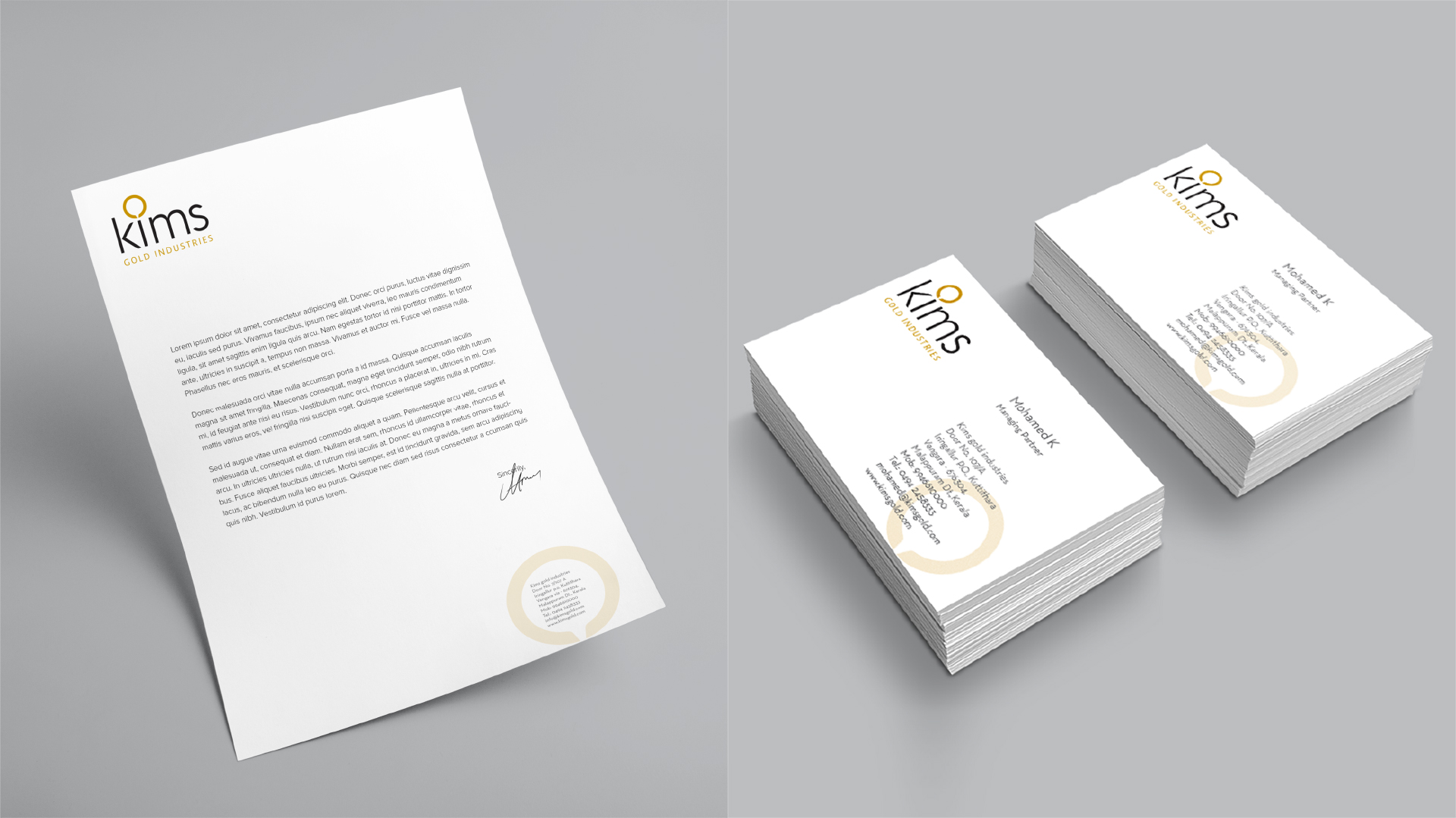
The integration of the furnace ring motif into the brand identity, as evidenced in packaging designs and stationeries, reinforces the logo’s symbolism and creates a cohesive visual language for the brand. This consistent use of the motif strengthens brand recognition and establishes a strong connection between the logo and the company’s core values.

