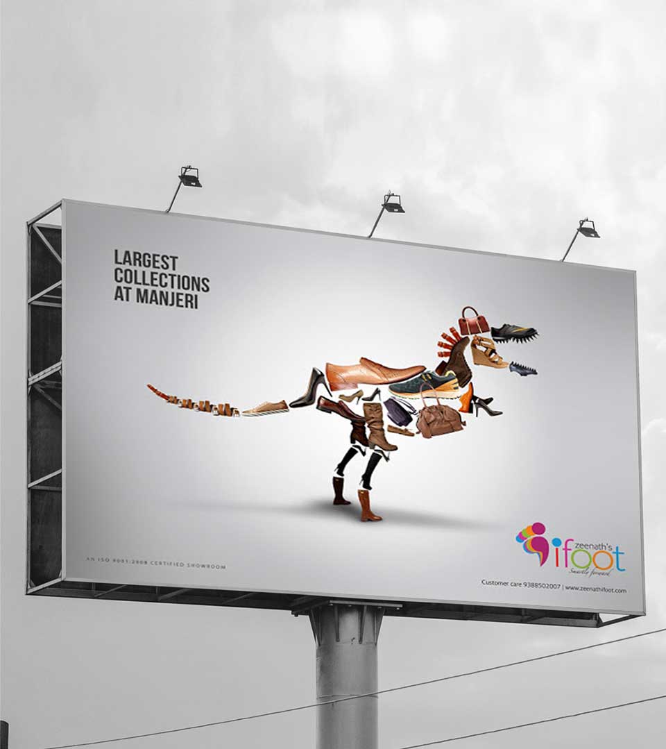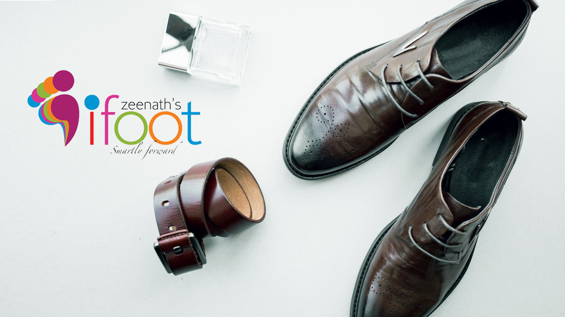
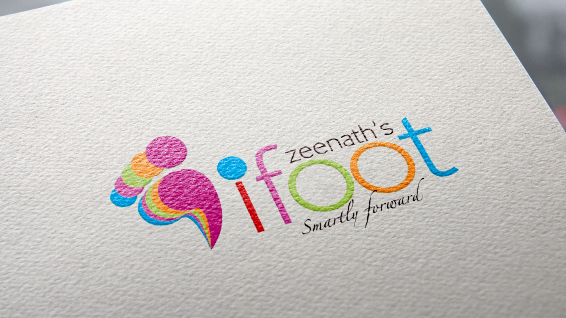
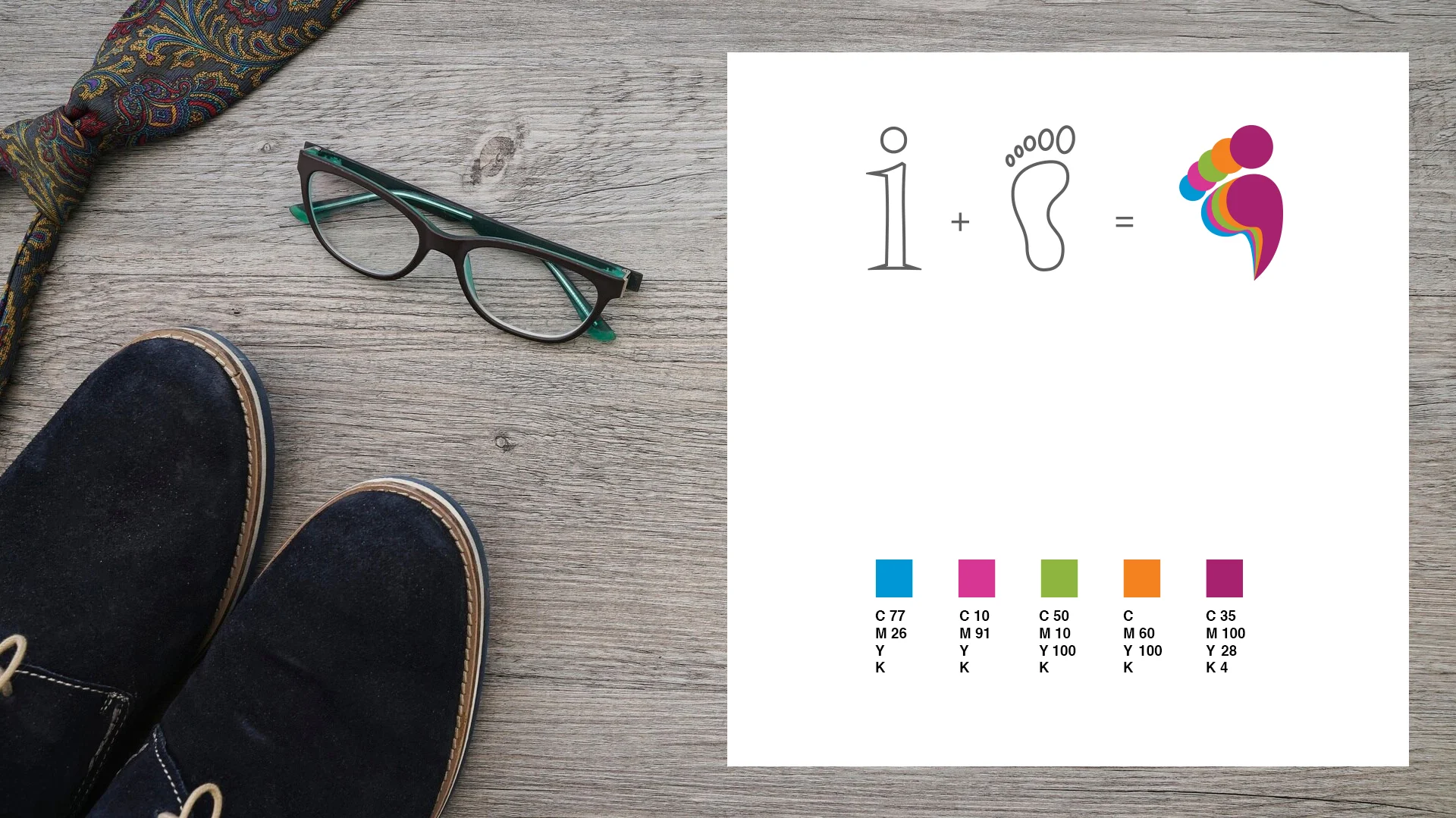
The Logo
The most prominent element of the logo is the stylized footprints, a direct and literal representation of the product category. It not only signifies the core offering of the brand but also evokes a sense of movement and progress.
The footprint is adorned with vibrant, contrasting colors, creating a visually engaging and dynamic composition. This color palette symbolizes energy, youthfulness, and the diverse range of styles offered by I Foot. The typography is clean, modern, and easily legible, ensuring that the brand name is instantly recognizable.
The Tagline
‘Smartly Forward’, the tagline perfectly complements the visual elements of the logo, conveying a sense of confidence, innovation, and progress. It suggests that I Foot offers footwear that not only looks good but also feels comfortable and supports an active lifestyle.
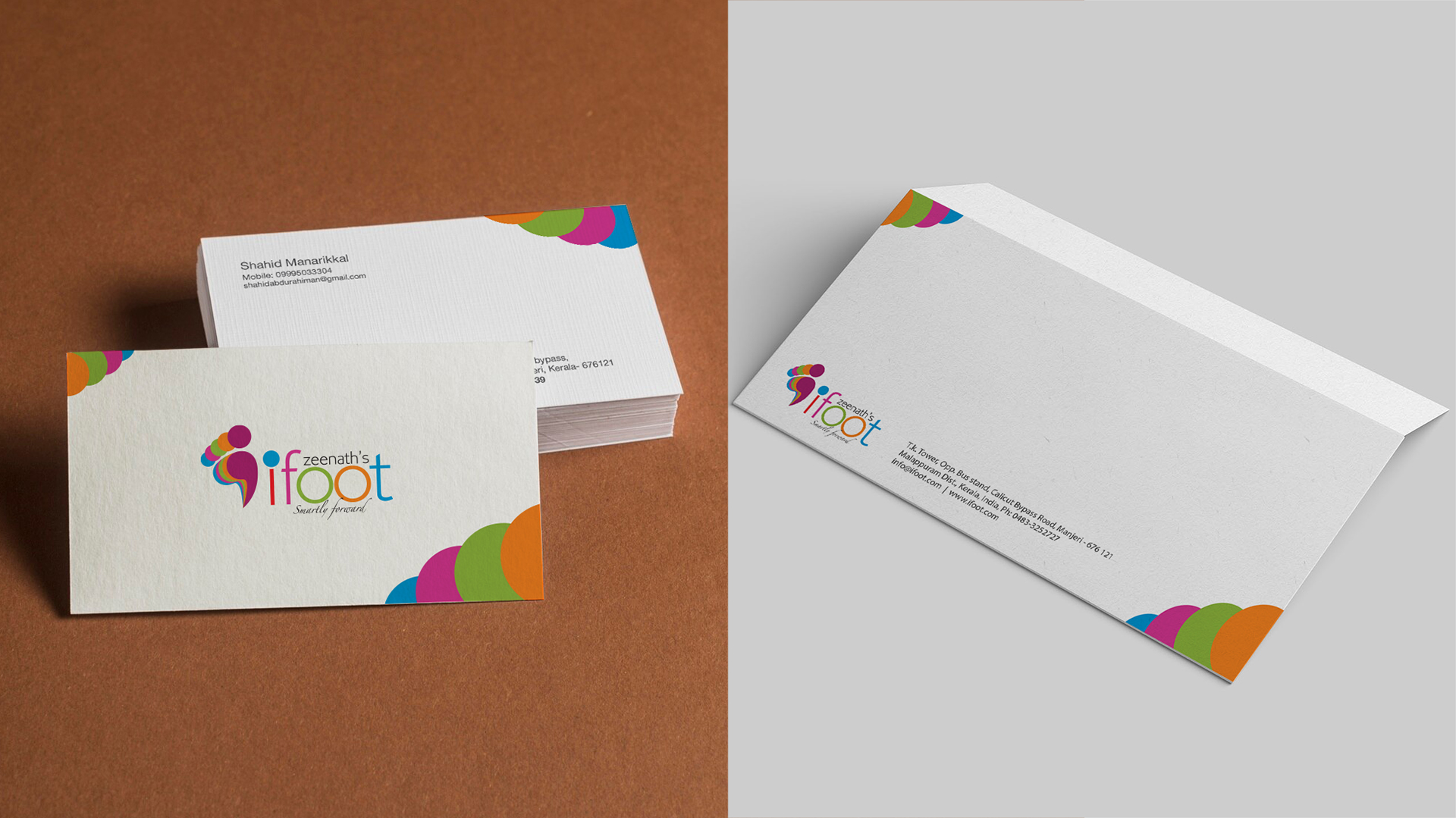
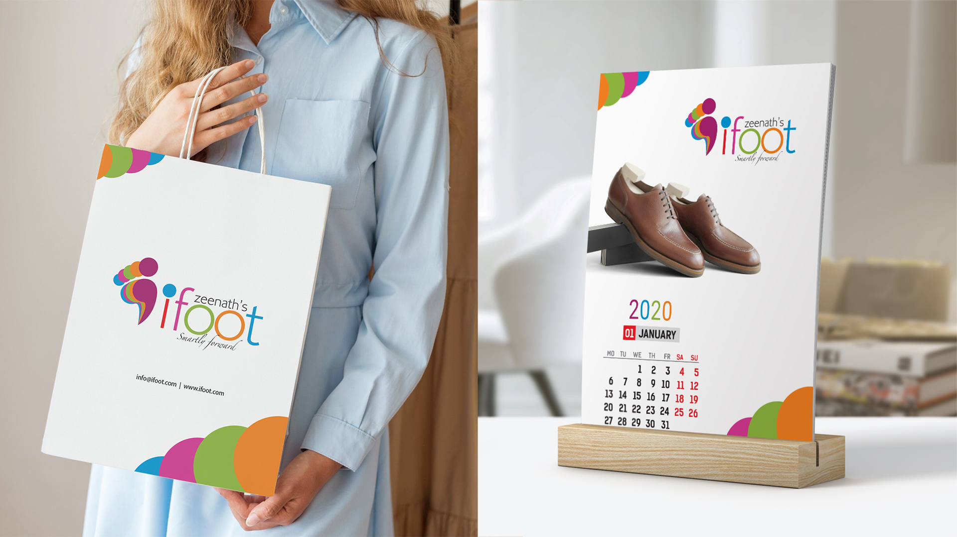
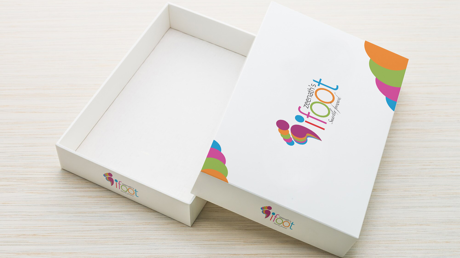
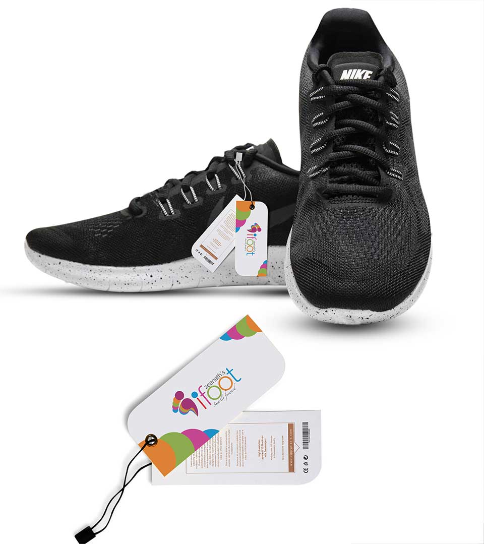
The Brand Identity
The logo’s key elements, particularly the stylized footprints and the ‘iFoot’ typography, can be used consistently across various marketing materials, such as stationery, packaging, and digital assets. This ensures a cohesive brand identity and reinforces the recognition of the I Foot brand.