The Concept
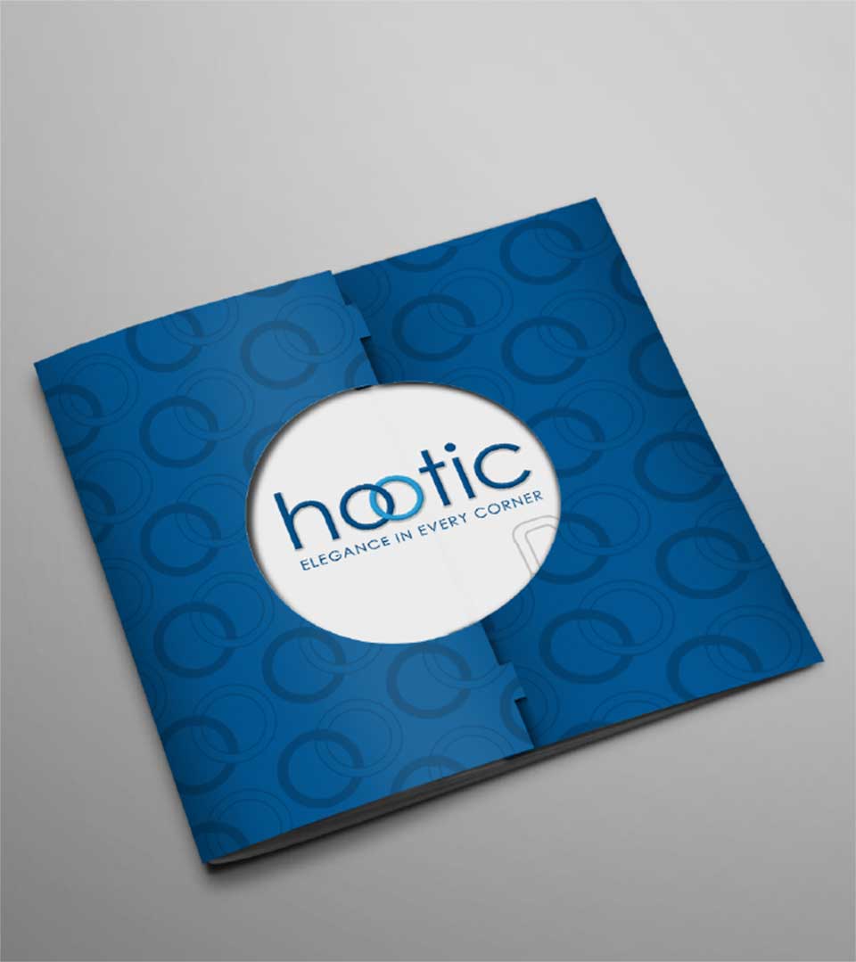
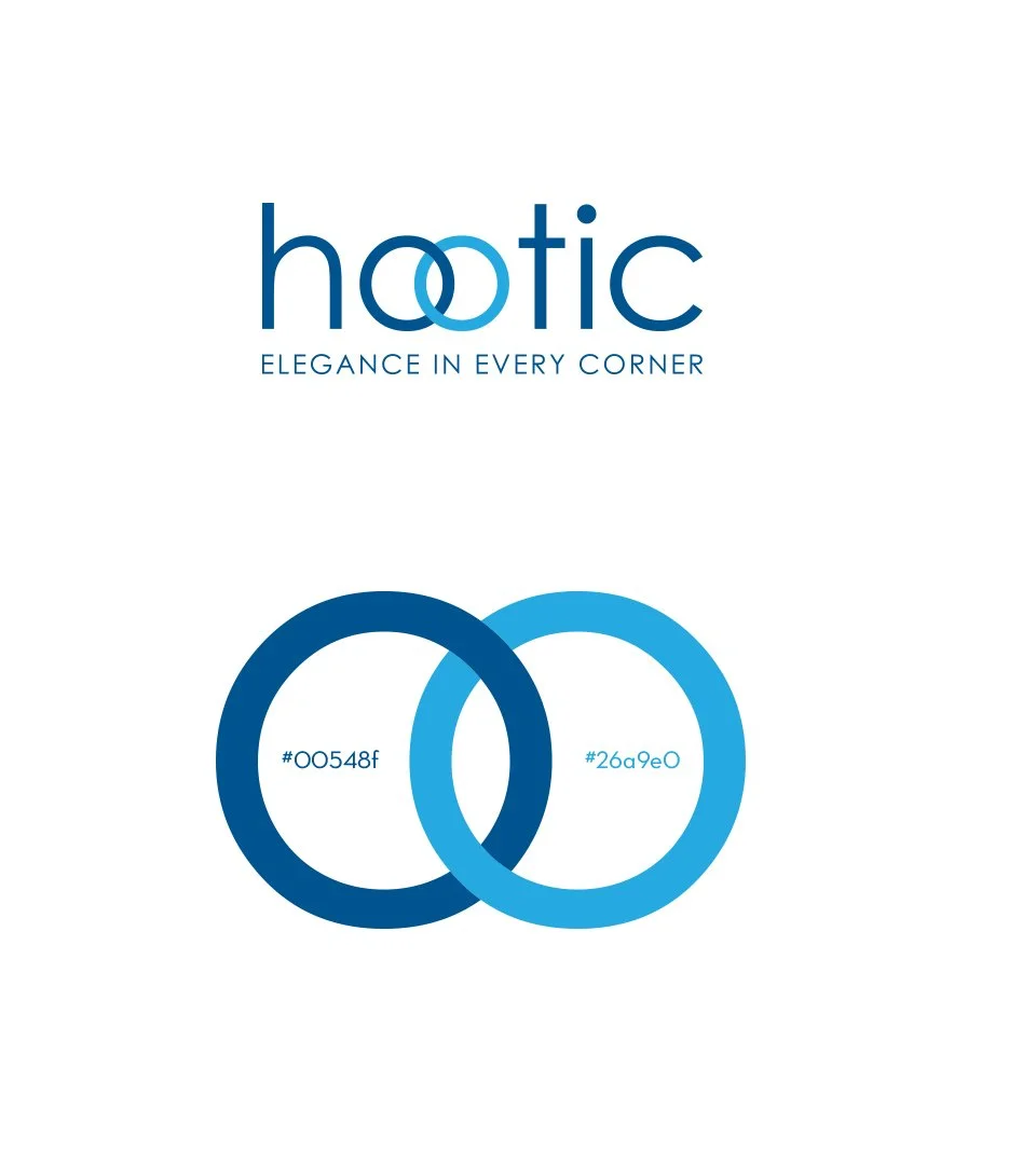
The logo symbolizes harmony. The kitchen is a place where good feelings emanate and unite. The two circles joined together represent union and harmony; Union of minds, harmony of feelings.
The Logo
The logo blends form and function. The clean typeface strikes a balance between modernity and timelessness, reflecting the brand’s commitment to contemporary design. The central element, the interconnected circles, serves as the visual heart of the logo.
The Color Pallete
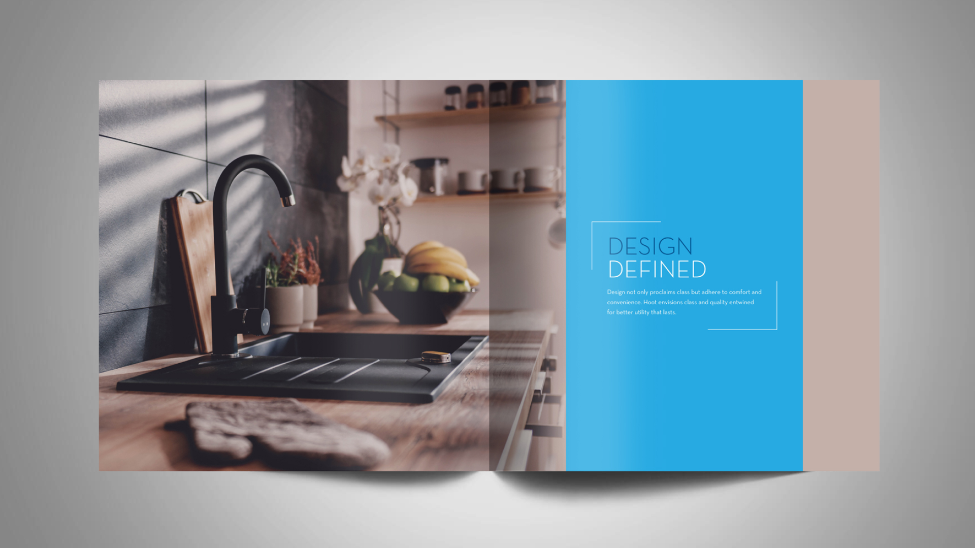
The choice of deep, rich blue, and bright sky blue suggests sophistication and elegance, aligning with the brand’s premium positioning. Blue is often associated with water, cleanliness, and freshness, which are qualities that are highly desirable in a kitchen sink. This reinforces the brand’s image as a provider of high-quality, functional, and aesthetically pleasing products.
Logo Breakdown
The two circles, gracefully joined together, symbolize the harmonious coexistence of different elements. This represents the unity of form and function, aesthetics and practicality, and ultimately, the harmonious integration of a HOOTIC sink into any kitchen space.
Also, the interconnected circles evoke the imagery of water flowing from a tap into a sink. The circles represent the valve and the water stream, respectively to form the circles. This subtle yet powerful metaphor underscores the functional aspect of the brand while maintaining an elegant aesthetic.
The Tagline
‘Elegance in Every Corner’ complements the logo’s message of harmony and sophistication. It suggests that a Hootic sink not only enhances the functionality of a kitchen but also adds a touch of elegance to every space.
The Brand Identity
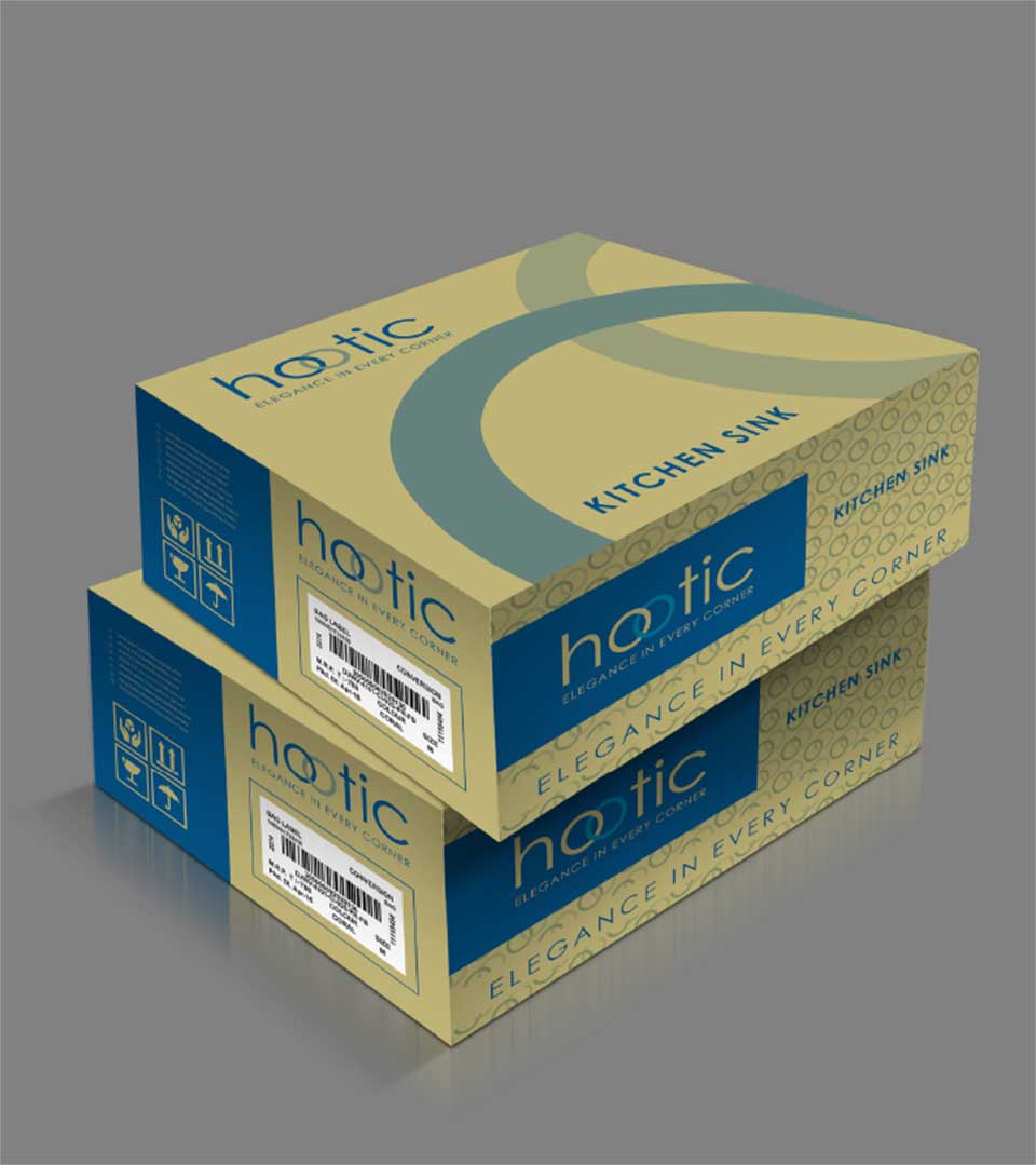
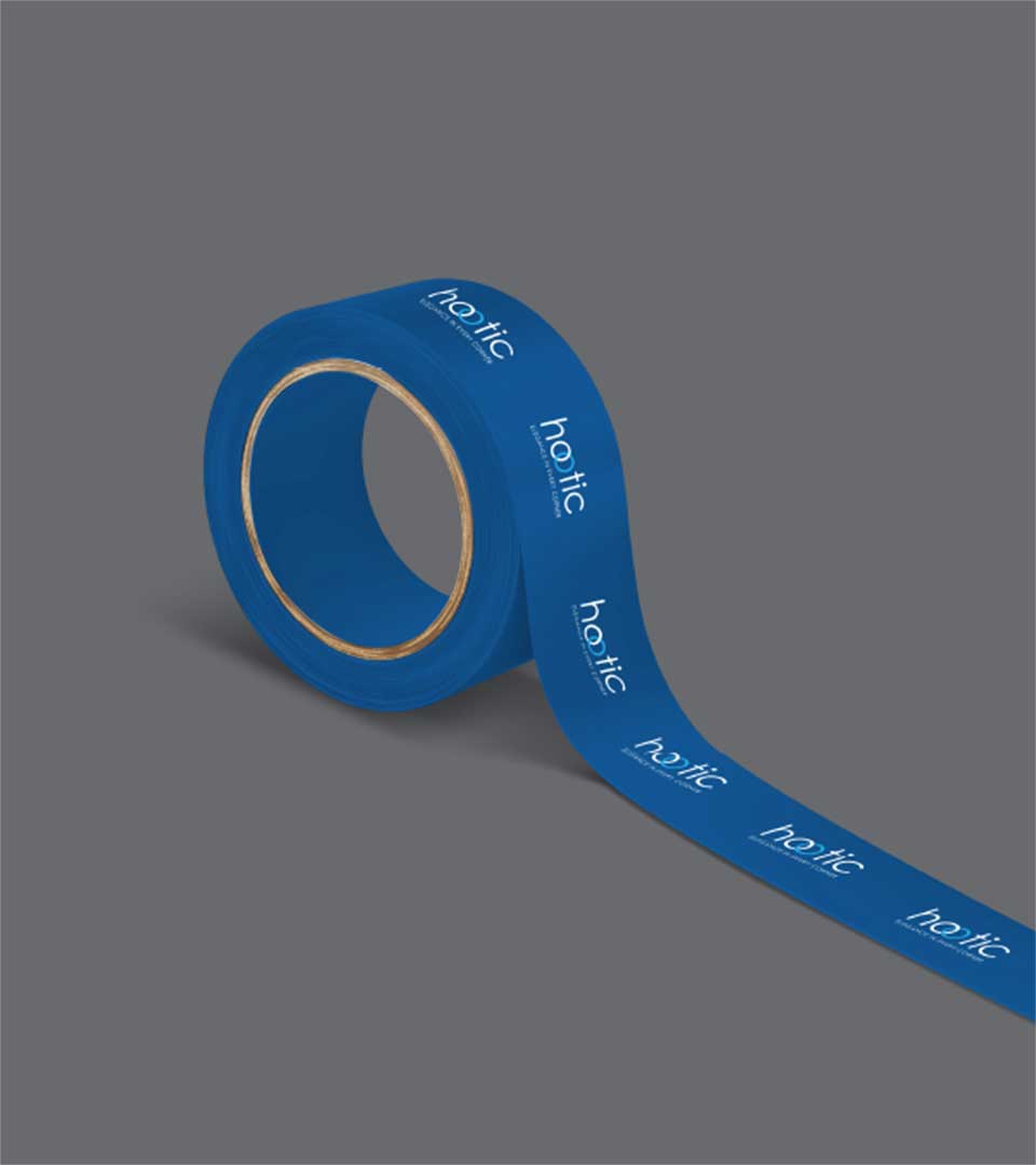
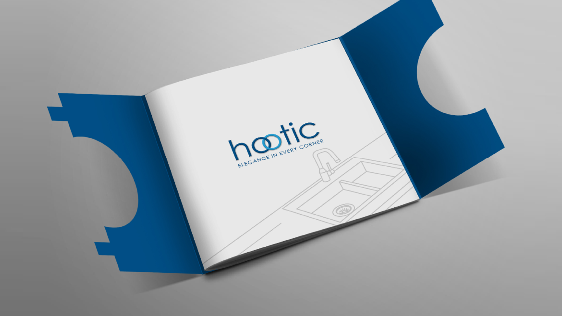
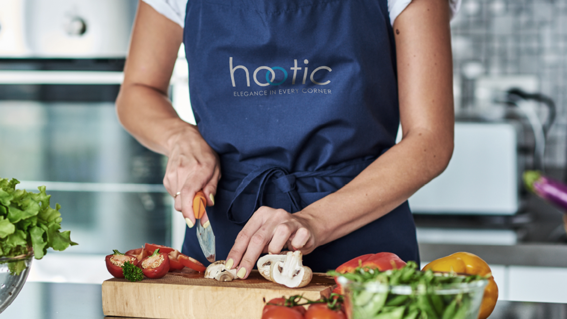
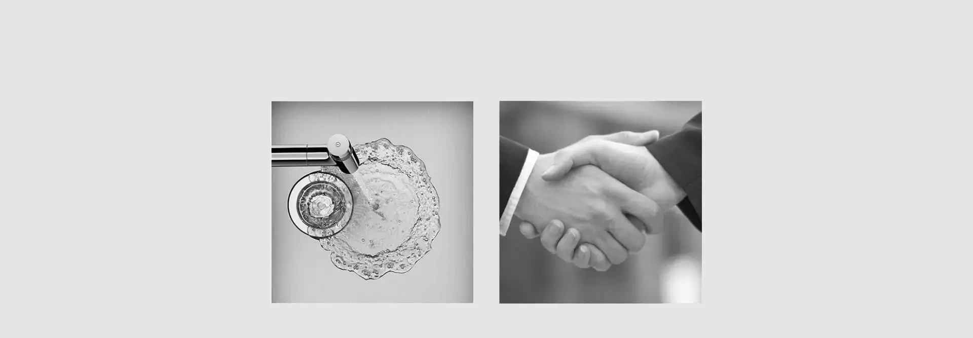
The interconnected circles, a distinctive element of the logo, have been incorporated into the brand identity across various touchpoints. From packaging designs to stationery and brochures, this element serves as a visual cue that connects all brand communications.