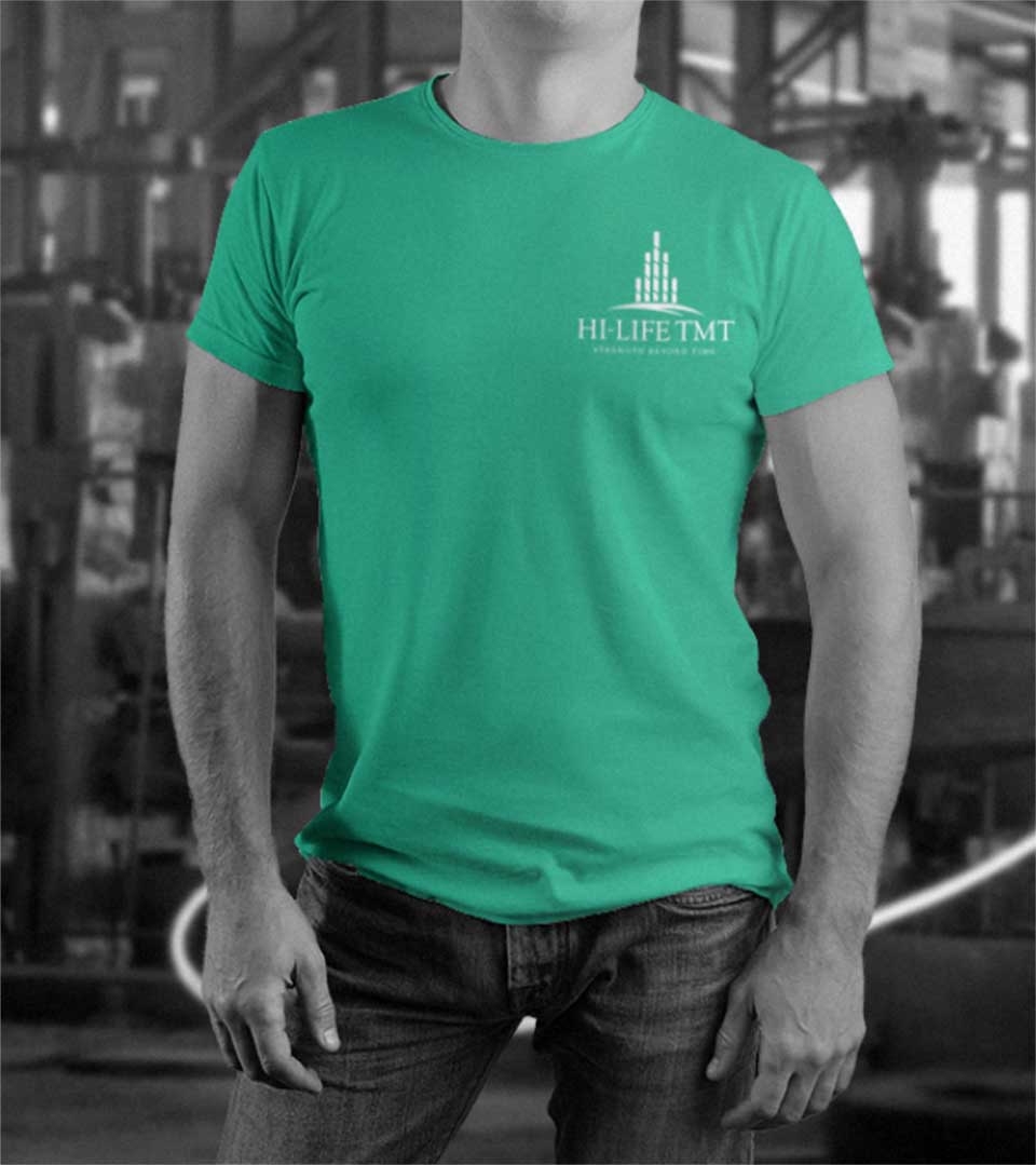
The Logo
The brand name Hi Life is aptly blended into the logo. The five steel bars represent the upcoming building and the leaf beneath represents life.
The design is a harmonious blend of abstract and figurative elements, each carefully chosen to convey a specific message. The towering structure, formed by five stylized steel bars, symbolizes the brand’s strength and resilience. It evokes imagery of infrastructure, underscoring HiLife TMT’s role in shaping the built environment.
The leaf motif beneath the tower represents life, growth, and sustainability. It signifies the company’s commitment to eco-friendly practices and its contribution to a greener future.

The Color Palette
The teal with a hint of green hues chosen for the logo conveys a sense of freshness, vitality, and reliability. They also allude to the recyclable nature of steel, reinforcing HiLife’s eco-conscious approach.
The Fusion of Brand Name and Symbolism
The brand name ‘HiLife’ is seamlessly integrated into the logo, reinforcing its identity. The juxtaposition of the abstract tower and the organic leaf creates a visual tension that reflects the company’s balance between modern technology and natural resources.
Breaking the Mold
The logo’s soft and elegant aesthetic deviates from the industry norm, setting HiLife TMT apart from its competitors. By choosing a more refined approach, the brand positions itself as a forward-thinking company that values quality and innovation.
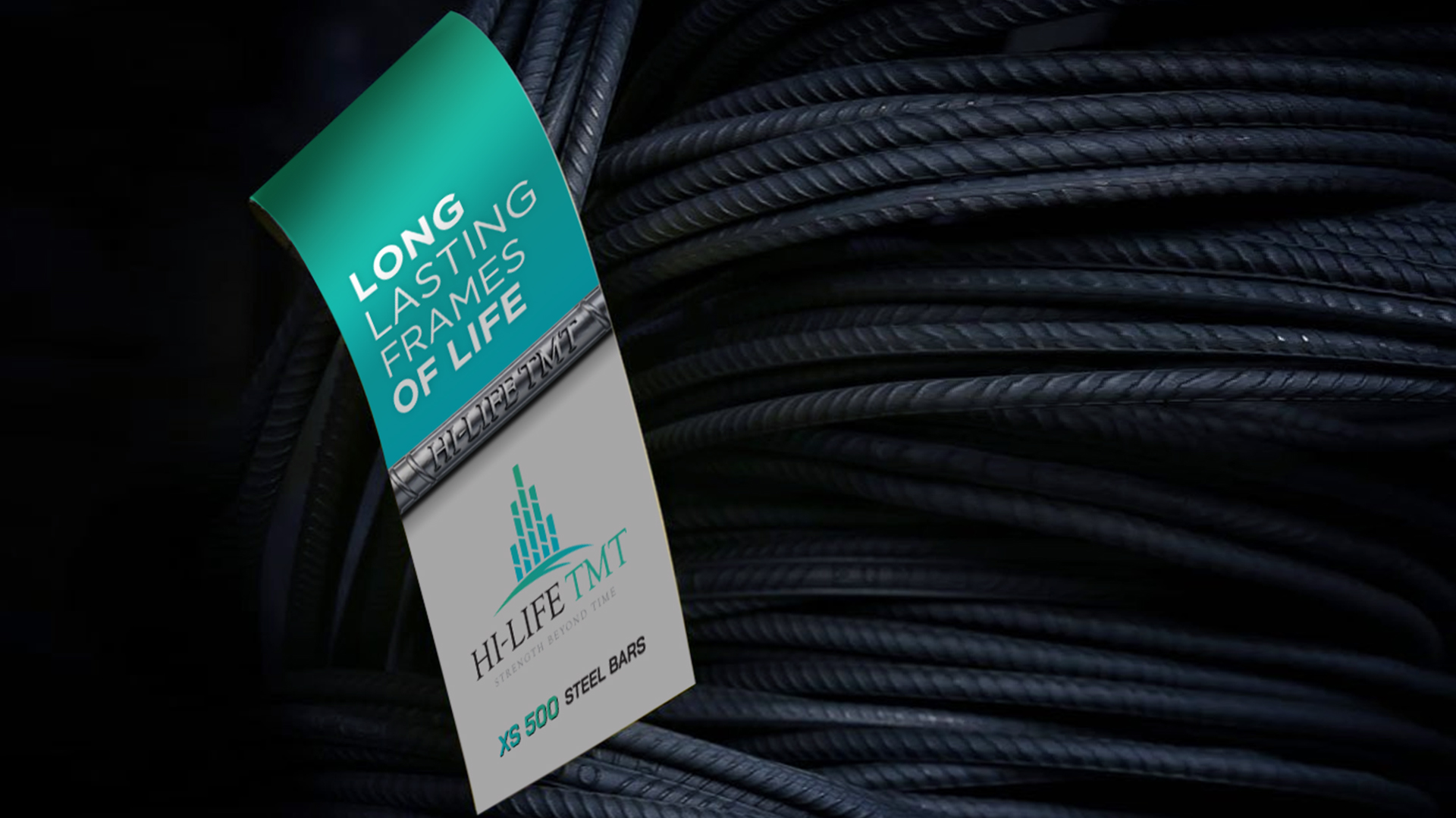
The Tagline
The tagline ‘Strength beyond time’ perfectly complements the logo and reinforces the brand identity. The phrase ‘beyond time’ suggests that HiLife TMT products are built to last, enduring the test of time and remaining strong and reliable for years to come.
‘Strength beyond time’ effectively communicates the core values of HiLife and reinforces the brand’s reputation for quality, durability, and reliability.
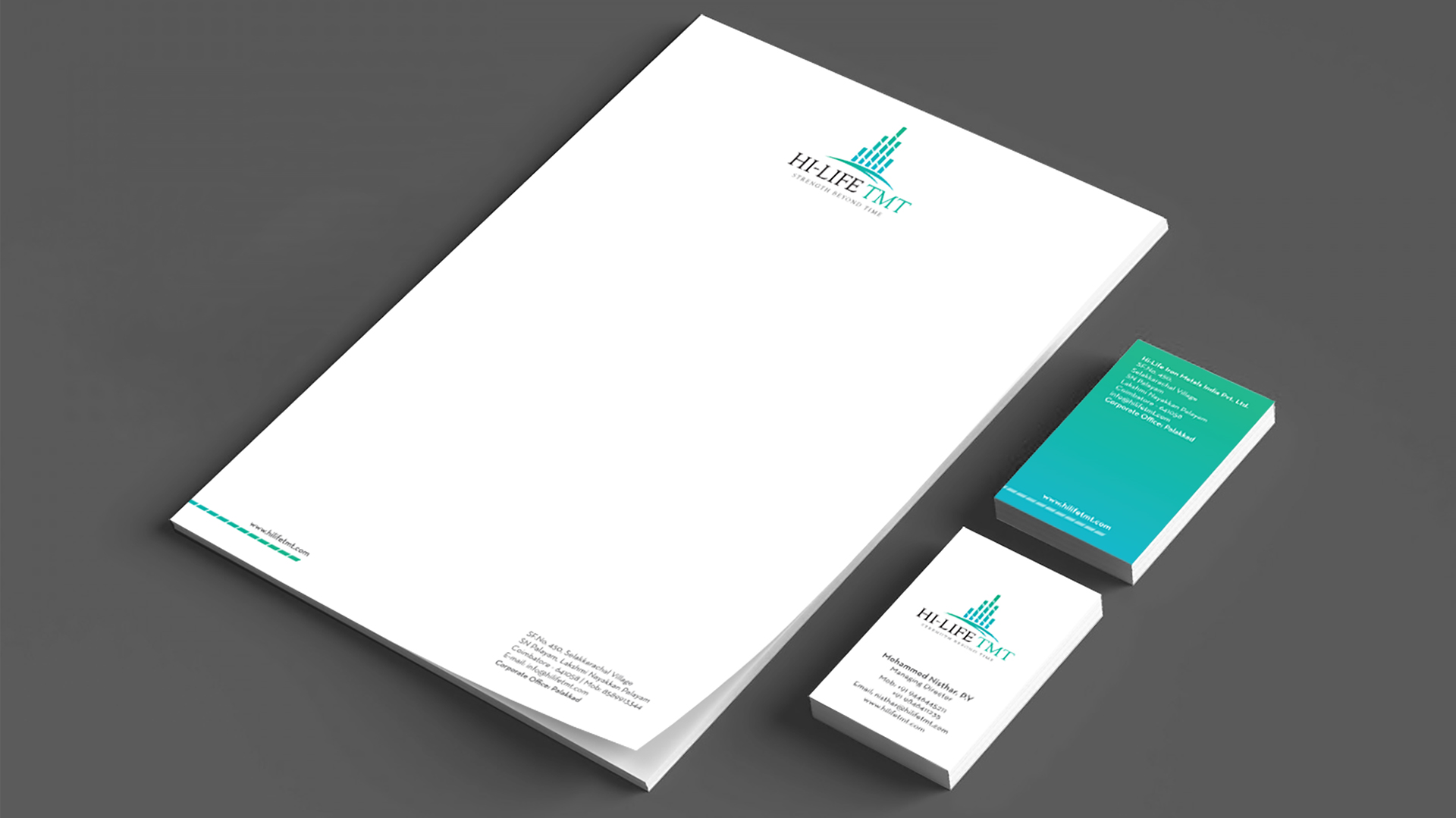
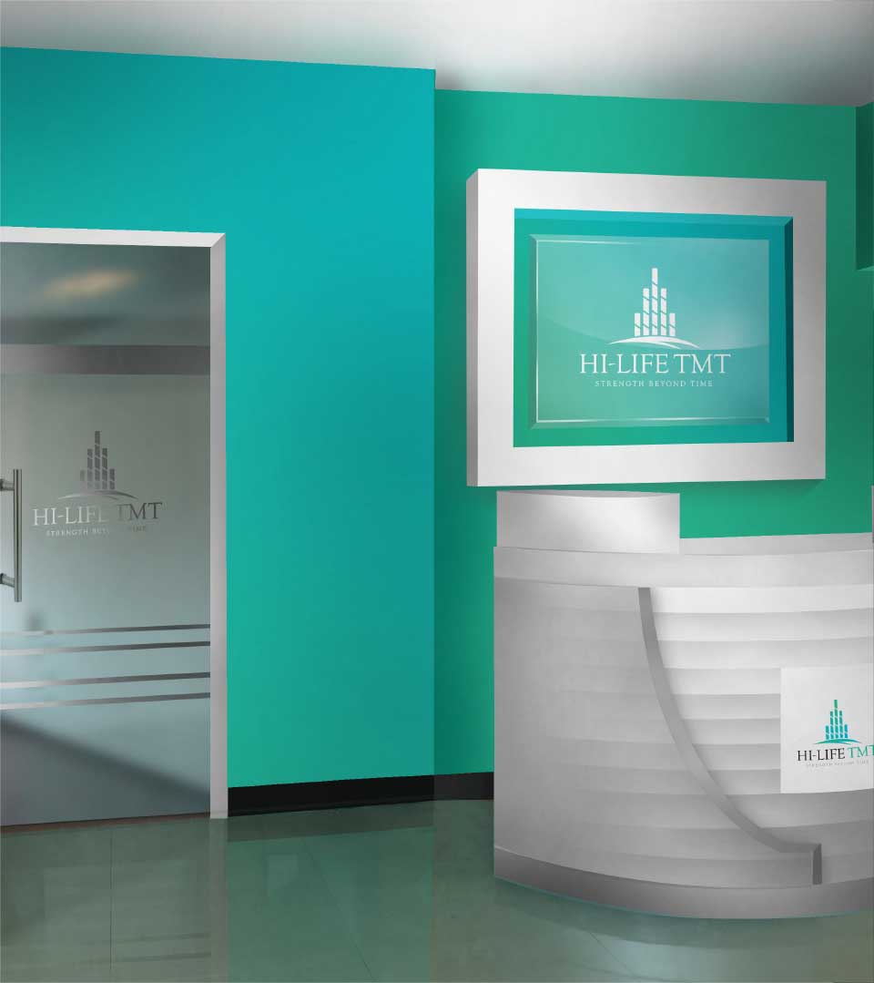
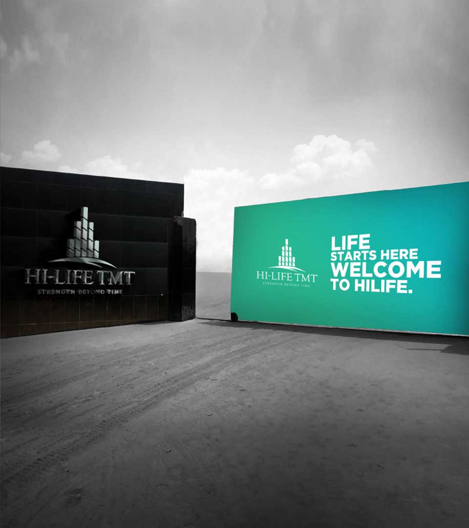
The Brand Identity
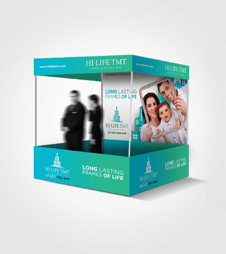
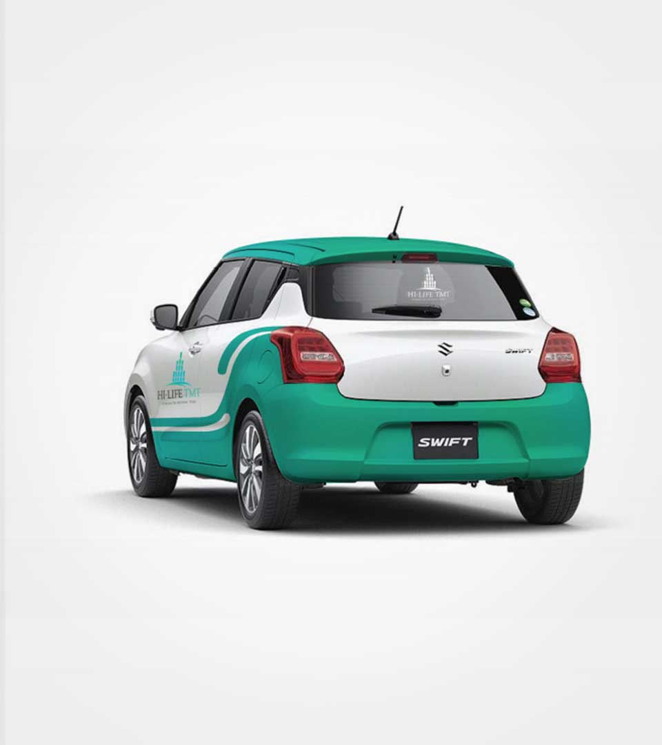
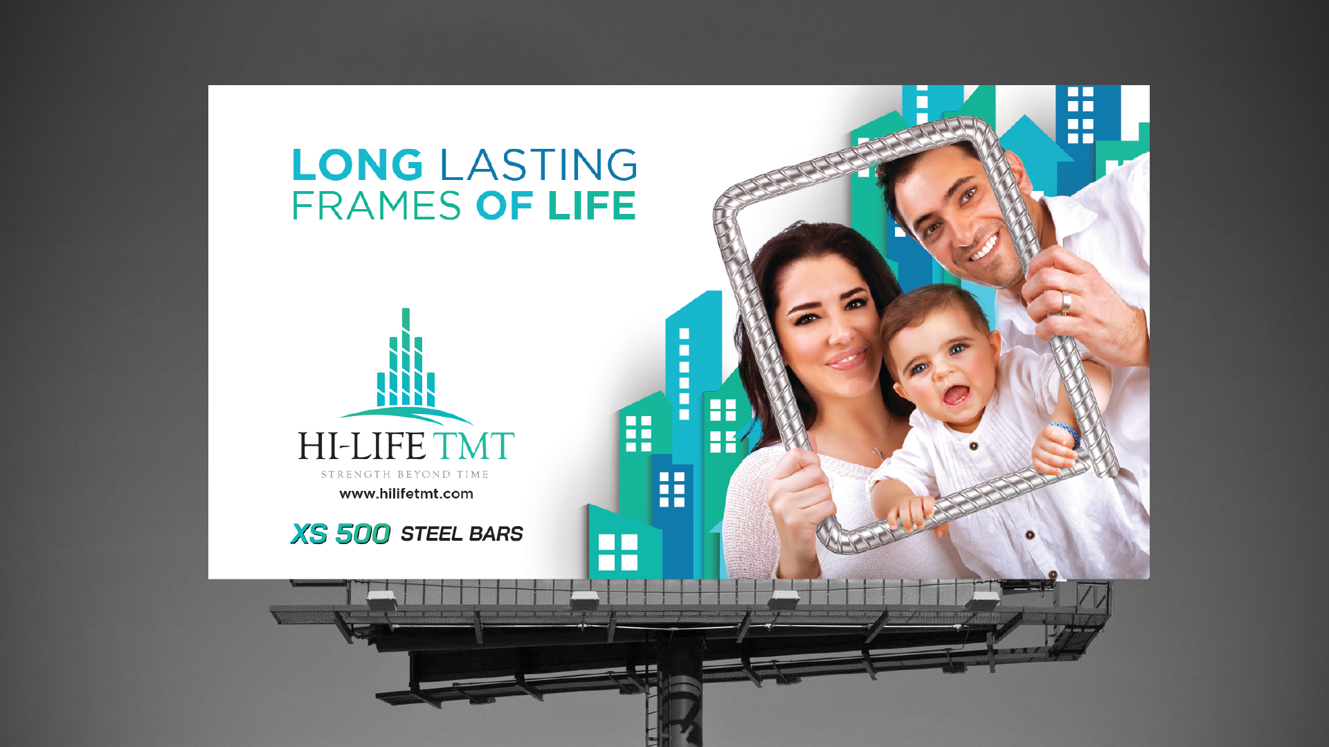
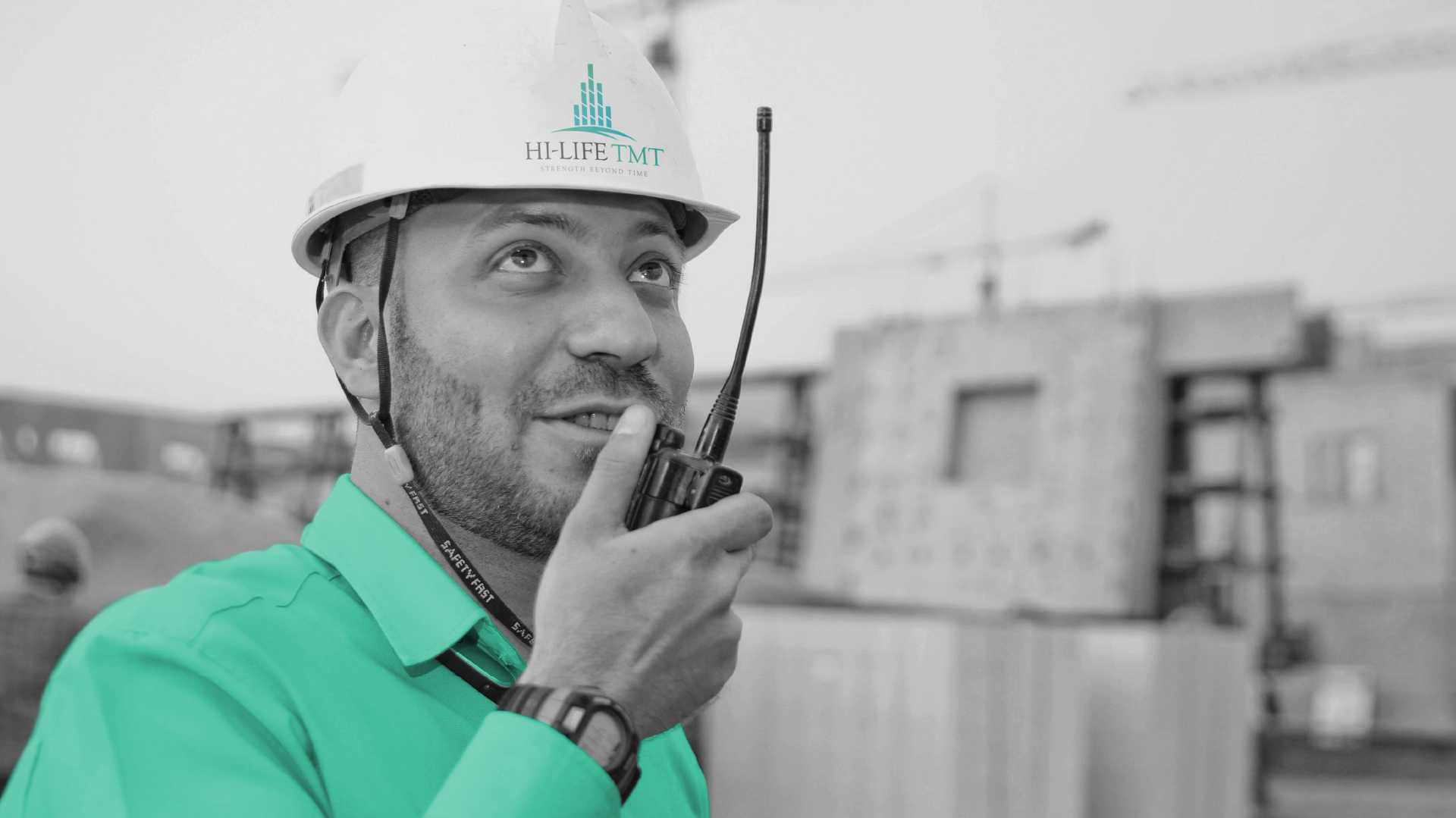
The color palette chosen for HiLife plays a crucial role in establishing the brand’s identity. The combination of the gradient of teal evokes a sense of freshness, vitality, and sustainability. This color scheme aligns with the brand’s commitment to eco-friendly practices and its association with the natural world.
By consistently using this color palette across various marketing materials, HiLife creates a strong visual association that reinforces its brand values and makes it instantly recognizable to consumers.