The Focus
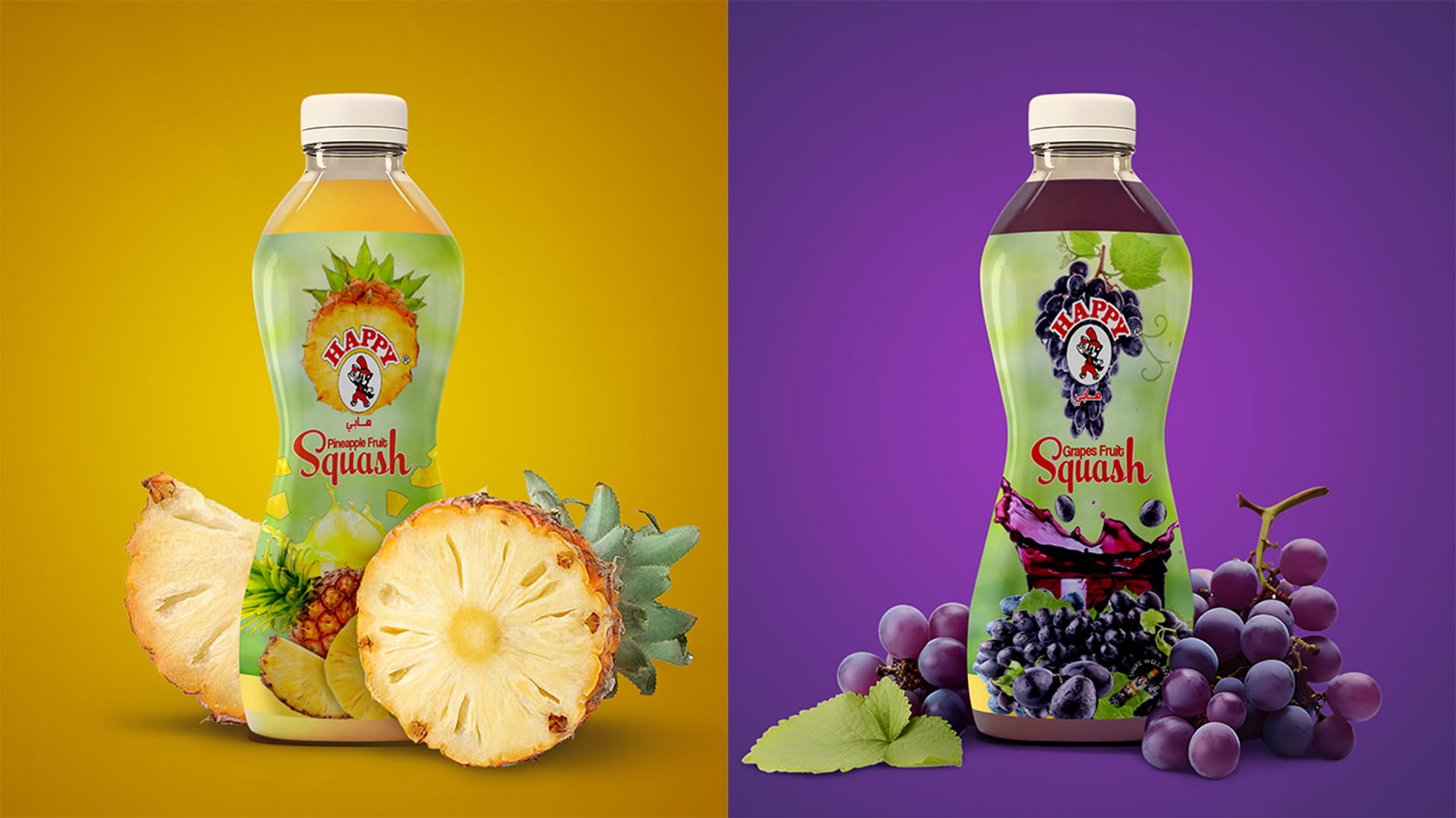
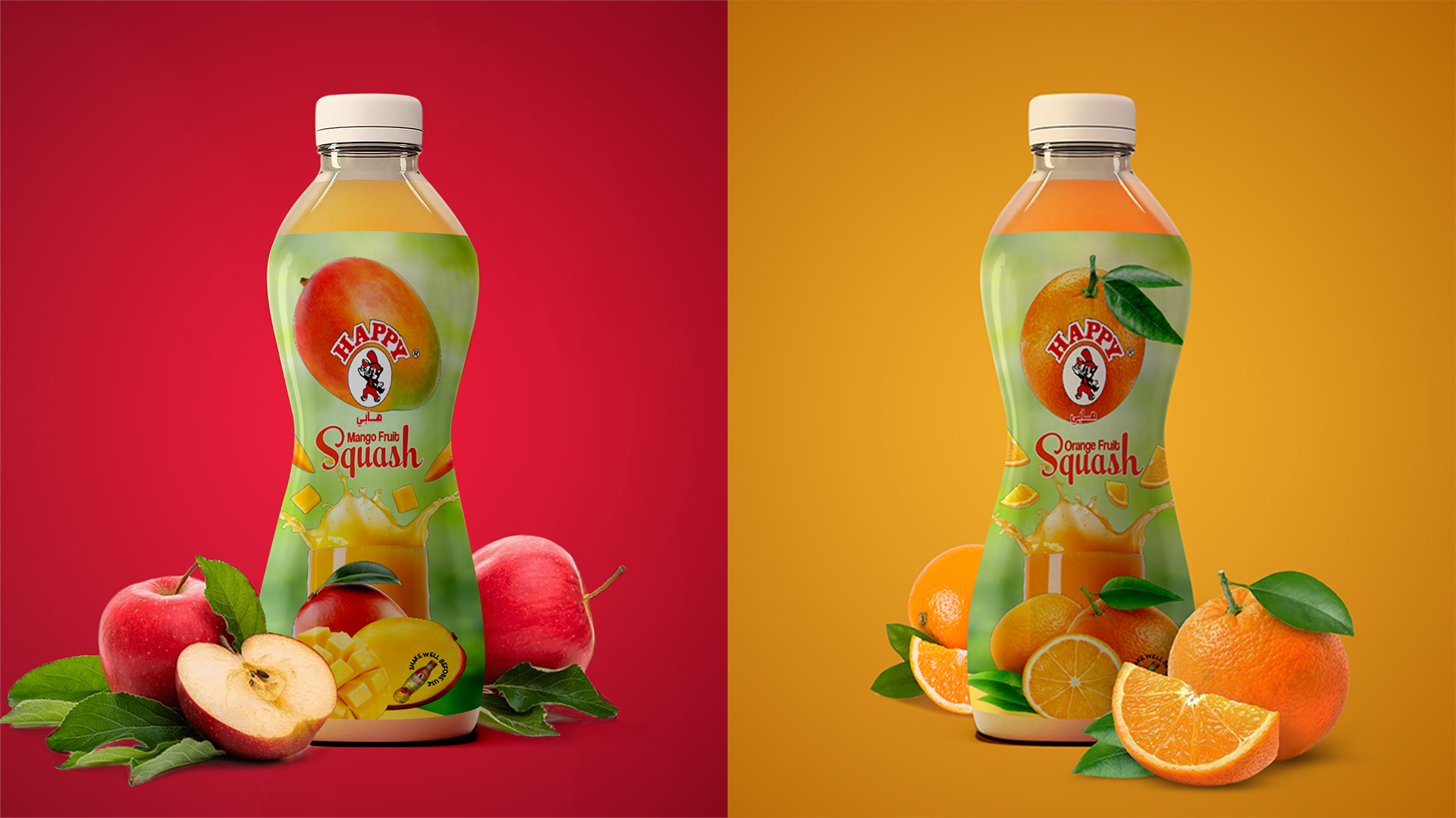
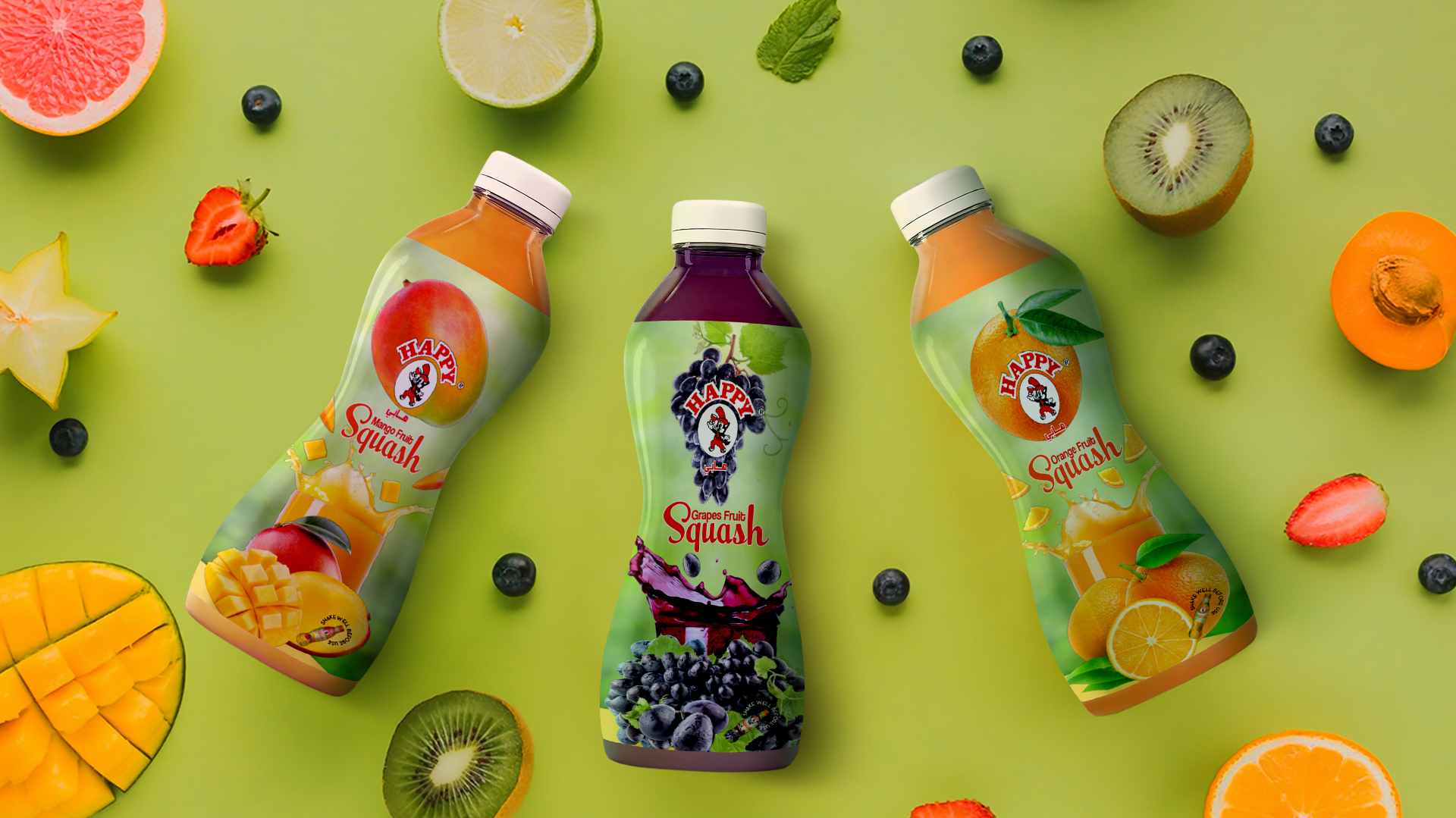
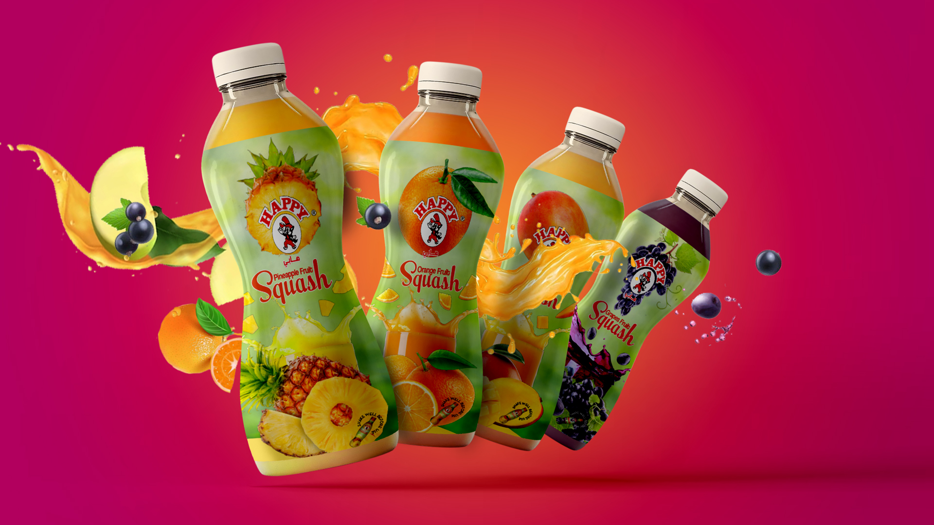
The primary focus of the redesign was to highlight the unique ingredients of each squash flavor. By incorporating visual cues related to the specific ingredients, we aimed to create a more engaging and informative packaging experience. Additionally, the design needed to reflect the brand’s association with freshness and life, while also appealing to a wider audience.
The Design
To achieve these goals, we implemented a design strategy that centered around the concept of “nature’s splash.” A vibrant splash motif, colored in the respective flavor’s hue from the glass, was incorporated into each package. This playful element added a sense of energy and vitality, while also visually representing the refreshing nature of the product.
The color palette, dominated by green tones, further reinforced the brand’s association with freshness and natural ingredients. The green color also complemented the squash flavors, creating a cohesive and visually appealing design.
To enhance the overall aesthetic, we selected a unique font that “squeezes” when it comes to the word “Squash.” This playful typography added a touch of personality and complemented the vibrant design elements.
The redesign successfully revitalized the brand, positioning it as a fresh and exciting choice for consumers seeking a refreshing and natural beverage.
Key Design Elements
Splash motif: A dynamic visual element representing the refreshing nature of the product.
Green color palette: This evokes feelings of freshness, vitality, and natural ingredients.
Unique font: Adds personality and complements the overall design.
Ingredient-related cues: Enhances product recognition and engagement.