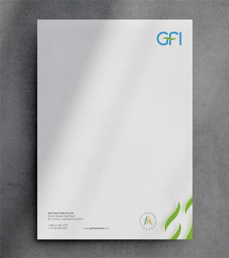

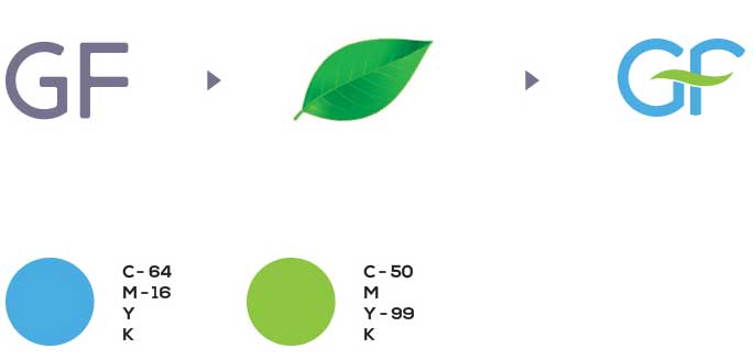
The GFI logo effectively conveys a sense of freshness, cleanliness, and natural purity, which aligns perfectly with the brand’s identity. The design is clean, modern, and visually appealing, making it suitable for various applications.
The Logo
The use of a leaf element within the logo is a strategic choice. Leaves are universal symbols of freshness, growth, and nature. This visual cue immediately connects the brand with its core values. The integration of the leaf into the letterforms suggests a harmonious relationship between nature and the product, implying that GFI’s products are derived from or inspired by natural elements.
The Color Palette
Turquoise blue is often associated with cleanliness, purity, and serenity. Lime green symbolizes growth, freshness, and vitality. Together, they create a visually appealing and meaningful combination that reinforces the brand’s identity.


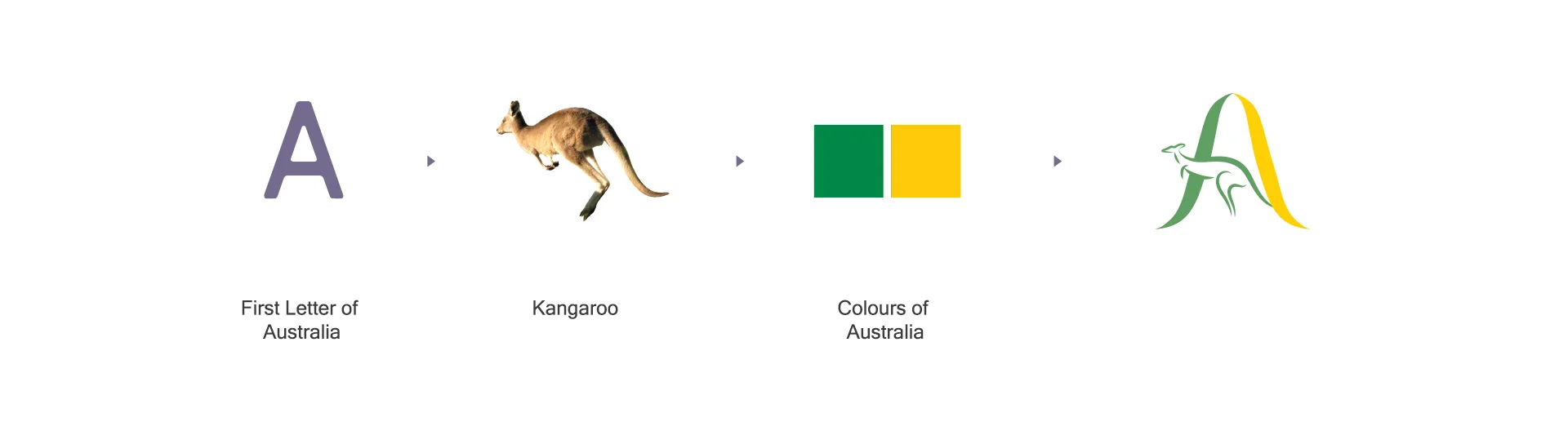
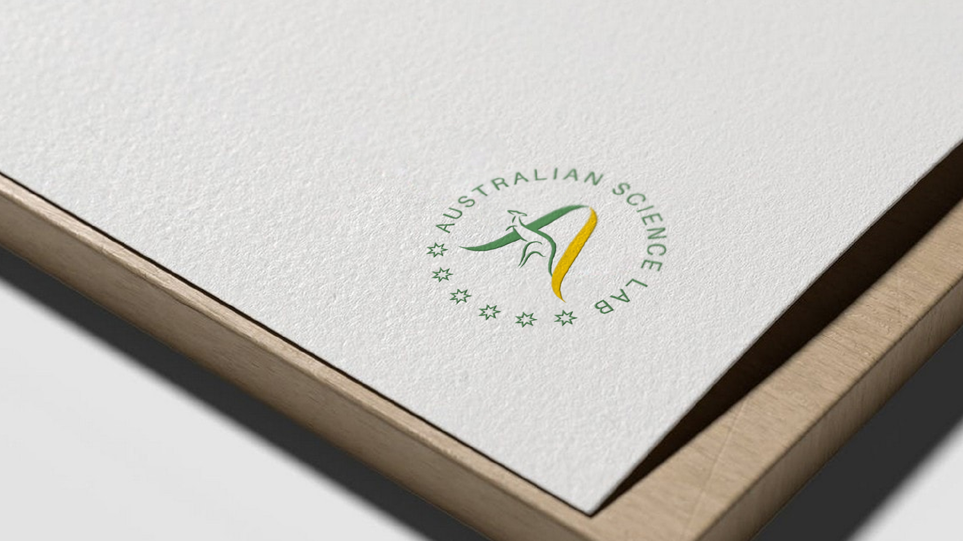
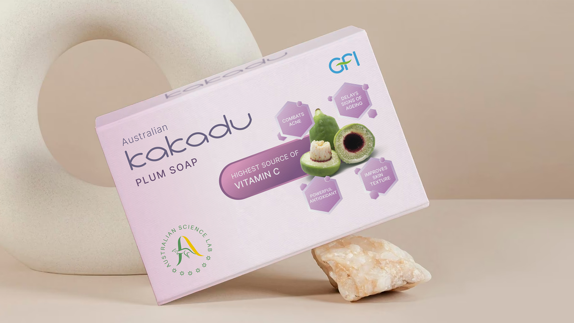
We had to design another supporting logo for GFI, to place on the packaging designs, as Australian Science Lab is where all the tests and certifications took place.
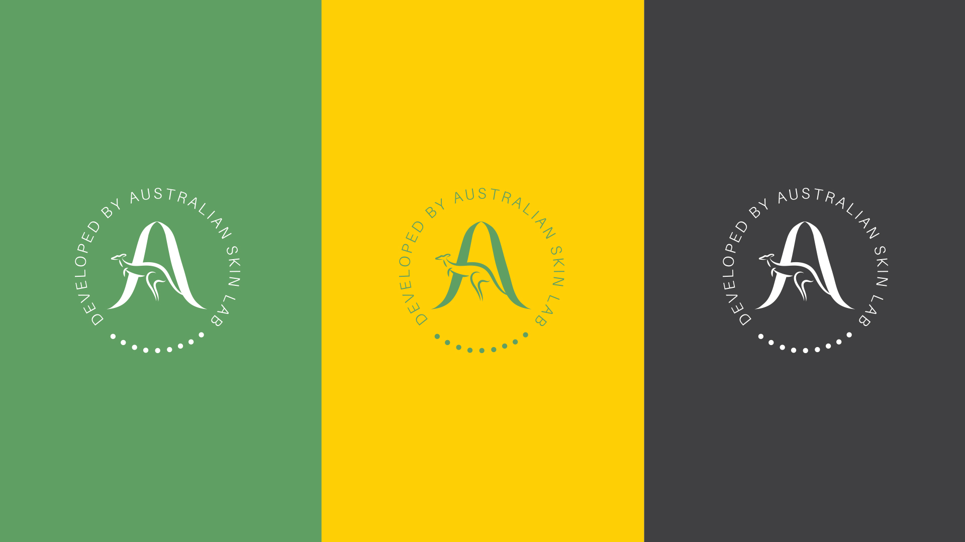
The Australian Science Lab logo effectively captures a sense of Australian identity, scientific rigor, and professionalism. The design is clean, modern, and visually appealing, making it suitable for a laboratory setting.
Key Elements and Their Significance
Kangaroo: As a quintessential Australian icon, the kangaroo symbolizes strength, agility, and resilience – qualities often associated with scientific exploration. Its dynamic pose conveys a sense of forward momentum and progress.
The letter ‘A’: Representing the first letter of “Australian”, the “A” is a central focal point. Its bold, stylized form suggests innovation and creativity. The yellow and green color gradient within the “A” adds visual interest and a connection to the Australian flag.
Circle and Text: The logo is enclosed within a circle, symbolizing unity, completeness, and a global perspective. The text “Australian Science Lab” is arranged around the circle, providing clarity and establishing the brand identity.
Stars: The five stars at the bottom likely represent the Southern Cross constellation, a prominent feature of the Australian flag. They contribute to the Australian identity of the logo.
The Brand Identity
The GFI logo successfully communicates the brand’s essence. The leaf element, color palette, and overall design effectively convey the brand’s commitment to freshness, hygiene, and natural purity. The logo is versatile and can be adapted to various applications without losing its impact. We developed a leaf pattern from the brand element from the created logo to create a brand identity over the business stationaries and marketing collaterals.