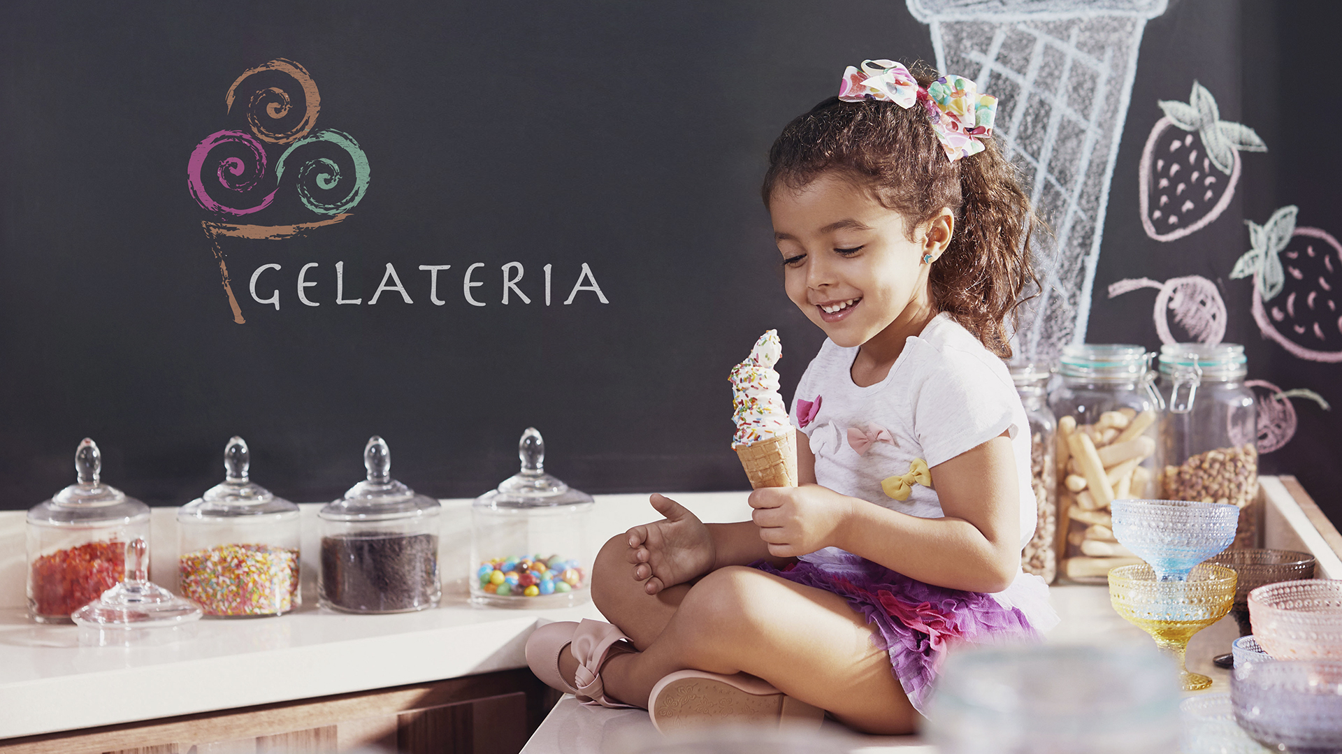

The Concept

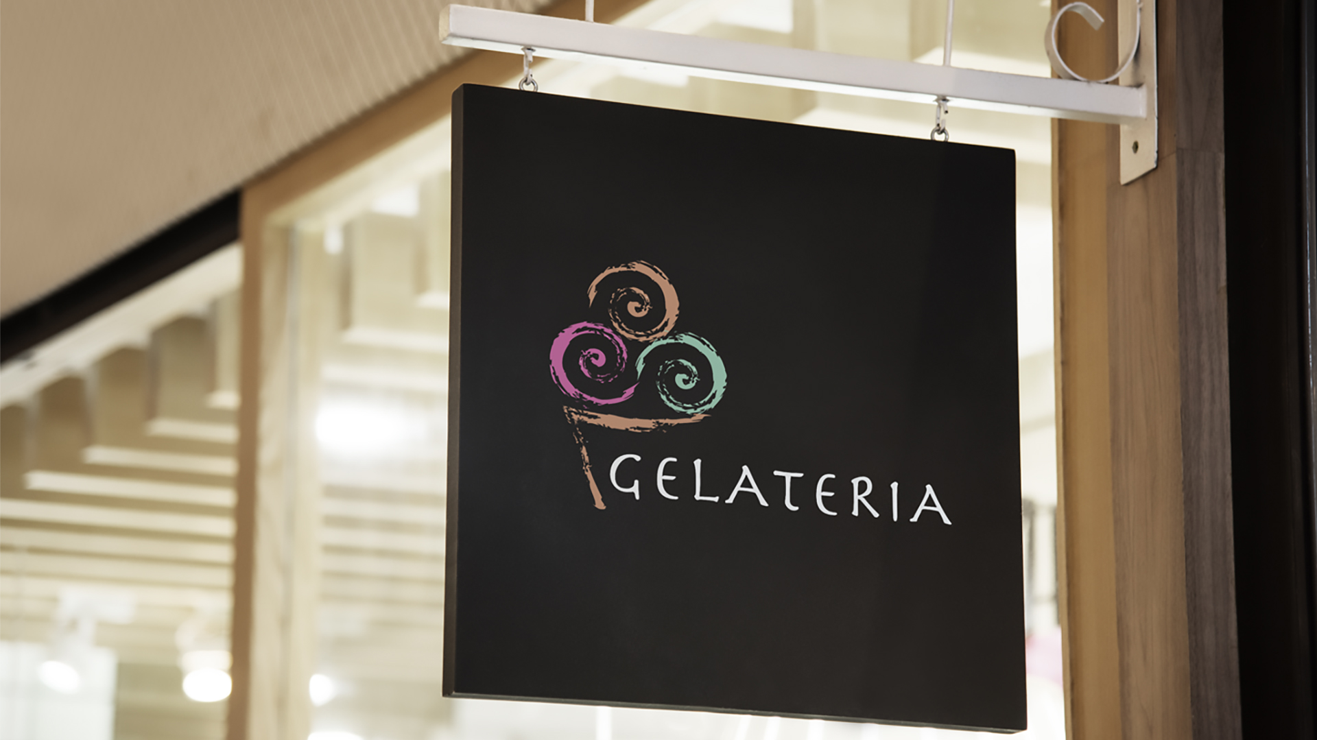
The logo sums up the essence of Gelataria, the delightful ice cream corner at Mysk by Shaza Hotels, translating the Italian word for “ice cream parlor” into a visual delight. The client’s desire for a direct and immediate association with ice cream led us to the iconic image of an ice cream cone.
This universally recognized symbol serves as the foundation of the logo, ensuring instant recognition and memorability. By incorporating three distinct scoops of ice cream in varying shades, we add a playful and dynamic element, reflecting the diverse flavors and experiences Gelateria offers.
The Logo
The contemporary typeface chosen for the logo strikes a perfect balance between modernity and elegance, complementing the overall premium positioning of Mysk by Shaza hotels. The logo’s simplicity makes it highly scalable, ensuring its effectiveness across various platforms and mediums. The use of negative space within the ice cream scoops adds depth and visual interest to the design. Also, the logo’s horizontal orientation provides a sense of stability and balance, enhancing its overall appeal.
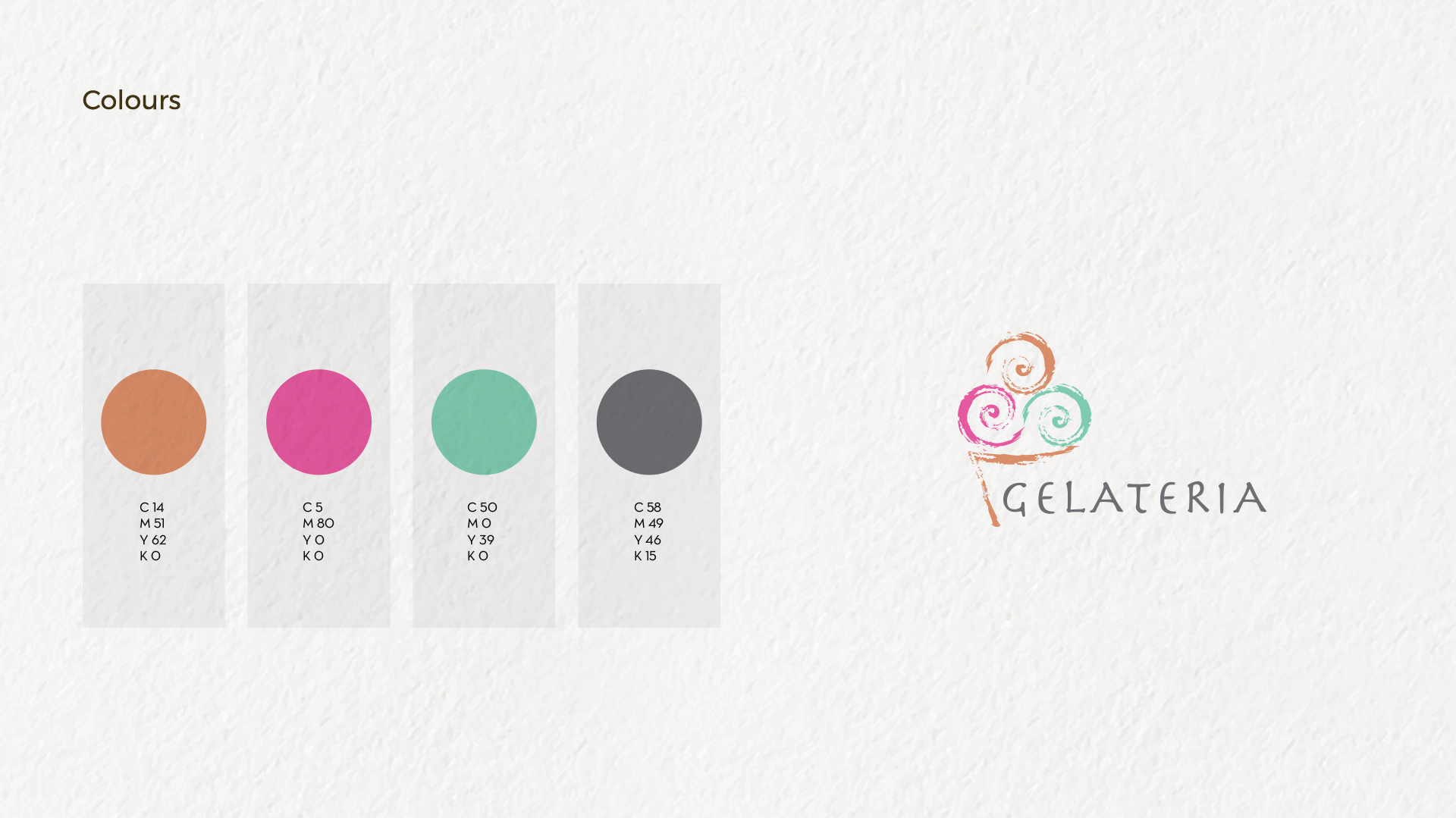
The Colour Pallete
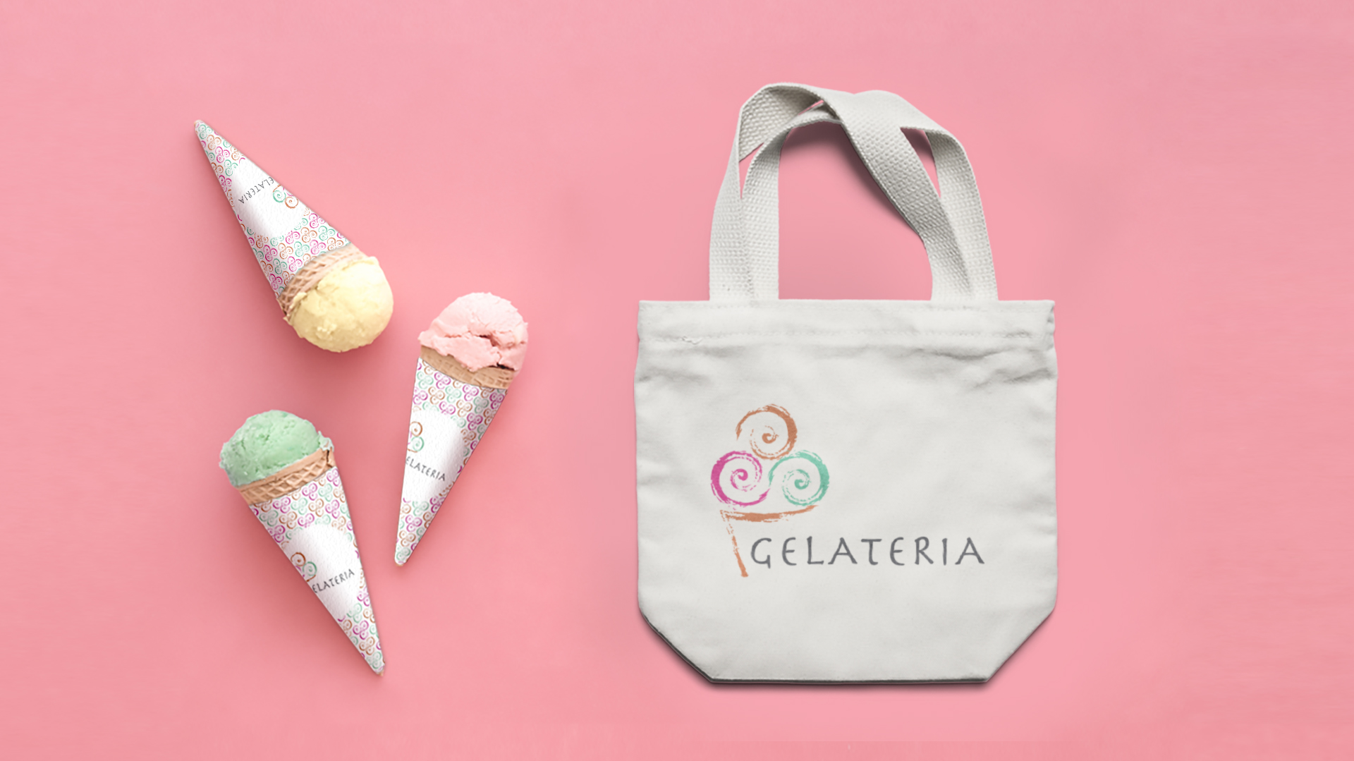
The carefully selected color palette plays a crucial role in creating a light and inviting atmosphere. The soft, pastel tones evoke a sense of joy and fun, appealing to both families and kids.
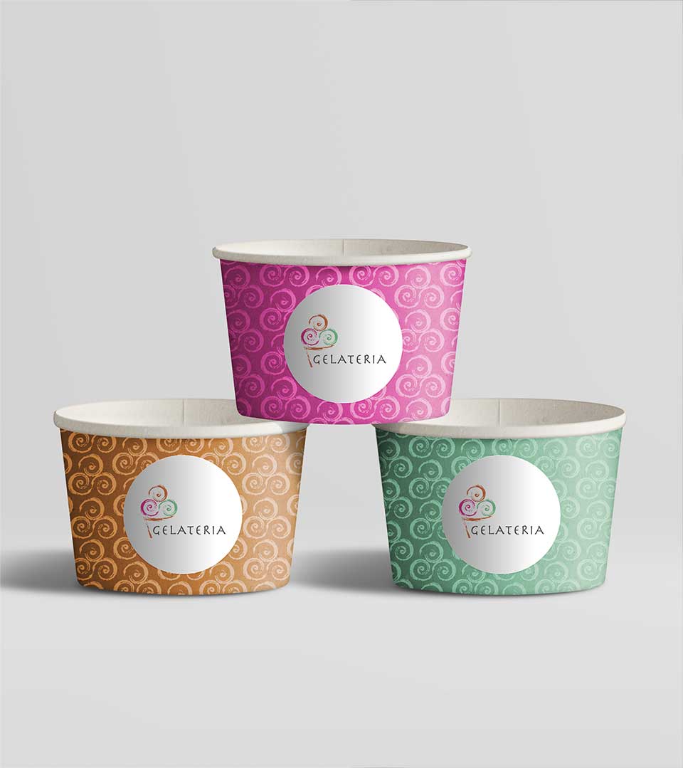
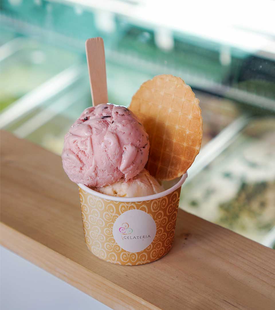
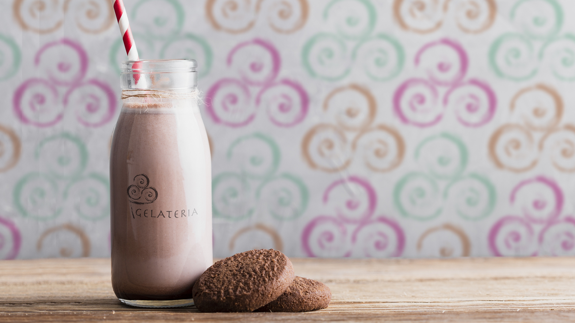
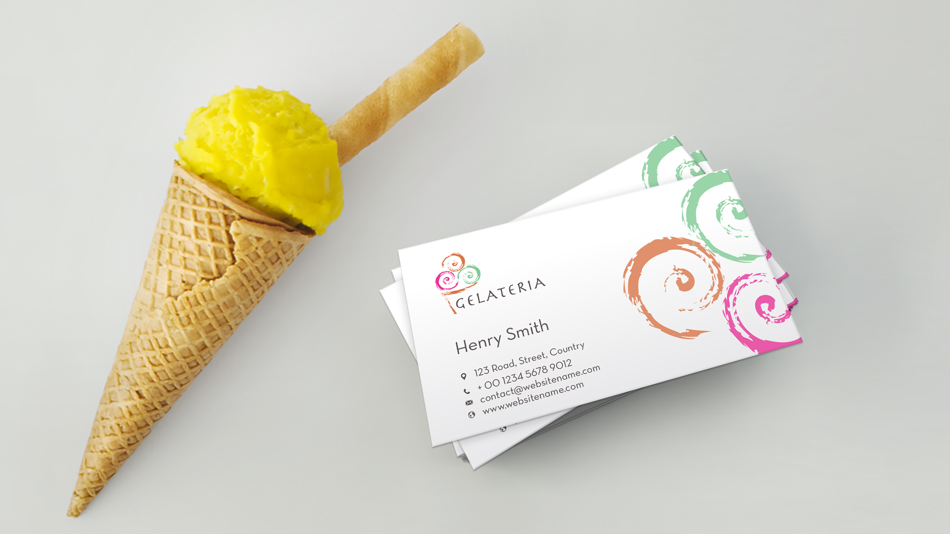
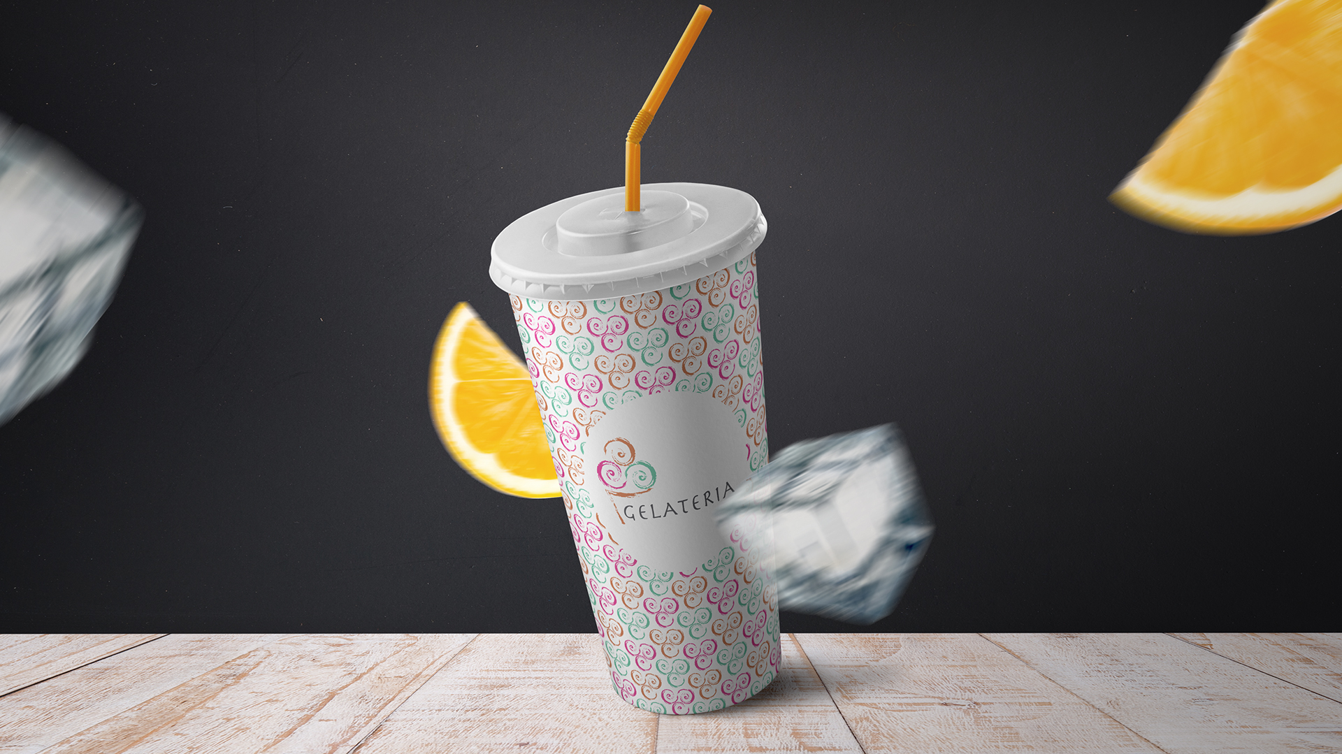
The Brand Identity
The logo’s design elements are adaptable, allowing for seamless integration into various brand applications. The abstract forms derived from the ice cream scoops creatively used in packaging designs and menu layouts, create a cohesive and recognizable brand experience.
Through its simple yet impactful design, it effectively communicates the product offering while aligning with the overall aesthetic of Mysk by Shaza hotels. This logo is a testament of CR8 to the power of design in creating a memorable and engaging brand identity.