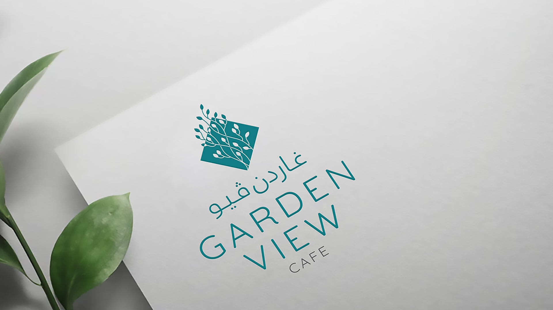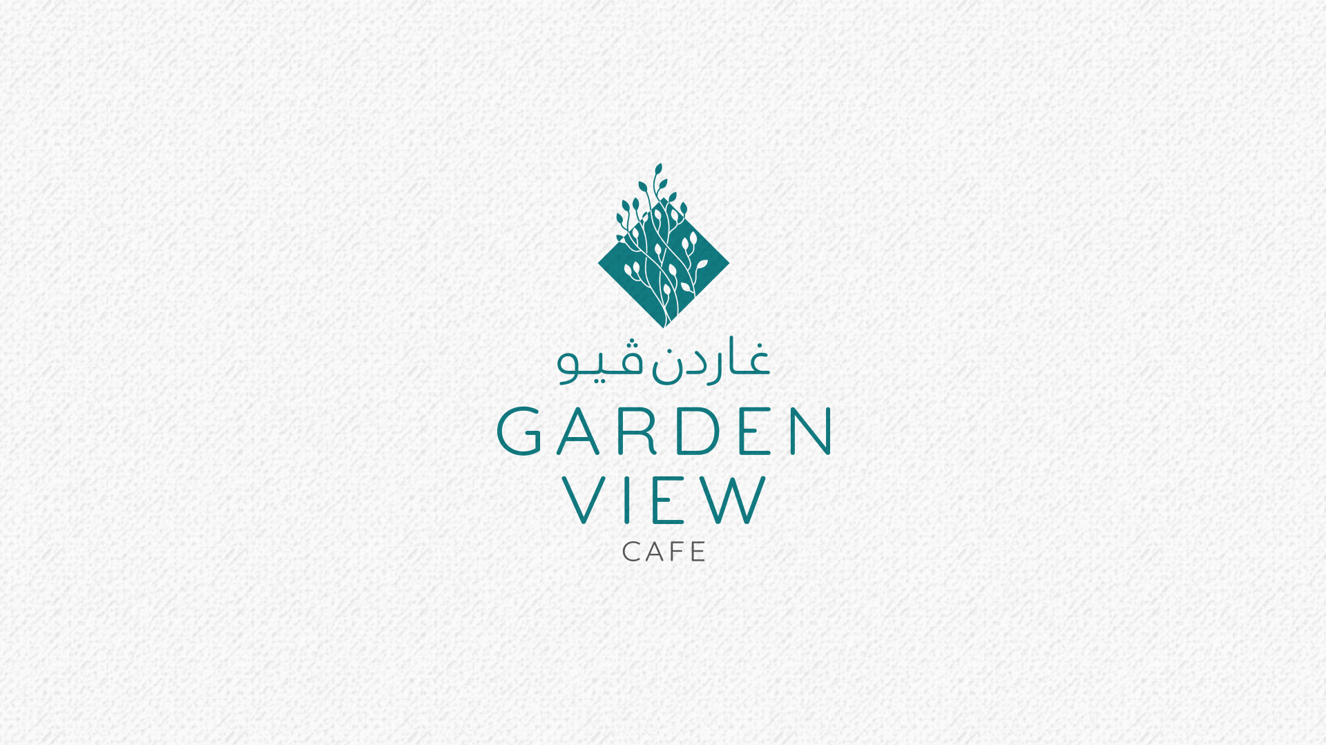
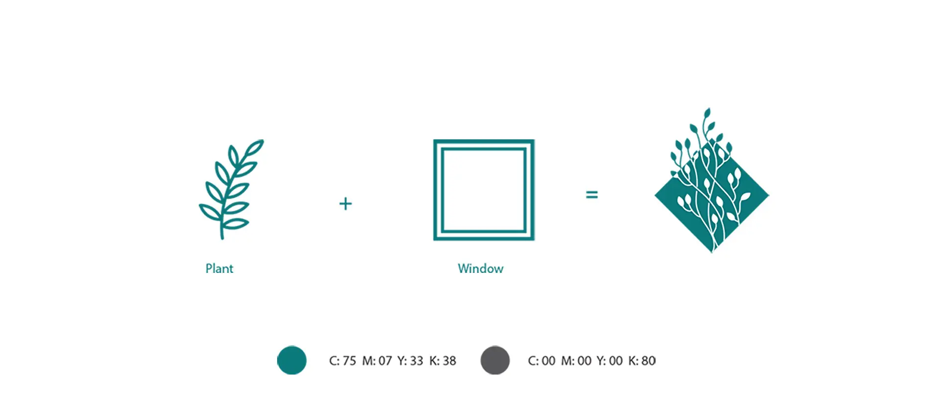
The Logo
The logo is a perfect blend of natural elements and modern design. The central motif of a plant within a window frame represents the café’s connection to nature and its ability to provide a sanctuary amidst the urban landscape.
The plant symbolizes growth, vitality, and the beauty of nature. Its intricate details evoke the diversity and richness of the natural world. And the window element provides a sense of structure and balance, contrasting with the precious and unique experience that the cafe offers.
The Color Palette
The use of a teal color reinforces the natural theme and creates a calming and inviting atmosphere. The combination of dark gray offers a subtle depth and sophistication to the design.
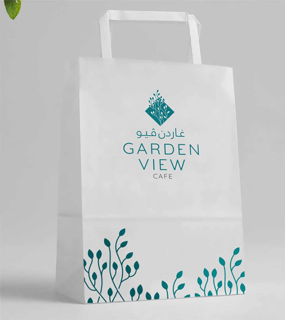
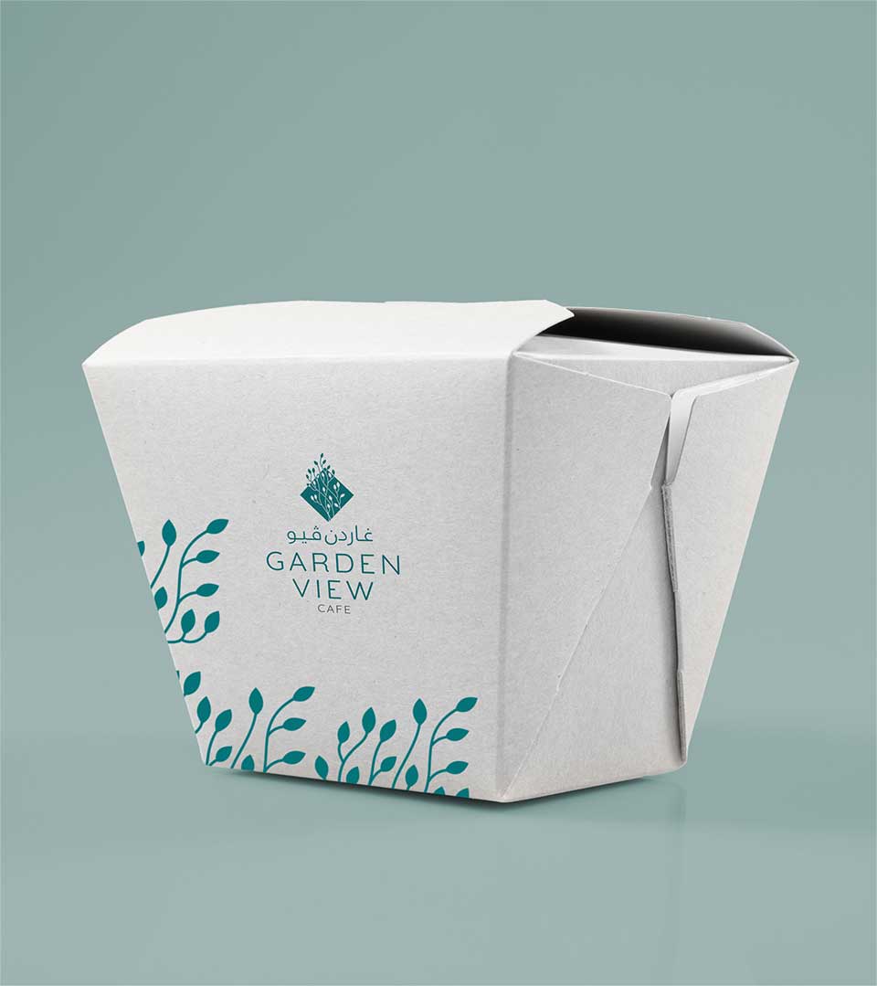
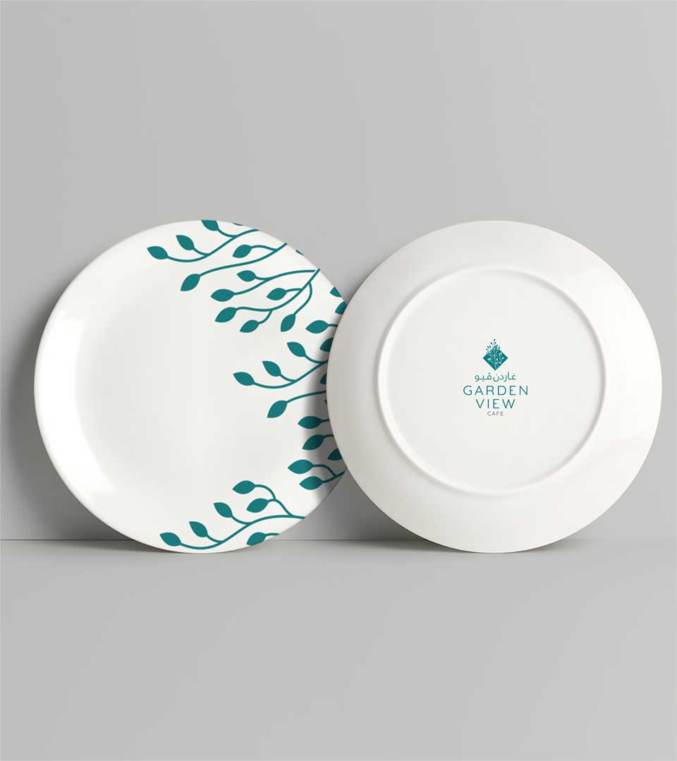
Brand Identity
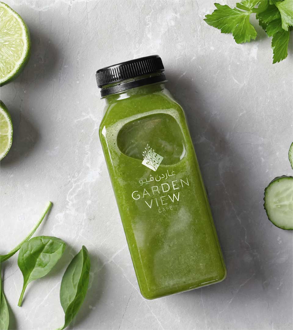
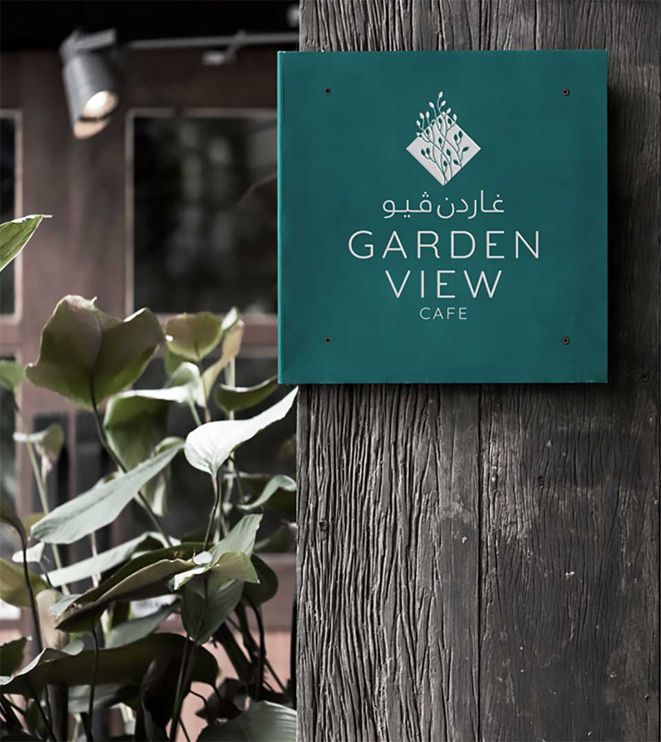
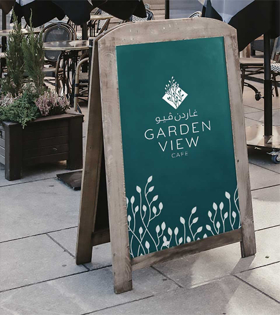
The plant motif used in the logo has been seamlessly integrated into the café’s brand identity. This motif is carried through to packaging designs, stationeries, and other marketing materials, creating a cohesive and recognizable visual language.
The use of consistent branding element reinforces the Garden View brand and strengthens its connection with customers.