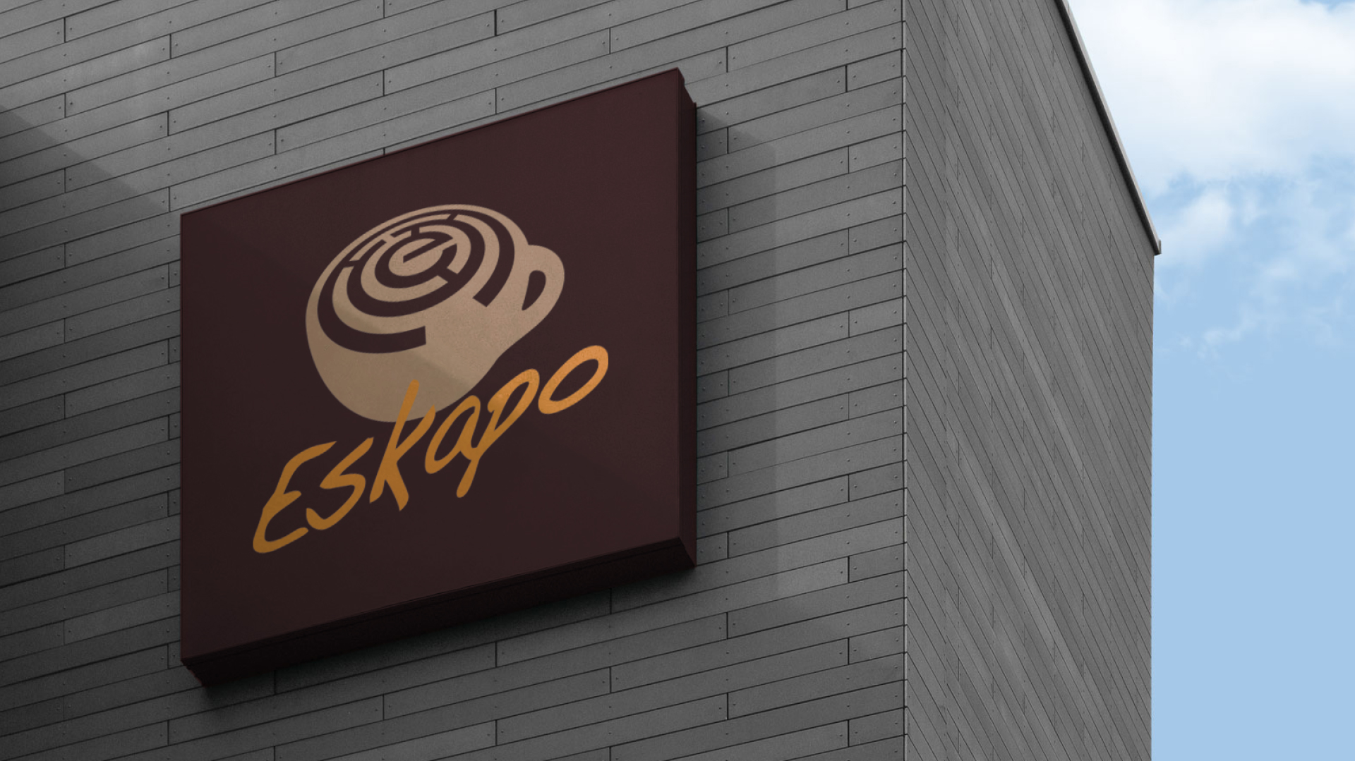
The Concept
The Filipino word ‘Eskapo’ means Escape. The logo design projects a brilliant representation of coffee art. The art is made on the top of the coffee foam. It is in the form of a maze puzzle with the first letter of the cafe ‘E’. Usually when with a mind-blowing coffee in hand you don’t want to escape anywhere else but inside you. It also signifies a stress reliever where the pearls get out through a puzzle.
The Logo
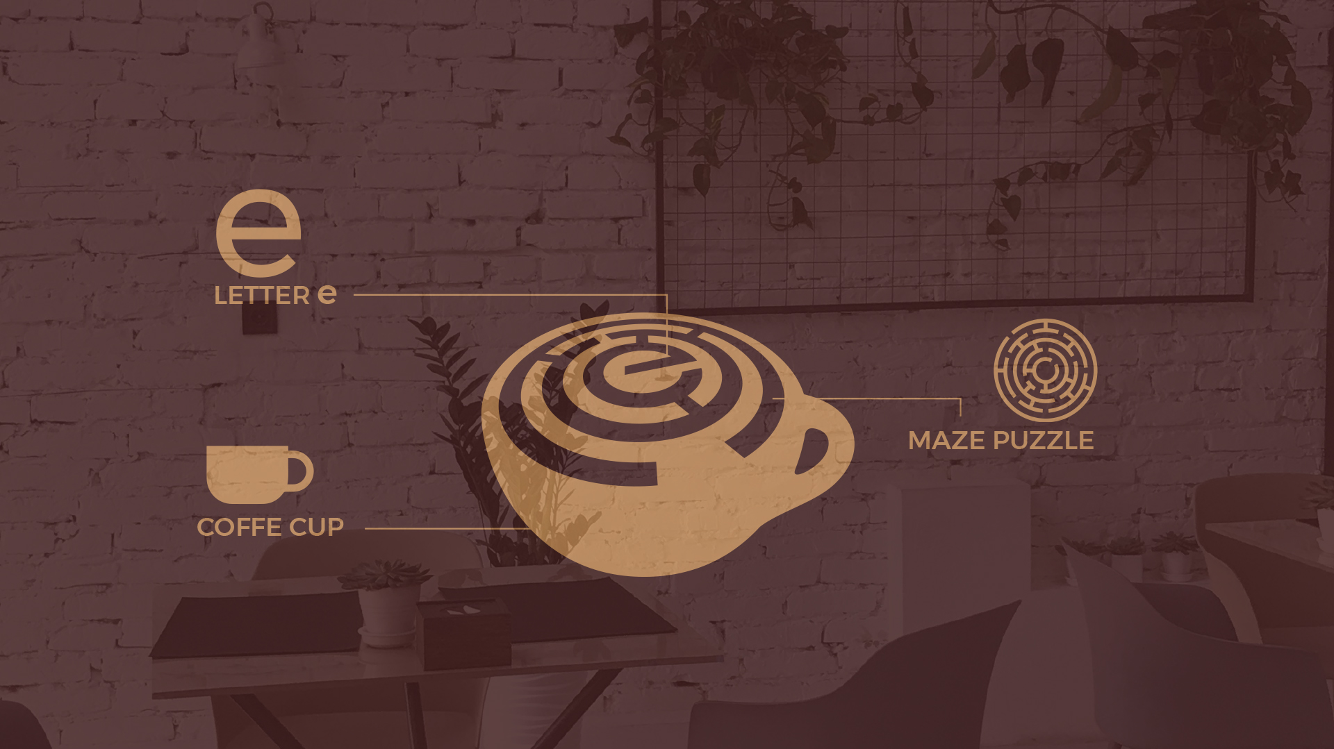
The logo is a masterful blend of artistry and symbolism, reflecting the cafe’s commitment to providing a truly unforgettable experience. The central element, a coffee cup topped with a maze-like pattern, immediately draws the eye and invites exploration.
Logo Breakdown
The Maze
The act of navigating through a maze can be seen as a form of escape, offering a mental challenge and a temporary break from the everyday.
The Coffee Cup
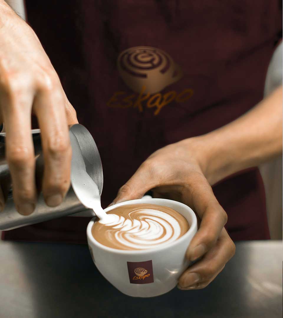
As the heart of the cafe, the coffee cup is a powerful symbol of warmth, comfort, and enjoyment. It represents the communal experience of sharing a cup of coffee with friends and loved ones.
The Letter ‘E’
The initial letter of ‘Eskapo’ is cleverly incorporated into the maze pattern, creating a seamless and visually appealing connection. This subtle detail reinforces the brand name and adds a touch of sophistication.
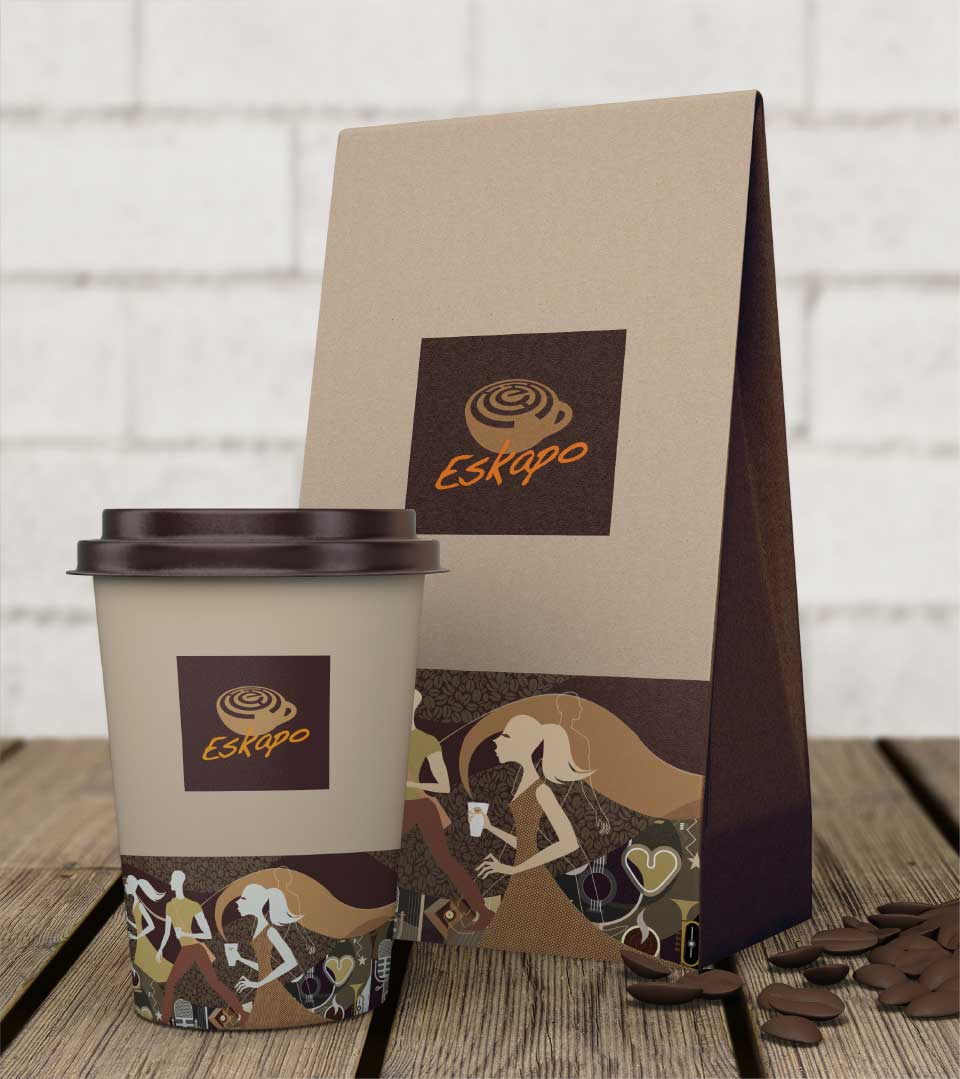
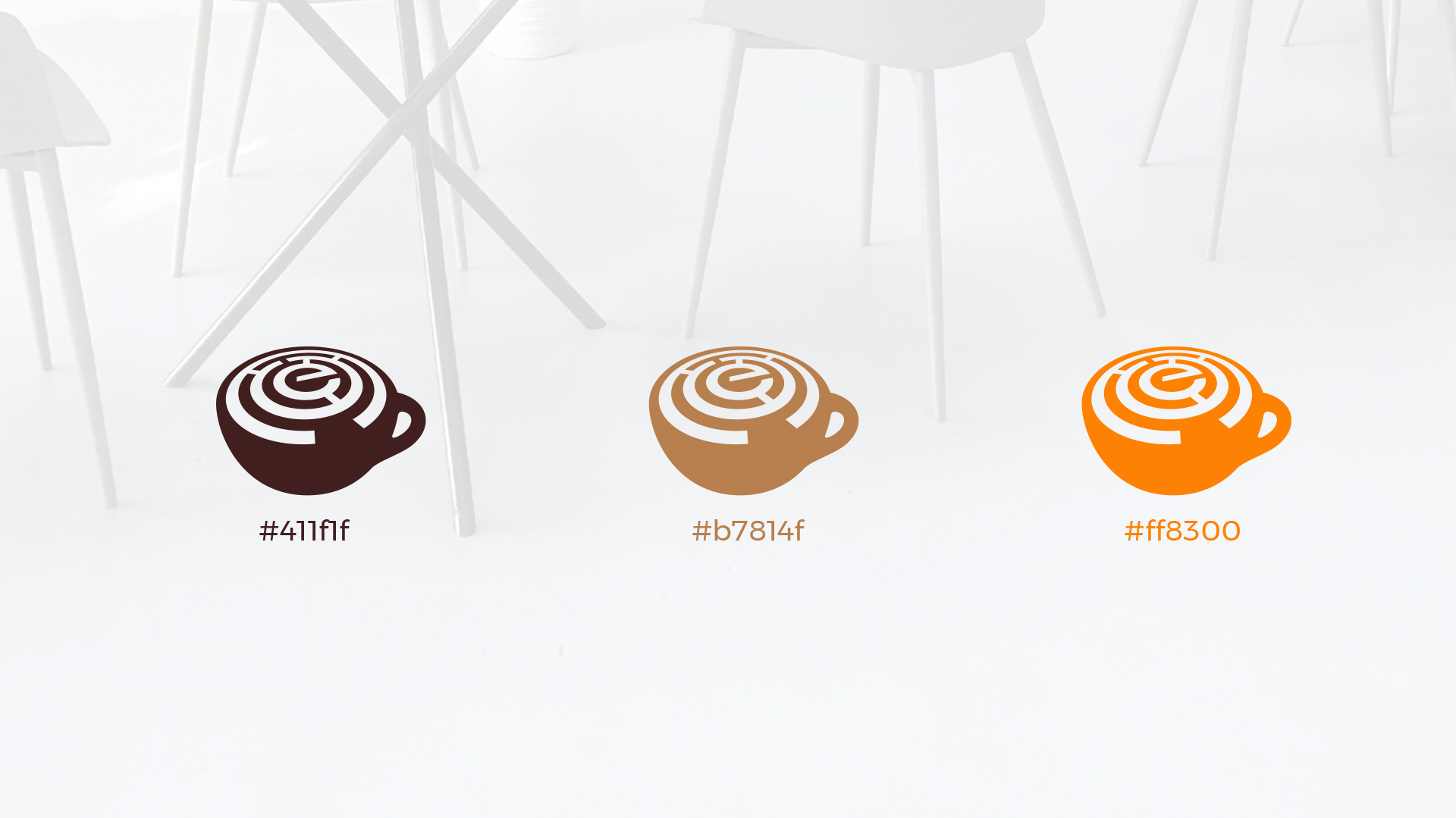
The Color Palette
The logo’s color palette complements the symbolism and evokes a sense of warmth and inviting atmosphere. The deep reddish-brown base color conveys a sense of richness and depth, while the warm brown and vibrant orange accents add a touch of energy and vibrancy. This combination creates a visually appealing and memorable logo that aligns with the cafe’s overall aesthetic.
The Brand Identity
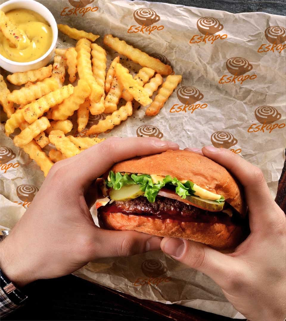
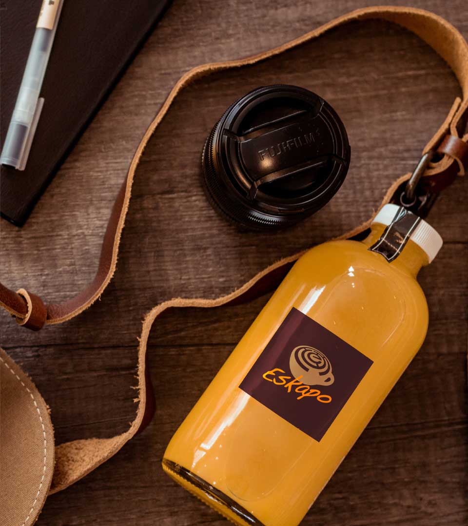
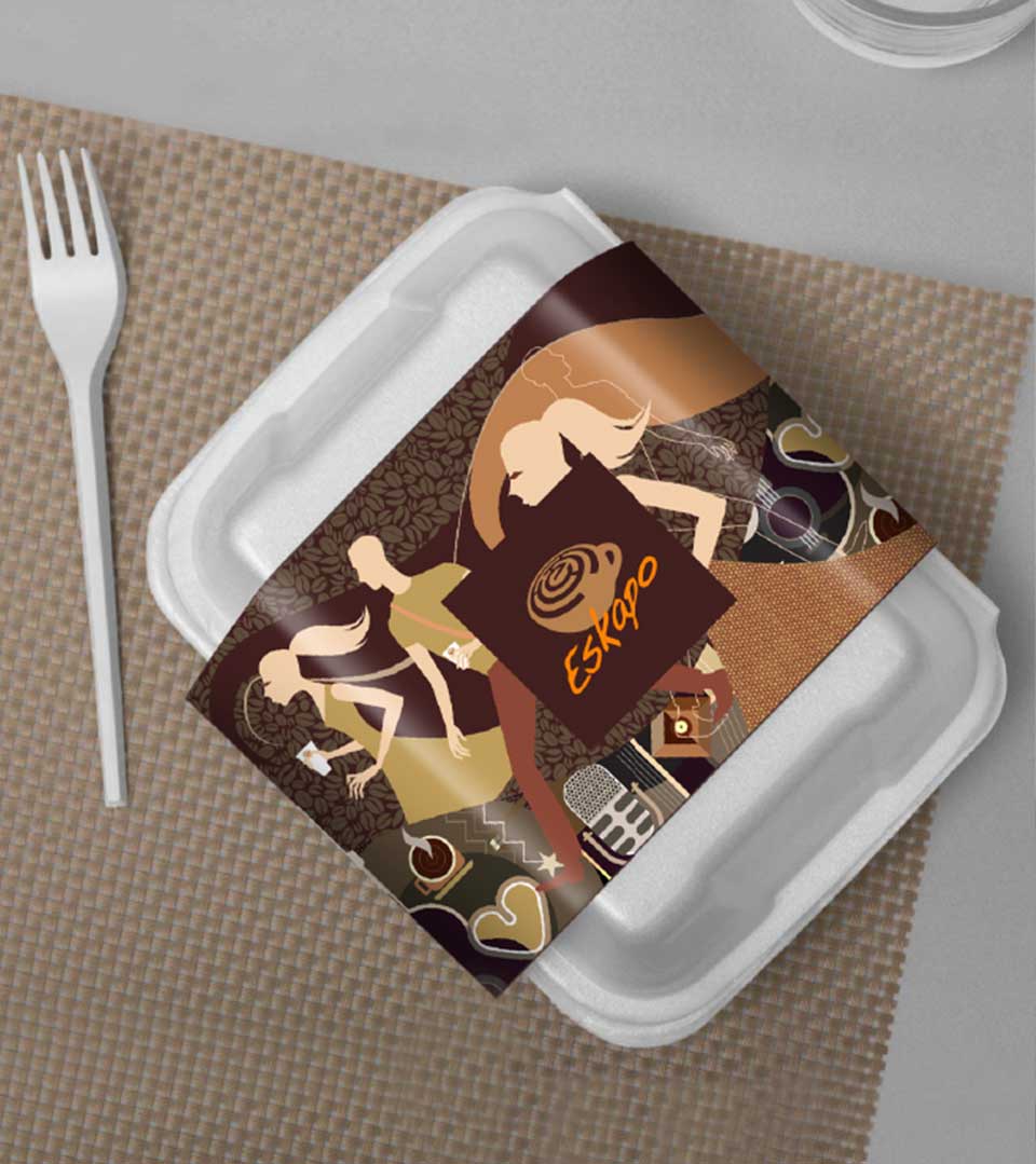
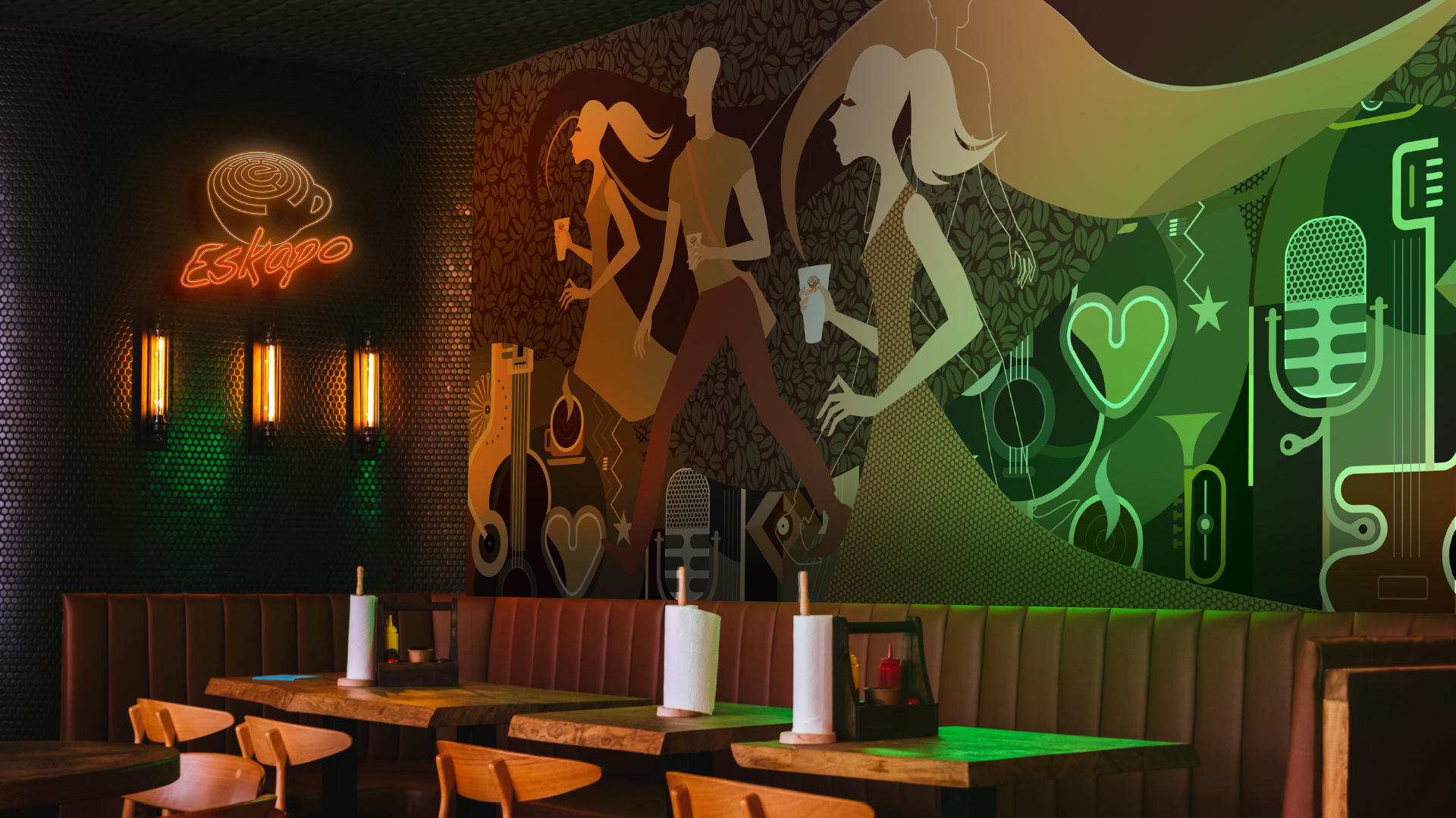
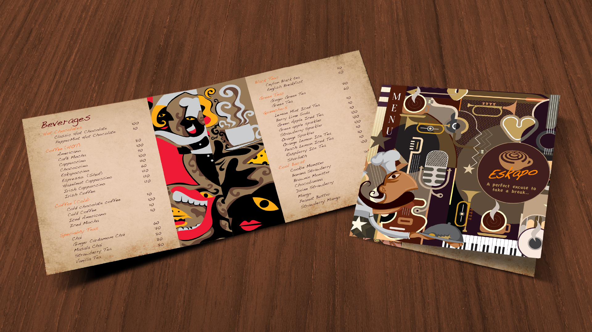
To ensure a consistent and memorable brand experience, CR8 leverages the key elements of the logo to create a cohesive brand identity. The maze pattern, symbolizing exploration and challenge, will be incorporated into various brand touchpoints, including stationery, menu cards, and interior design. This will create a sense of familiarity and reinforce the cafe’s unique personality. Additionally, the warm color palette used in the logo can be extended to the overall ambiance of the cafe, creating a welcoming and inviting atmosphere that complements the brand’s identity.

The Brand Identity
To ensure a consistent and memorable brand experience, CR8 leverages the key elements of the logo to create a cohesive brand identity. The maze pattern, symbolizing exploration and challenge, will be incorporated into various brand touchpoints, including stationery, menu cards, and interior design. This will create a sense of familiarity and reinforce the cafe’s unique personality. Additionally, the warm color palette used in the logo can be extended to the overall ambiance of the cafe, creating a welcoming and inviting atmosphere that complements the brand’s identity.