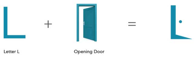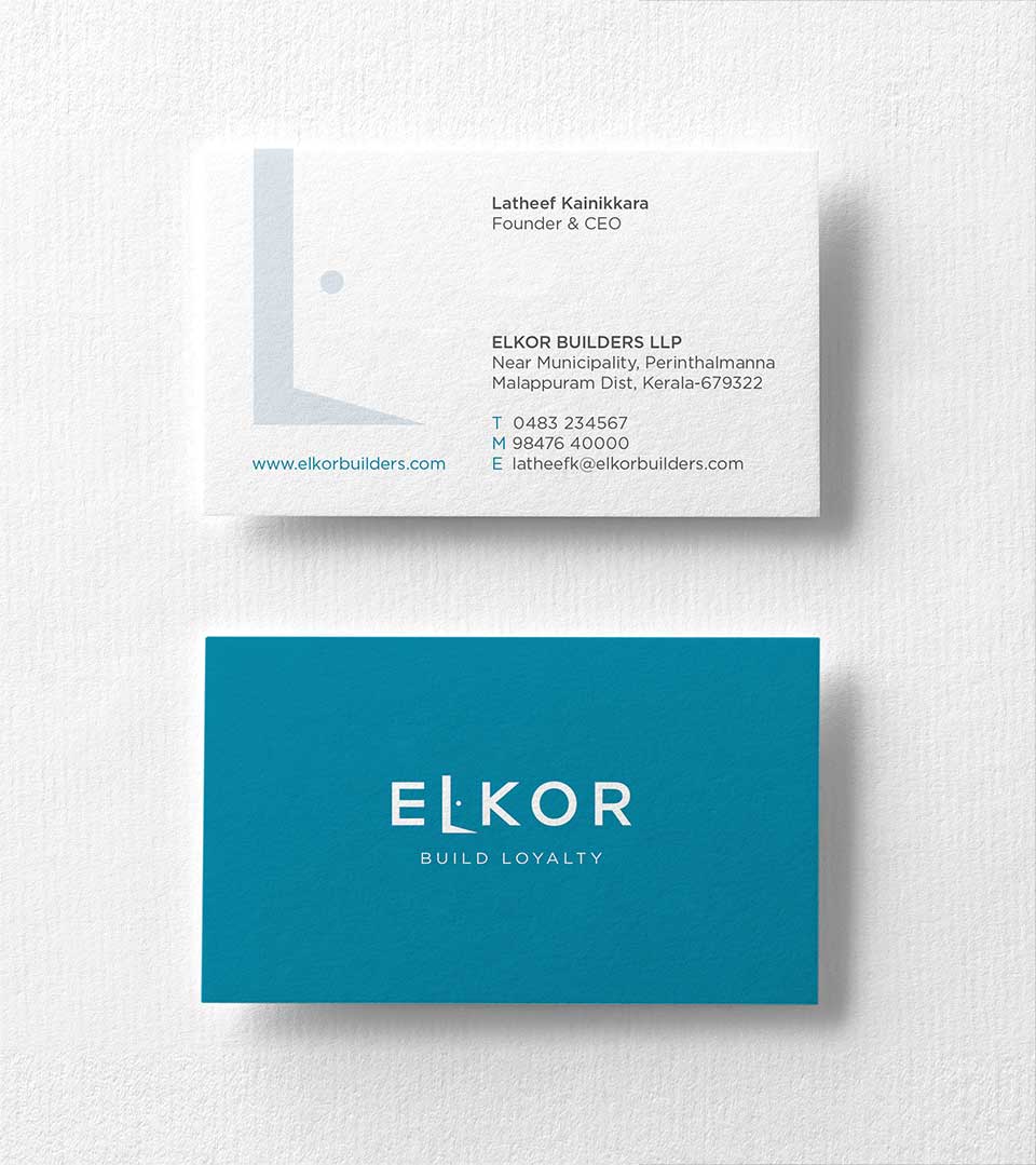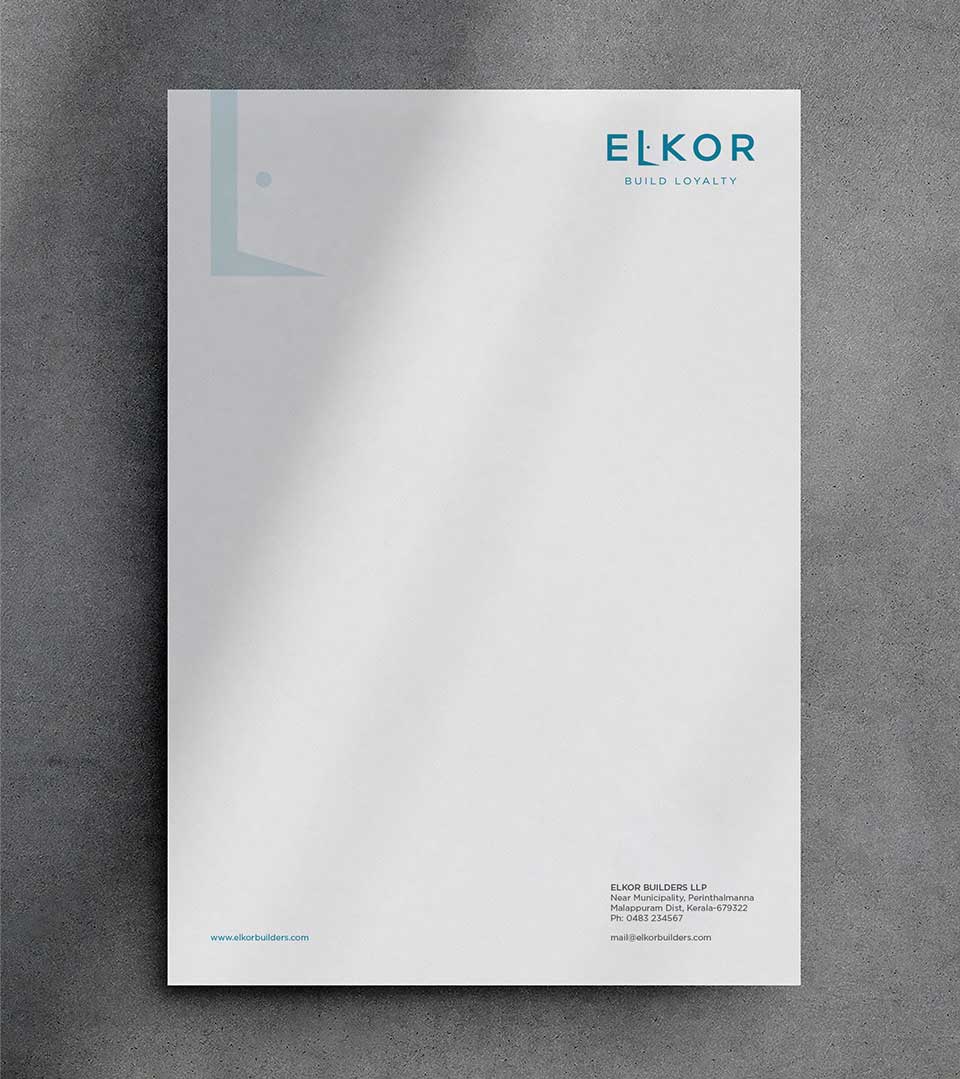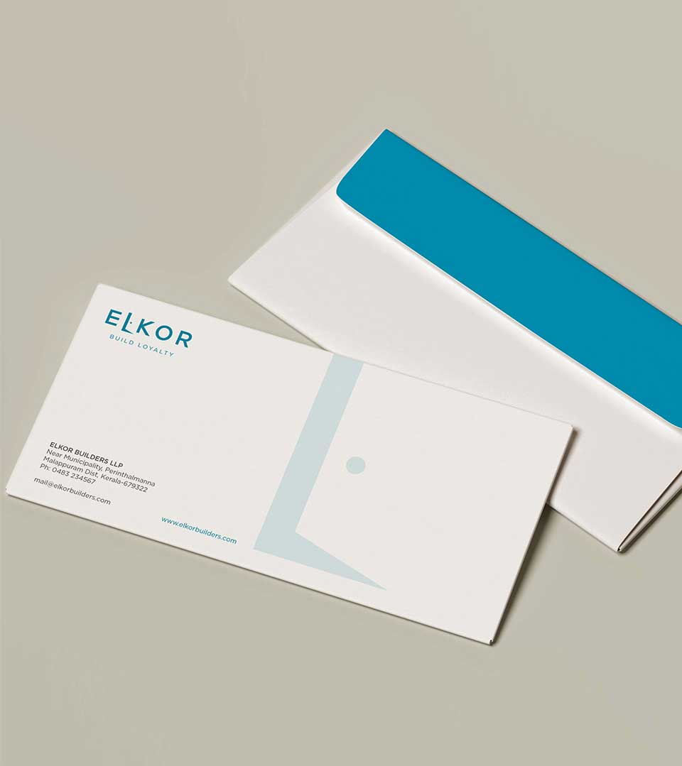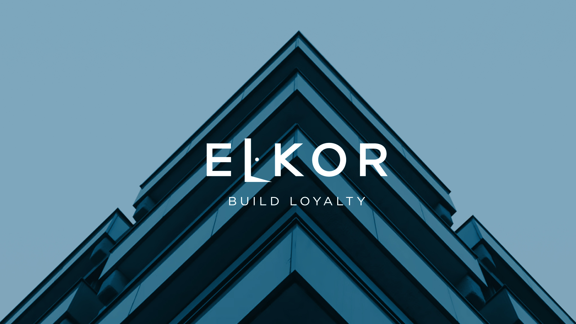
Concept behind the logo
A modern and symbolic representation of the company’s core values: loyalty, opportunity, and trust. The logo is primarily composed of a stylized window icon and letter ”L” typography. The stylized font used for “Elkor” incorporates a cleverly designed letter “L” that doubles as a door icon. This signifies the company’s commitment to transparency and building a foundation of trust with clients.
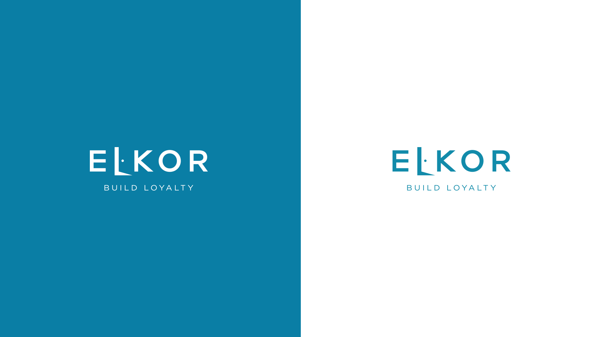
Capitalization adds a sense of authority and solidity, emphasizing Elkor Builders’ established reputation and commitment to excellence.
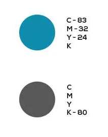
Colour Pallete
The Teal Blue color represents trust and power. The logo features a modern design with sans serif typography, providing a clear visual presence. Text is written in all caps, creating a sense of authority and solidity.
A Powerful Tagline
The tagline, Build Loyalty, is a direct reflection of the company’s core value and reinforces the idea that Elkor Builders prioritizes building long-term relationships with clients built on trust and satisfaction.
As the best branding and marketing agency in Kerala, this logo design for Elkor Builders is a prime example of how effective branding can communicate a company’s values and mission statement.