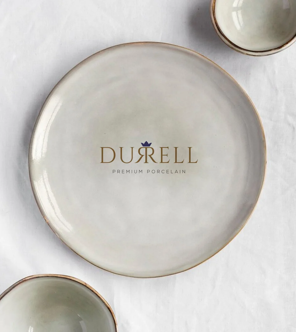

Logo Breakdown
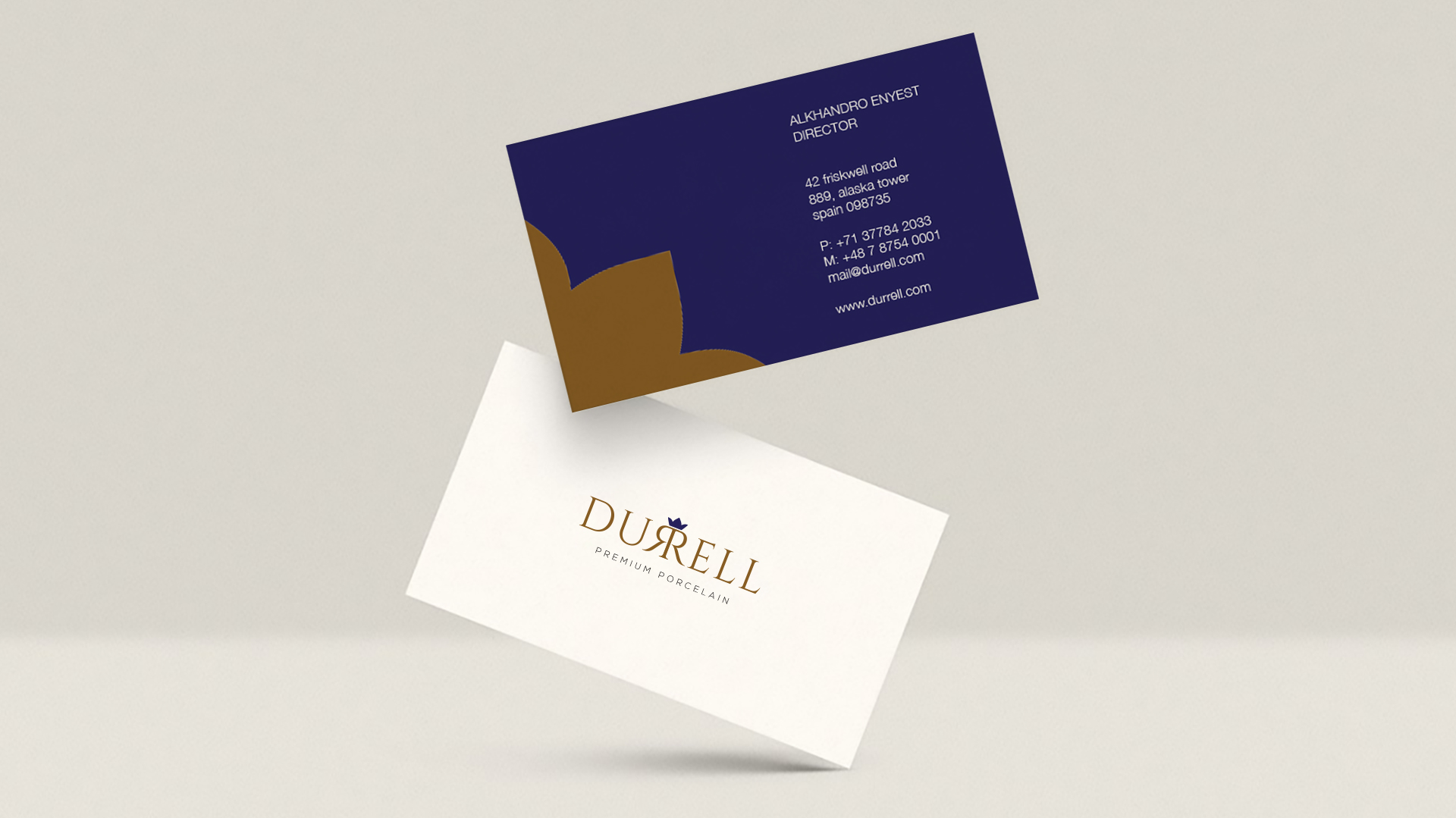
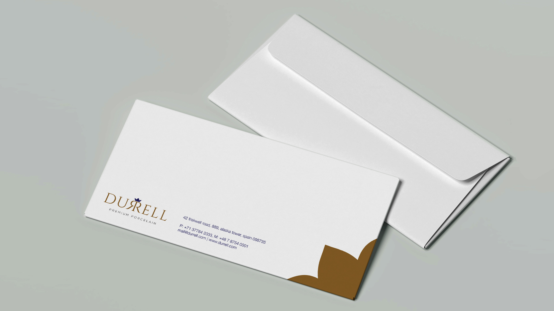
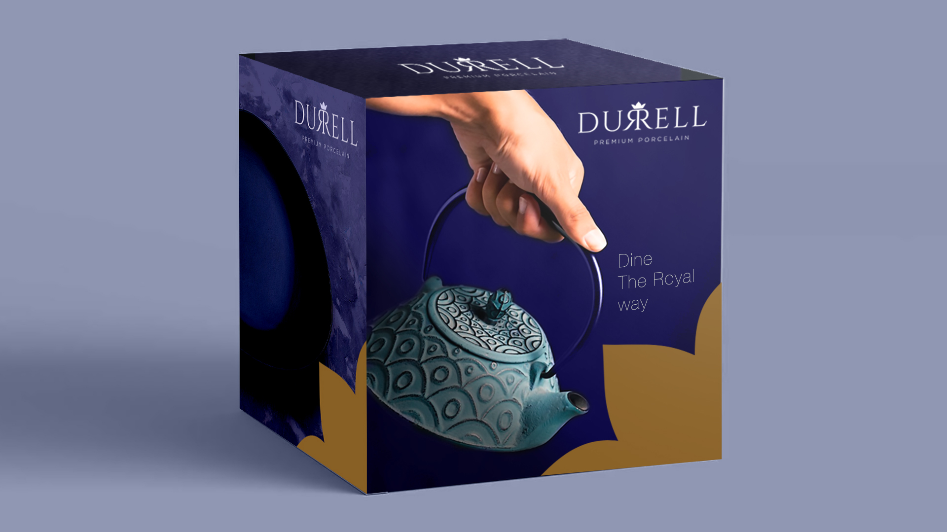
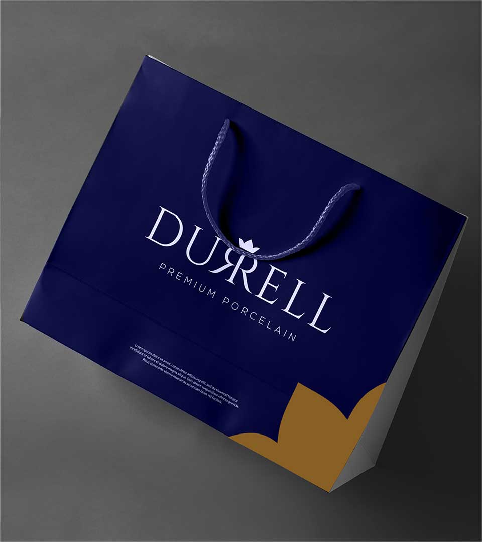
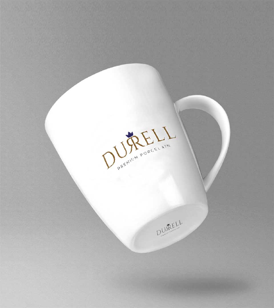
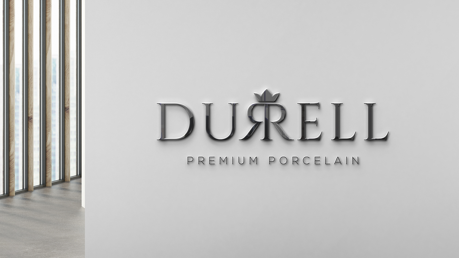
The logo utilizes an elegant font that exudes a timeless and sophisticated aesthetic. This choice aligns perfectly with Durrel’s positioning as a premium brand. The double ‘R’ in Durrel is emphasized, creating a visual focal point. This emphasis not only strengthens brand recognition but also subtly hints at the word ‘Royal’, further reinforcing the brand’s association with luxury and prestige.
The mirrored effect applied to the letters following the double ‘R’ adds a touch of intrigue and visual interest. This subtle detail elevates the logo beyond a simple typographic design and imbues it with a sense of uniqueness.
The Color Palette
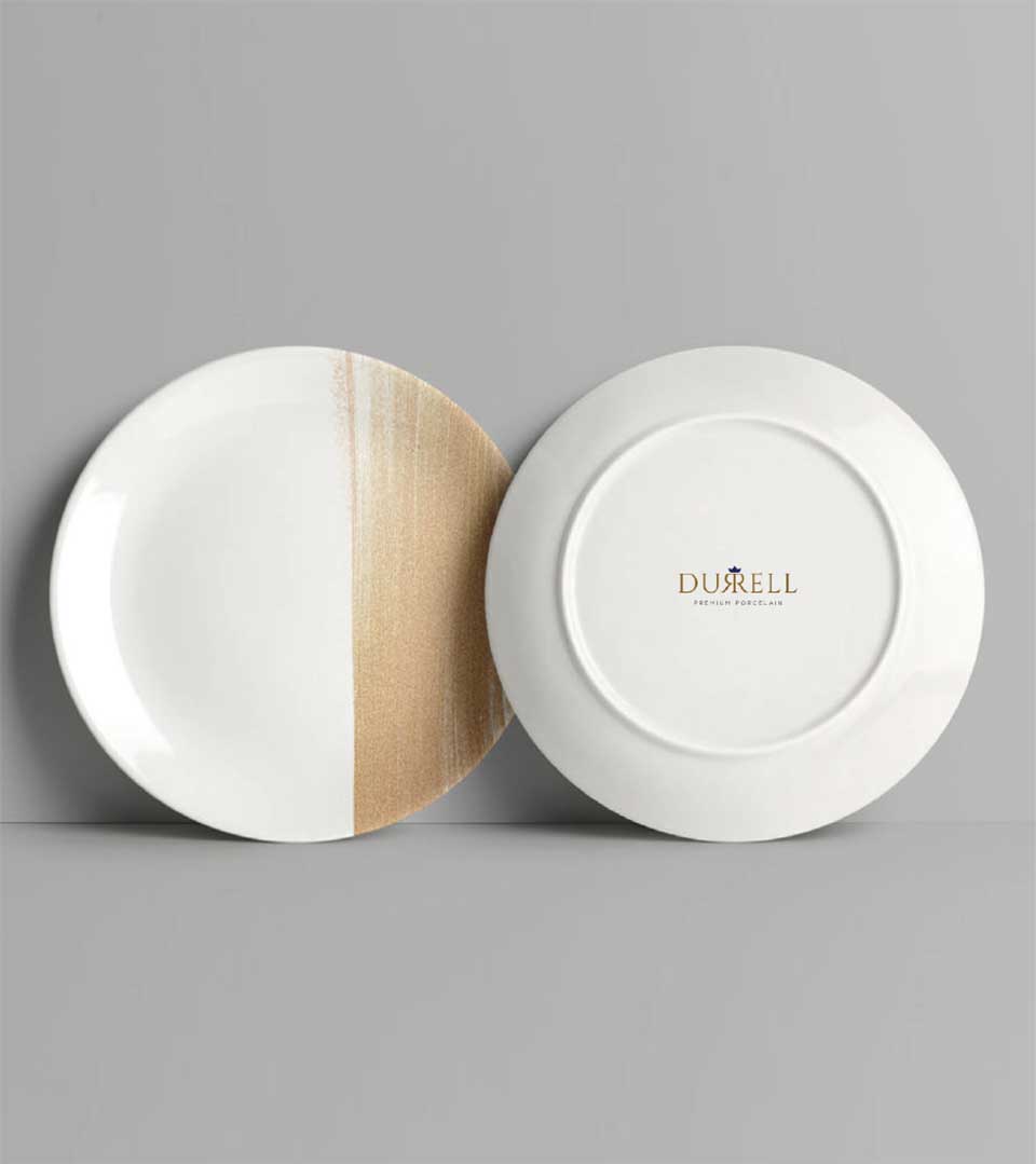
The chosen regal color palette plays a vital role in communicating Durrel’s brand identity. The deep, rich violet evokes a sense of regality and luxury. It’s bold, intense, and commands attention, perfectly reflecting Durrel’s premium status. The warm, earthy brown color acts as a grounding element within the palette. It provides a natural counterpoint to the more vibrant violet, adding a touch of sophistication and warmth. This combination creates a balanced and visually appealing aesthetic.
