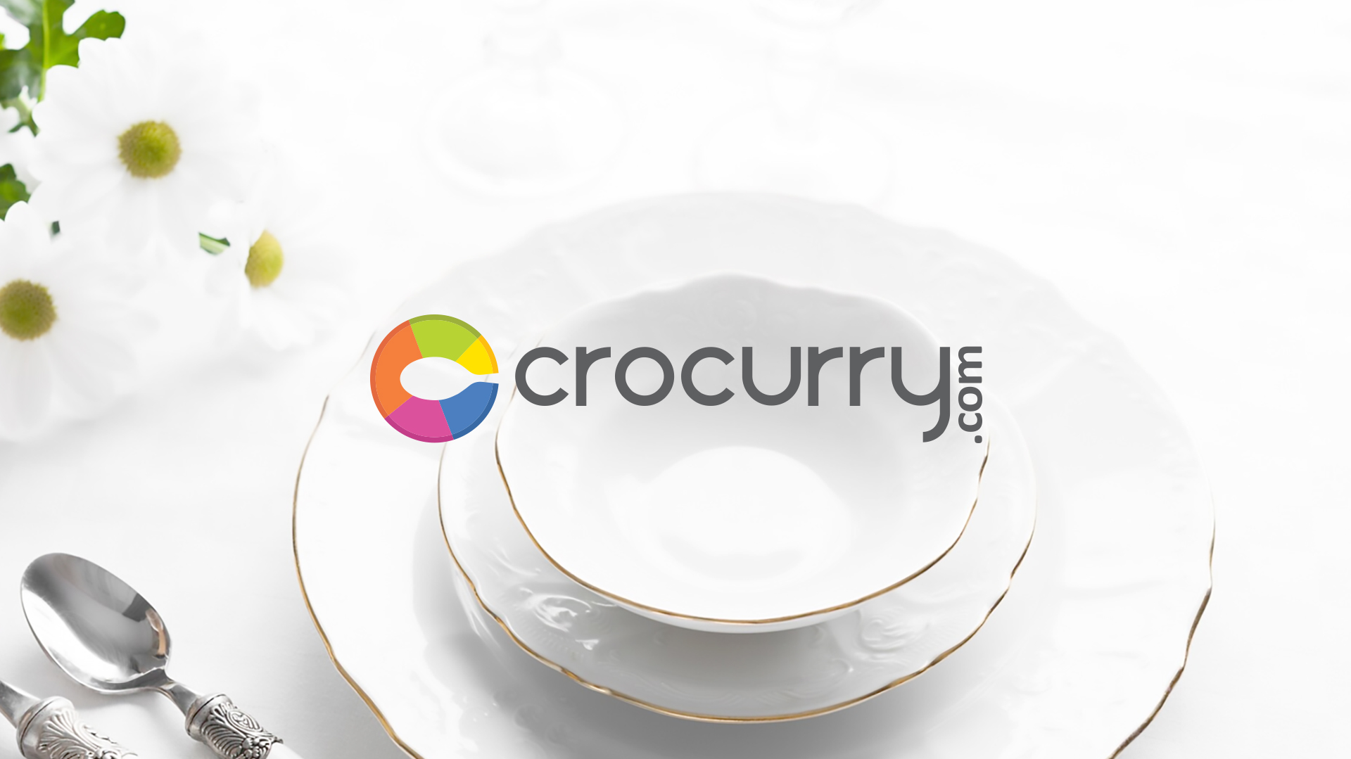


The Concept
The name “Crocurry” is a playful combination of the words “crockery” and “curry.” This creates a unique and memorable brand name that is relevant to the company’s product offerings. The logo for Crocurry.com is a clever and memorable design that effectively combines the letter “C” with the image of a spoon resting on a plate. This creates a visual metaphor that clearly communicates the company’s business of selling kitchen and dining products.
The Logo
The logo is a well-designed and effective brand mark. The use of a visual metaphor and a playful brand name helps to make the logo even more effective. The diverse color palette adds visual interest and reflects the wide variety of products that Crocurry.com offers.
The use of negative space to create the spoon image is a clever and creative design technique.
Also, the logo is likely to appeal to Crocurry.com’s target audience of home cooks and food enthusiasts.

The Color Palette
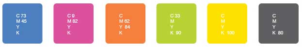
The color palette is a vibrant and eclectic mix that effectively reflects the brand’s diverse product offerings and its energetic approach. The cool mid-blue provides a sense of calm and reliability, grounding the palette. The bright magenta and warm orange introduce energy and excitement, hinting at the vibrancy and variety of kitchenware available. The addition of green and yellow further enhances the lively and fresh feel of the brand, evoking images of nature and healthy living. Finally, the dark gray acts as a balancing element, adding sophistication and depth to the overall color scheme.
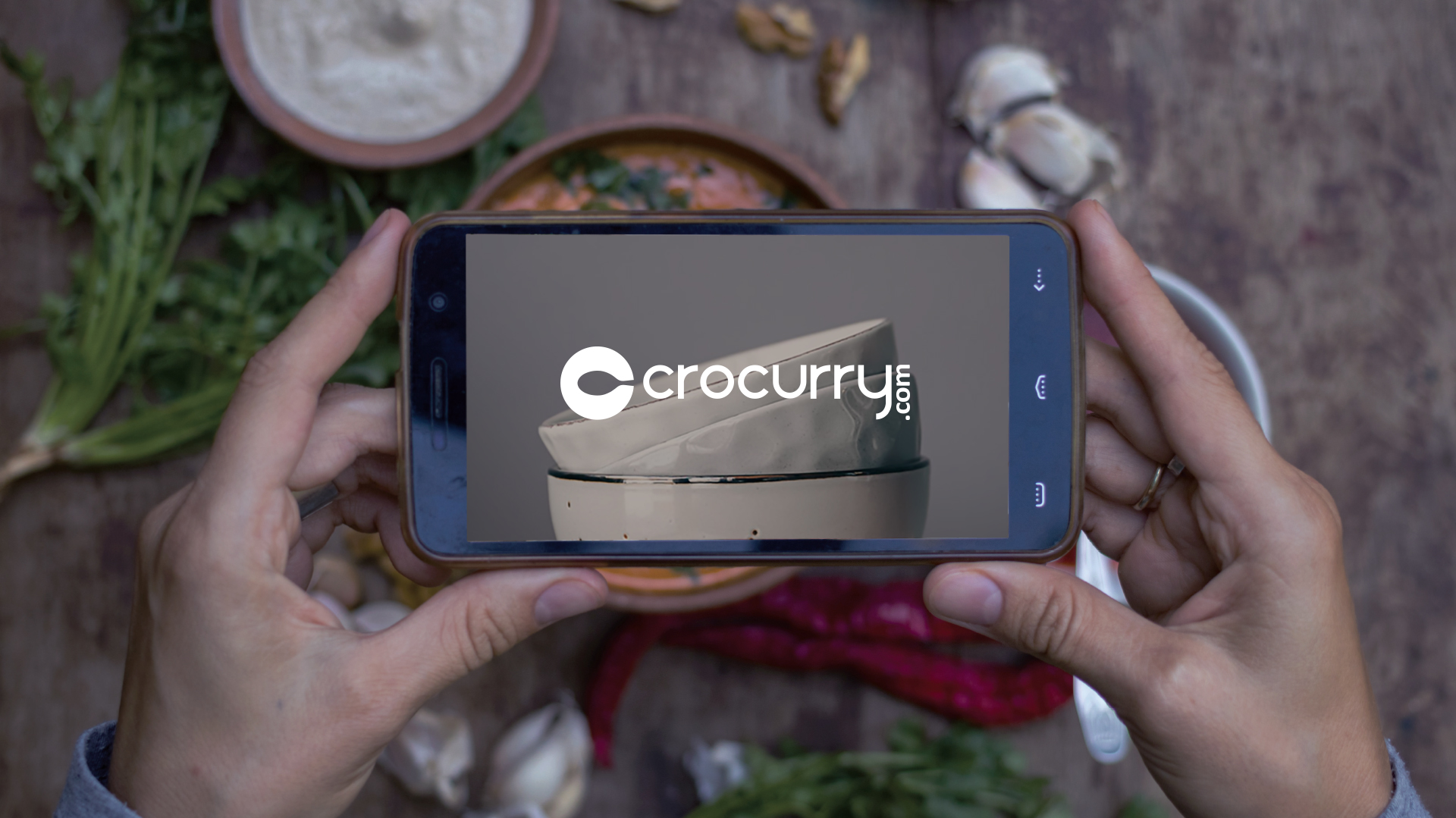
The Brand Identity
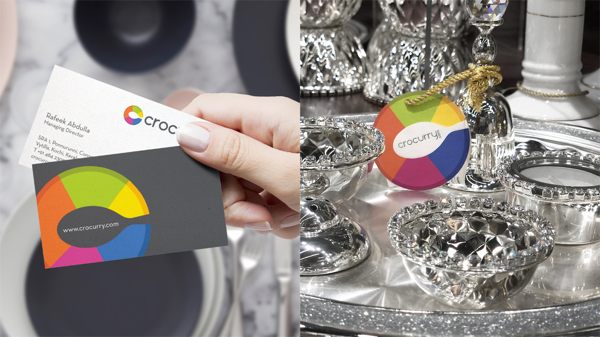
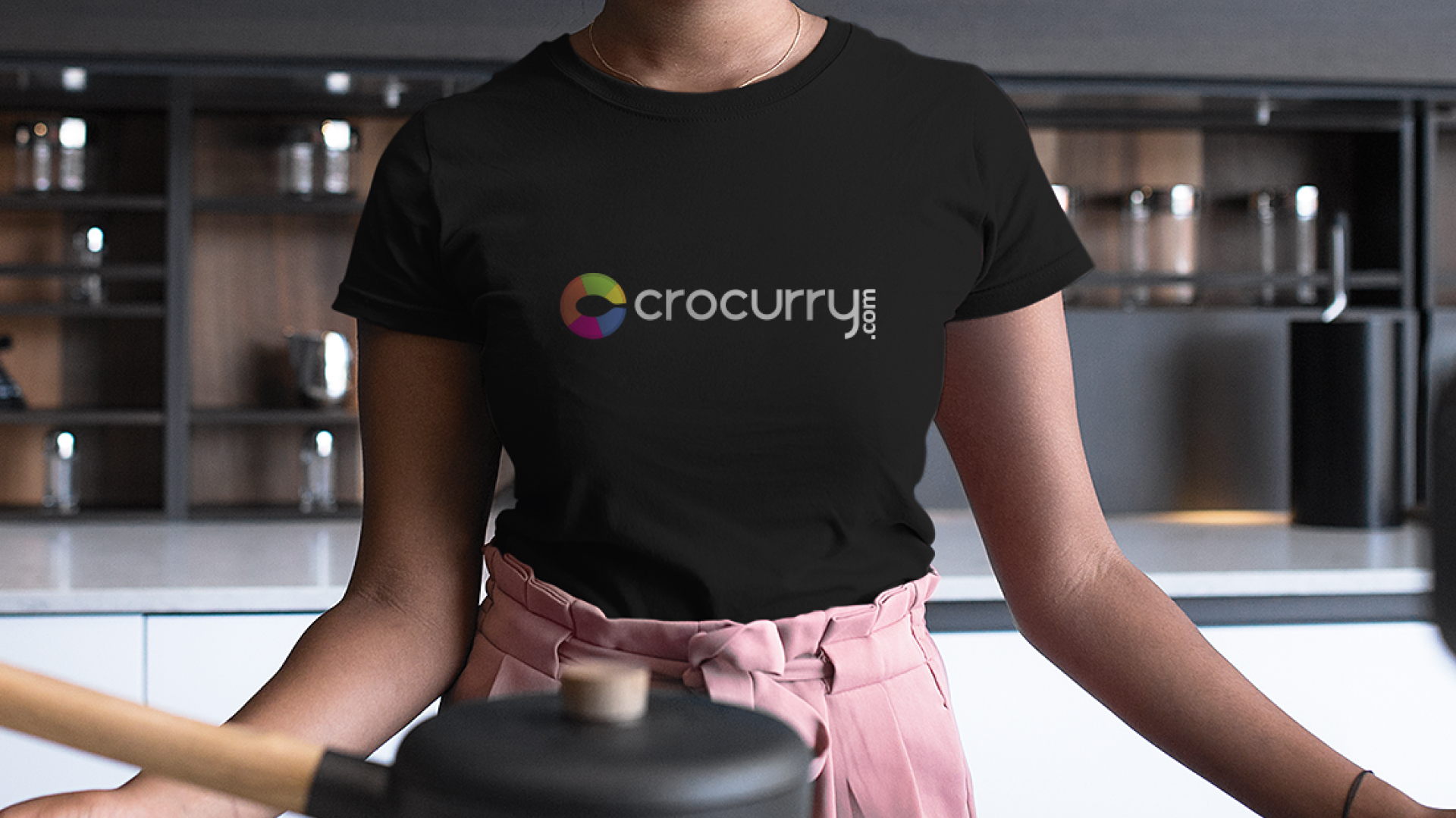
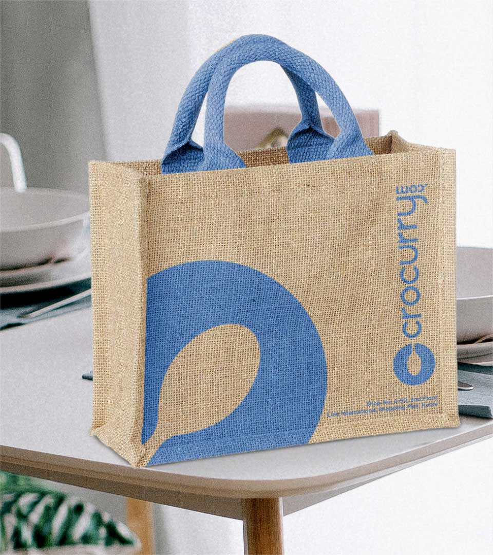
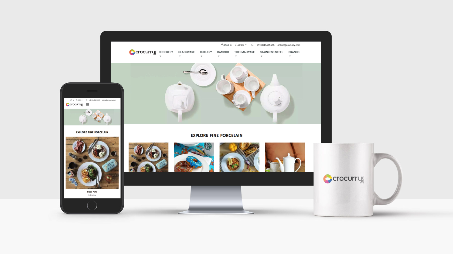
The Crocurry brand identity has been seamlessly integrated into a cohesive and visually appealing range of business stationery, collaterals, packaging, and shopping bags. The masterful adaptation of the core brand elements, such as the distinctive logo and color palette, creates a unified brand experience across all touchpoints.