The Focus
Chakson’s mission is to make cooking a pleasurable experience. The focus was on creating designs that were both visually appealing and informative, helping consumers make informed choices and appreciate the value of Chakson products.
The Design
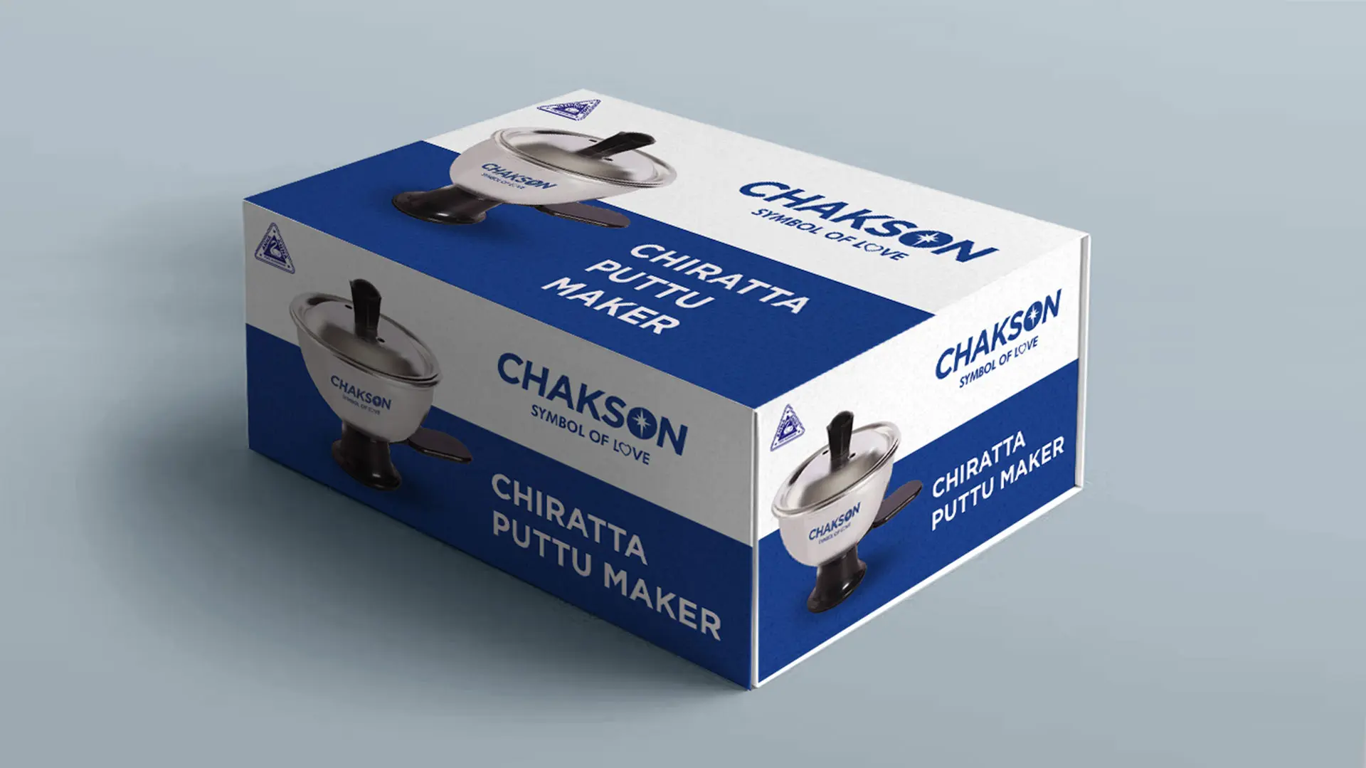
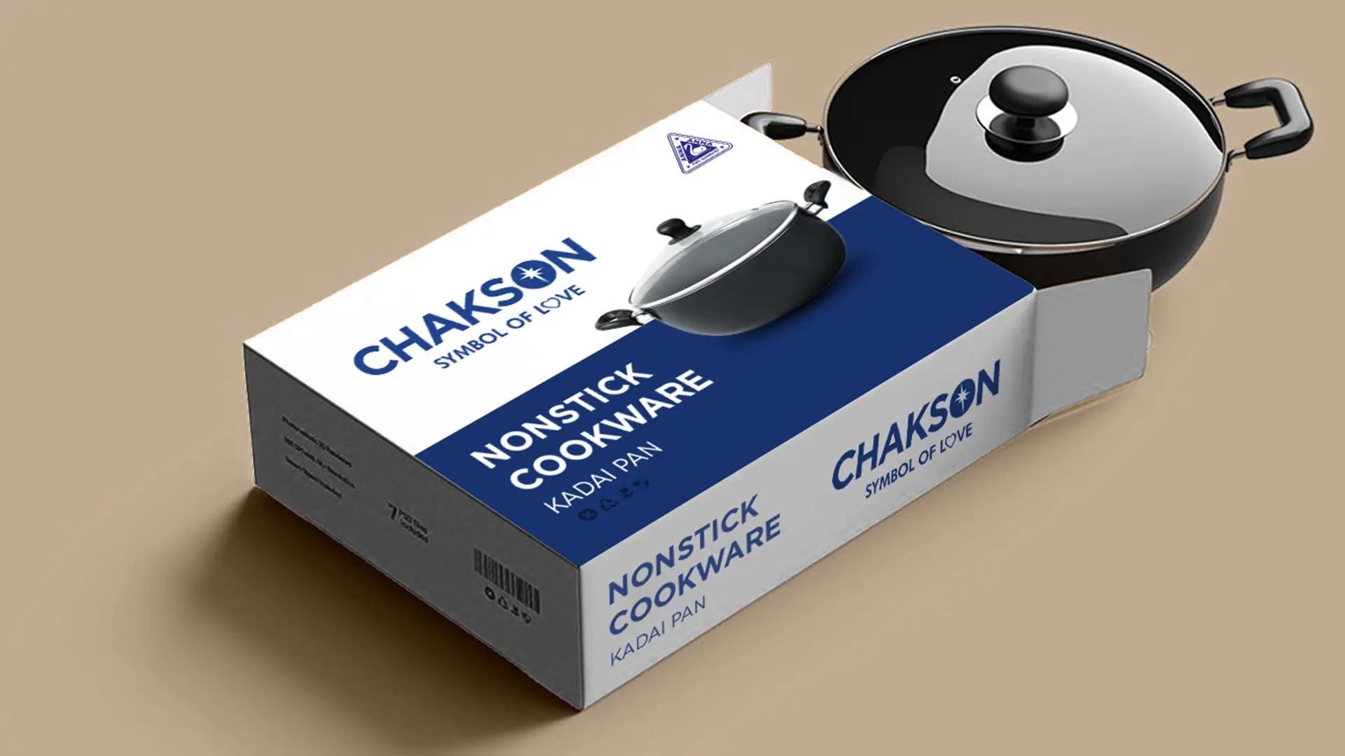
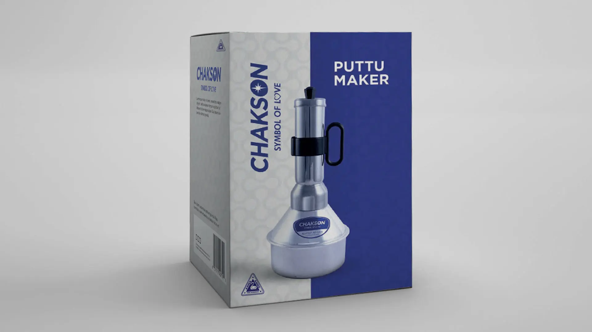
The design concept for Chakson’s packaging drew inspiration from the brand’s rich history while embracing contemporary trends. The iconic Chakson logo, a symbol of quality and reliability, was prominently featured on each package. The color palette, featuring bold blue and crisp white, created a visually striking contrast that captured attention on store shelves.
To showcase the products effectively, the packaging incorporated high-quality product images that highlighted the unique features and benefits of each item. Clear and concise product information was included, ensuring that consumers could easily understand the specifications and make informed decisions.
Key Design Elements
Bold Typography: The Chakson brand name is prominently displayed in bold typography, ensuring easy visibility and recognition on store shelves.
Clear Product Image: The packaging features a clear and high-quality image of the cookware, allowing customers to visualize the product and its features.
Color Contrast: The use of blue as the primary brand color, paired with white contrast, creates a visually striking and professional aesthetic.
Minimalist Design: The overall design is clean and uncluttered, avoiding excessive ornamentation that could distract from the product itself. This minimalist approach emphasizes the quality and simplicity of Chakson cookware.
Functional Packaging: The packaging is designed to be practical and functional, protecting the product during transportation and storage while also providing clear instructions and product information.