The Concept
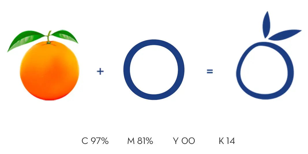
Orange is the perfect blend of nature’s freshness and vivacious color. So when it comes to representing a logo of a cafe there is no other choice but to expose nature’s bounty. The green leaves stand eternally for purity.
This logo is highly organic and simply represents nature. It could be anything with green leaves which give mankind energy and nourishment. And it stands for purity too.
The Logo
A blend of typography and imagery, symbolizing the brand’s core values. The stylized typeface lends a modern and contemporary feel, while the orange ‘O’ and green leaves evoke a sense of freshness and naturality.
The ‘O’ serves as a visual metaphor for the fresh, locally sourced fruits and vegetables used in Bistro’s cuisine. The green leaves complement the orange, reinforcing the natural and organic theme. Together, these elements create a cohesive and visually appealing composition.
The Color Palette
The blue color reinforces the organic theme and aligns with the brand’s commitment to fresh, wholesome food. Further emphasizes the connection to local, sustainable ingredients.
The Brand Identity
The logo successfully establishes a strong brand identity, differentiating it from competitors. Its unique combination of concept and symbolism communicates the brand’s values effectively and memorably.
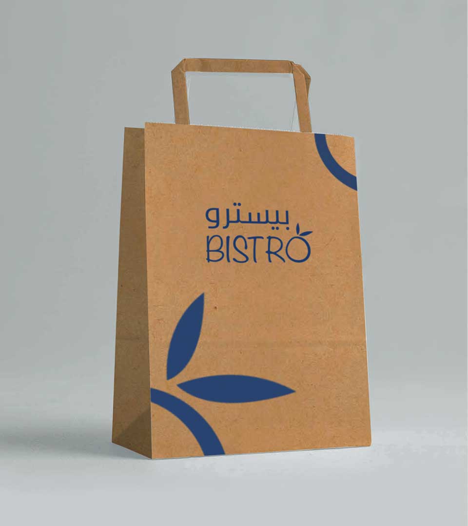
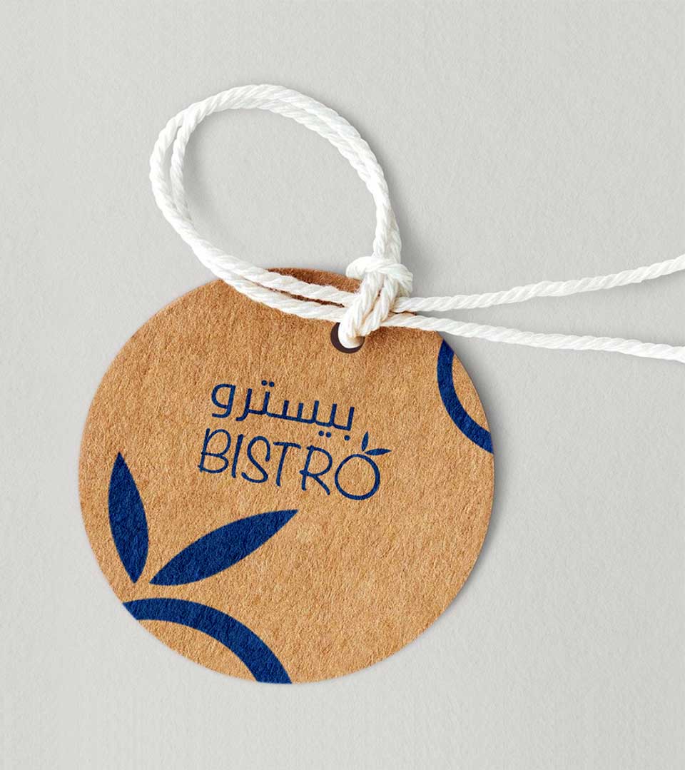
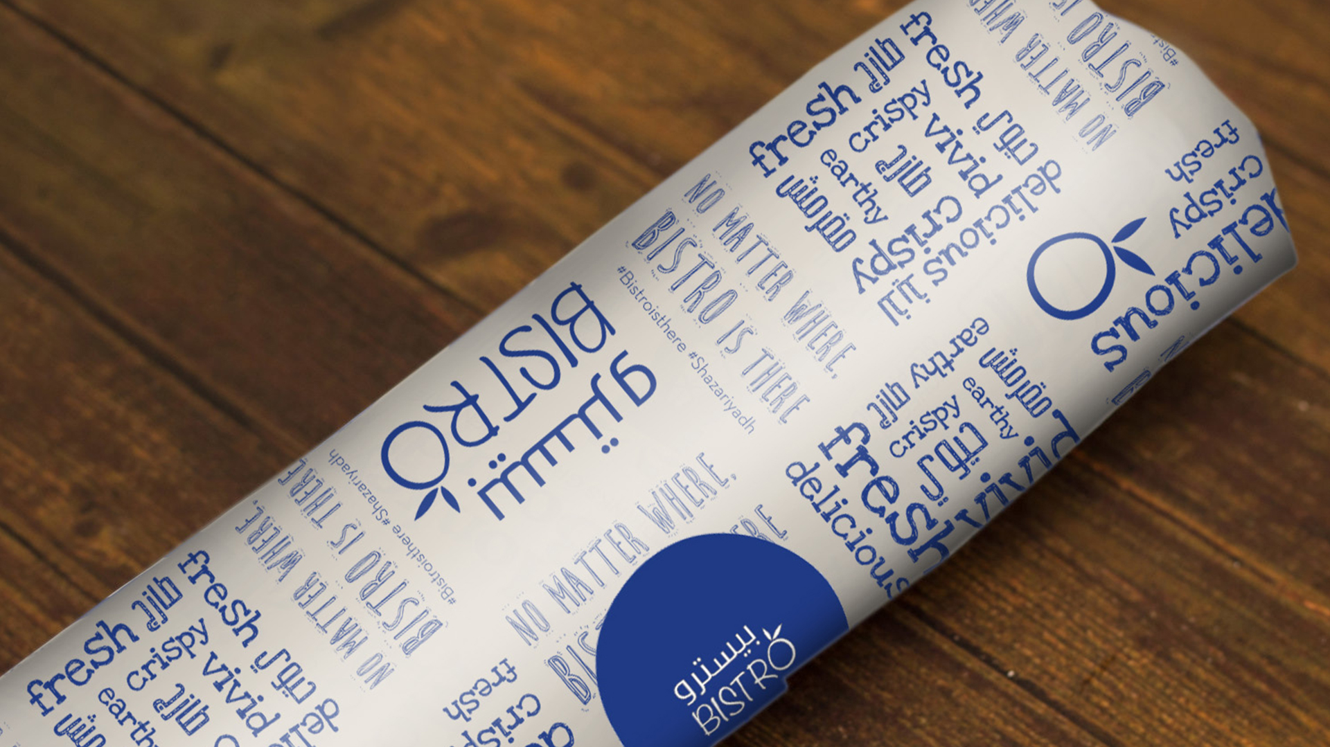
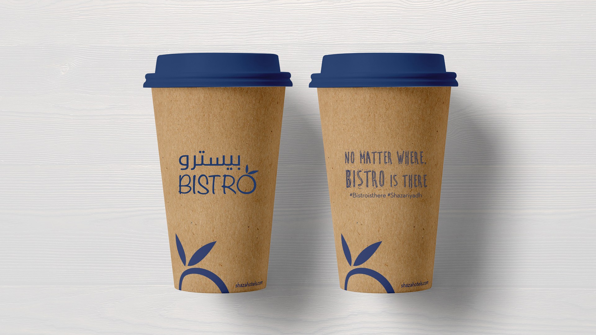
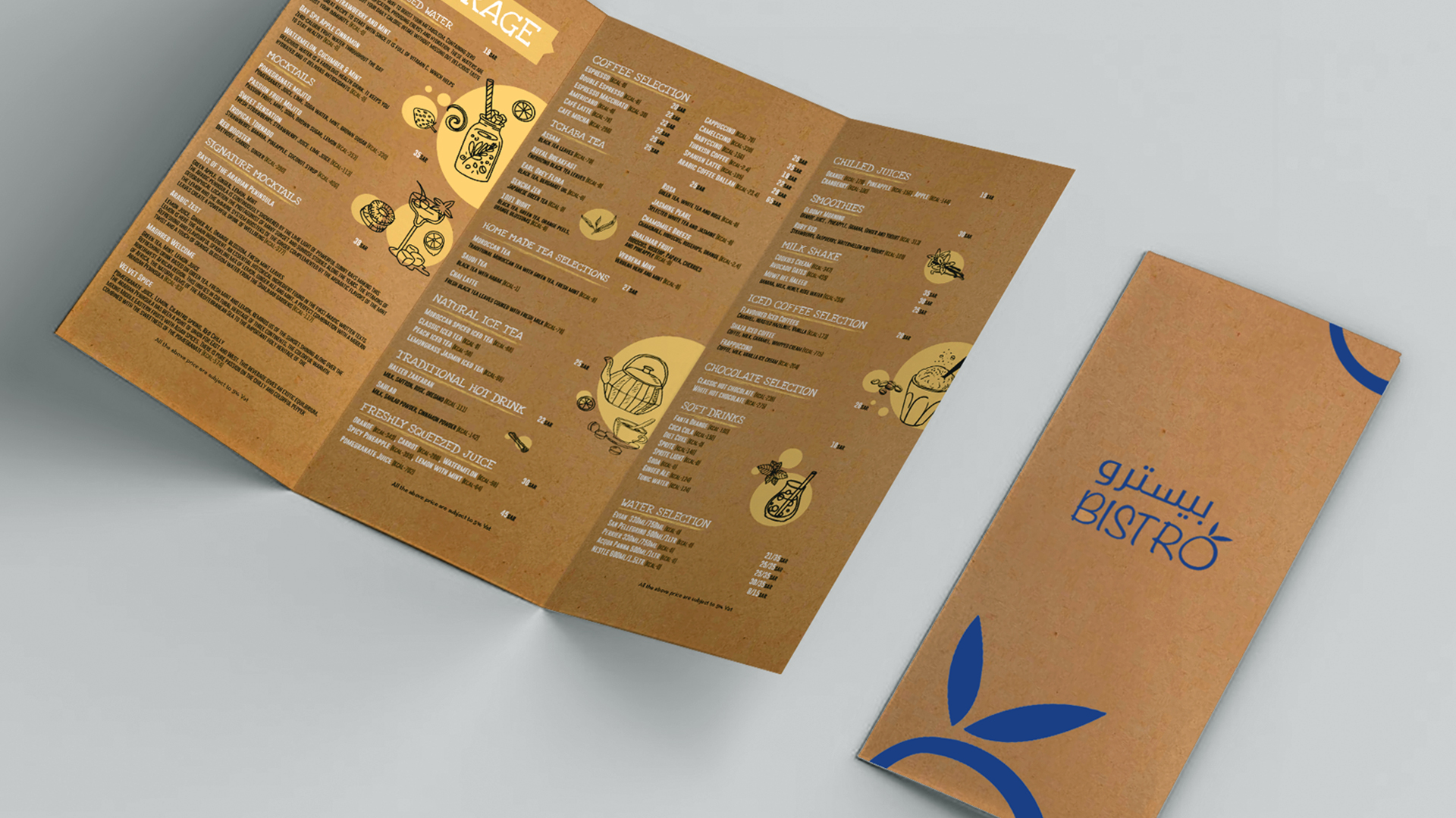
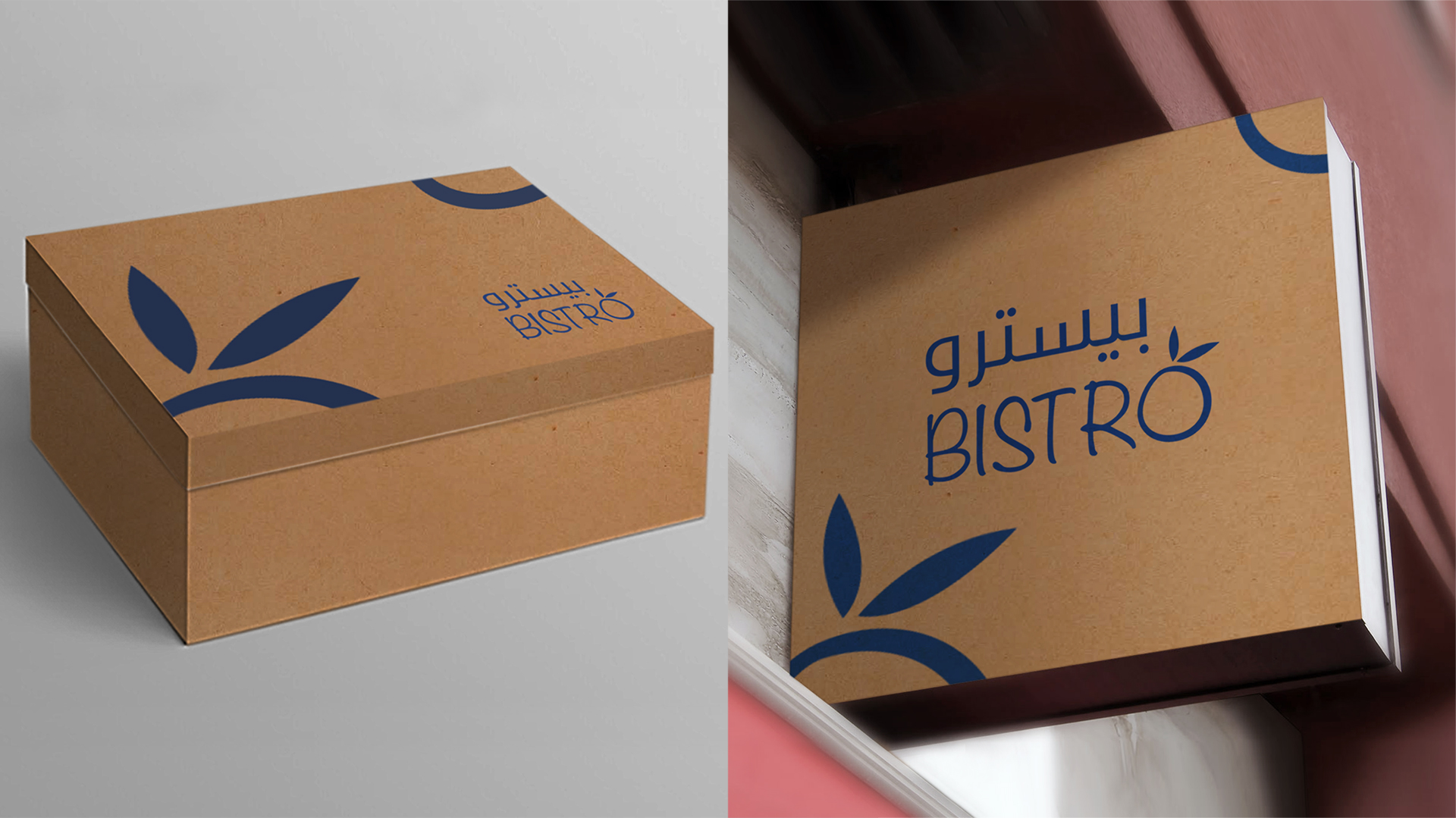
We developed a pattern using the brand element from the logo to create a brand identity and used it in the collaterals and stationery to maintain the consistency of the narration. Also used a biodegradable paper format for the packaging and stationary items to establish the vision of the brand.