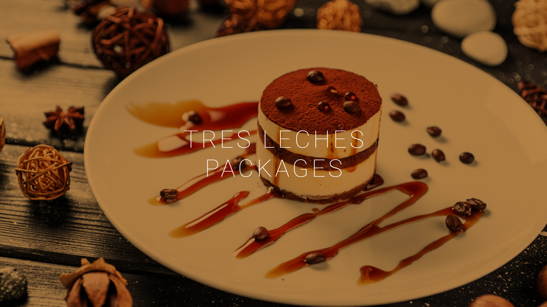
The Focus
While the honey cakes were undeniably delicious, their packaging lacked the visual appeal necessary to stand out in a crowded market. The challenge was to create a design that resonated with consumers and drove sales.
The goal was to convey the premium quality of the honey cakes while also making them visually appealing and convenient for consumers to enjoy.
The Design
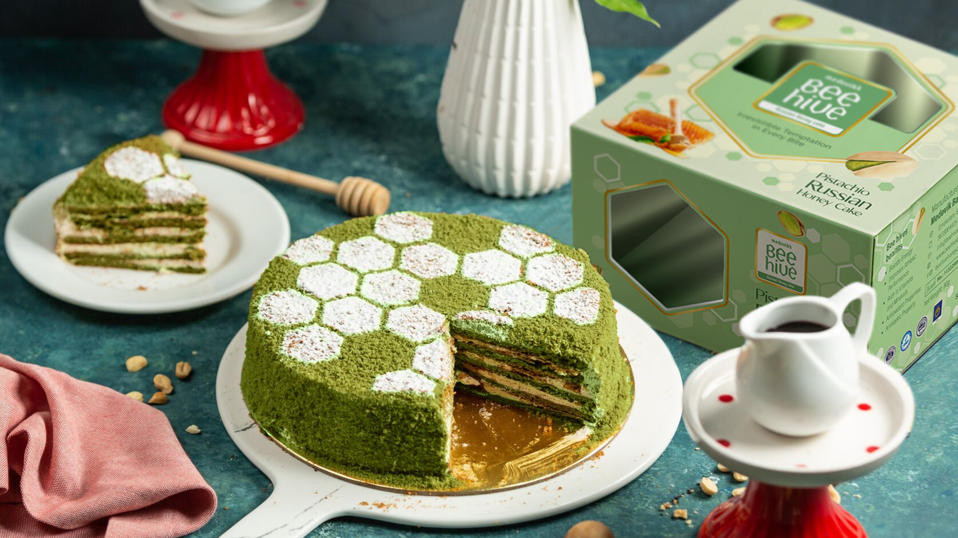
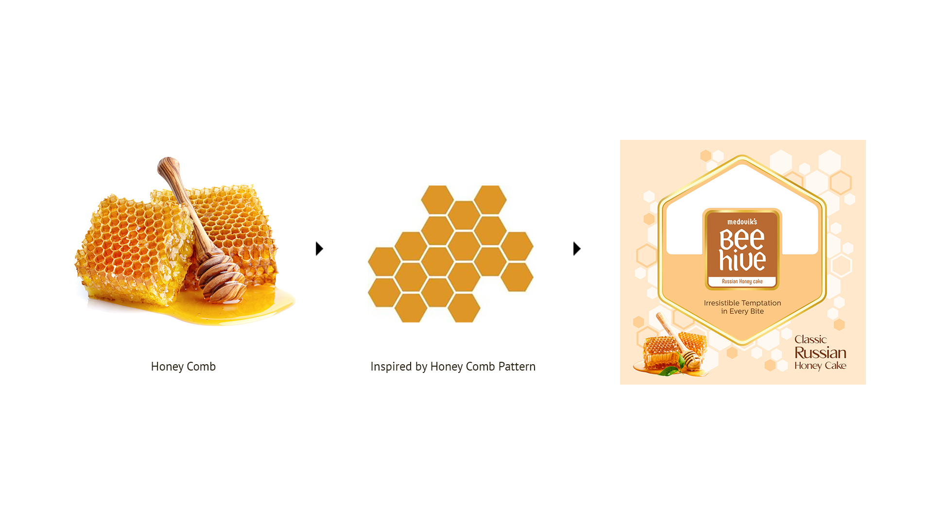
Inspired by the intricate patterns of honeycombs, CR8 developed a packaging design that was both visually striking and evocative of the product’s origins. The honeycomb motif was incorporated into the design, creating a sense of natural beauty and authenticity.
To enhance the premium appeal of the packaging, gold foils were added, adding a touch of luxury and sophistication. The use of met pet paper further elevated the overall aesthetic, creating a package that felt substantial and high-end.
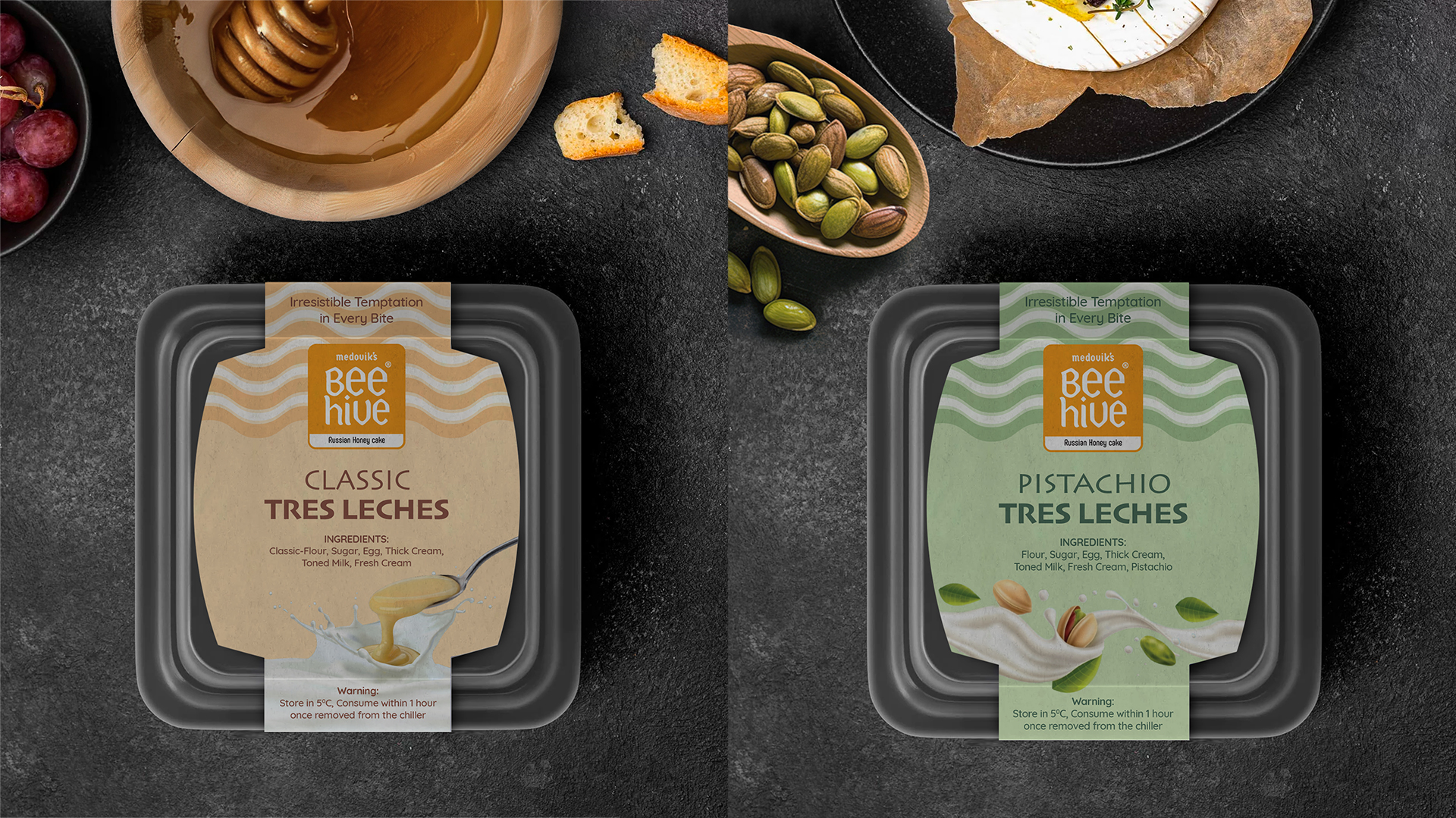
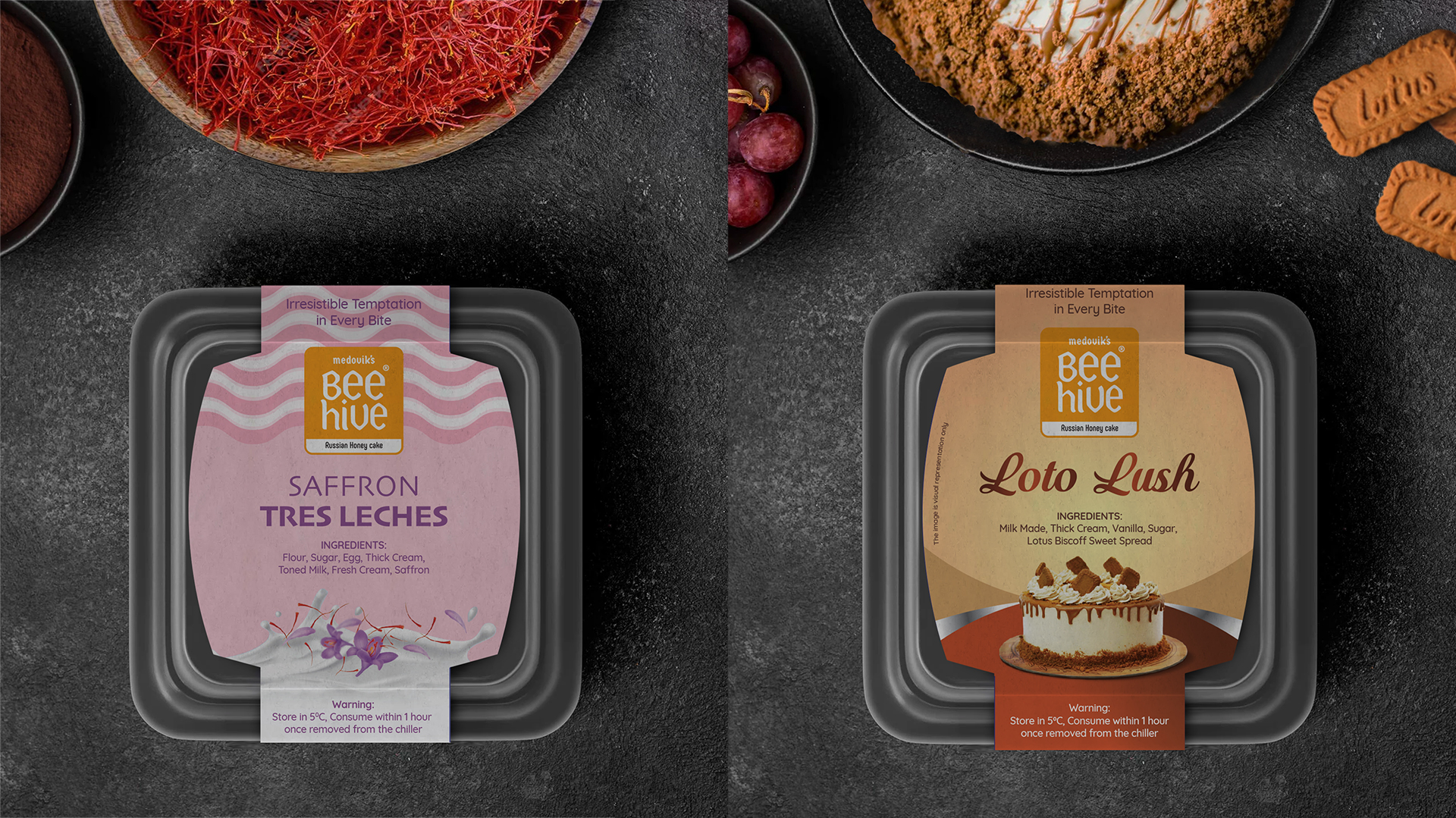
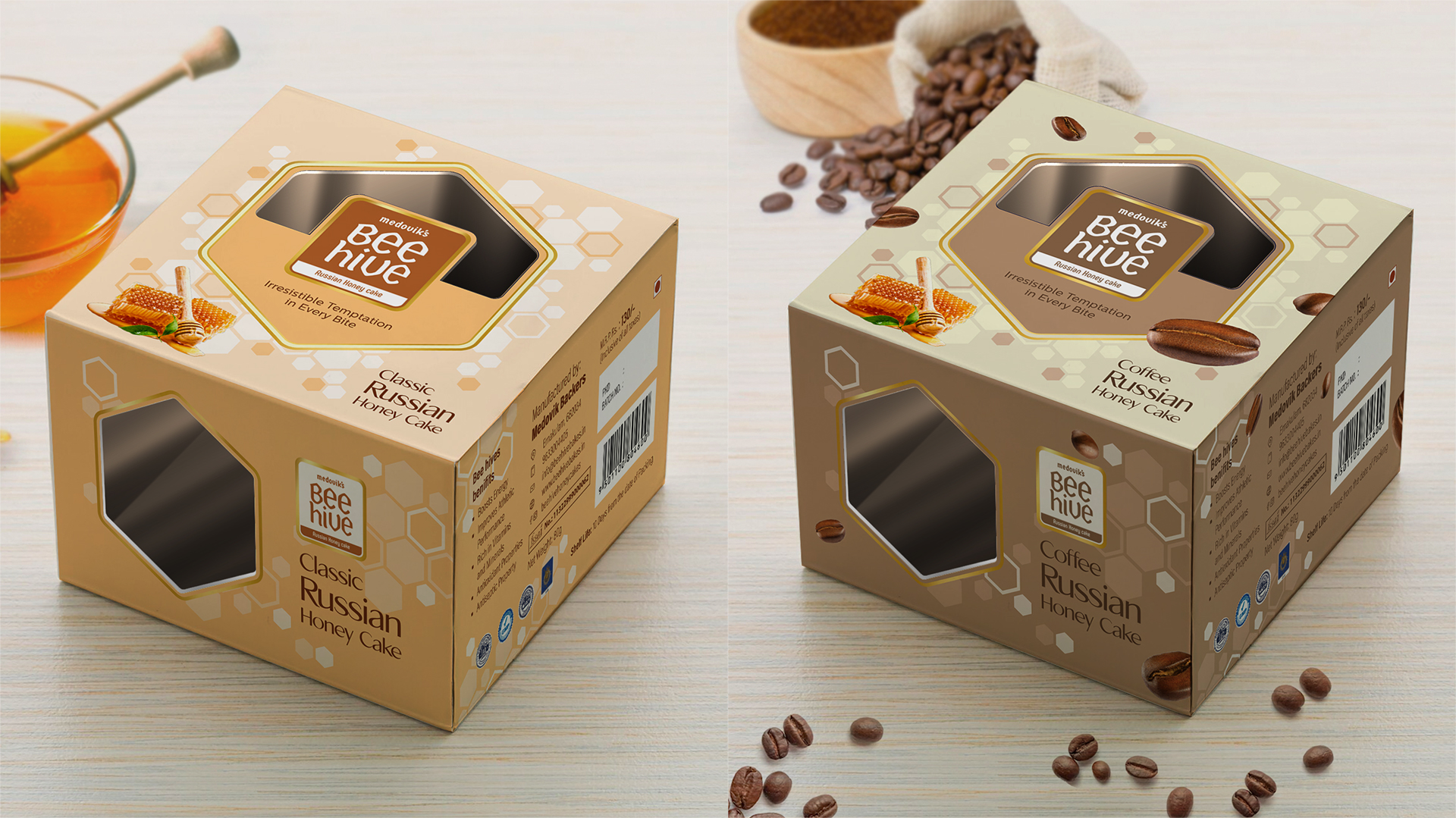
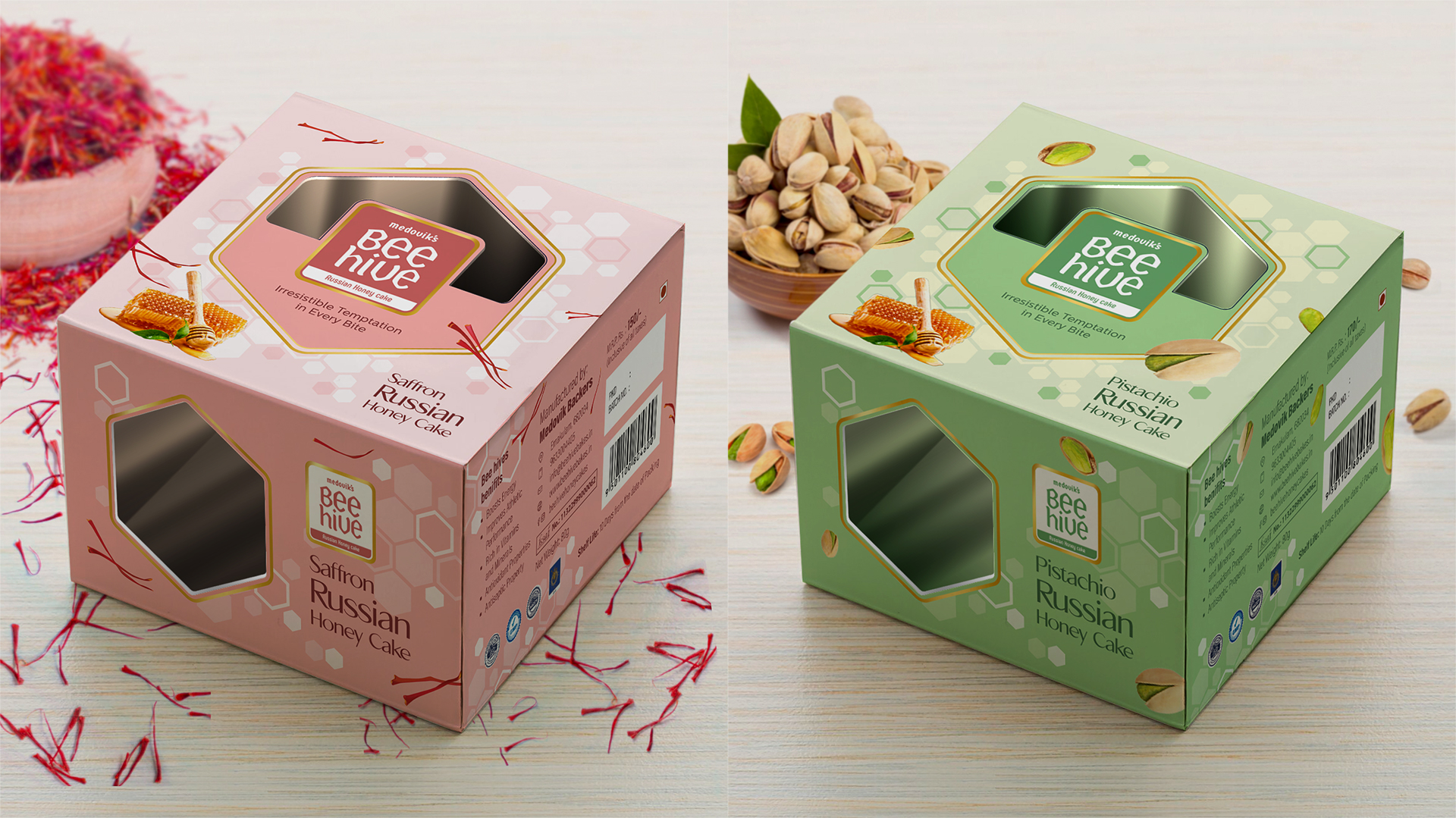
To make the honey cakes even more appealing, the packaging was designed with a transparent top, allowing consumers to see the deliciousness within. A tray-like base was also included, providing a convenient way for consumers to enjoy their treats without the need for additional plates.
The new packaging design for Bee Hive honey cakes was a resounding success. The visually appealing and functional packaging not only captured the attention of consumers but also conveyed the premium quality of the product. As a result, the honey cakes became even more popular, solidifying Bee Hive’s position as a leading manufacturer of exquisite Russian confectionery.
Key Design Elements
Honeycomb Pattern: The intricate honeycomb pattern served as the central design element, symbolizing the natural and artisanal nature of the honey cakes.
Gold Foils: The addition of gold foils added a touch of opulence and elegance, further enhancing the premium perception of the product.
Met Pet Paper: The use of met pet paper ensured the packaging was both durable and visually appealing, protecting the delicate cakes while showcasing their deliciousness.
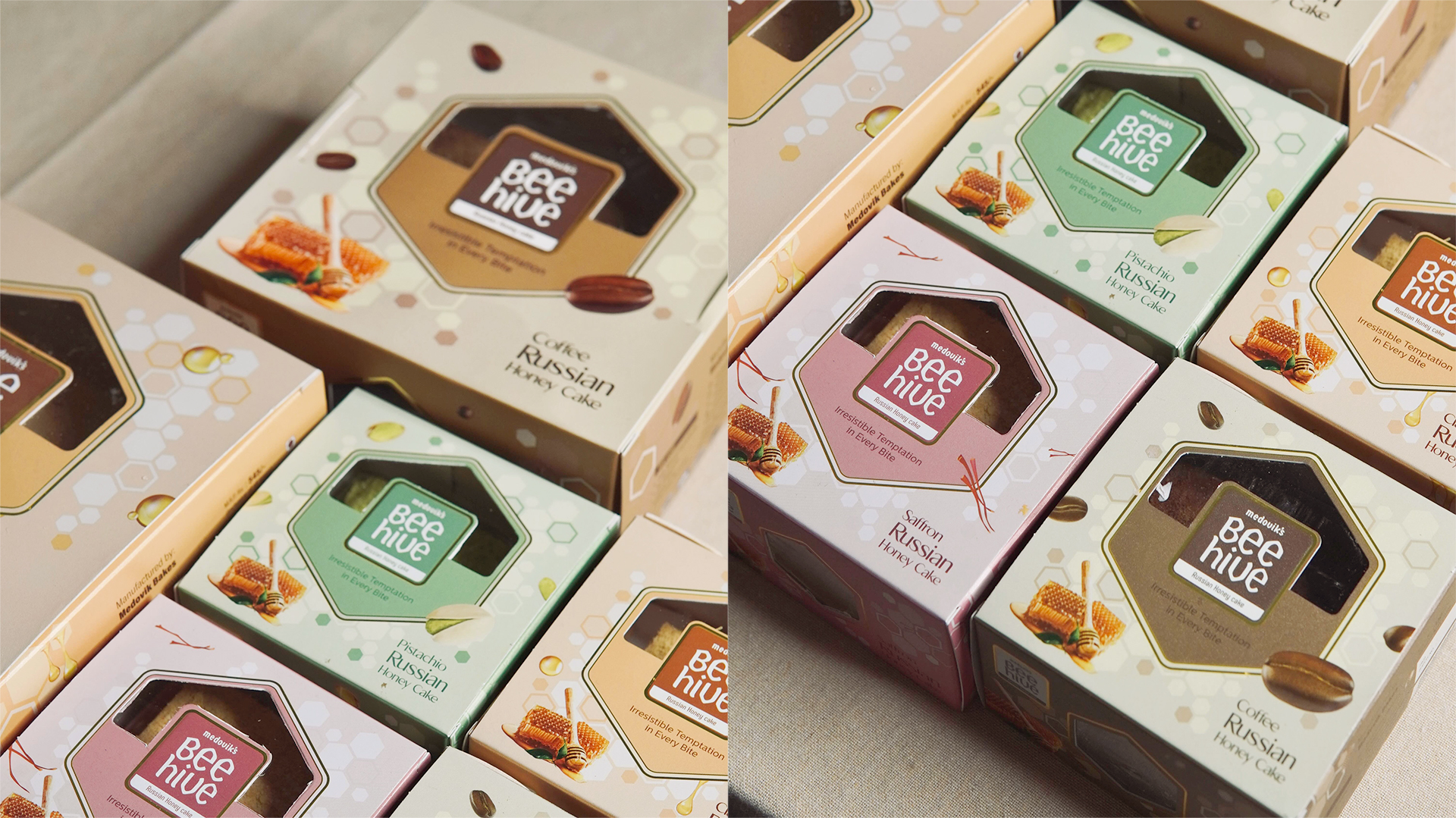
Pastel Colors: The use of pastel colors for different flavors not only added a vibrant and inviting aesthetic but also helped to differentiate the various offerings.
Flavor Motifs: The inclusion of flavor-specific motifs on the packaging provided visual cues about the taste and ingredients, making it easier for consumers to choose their preferred flavor.
Transparent Top: The transparent top allows consumers to catch a glimpse of the deliciousness within, creating a sense of anticipation and desire.
Tray-Like Base: The packaging includes a tray-like base, making it convenient for consumers to enjoy their treats without the need for additional plates.
Spoon Holder: A built-in spoon holder adds a practical touch and enhances the overall user experience.