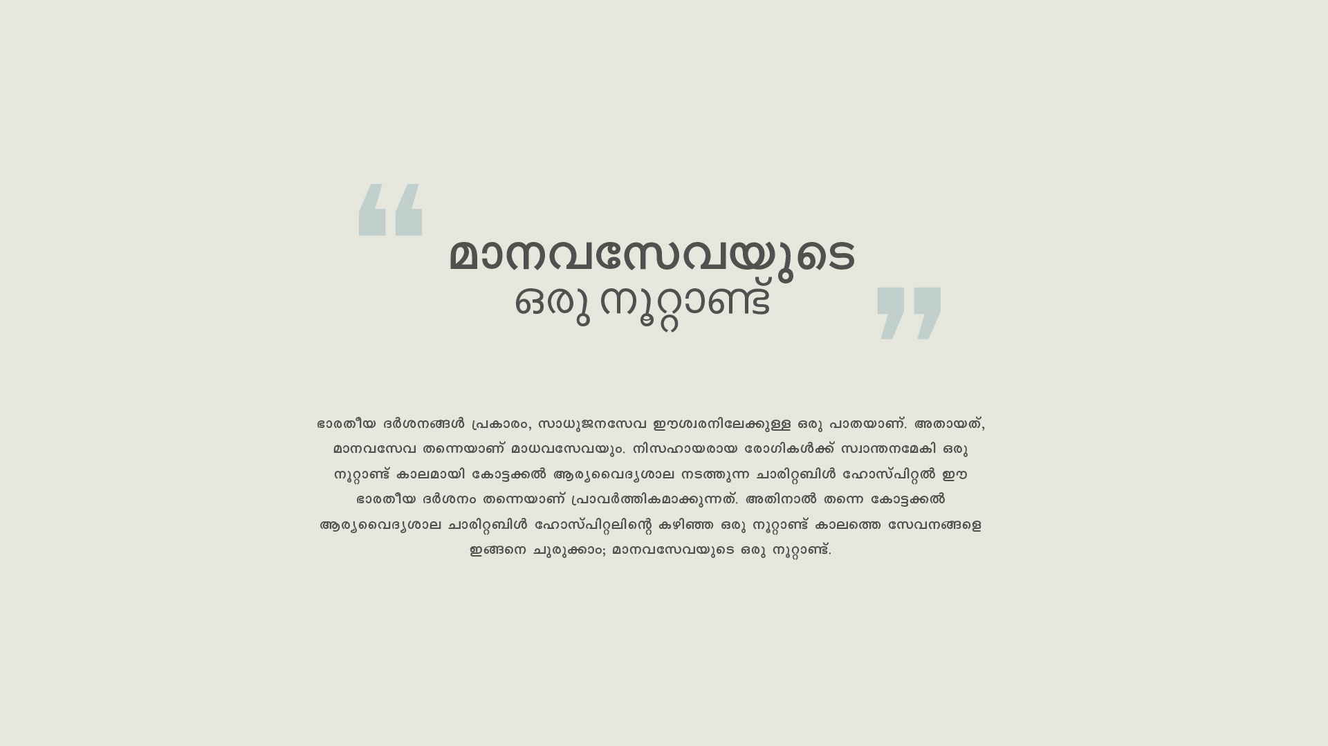
The Concept
The establishment of the Charitable Hospital is very significant not only in the history of Arya Vaidya Sala but in the history of the evolution of the Ayurvedic system of health care also. P.S. Varier established this facility for imparting practical instruction to the students of his Ayurveda College.
The logo design for the 100th-anniversary celebration should have effectively captured the essence of the institution’s rich history, compassionate care, and commitment to holistic well-being.
The design draws inspiration from the provided brief, which emphasizes the significance of the 100th anniversary, the legacy of Vaidyaratnam PS Variyar, the founder of Arya Vaidya Sala, and the hospital’s core values of care, peace, and hope.
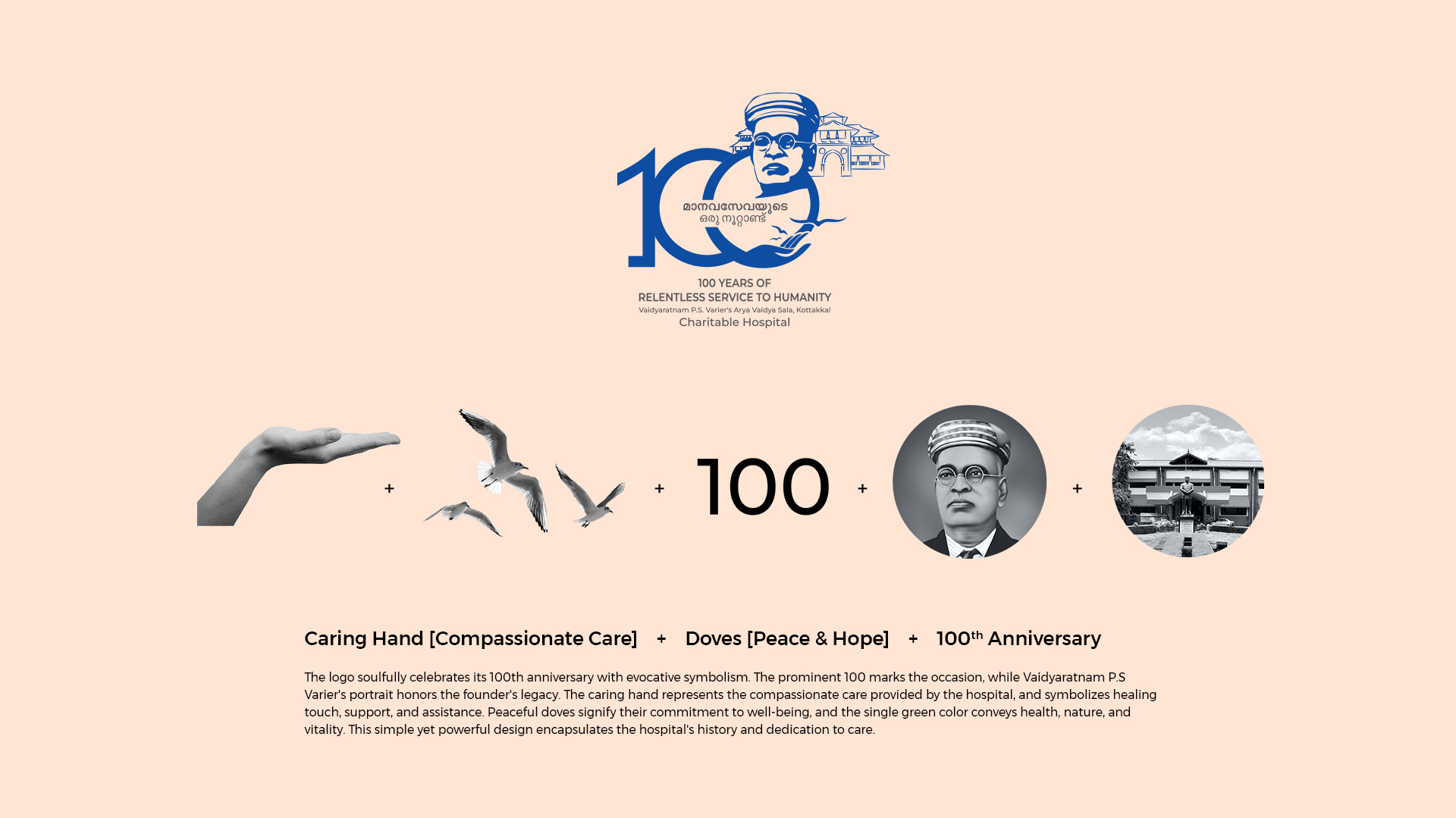
Central Symbolism
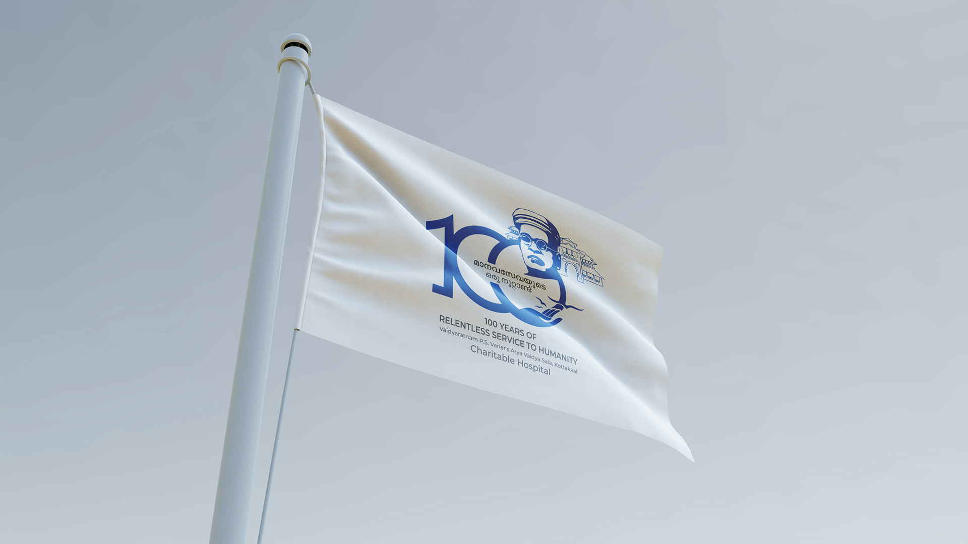
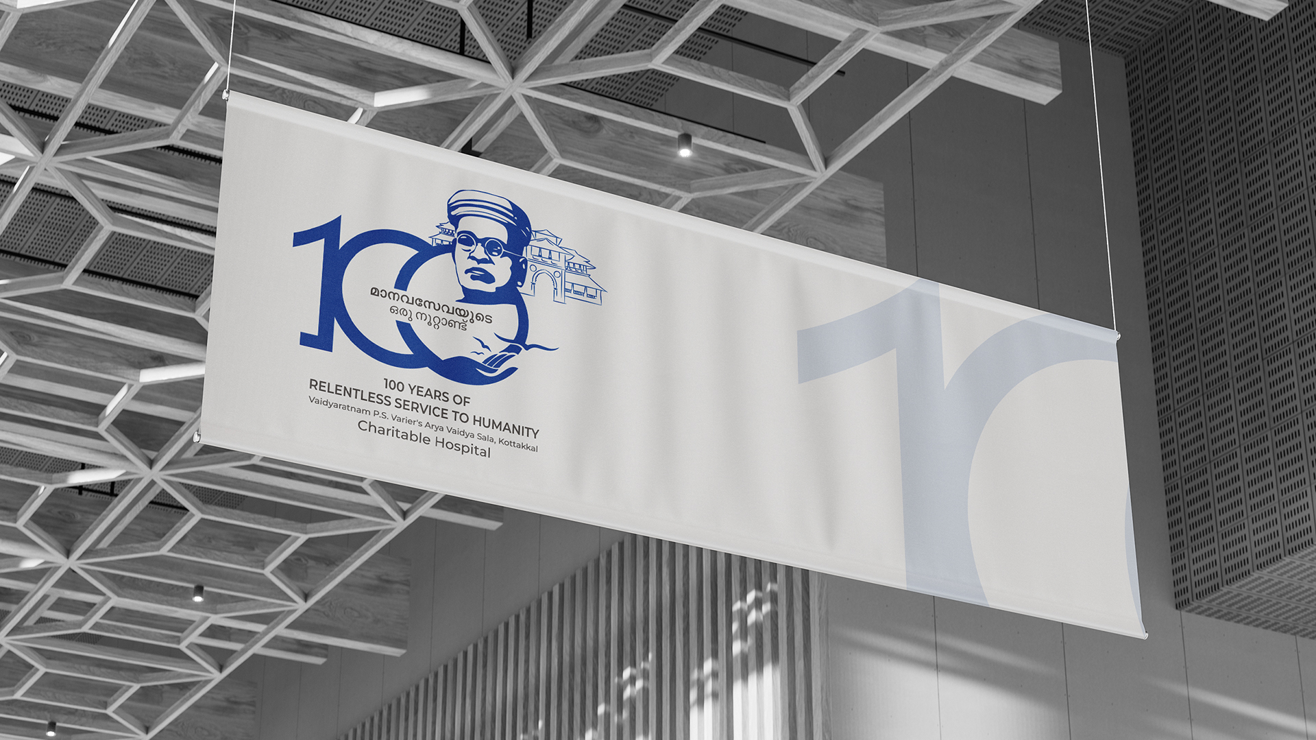
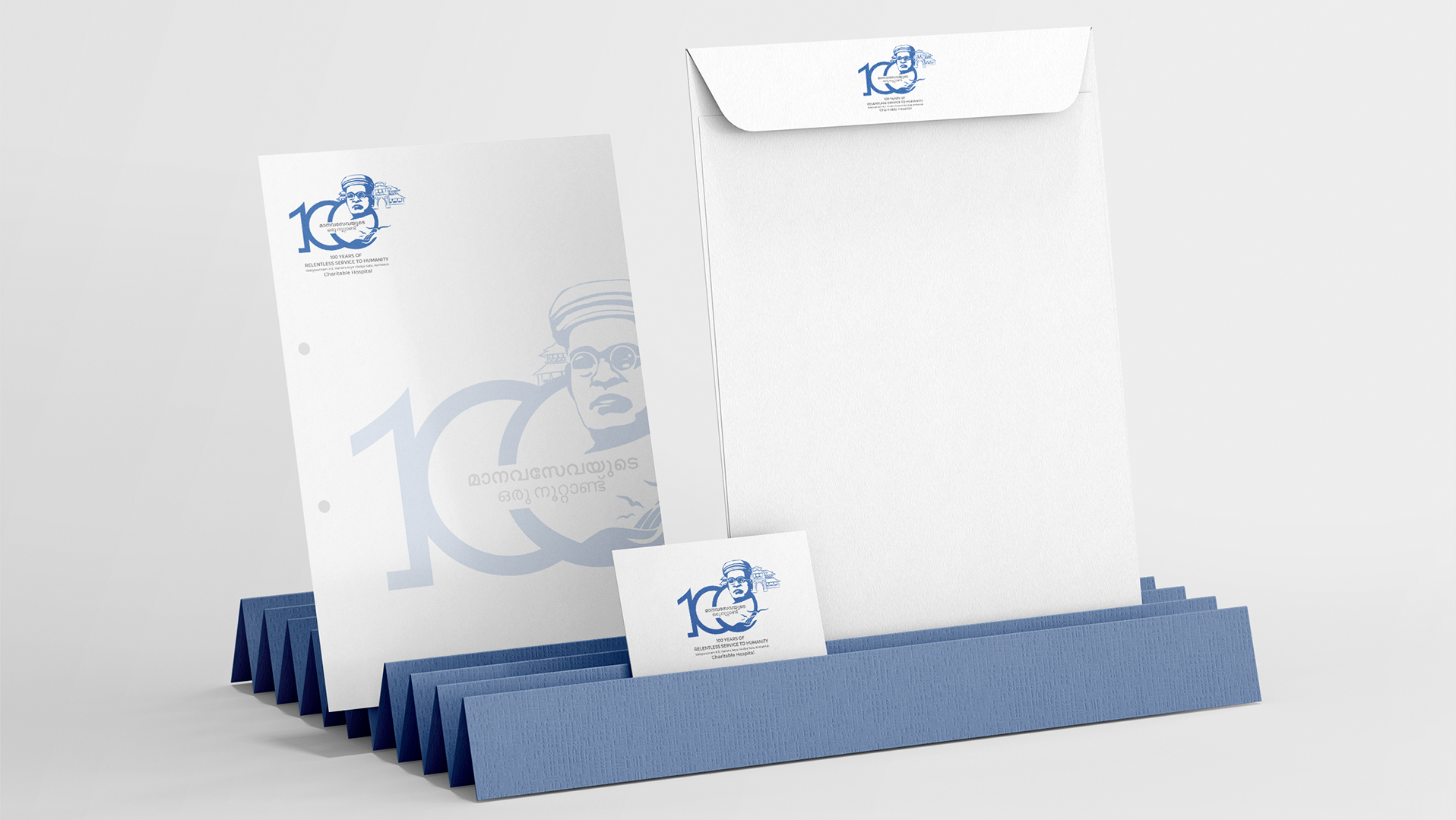
The prominent “100”: This serves as the anchor of the design, clearly marking the centennial celebration. It signifies longevity, experience, and the institution’s enduring legacy.
Vaidyaratnam PS Variyar’s portrait: Paying homage to the founder, the portrait instills a sense of respect and reverence for the institution’s roots. It symbolizes the visionary leadership that laid the foundation for the Arya Vaidya Sala’s success.
The caring hand: This delicate yet powerful symbol represents the compassionate care provided by the hospital. It evokes feelings of empathy, support, and healing, embodying the institution’s commitment to patient well-being.
Doves: These graceful birds symbolize peace, hope, and renewal. Their presence signifies the hospital’s role in restoring health and bringing solace to those in need.
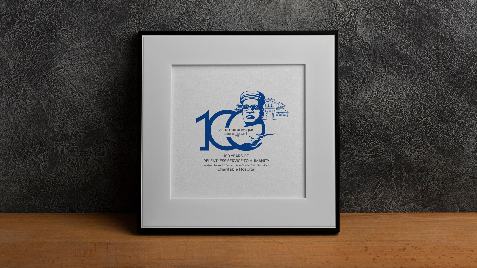
The Logo
The logo soulfully celebrates its 100th anniversary with evocative symbolism. The prominent 100 marks the occasion, while Vaidyaratnam PS Variyar’s portrait honors the founder’s legacy. The caring hand represents the compassionate care provided by the hospital and symbolizes healing touch, support, and assistance. Peaceful doves signify their commitment to well-being, and the single green color conveys health, nature, and vitality. This simple yet powerful design encapsulates the hospital’s history and dedication to care.
The Color Palette
The use of a single green color throughout the logo is both calming and invigorating. Green is universally associated with nature, health, and vitality, aligning perfectly with the principles of Ayurveda. It creates a sense of harmony and balance, reflecting the holistic approach of the Arya Vaidya Sala.
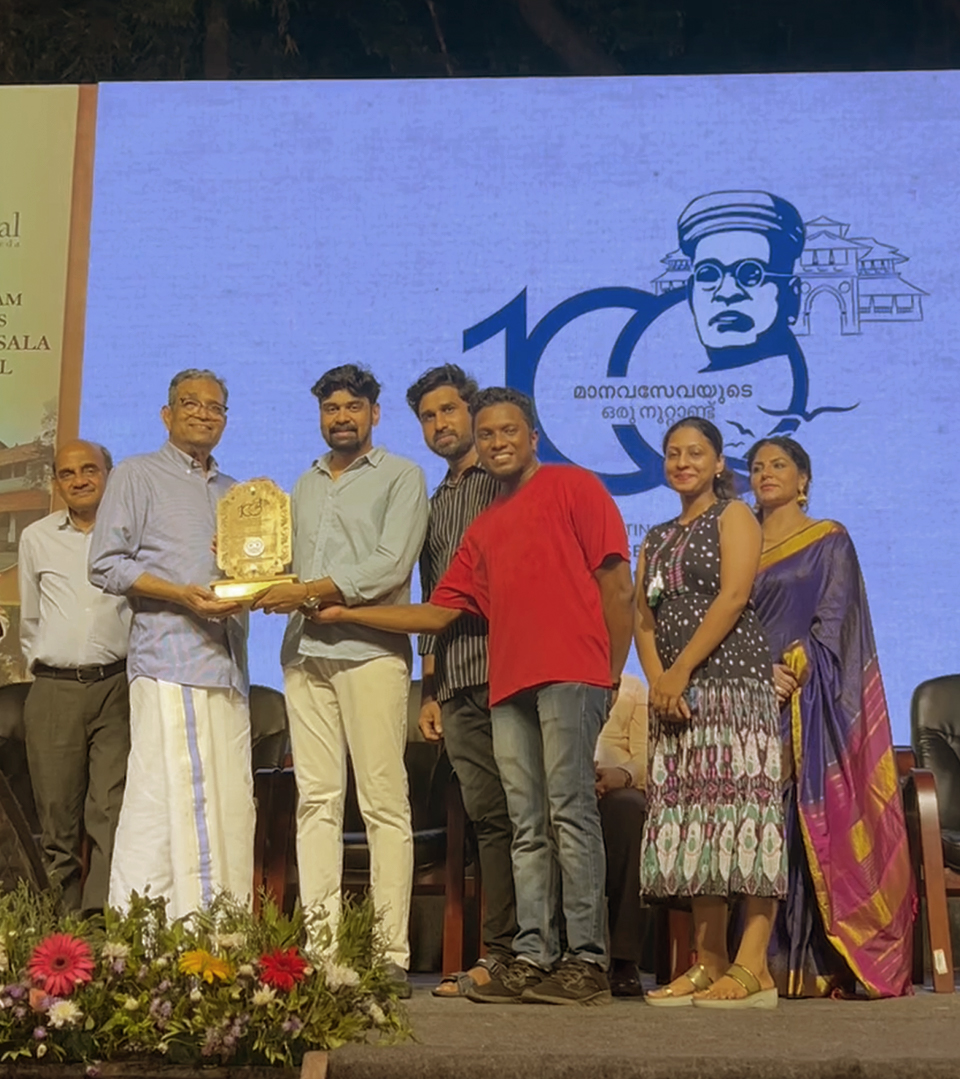
How the logo impacted the event
The logo effectively communicates the essence of the 100th anniversary celebration of the Charitable Hospital. Its symbolic elements resonate with the institution’s values and history, creating a strong visual identity that reinforces its brand image. The logo’s clean and elegant design exudes a sense of professionalism and trustworthiness, reflecting the hospital’s reputation for excellence in Ayurvedic care.
Incorporating the logo into various promotional materials and event collateral effectively conveyed the significance of the anniversary and generated excitement and anticipation among the target audience. The logo’s visual impact will leave a lasting impression, solidifying the Kottakal Arya Vaidya Sala’s position as a leading institution in Ayurveda and healthcare.
The logo design for the Kottakal Arya Vaidya Sala 100th anniversary celebration is a successful representation of the institution’s legacy, values, and commitment to patient care. It effectively captures the essence of the occasion and will undoubtedly leave a positive and memorable impact on the event.