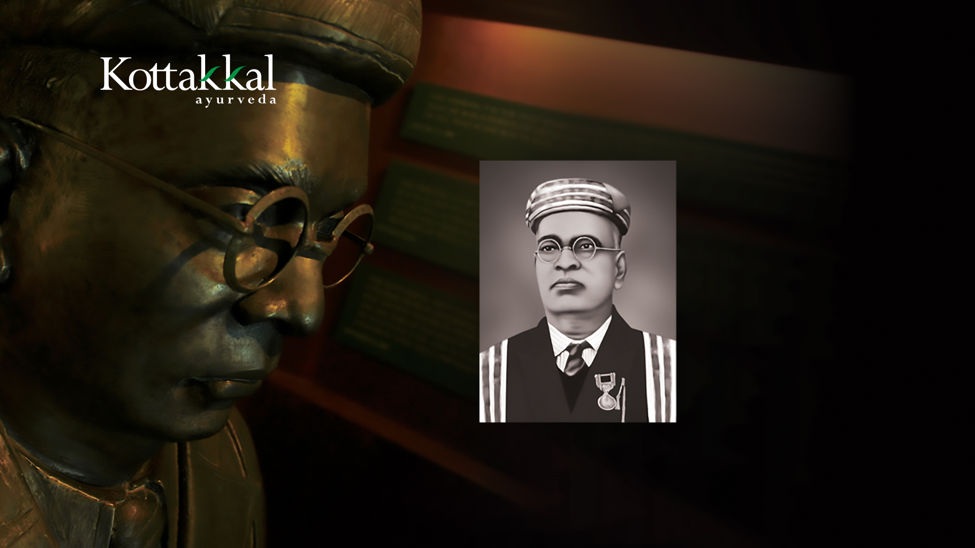
Commemorating the 150th Birth Anniversary of Vaidyaratnam P.S Varier
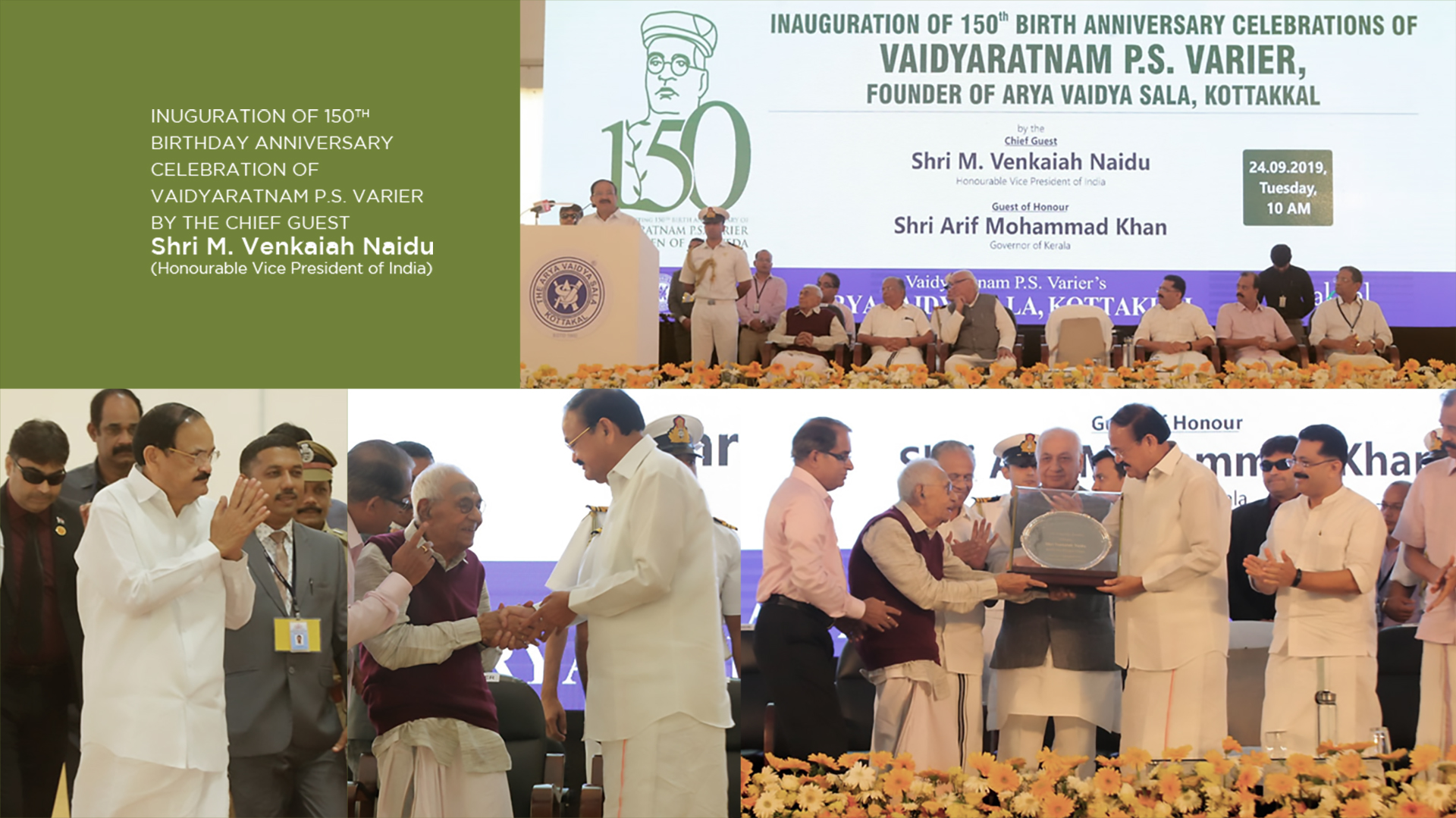
The Logo was a proud creation on the occasion of the 150th birth anniversary of Vaidyaratnam P S Varier, the doyen of Ayurveda in Kerala. The logo taps the sublime emotion of the name and the tradition it reminds of. The great soul had dedicated his entire life to Ayurveda and its growth. We used a plant as his body which conveys the whole concept. Honourable Vice President of India Sri. Venkiah Naidu inaugurated the anniversary celebrations.
The Concept
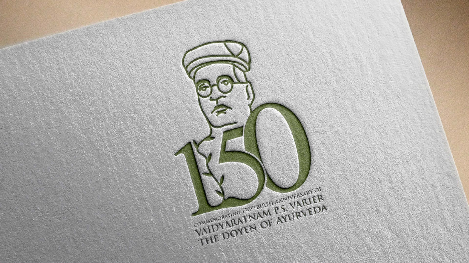
The concept of the logo is drawn from nature or it is nature-oriented. It shows the earth and its abundance and its reach to the total well-being of the human race. It can sprout inside and outward as shown at the tip. The tone is rather subdued as it is apt for the whole idea of greatness and defining divinity of certain processes.
Journey to the Concept
The design process began with a deep understanding of the client’s brief and the significance of the occasion. CR8 conducted extensive research into the life and work of Vaidyaratnam P.S. Varier, as well as the history and philosophy of Ayurveda.
Several design concepts were explored, but the final design emerged as the clear winner due to its simplicity, elegance, and resonance with the core message.
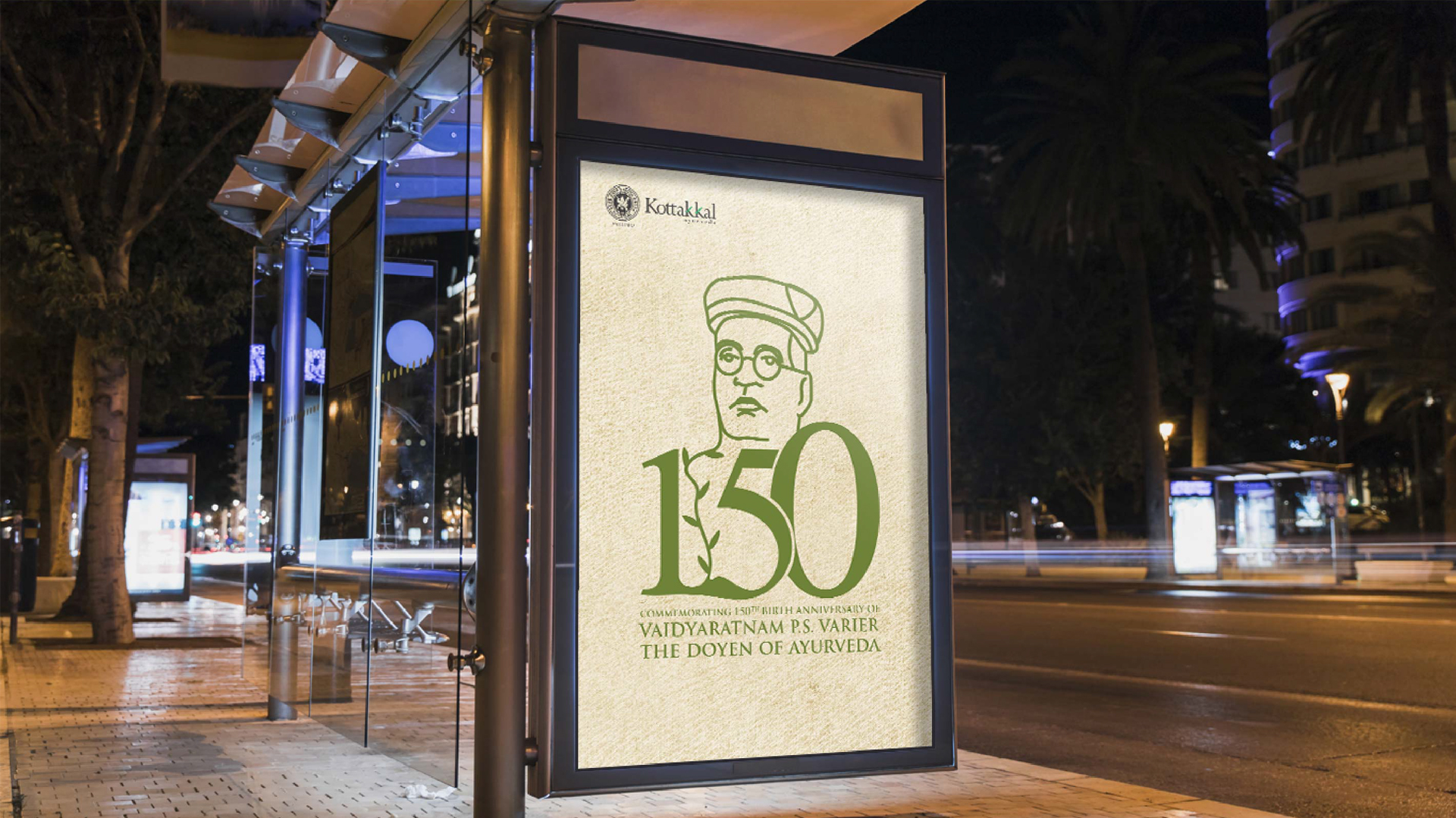
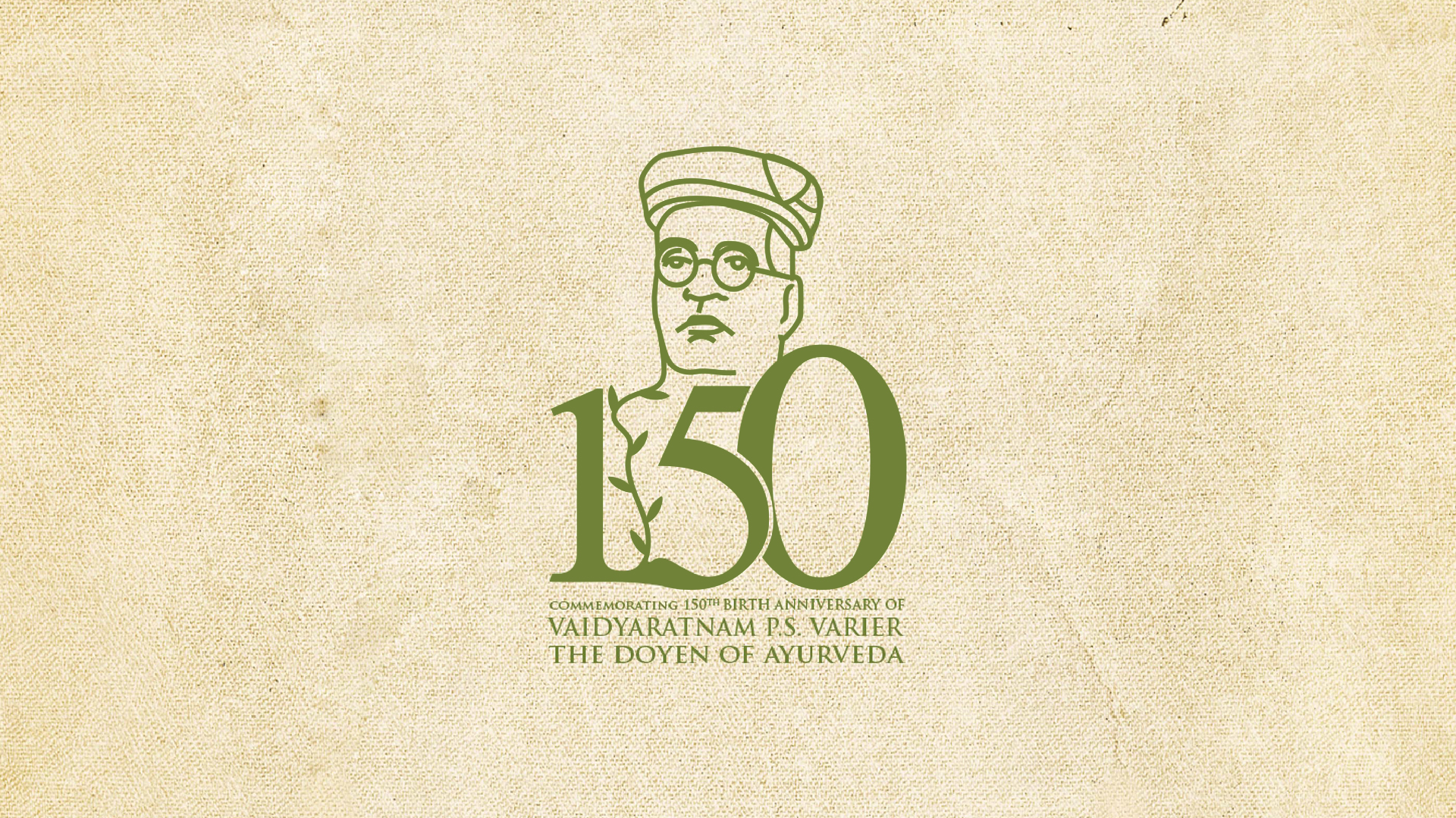
The Logo
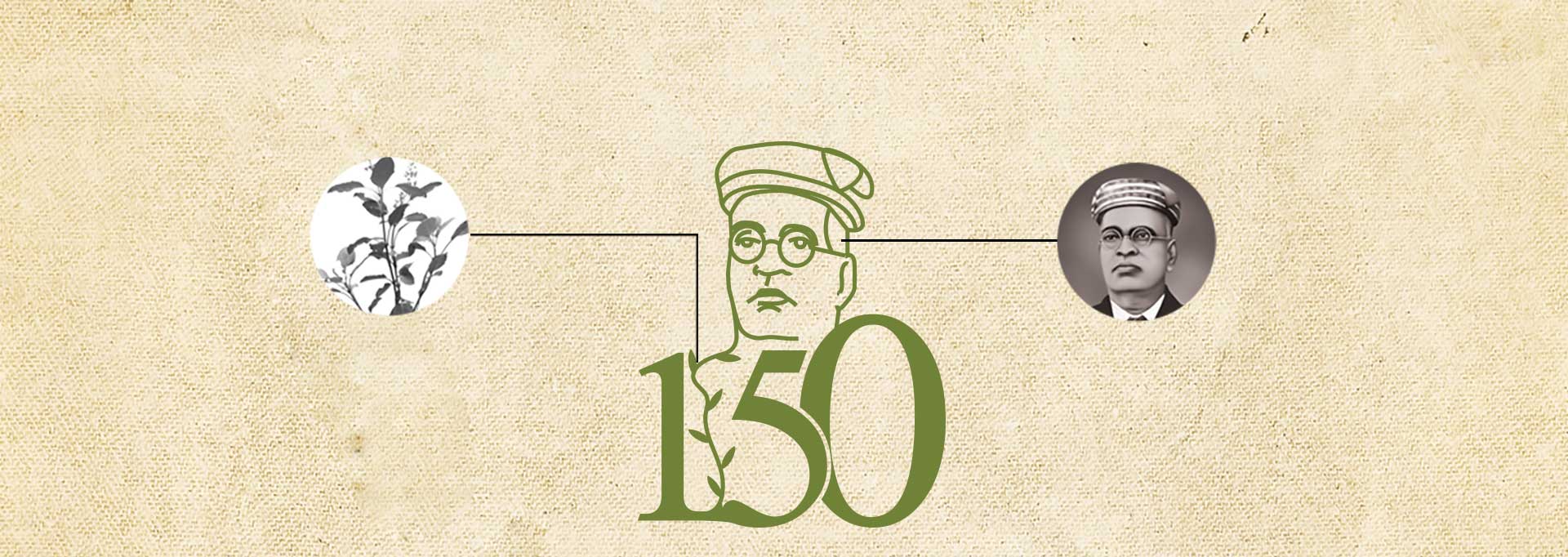
The logo is a powerful and evocative representation of the legacy of the great man, P.S Varier. The design is rooted in nature, drawing inspiration from the earth and its abundance, and reflecting the Ayurvedic principles of holistic health and well-being.
The central image of Vaidyaratnam P.S. Varier’s face is instantly recognizable, evoking a sense of pride and reverence for this revered figure. His likeness is rendered in a simple, yet dignified manner, capturing his essence and conveying his wisdom and compassion.
The number 150 is incorporated into the design in a creative and visually appealing way, symbolizing the long and illustrious history of Ayurveda and the significant milestone being celebrated. The intertwining of the number with the plant motif further reinforces the connection between Ayurveda and nature.
The Color Pallete
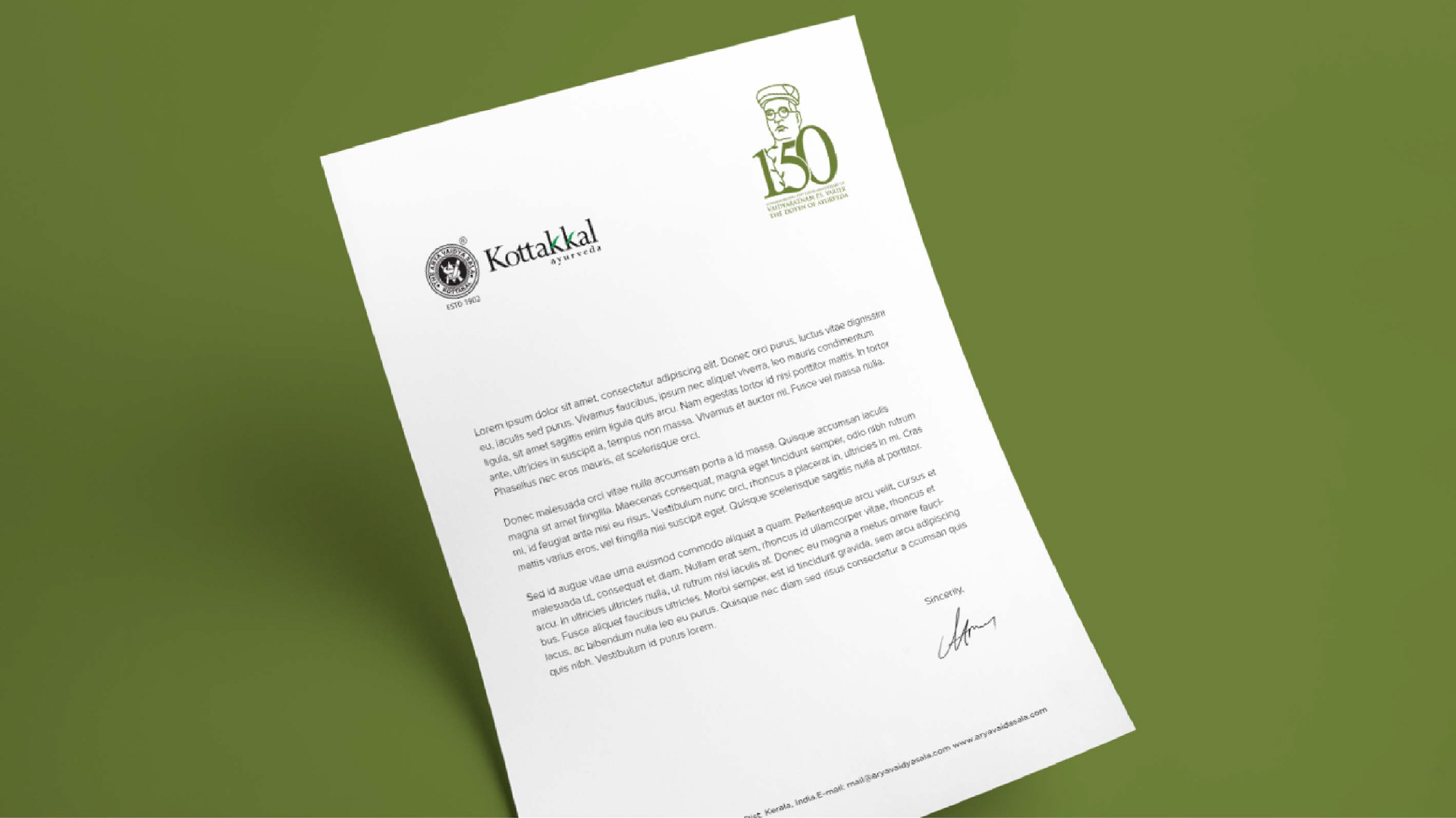
A muted and earthy color scheme dominates, drawing inspiration from the natural world that is central to Ayurvedic principles. These colors, such as deep greens, rich browns, and soft golds, symbolize growth, stability, and purity. The palette exudes a sense of timelessness and authenticity, reflecting the enduring legacy of Kottakkal Arya Vaidya Sala. This deliberate choice of colors reinforces the brand’s connection to nature and its commitment to holistic well-being.
How the logo impacted the event
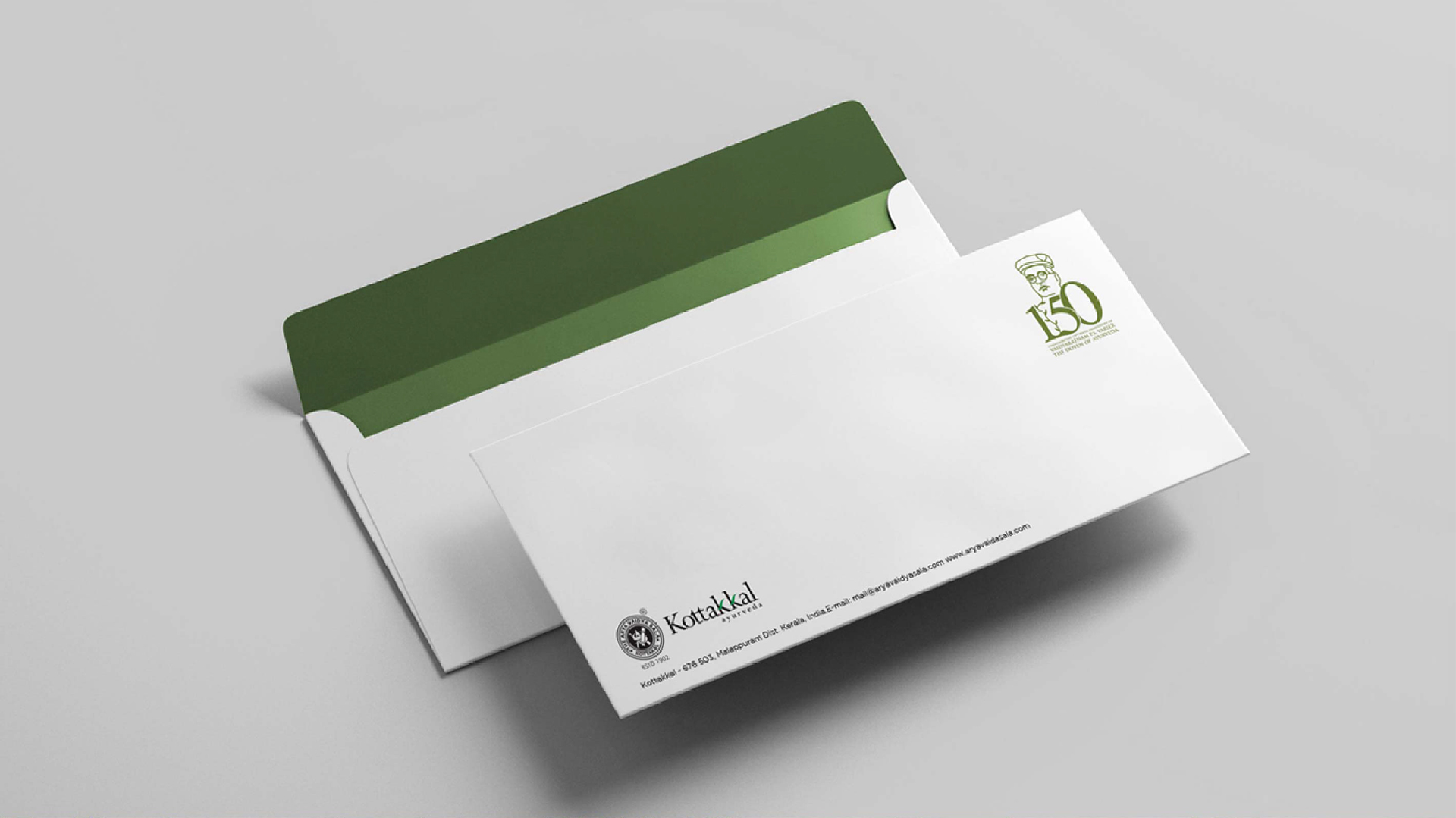
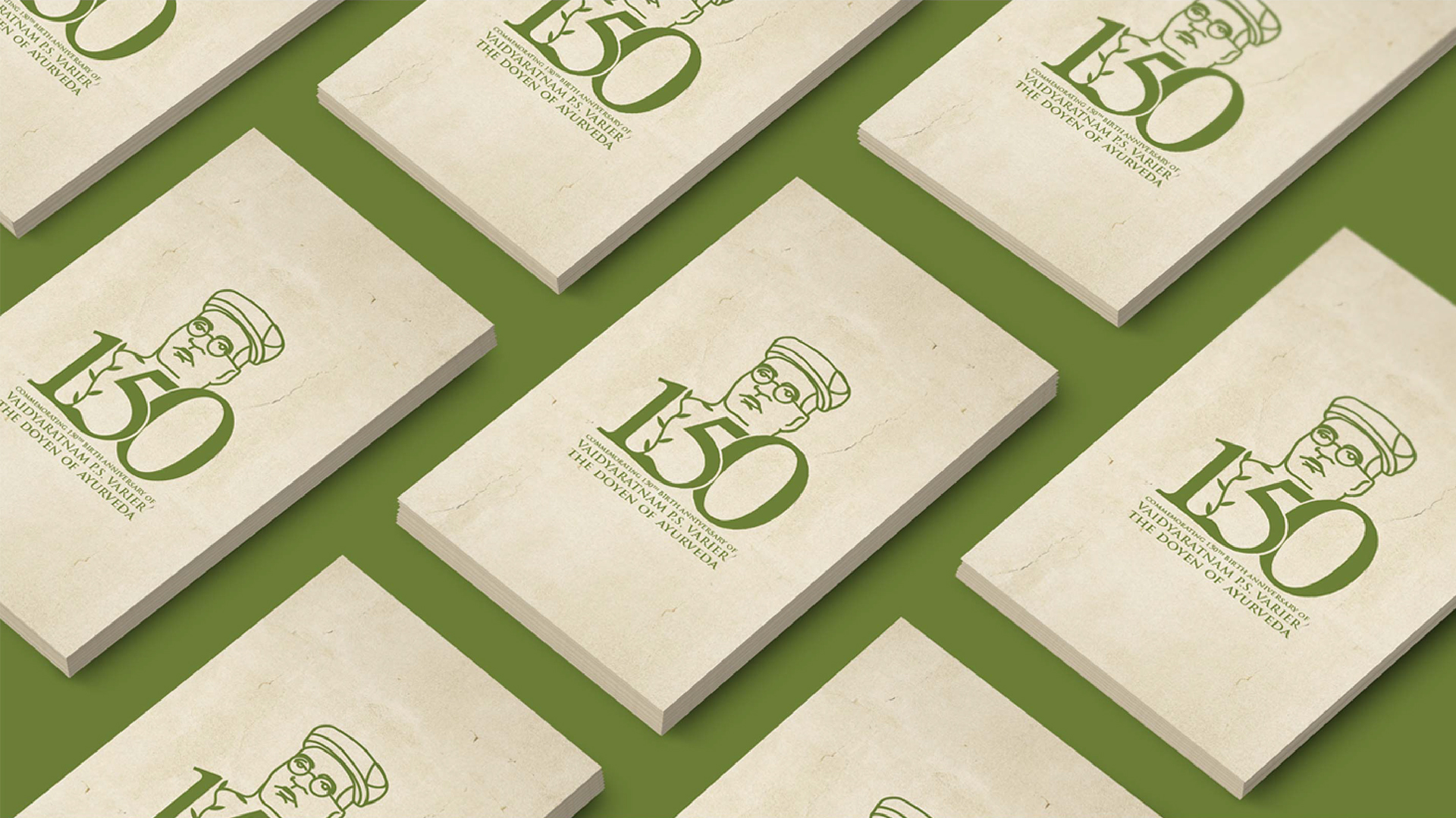
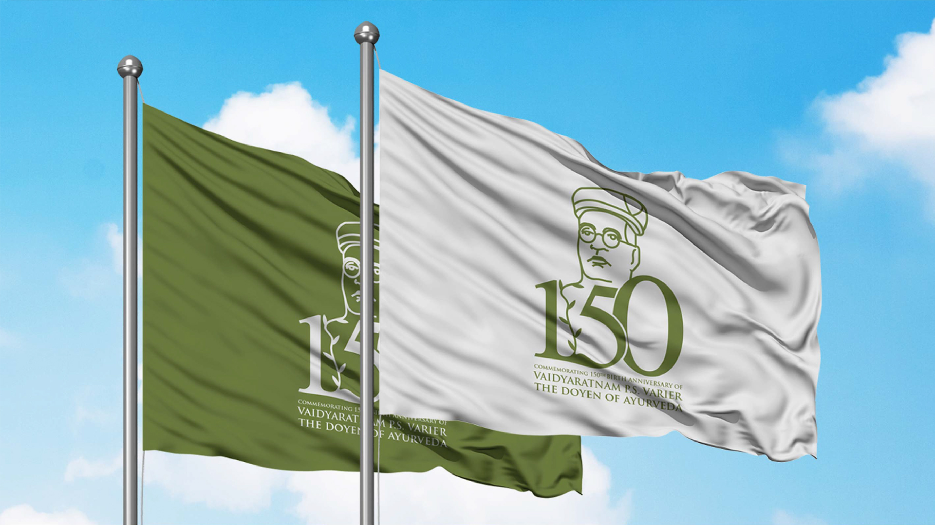
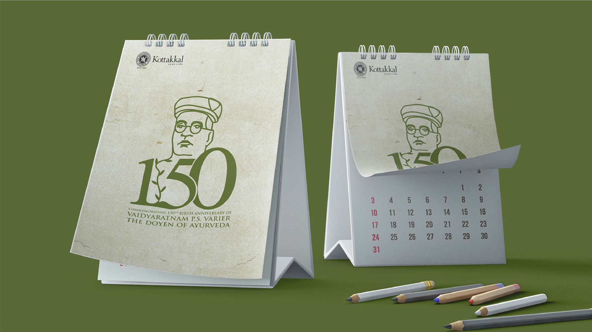
The logo played a crucial role in raising awareness of the 150th birth anniversary of Vaidyaratnam P.S. Varier and generating excitement and anticipation for the year-long celebration. It was widely used across all marketing and promotional materials, including print, digital, and outdoor advertising.
The logo helped to create a strong visual identity for the event, unifying the various activities and initiatives under a single, recognizable brand. It also helped to elevate the stature of the event, positioning it as a significant cultural and historical milestone.
The logo was well-received by the public and generated positive feedback from the media and the Ayurvedic community. It has become a lasting symbol of Vaidyaratnam P.S. Varier’s legacy and the enduring heritage of Ayurveda.
![]()