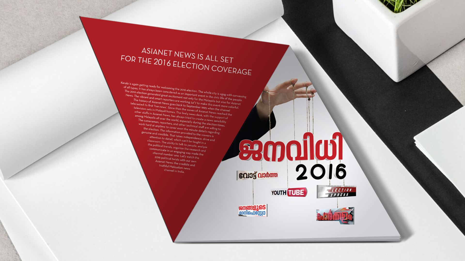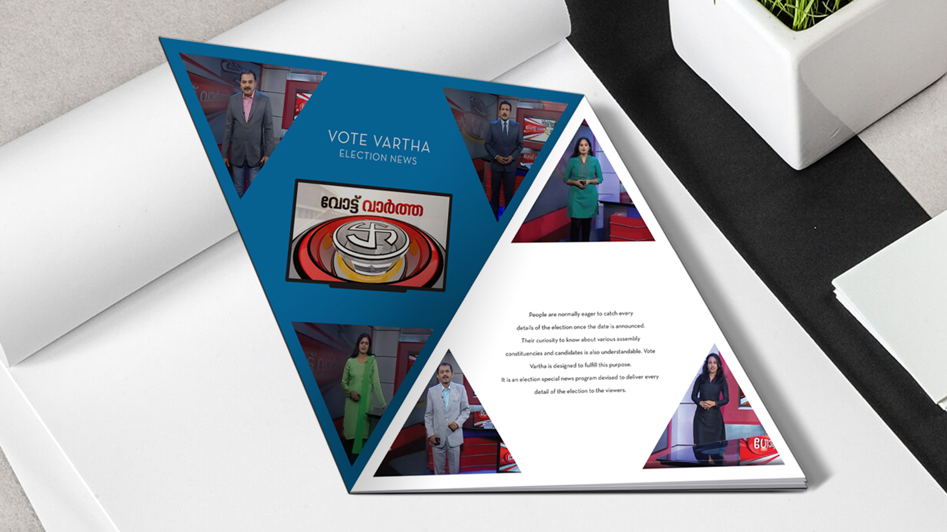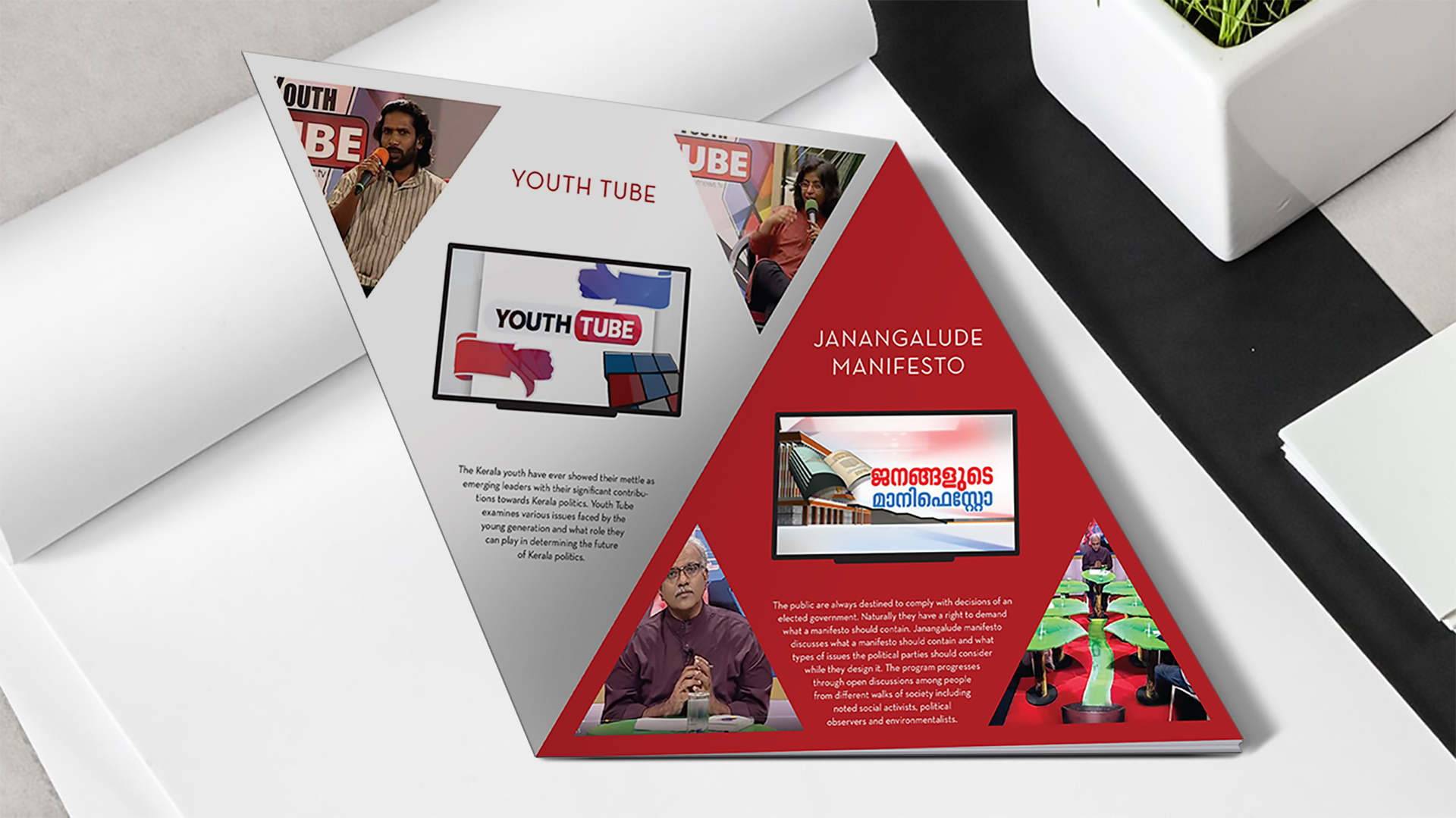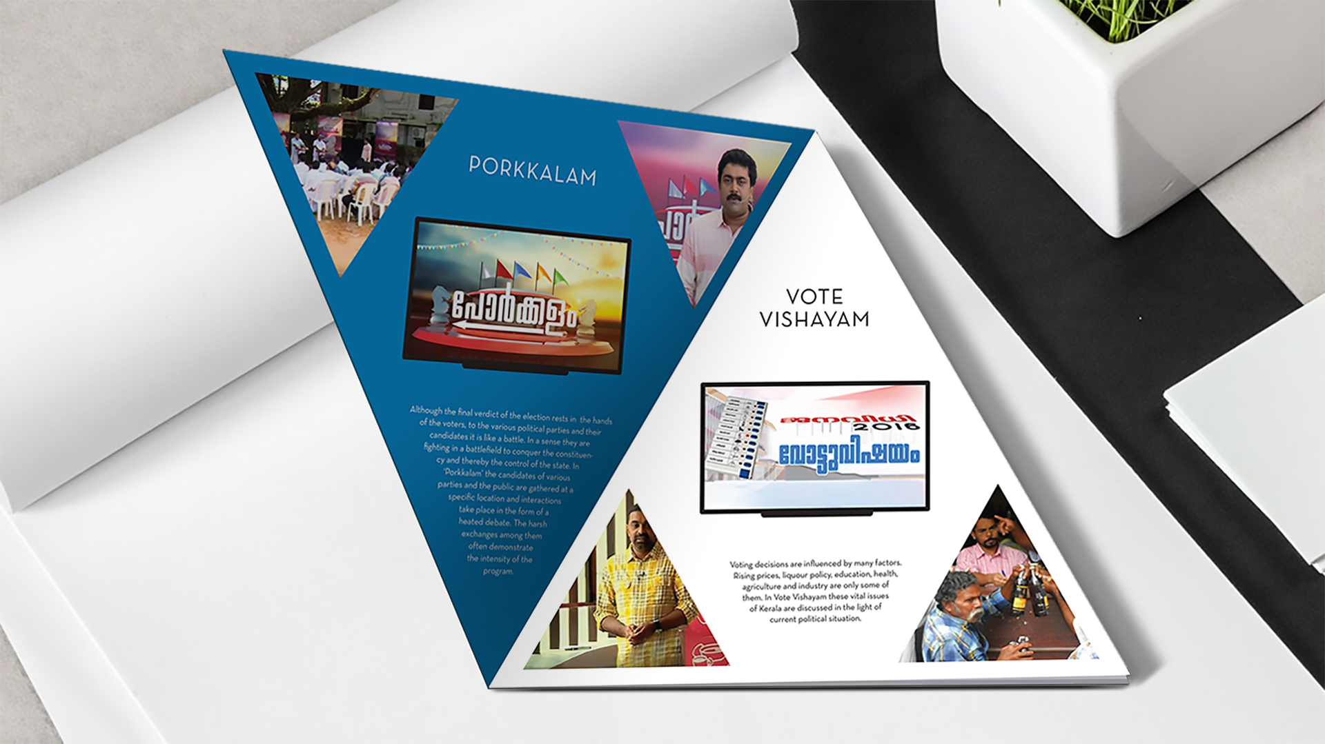
The Design
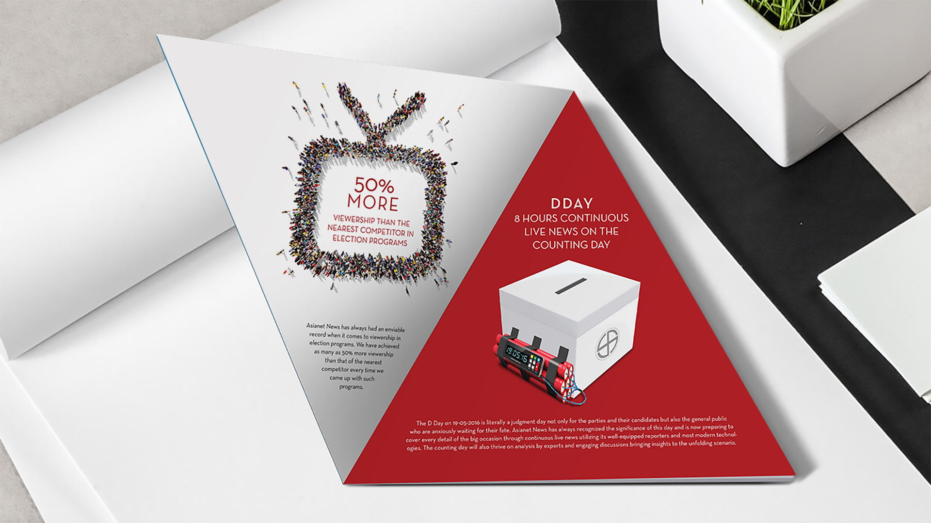
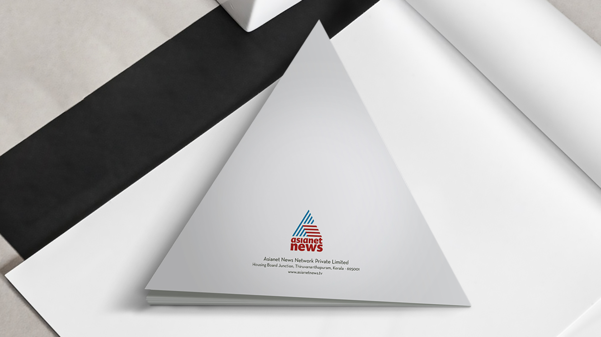
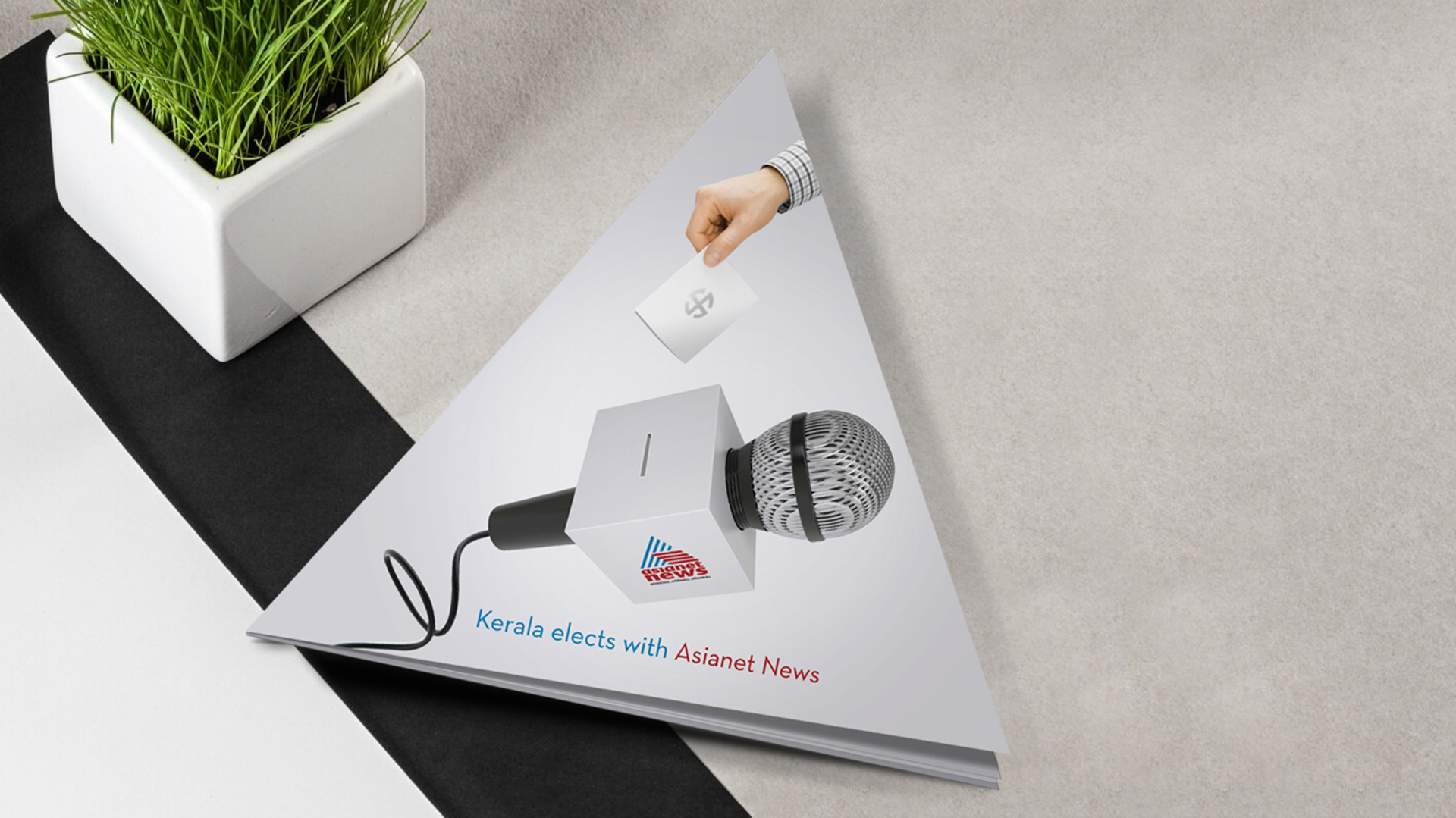
The design was a departure from traditional formats. Its unique triangular shape, inspired by the channel’s brand logo, immediately grabbed attention and made it stand out. This unconventional design choice reflected Asianet News’ innovative approach to journalism and also aligned with CR8’s commitment to creating visually impactful materials.
The strategic placement of the brand colors—red, blue, and white—enhanced the brochure’s readability and ensured that the key messages were easily discernible. The design incorporated elements that hinted at the election theme without being overly explicit. This subtle integration helped to maintain a professional and informative tone. The brochure includes program highlights, a concise overview of the new election-related programs, including their purpose and target audience.