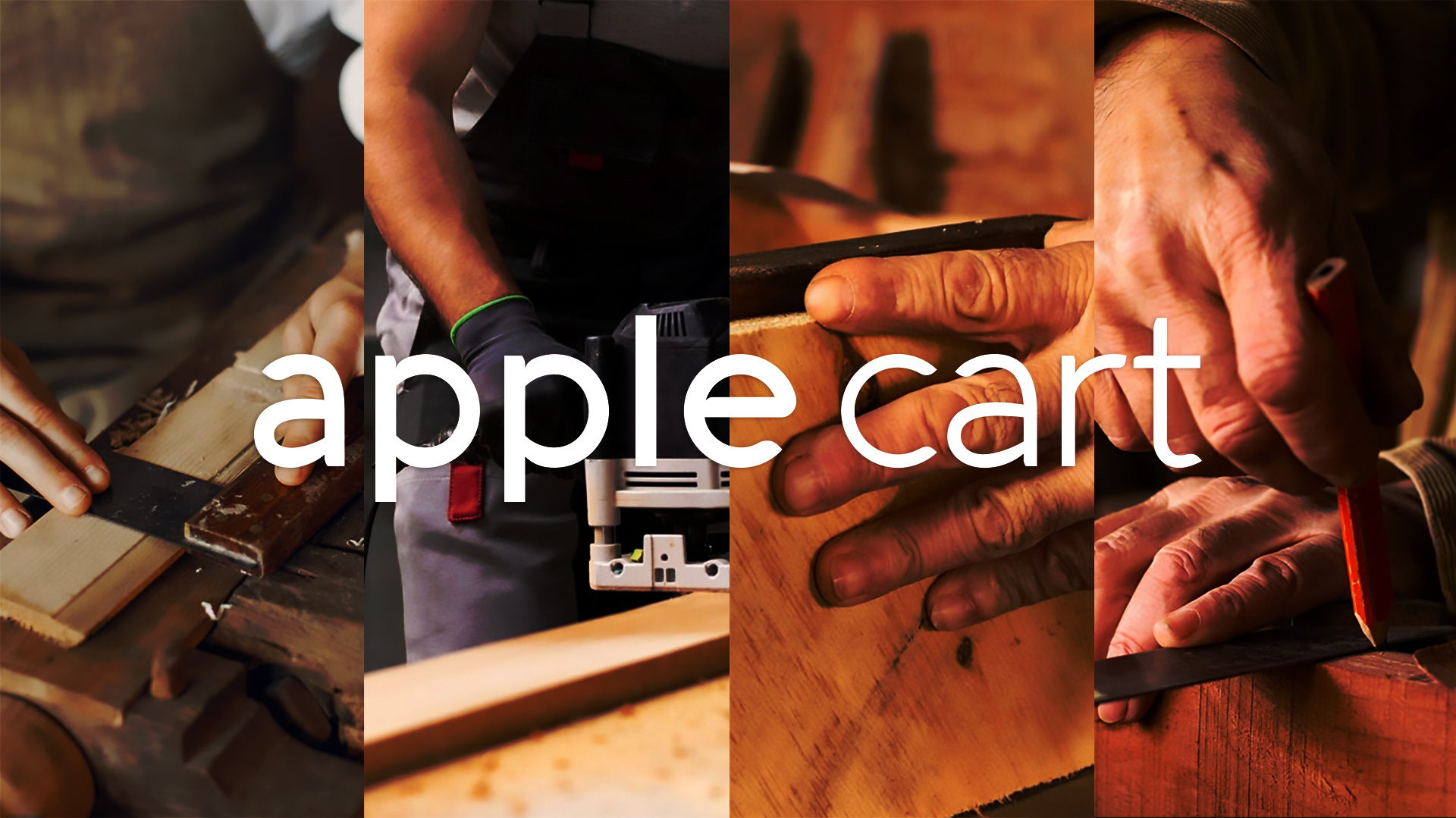
The Concept
The name “Apple Cart” is a bit different for a furniture brand, but it is a perfect fit for Tip Top’s new line of affordable, modern furniture. The apple cart is a symbol of durability and quality, and it is also a reminder of the company’s roots in the furniture industry.
The wooden basket that is used to gather apples is called an apple cart. They have long durability. Apple cart furniture was thus aesthetically connected to this symbol which could well be interpreted in terms of durability and quality.
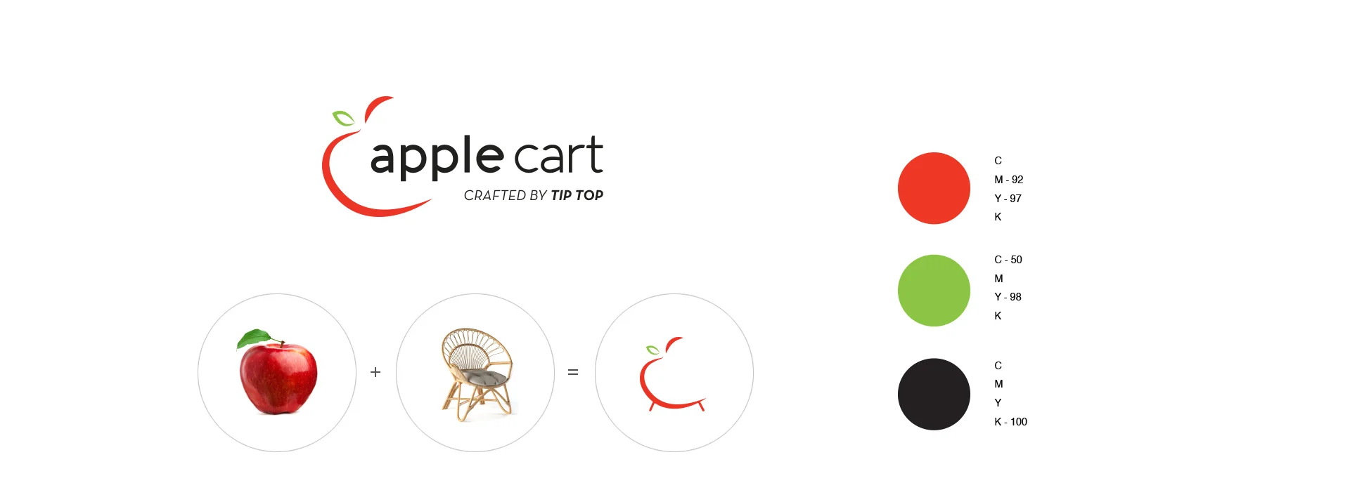
The Logo
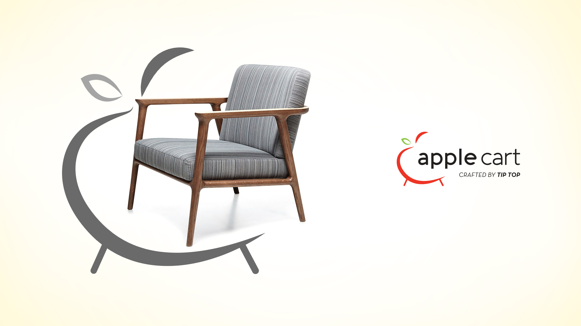
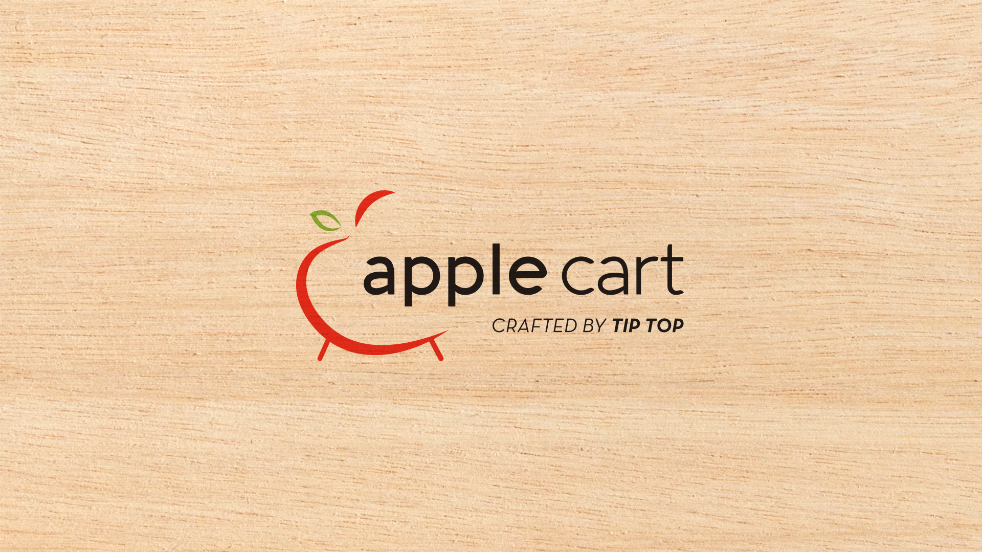
The Apple Cart logo is a simple yet elegant representation of the brand. The red apple is a bold and eye-catching symbol of the company’s name, and it also conveys a sense of freshness and vitality. The green leaf adds a touch of nature, and it also suggests that the company is environmentally conscious. The curved line that forms the basket of the apple cart is a nod to the company’s furniture-making heritage, and it also creates a sense of movement and energy. By giving a wooden leg to the apple in the logo the product assumed its needed attraction and meaning.
The logo uses a clean and modern typeface that is easy to read and understand. The font is slightly condensed, which gives it a sense of strength and stability.
The Color Palette
The color palette is a cornerstone of the Apple Cart identity. The vibrant red of the apple is the focal point, symbolizing energy, passion, and the brand’s contemporary spirit. It’s complemented by the verdant green of the leaf, representing growth, freshness, and a connection to nature. The combination of these primary colors creates a visually striking contrast, ensuring the logo stands out while maintaining a sense of clarity and modernity.
The Brand Identity
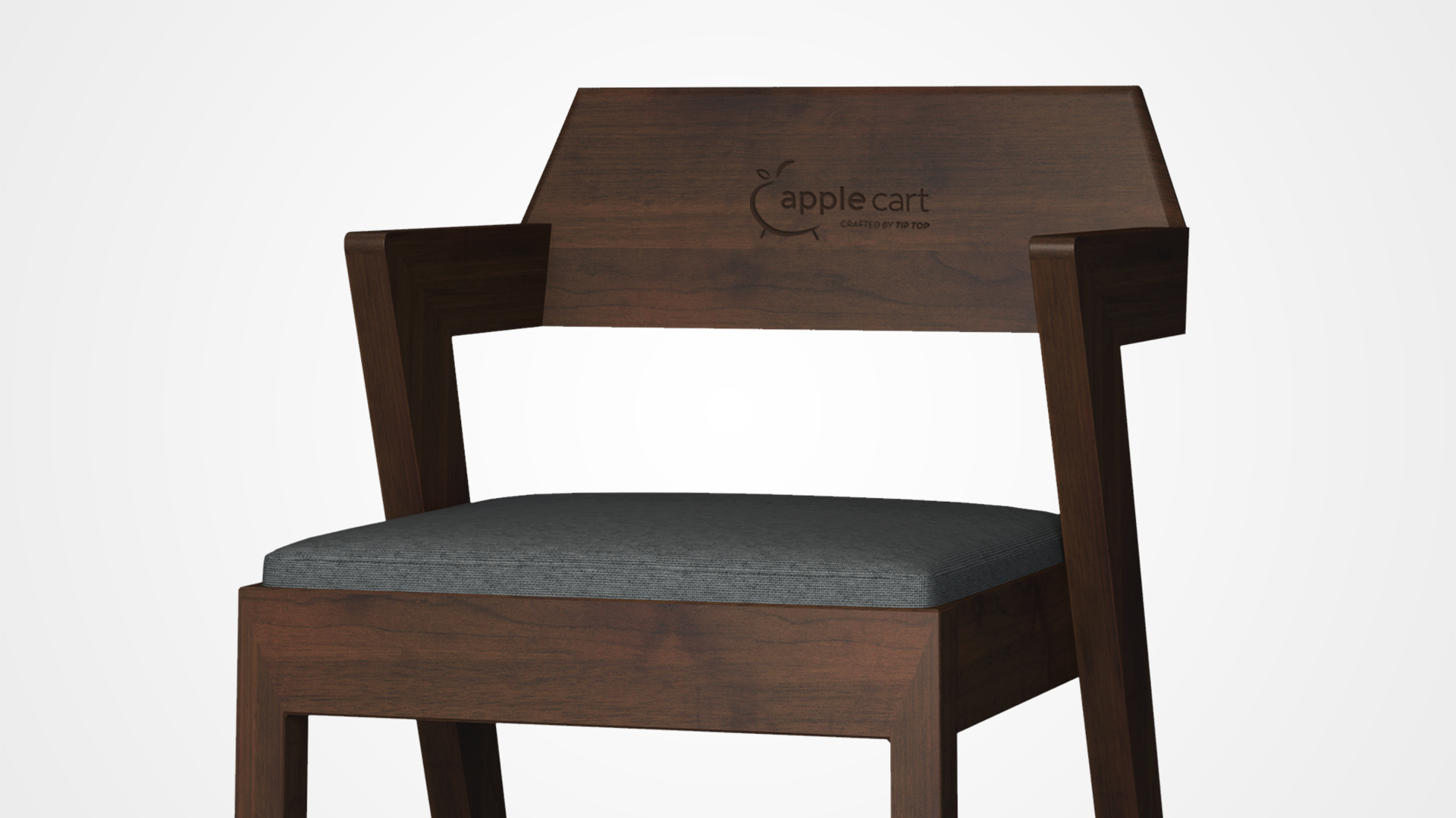
The logo is a great example of how a simple concept can be executed in a visually appealing way. Also, a good example of how a logo can be used to tell a story about a brand. It is both modern and timeless, and it conveys a sense of quality, durability, and affordability. The logo is also versatile, and it can be used in a variety of marketing materials.
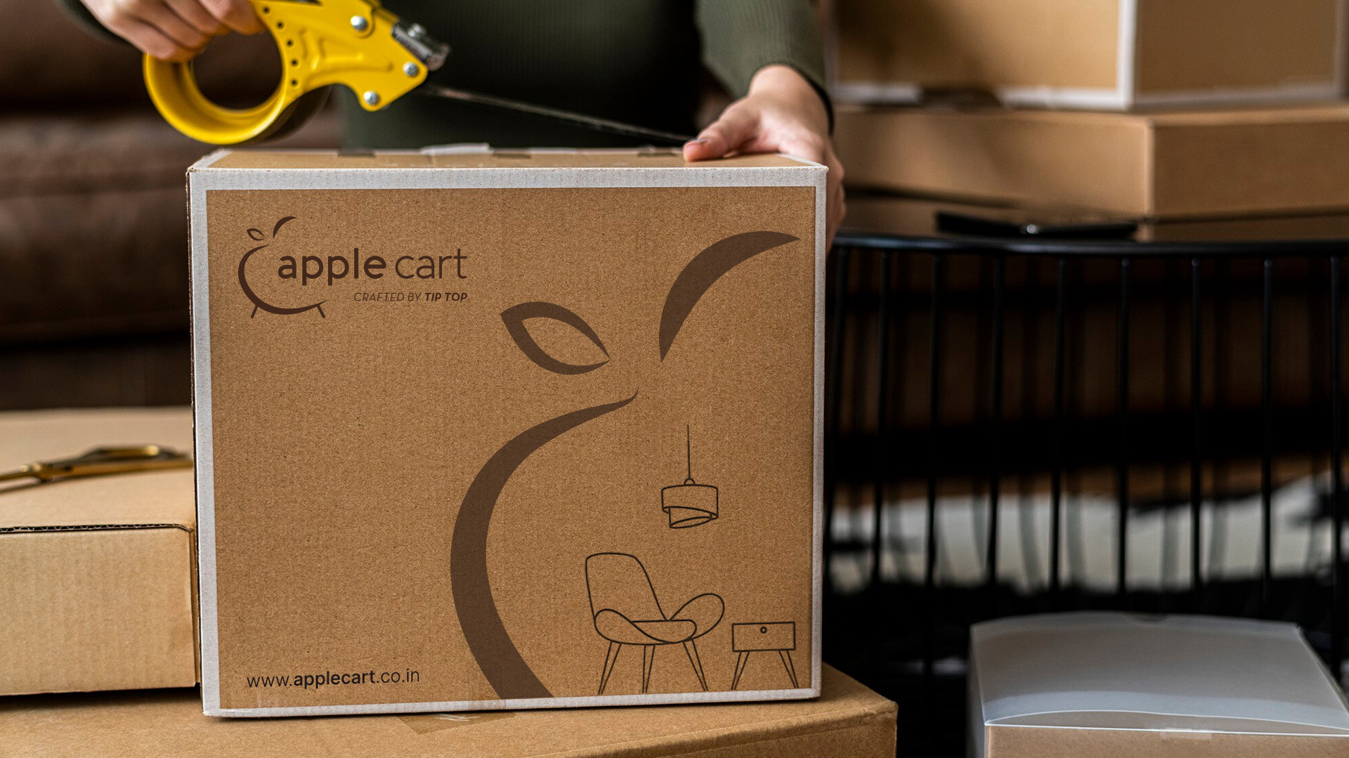
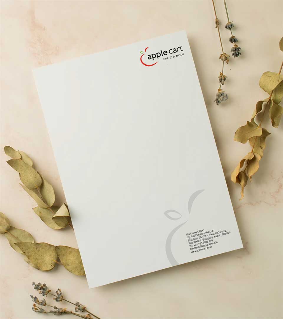
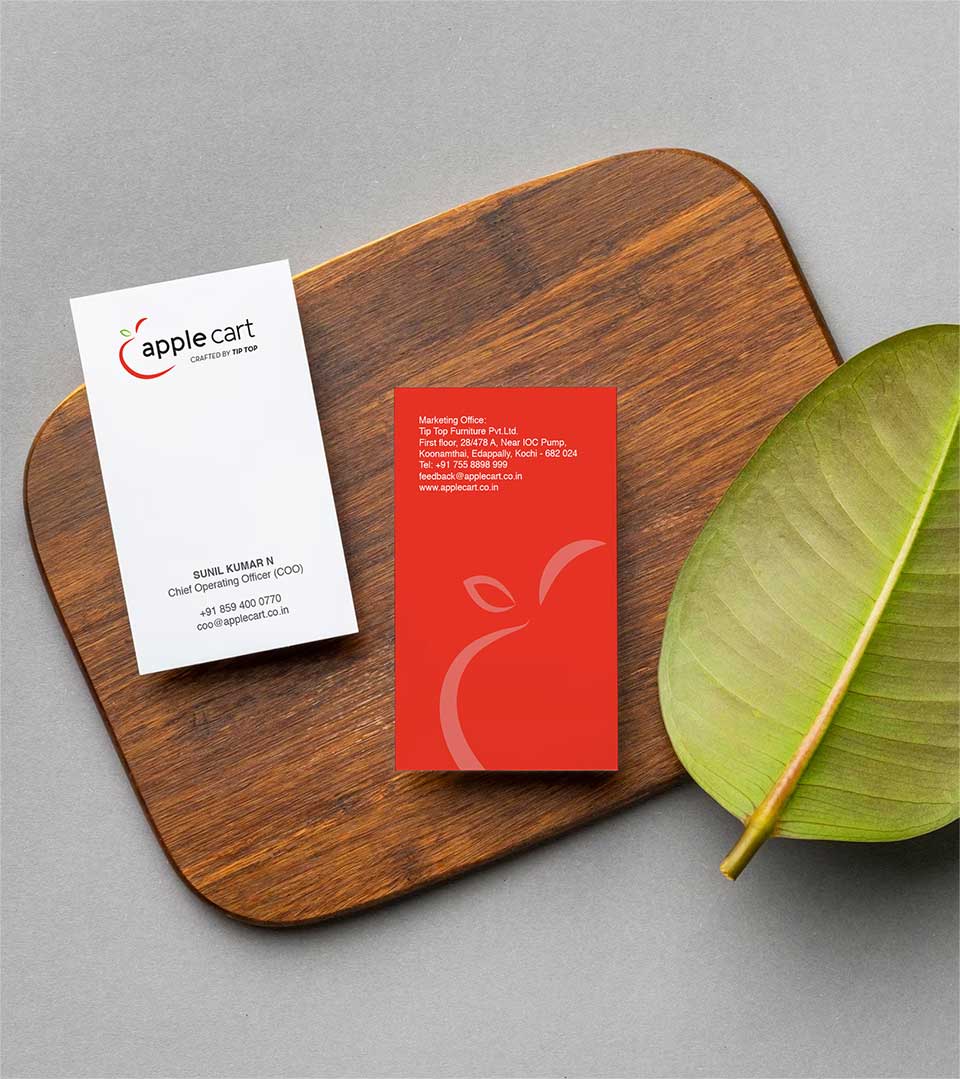
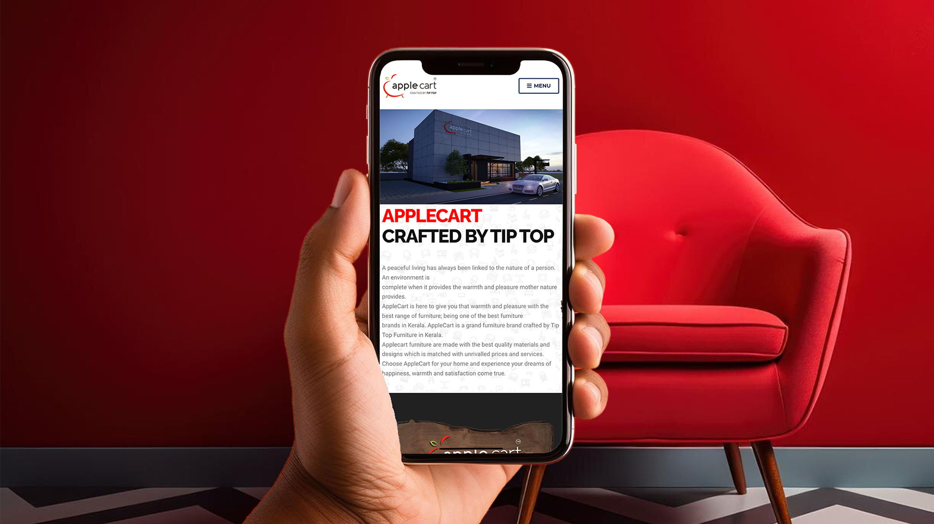
This seamlessly integrates into the brand’s diverse range of business stationery and collaterals. Its clean lines and vibrant colors lend themselves effortlessly to various applications, from letterheads and business cards to product packaging and digital platforms. The logo’s versatility is evident in its ability to maintain brand recognition while adapting to different formats and sizes, ensuring a cohesive and professional brand image across all touchpoints.
By strategically placing the logo and incorporating brand elements consistently, Apple Cart has achieved a strong visual identity that reinforces its position as a contemporary furniture leader.