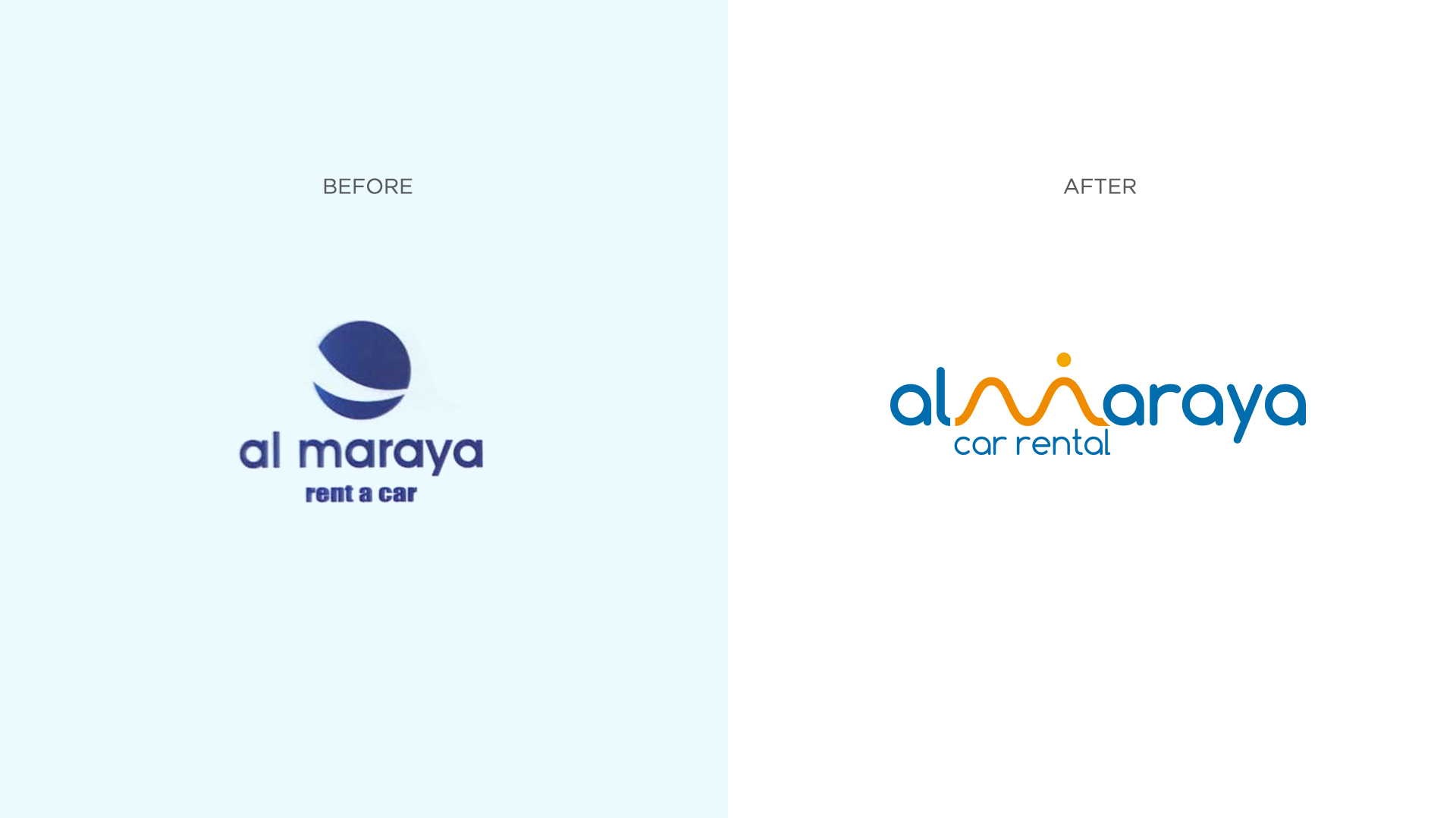
Al Maraya Rent a Car: A Rebrand for a New Era
Al Maraya, a name synonymous with luxury car rental in Dubai, has recaptured the essence of its brand identity through meticulous rebranding. The design by CR8, a blend of artistry and symbolism, reflects the company’s commitment to providing unparalleled experiences for its clientele.
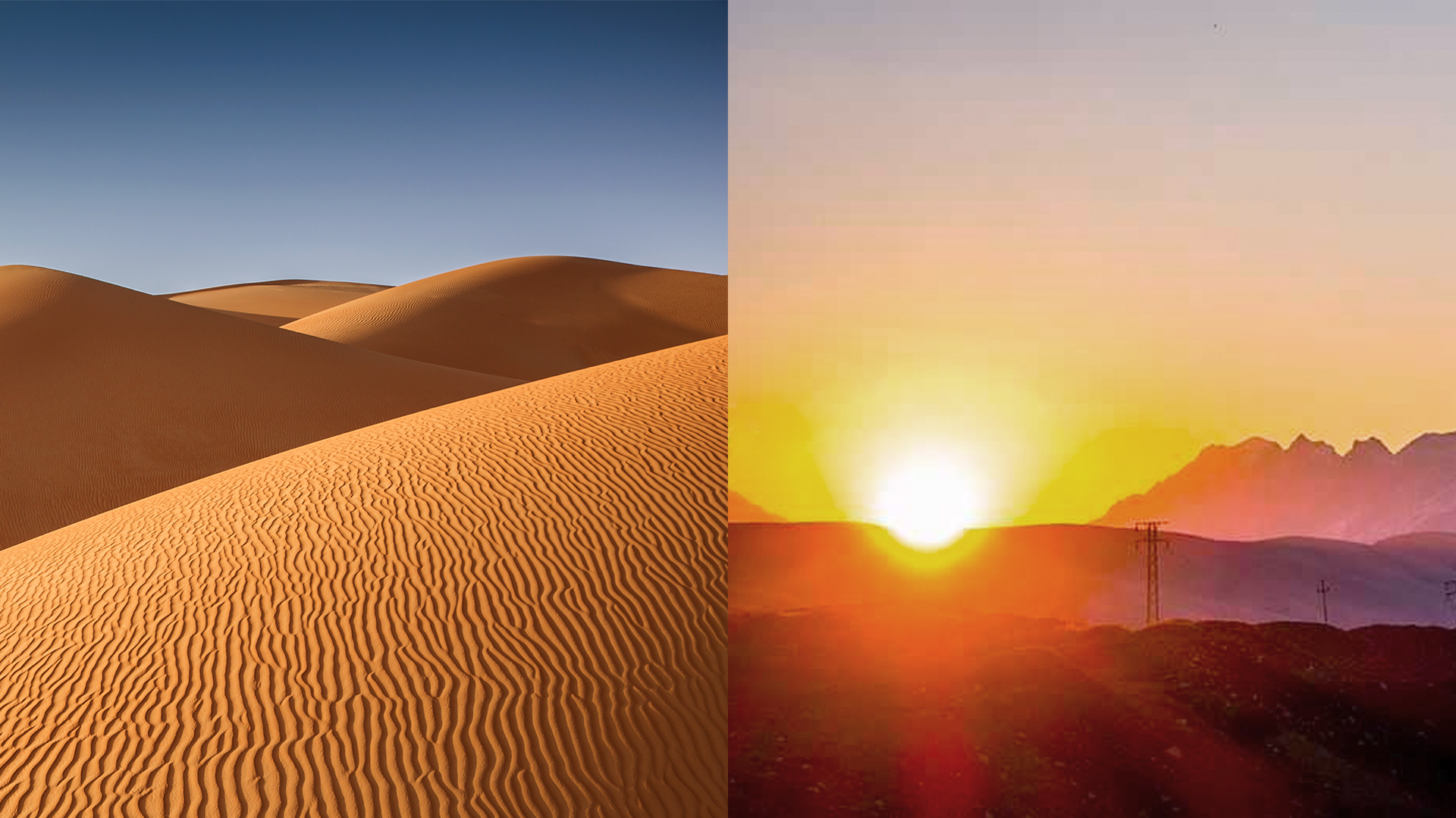
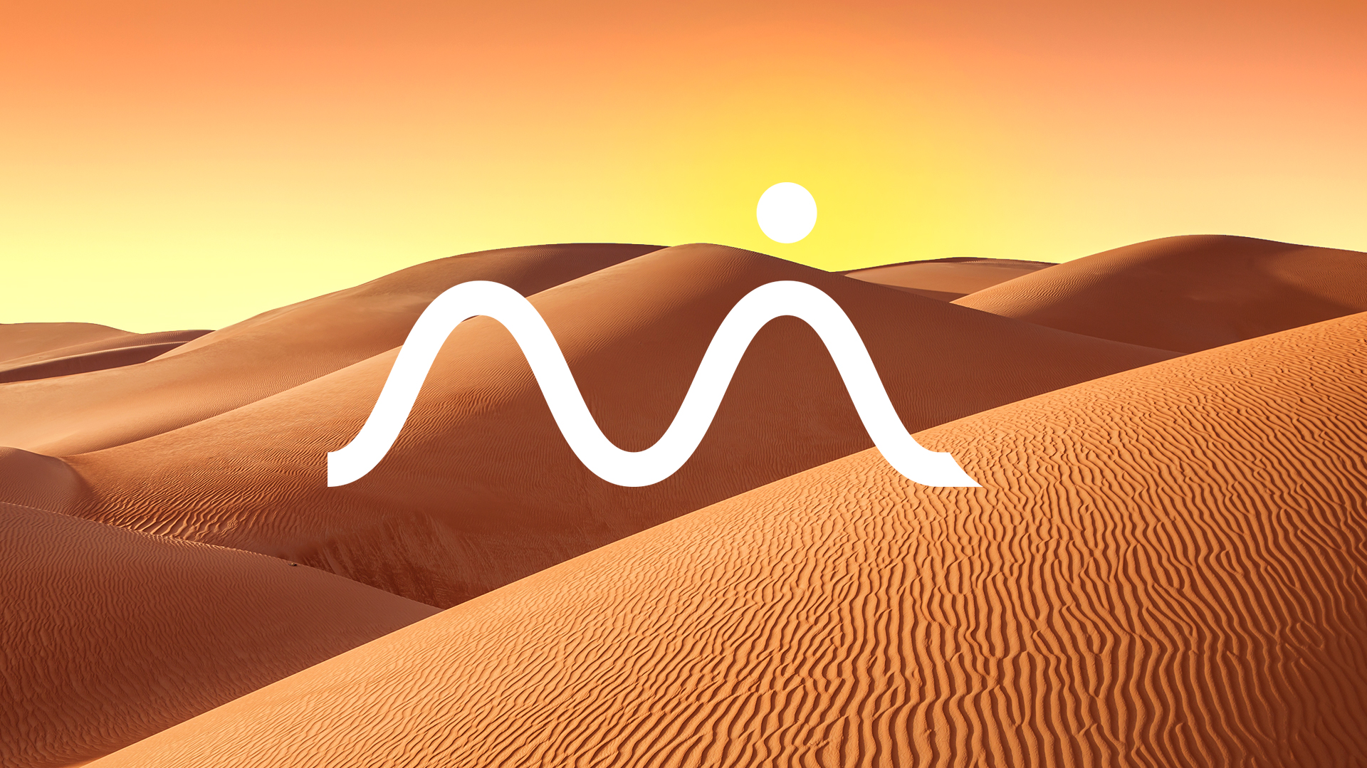
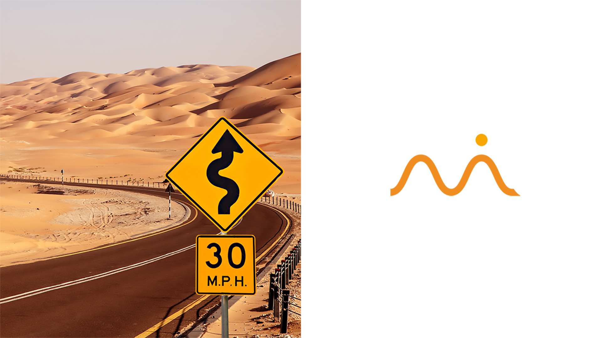
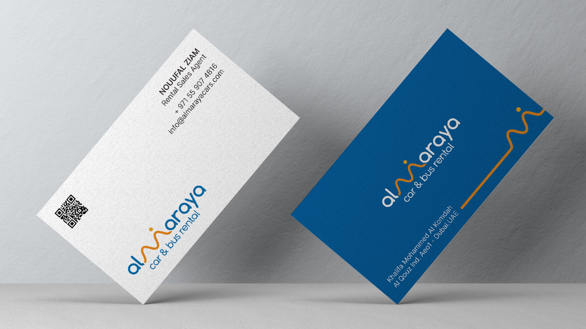
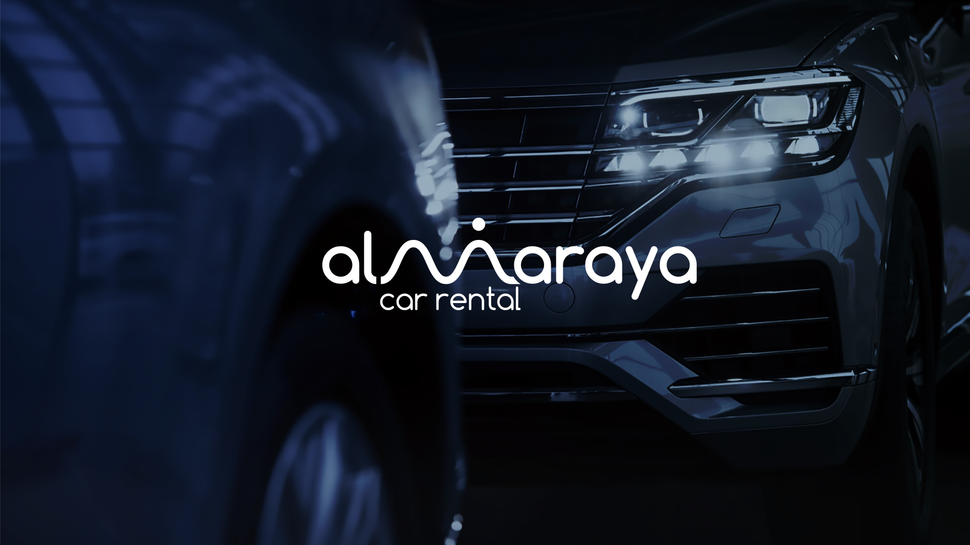
The logo here is a synthesis of symbols. The sun of eternal hope, the road of endless songs, and the inviting charm of sand dunes all expressively represent the vision of Al Maraya. And that speaks the dream and reality in the most aesthetic sense.
The Concept
The logo summarizes this narrative by transforming the letter “M” in Al Maraya into a majestic sand dune. This iconic element not only pays homage to the region’s heritage but also symbolizes the company’s foundation and growth.
The crowning touch is the addition of a dot atop the “M,” representing the rising sun. This radiant symbol signifies a new beginning, optimism, and the promise of a bright future.
It aligns seamlessly with Al Maraya’s vision of transforming every journey into a memorable experience.
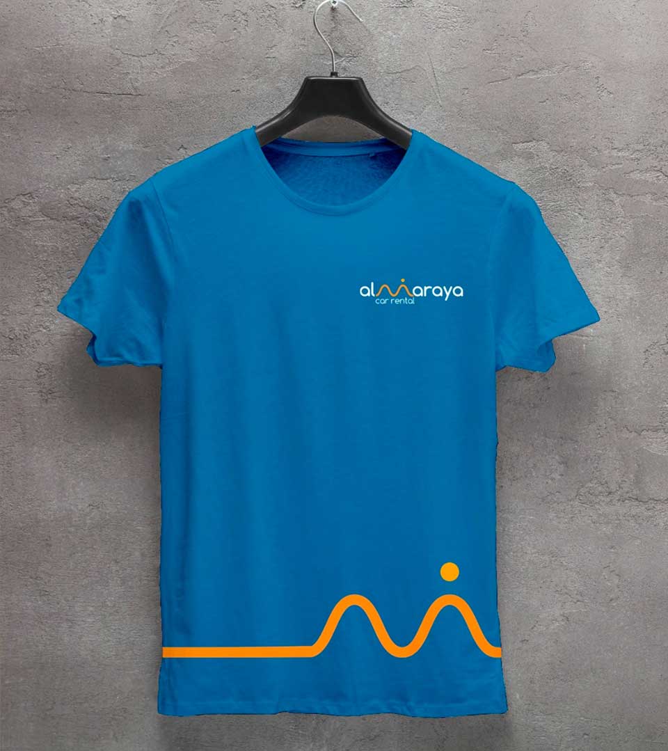
Colour Pallete
The combination of blue and orange creates a visually appealing contrast. The calming blue evokes the vastness of the sky, while the sand dune’s vibrant orange mirrors the desert sun’s warmth and energy. Together, these colors create a visually striking and harmonious composition.
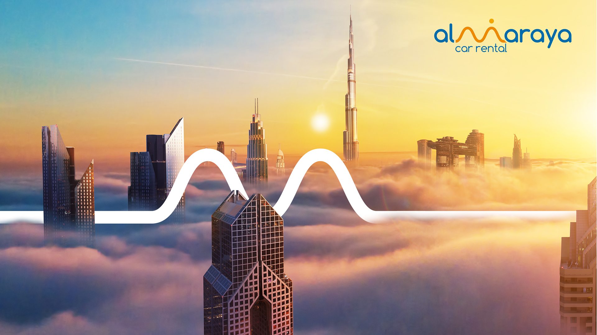
The rebranded logo, in conjunction with other brand elements, creates a cohesive and modern identity for Al Maraya Rent A Car. It positions the company as a forward-thinking and customer-centric organization, ready to redefine the car rental experience.