The Focus
The overarching goal was to design a packaging that conveyed the premium quality of Ajfan’s date jam while highlighting its organic origins. The design needed to evoke a sense of luxury and sophistication, reflecting the brand’s reputation for excellence.
The Design
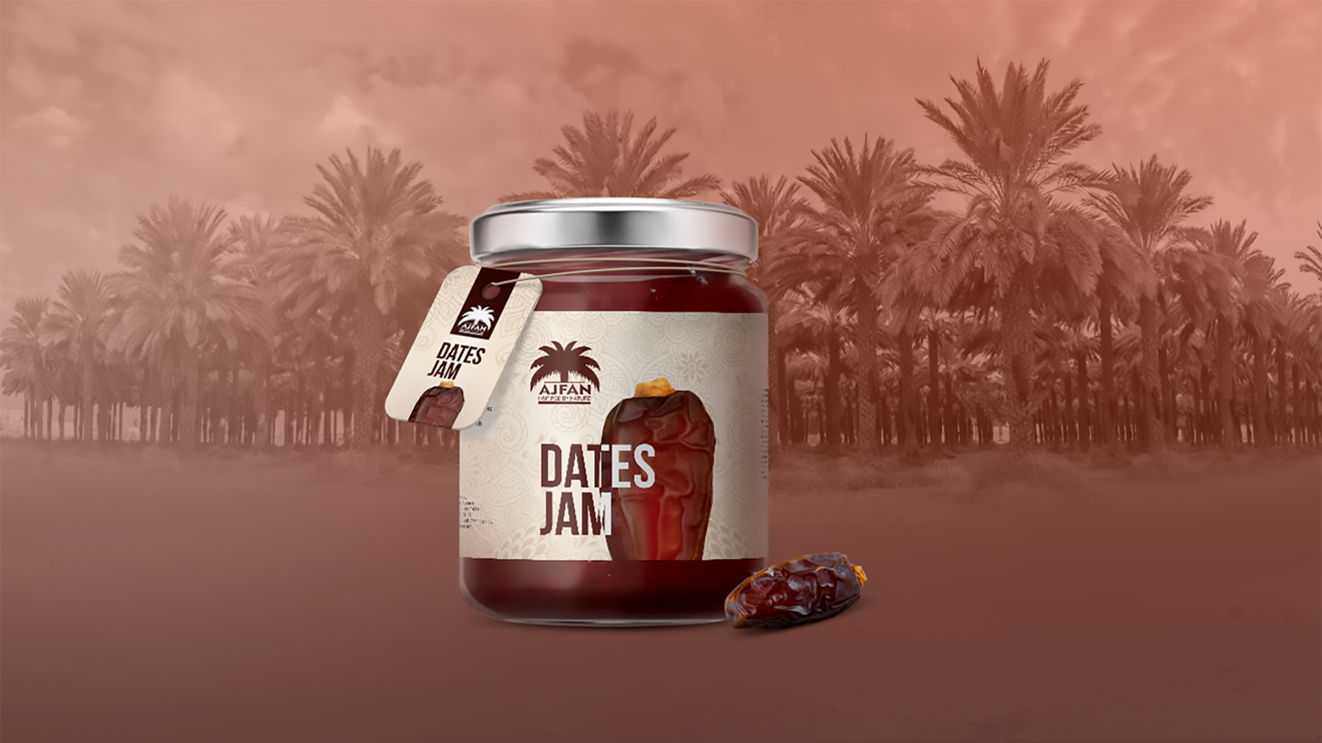
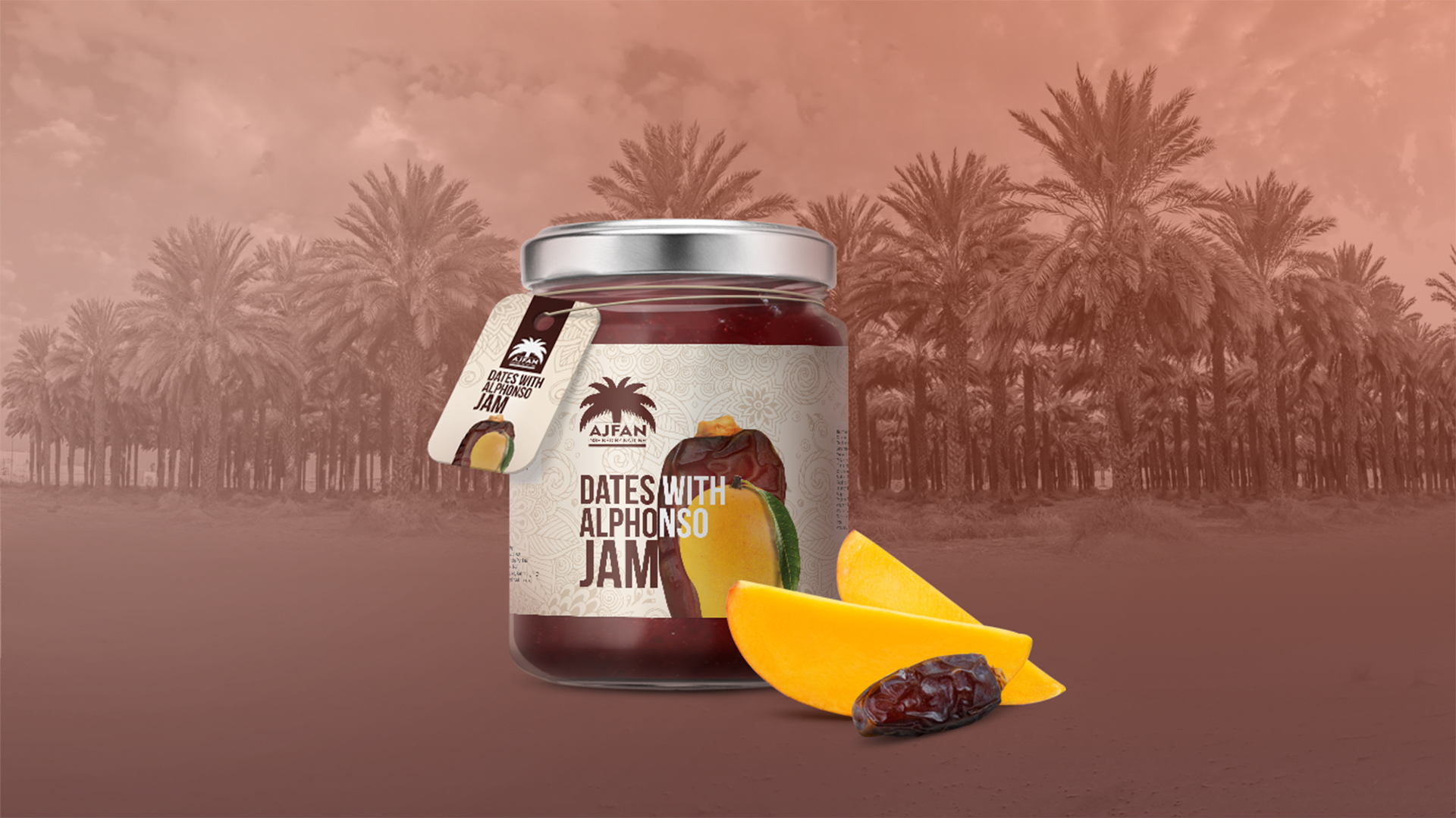
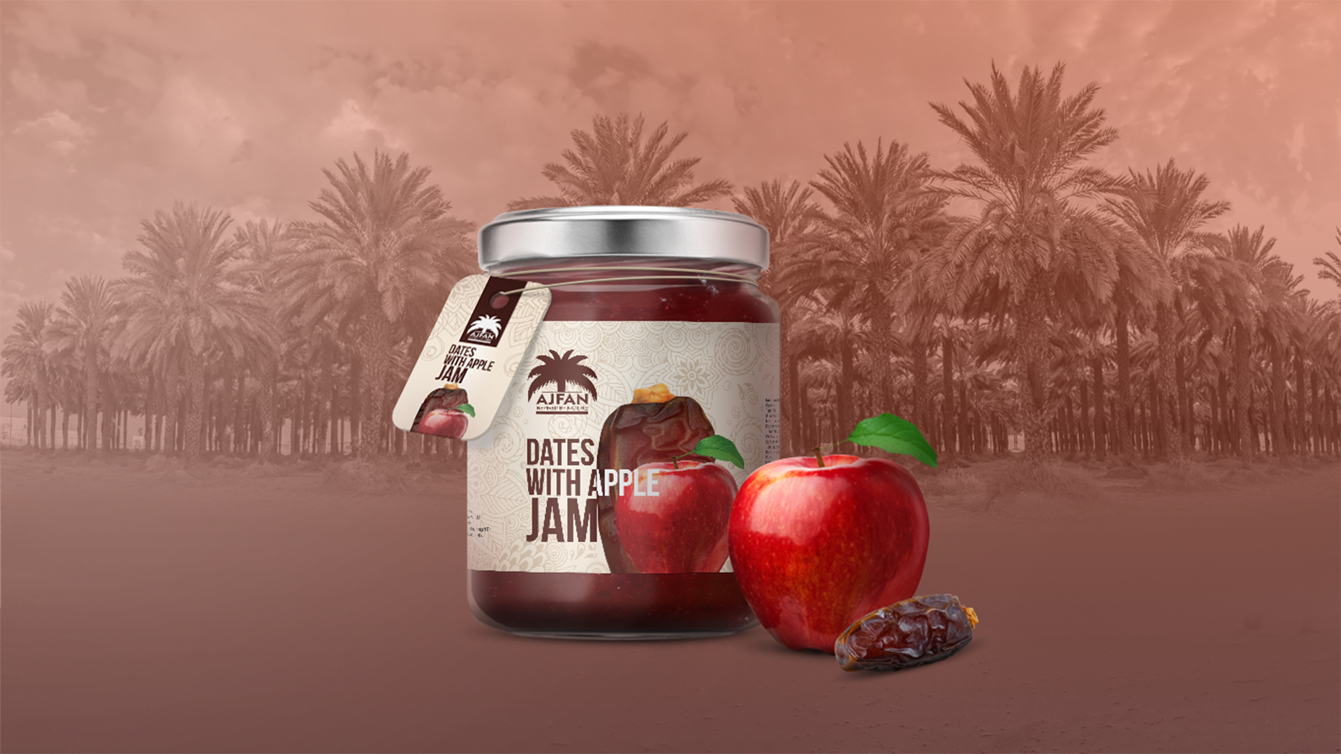
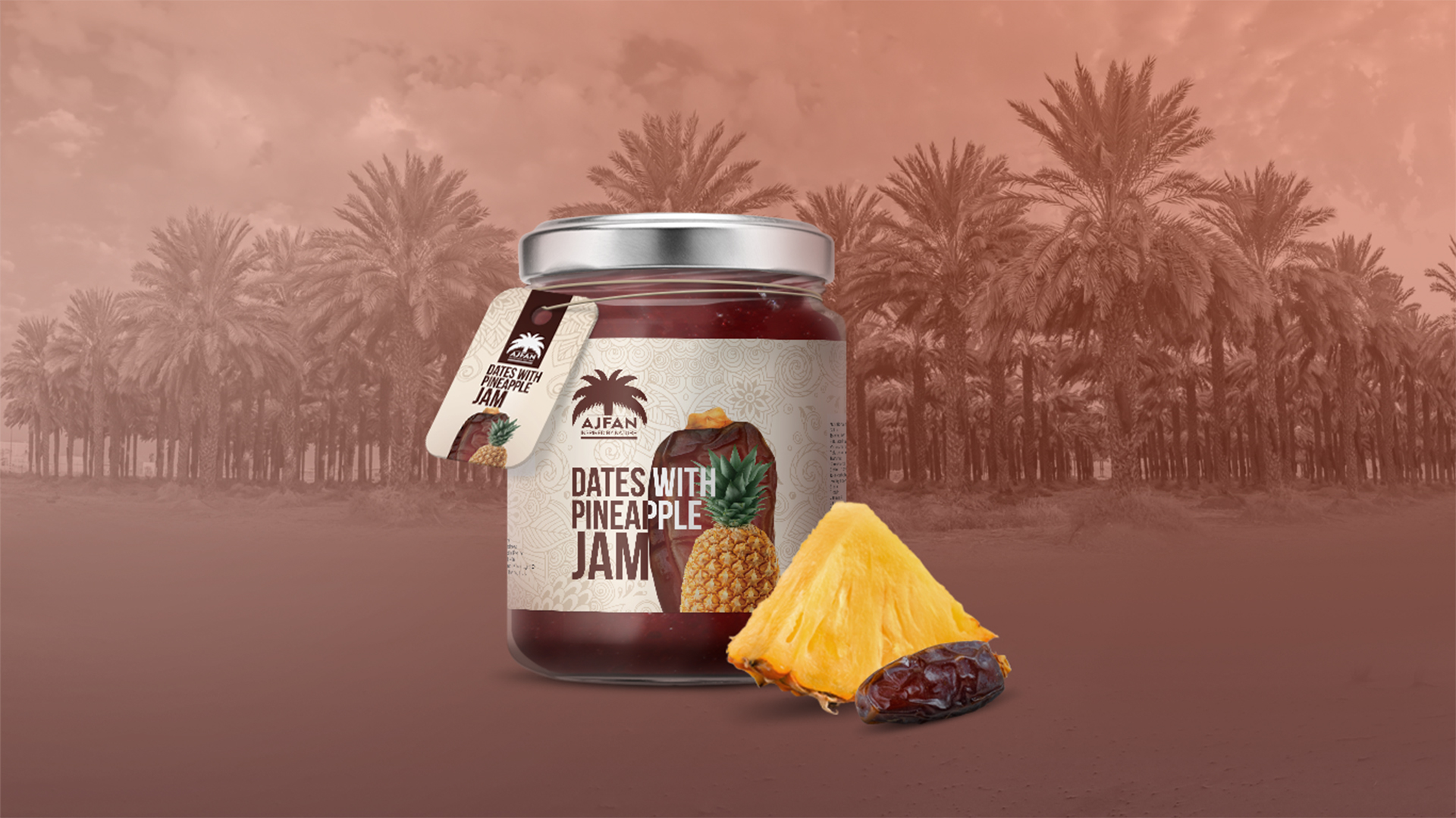
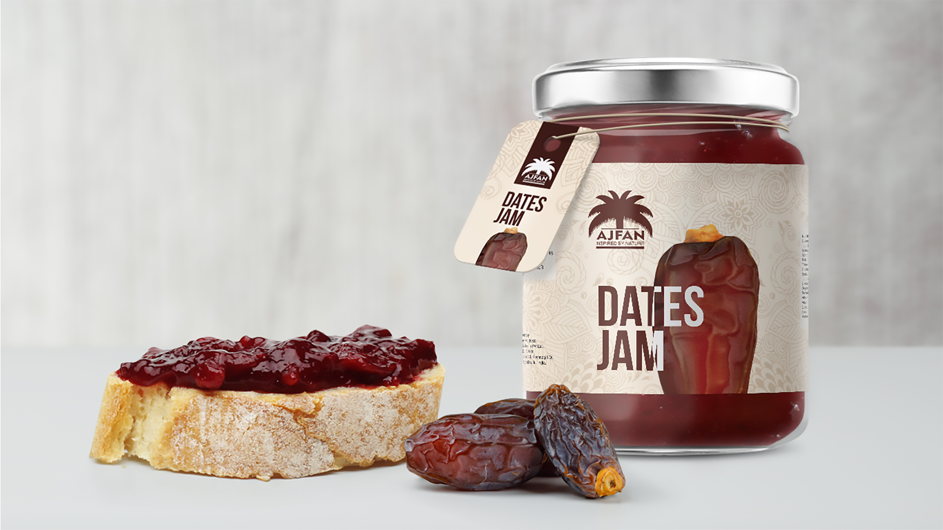
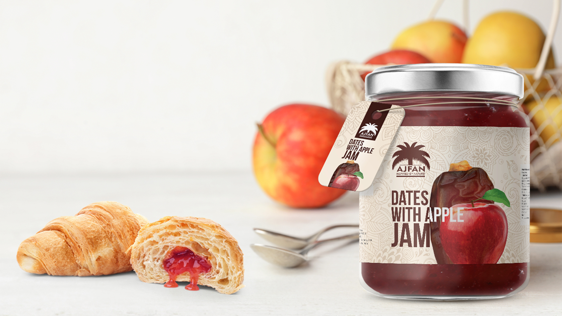
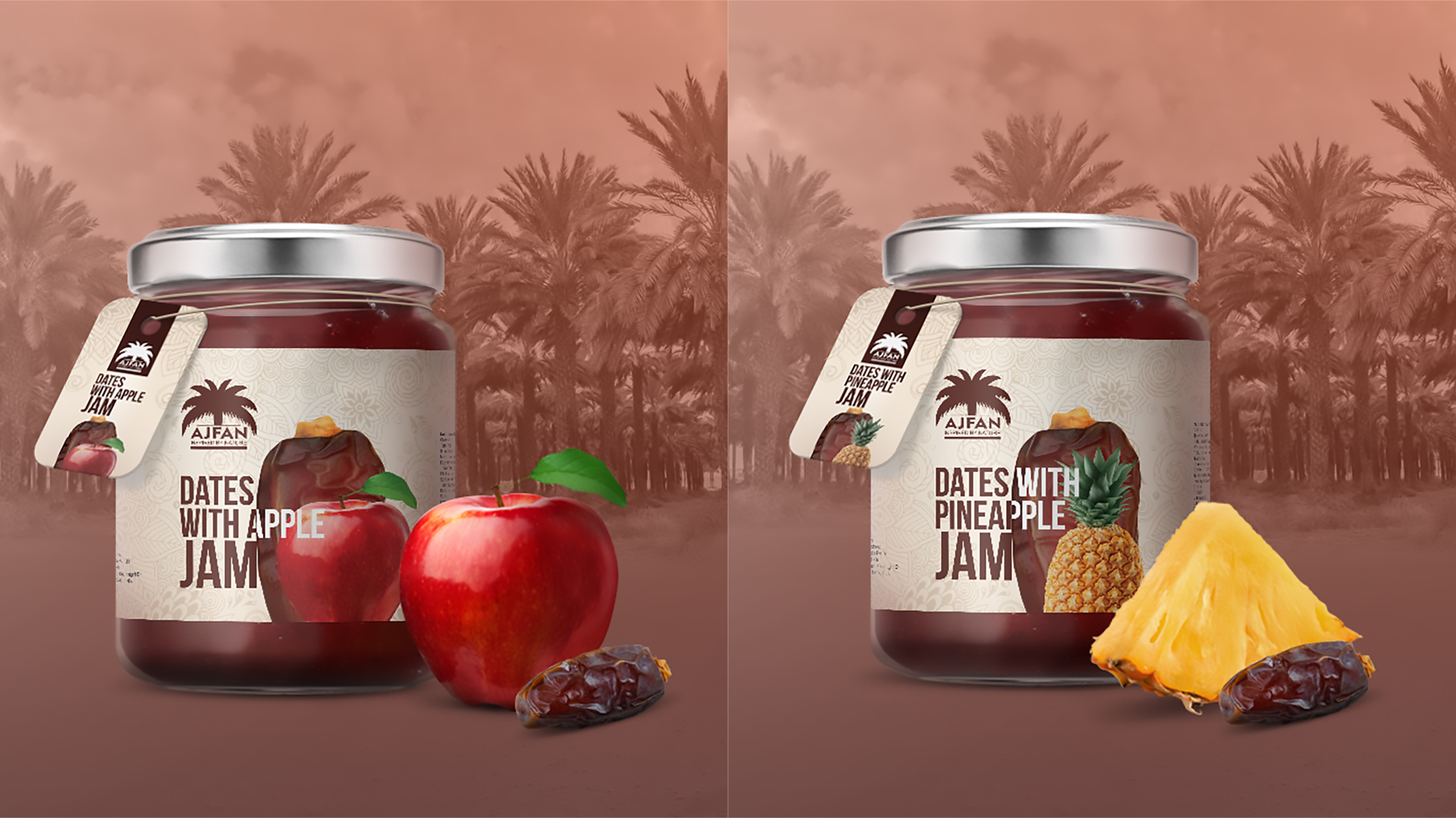
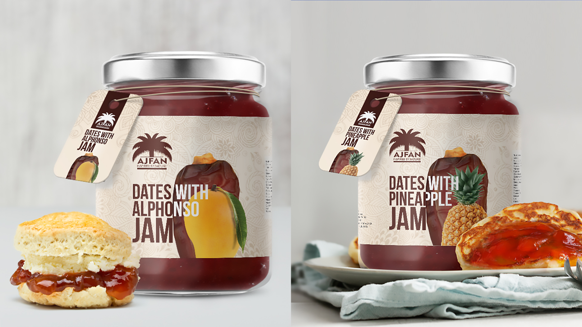
To achieve this, we adopted a minimalist yet impactful approach. The design incorporates a subtle yet elegant pattern creating a visually appealing and harmonious background. This pattern is used consistently throughout the packaging, reinforcing the brand’s identity.
The product name is prominently displayed in a bold typeface that is both modern and easily recognizable. This typeface choice strikes a balance between elegance and clarity, ensuring that the product is instantly identifiable on store shelves.
To enhance the product’s distinctiveness, we introduced a tag tied around the neck of the jam bottle. This tag serves as a visual cue, drawing attention to the product and providing additional information about the brand and the product. The tag’s design complements the overall aesthetic of the packaging, creating a cohesive and visually appealing presentation.
Key Design Elements
Pattern: A delicate, intricate pattern is used throughout the design, adding depth and visual interest without overwhelming the overall aesthetic.
Typeface: A bold, clean typeface is chosen for the product name, ensuring it is easily readable and memorable.
Tag and Label: A distinctive tag tied around the neck of the jam bottle, featuring the product name, adds a touch of sophistication and helps to differentiate the product.
Color Palette: A muted color palette is used to create a premium and timeless look, complementing the natural nature of the date jam.