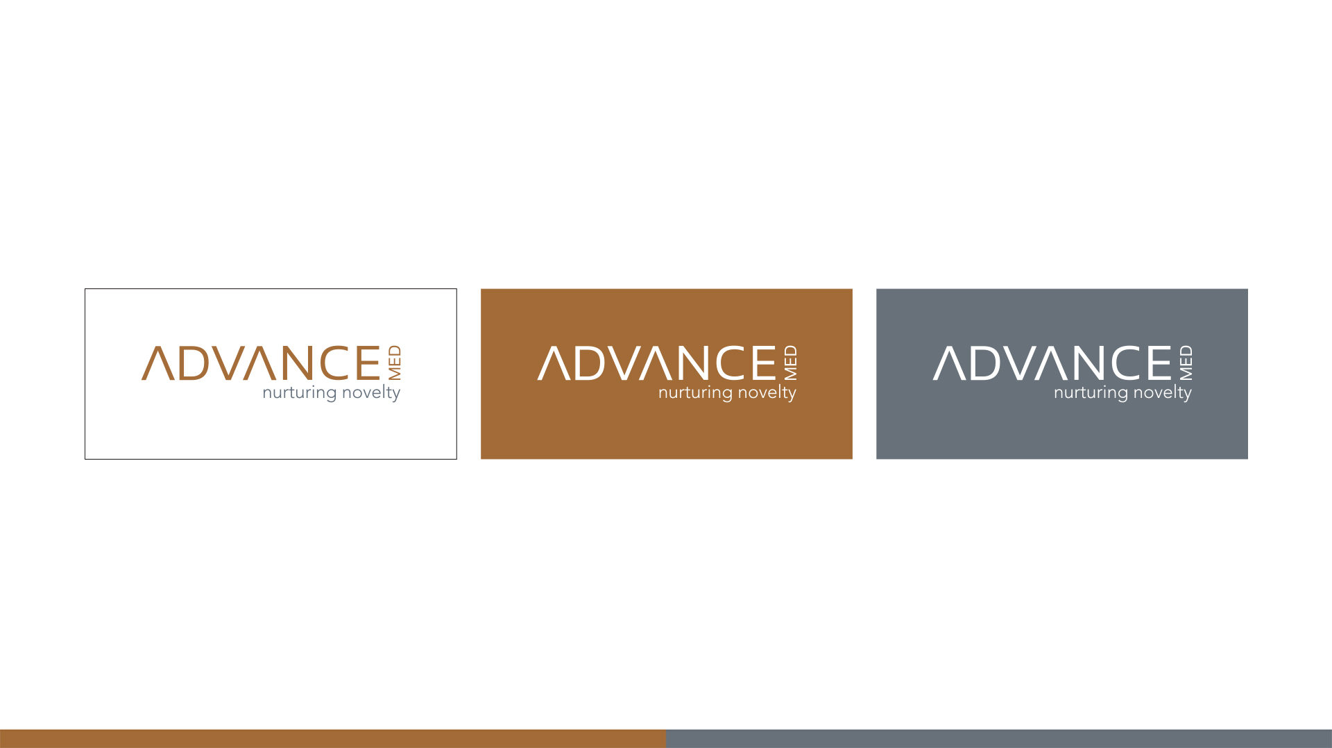
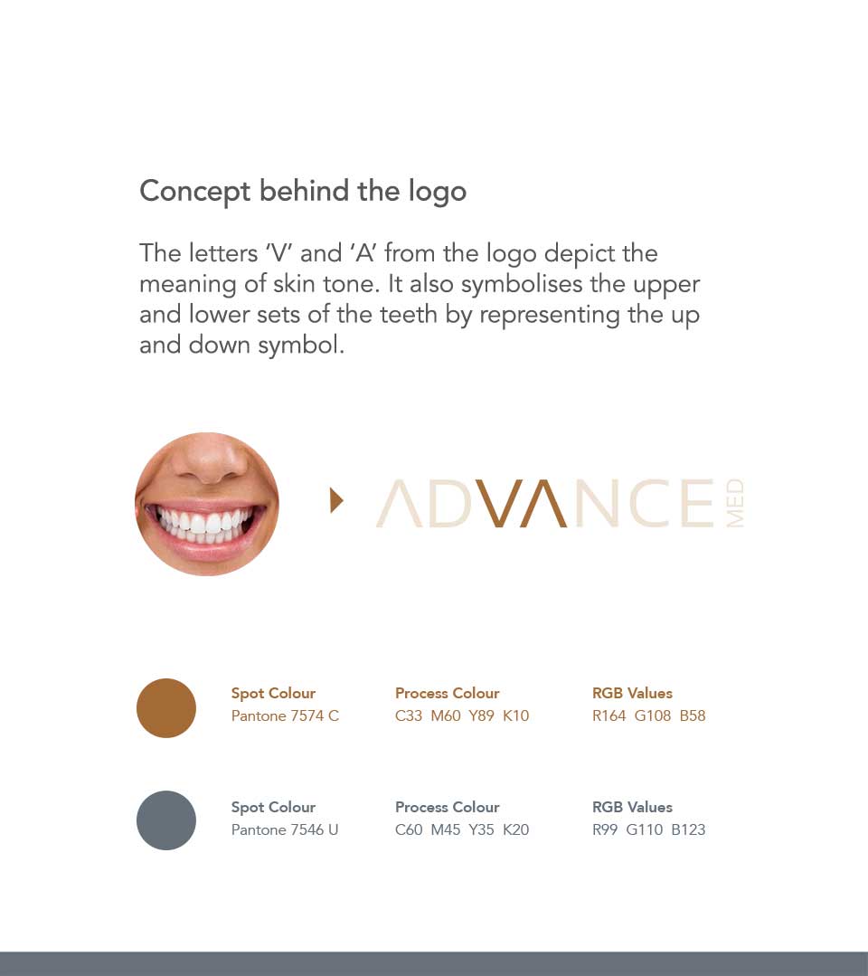
The Logo
The logo, a clean and modern typographic, cleverly incorporates the letters ‘A’ and ‘V’ to symbolize both skin tone and the upper and lower sets of teeth. This ingenious interplay of form and function is the cornerstone of the logo’s success. The clean lines and precise forms convey a message of professionalism, expertise, and attention to detail.
The careful selection of typography plays a crucial role in the logo’s overall impact. The subtle variations in letter spacing create a visual rhythm that draws the eye and enhances the logo’s memorability.
The Colour Pallete
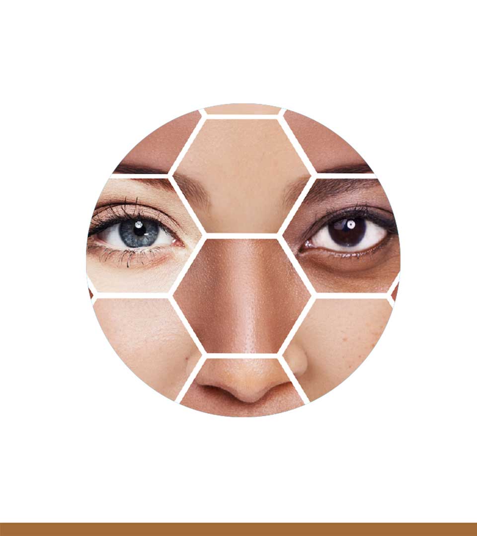
The use of brown as the primary color evokes feelings of warmth, stability, and reliability. The complementary gray with a shade of blue adds a touch of sophistication and balance, further reinforcing the brand’s professional image.
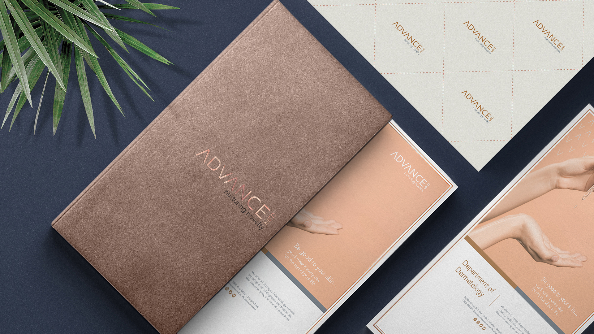
The Tagline
The tagline, “Nurturing Novelty,” perfectly complements the logo’s essence. It underscores the clinic’s commitment to staying at the forefront of dental and aesthetic advancements while nurturing the natural beauty of each patient. The word “Nurturing” conveys a sense of care and expertise, while “Novelty” highlights the clinic’s innovative approach to treatments.
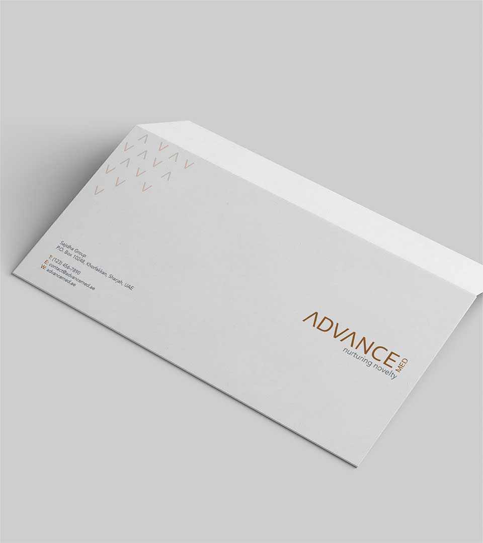
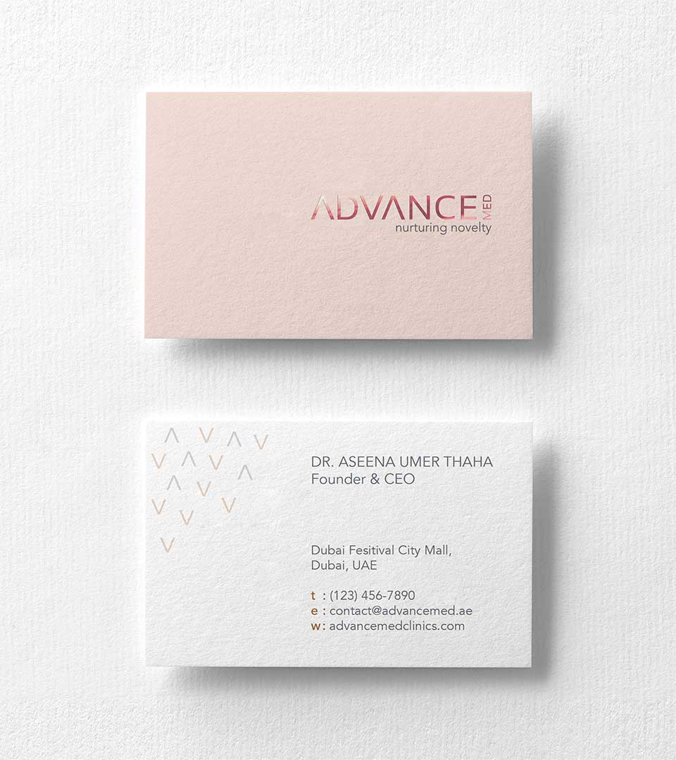
The Brand Identity
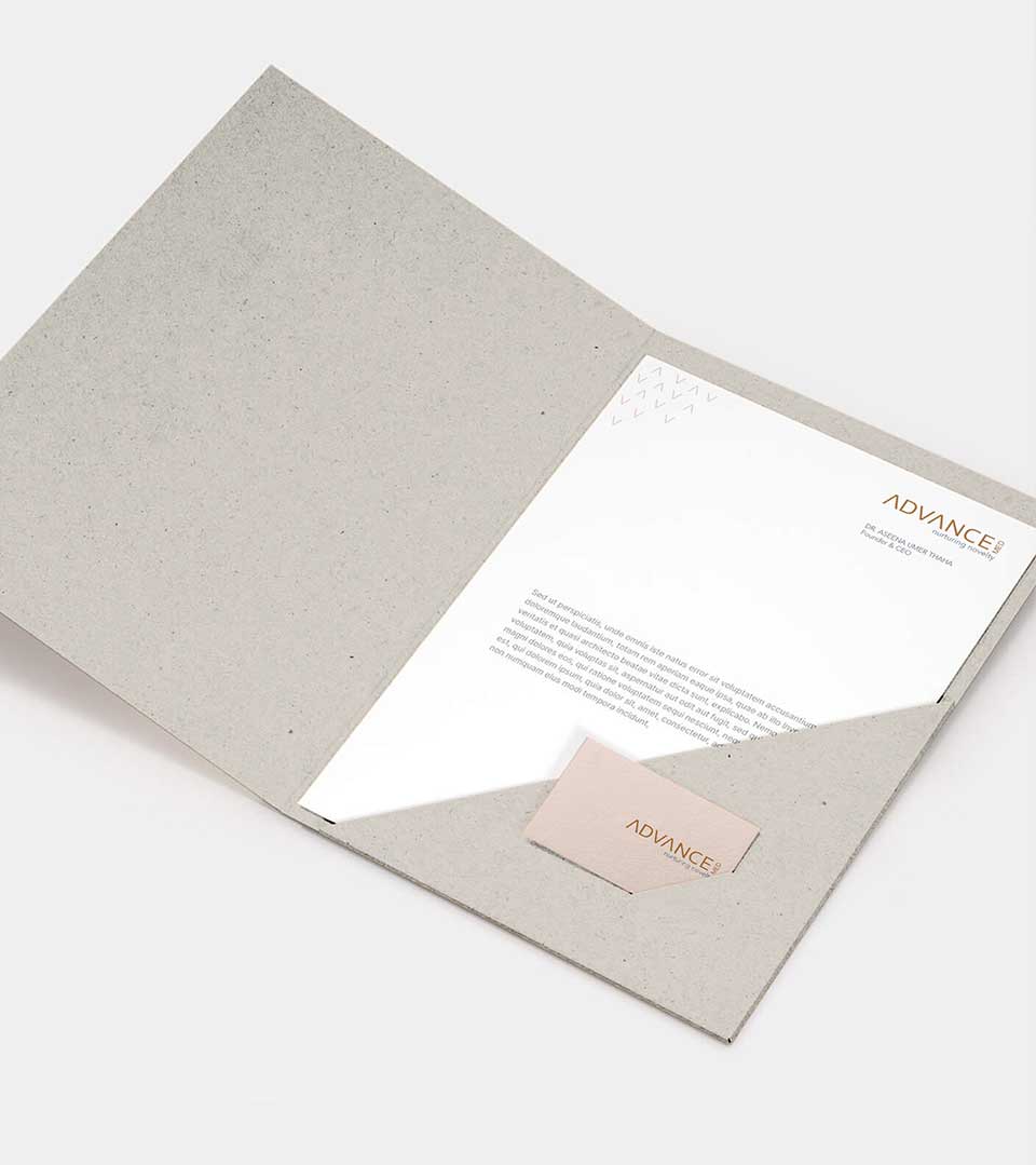
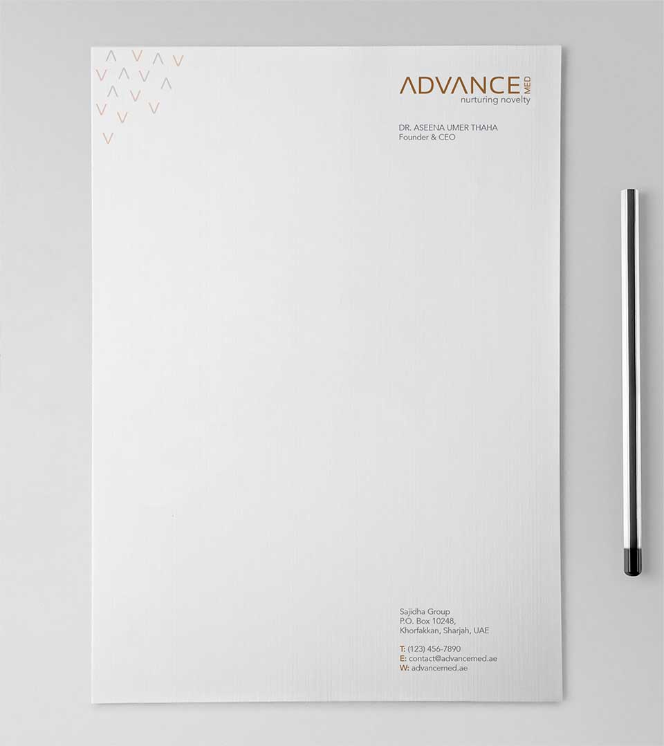
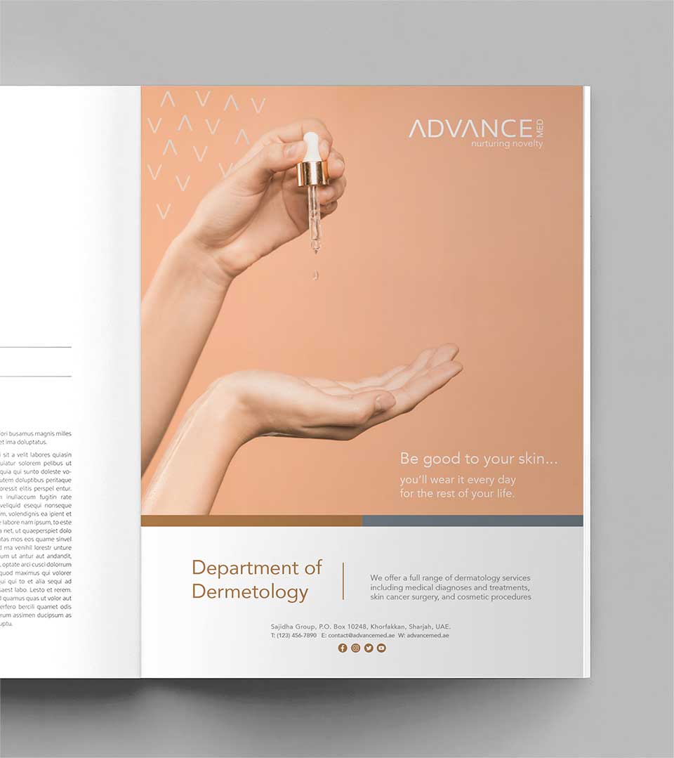
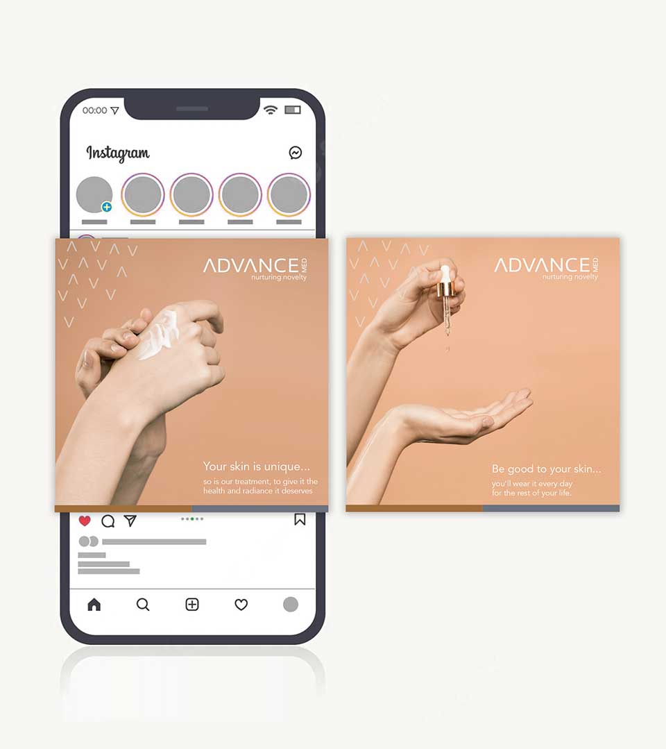
The ‘AV’ pattern, derived from the logo, serves as a versatile design element effectively integrated into business stationery and other collaterals. This pattern reinforces the brand identity, creating a cohesive and recognizable visual language across all touchpoints.