![]()
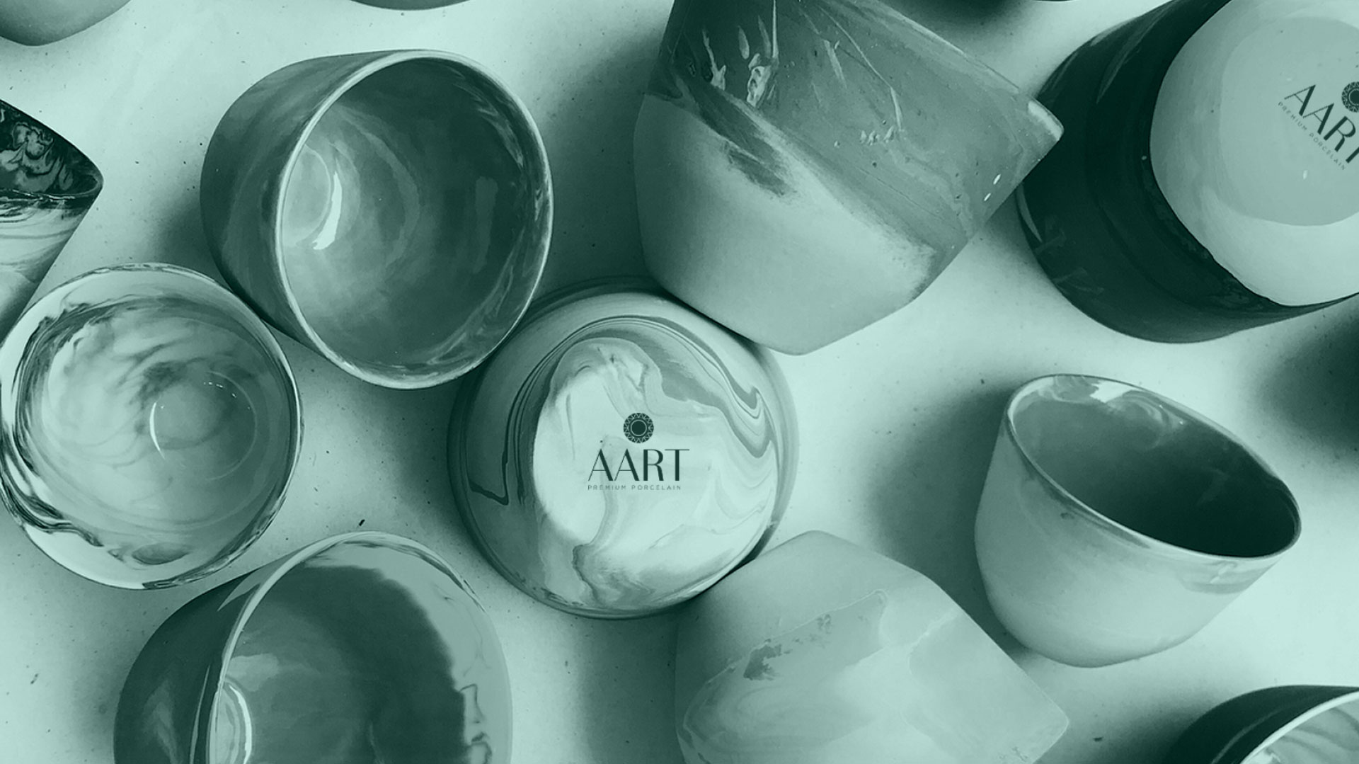
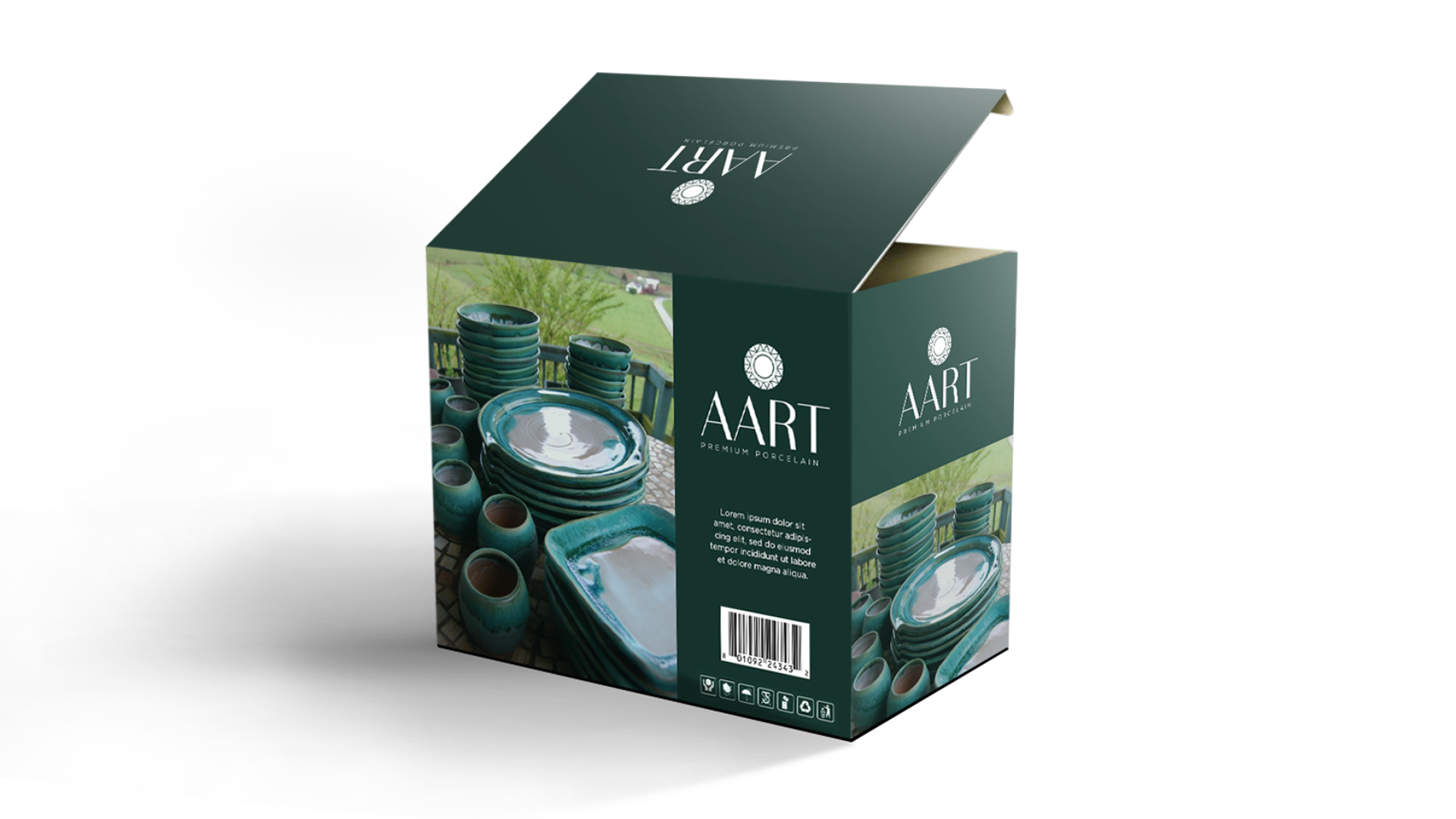
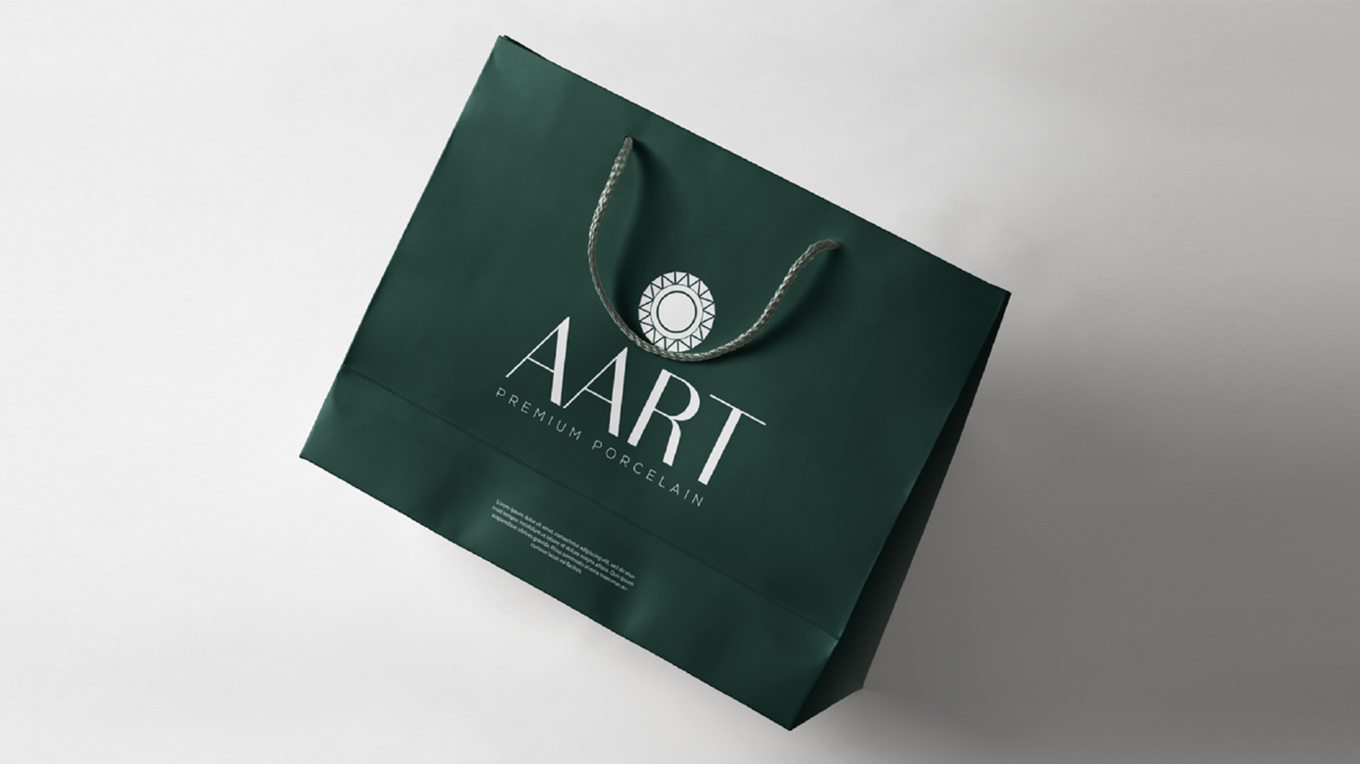
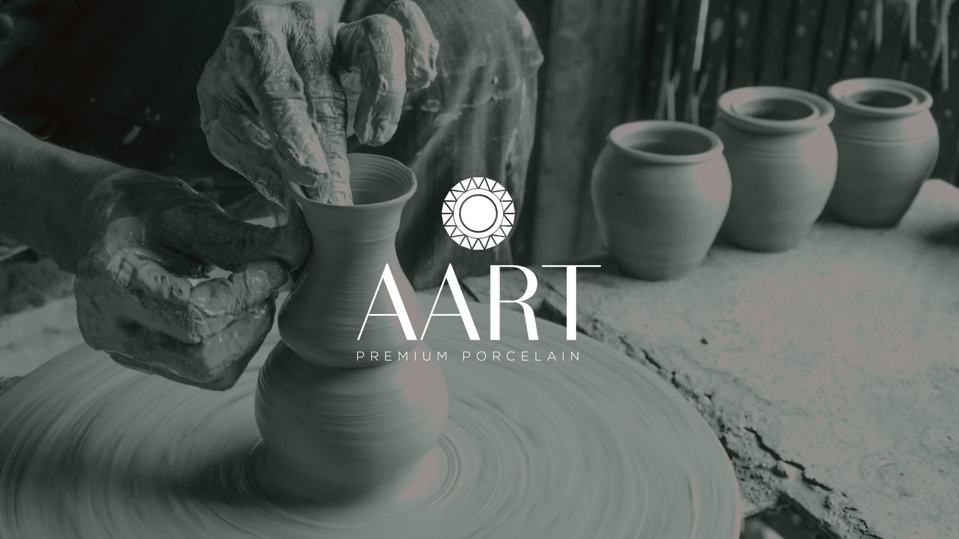
We delved into the essence of AART, focusing on the brand’s core values – premium porcelain crafted with an artistic touch. To achieve this, we opted for a typographic logo with subtle yet impactful design elements.
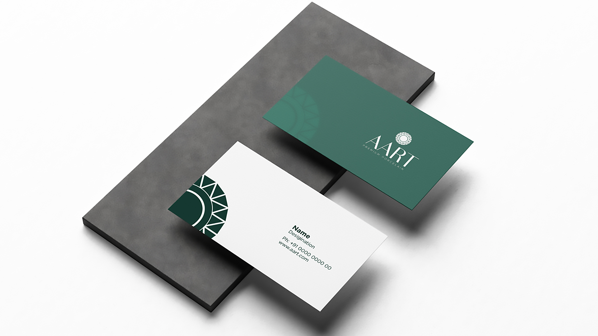
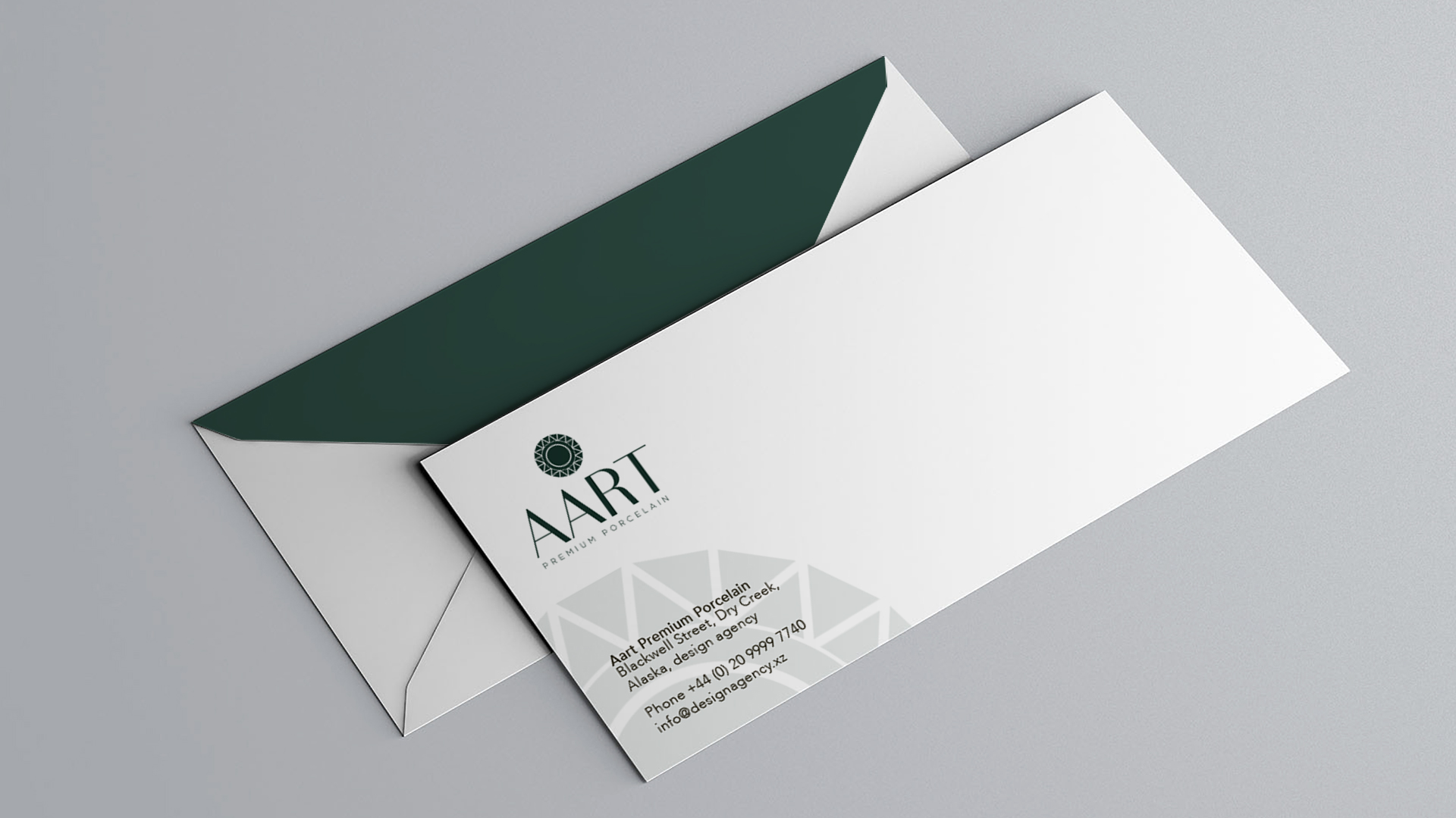
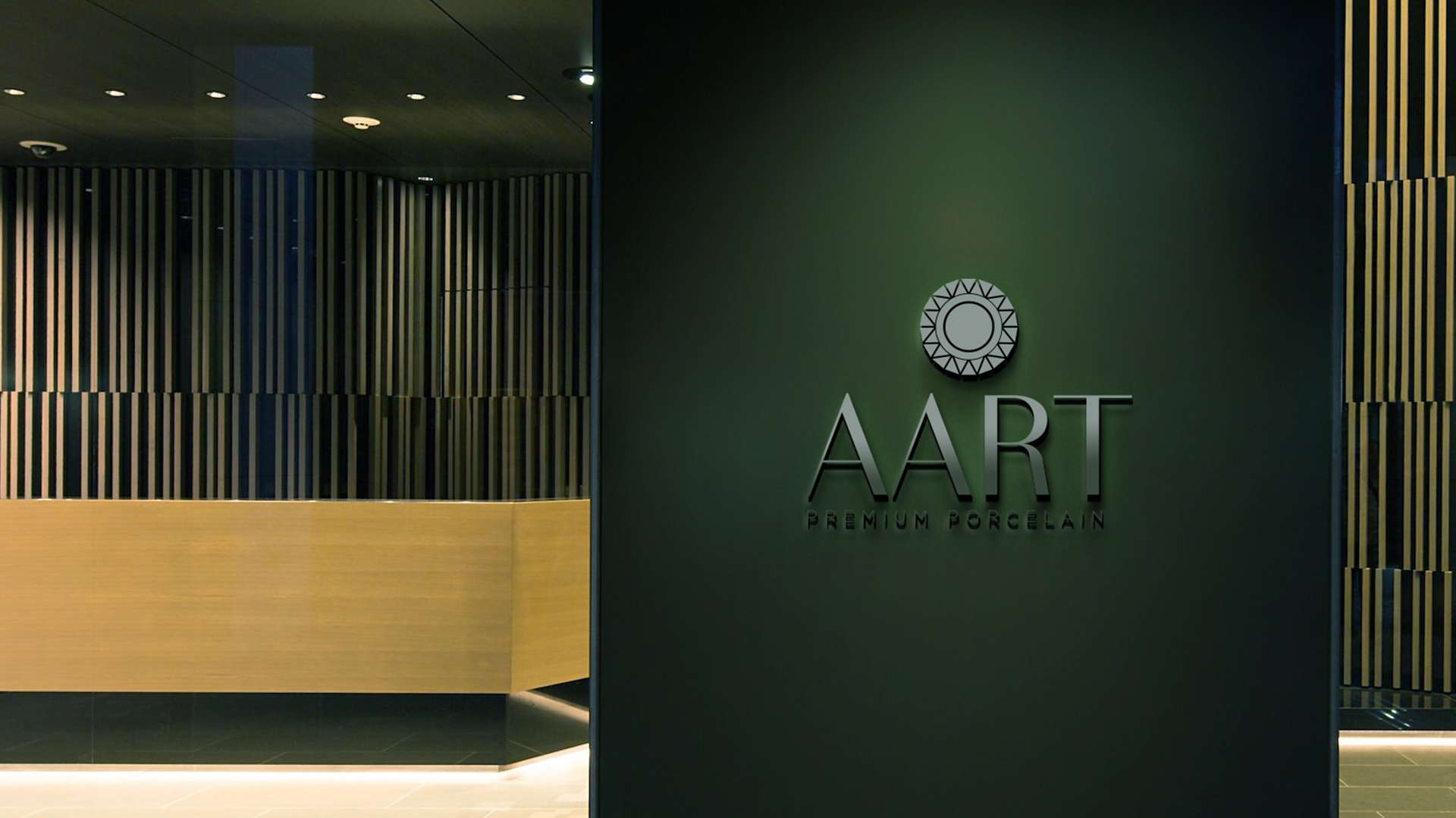
The Logo
Typography: The typeface is both modern and timeless, reflecting the brand’s commitment to quality and enduring style.
Plate Element: A subtle silhouette of a plate is cleverly incorporated. This visual cue instantly communicates the product category, allowing for quick brand recognition and a unique design element.
Potter’s Wheel: A stylized representation of a potter’s wheel is integrated into the plate. This element evokes the artistry and craftsmanship involved in creating porcelain pieces, adding a touch of heritage and tradition to the brand identity.
Color Palette: A dark green color palette was selected. Dark green is associated with growth, luxury, and sophistication, perfectly aligning with AART’s brand image. The color choice adds an artistic touch while maintaining a sense of class and elegance.